
Are you a healthcare provider or a hospital administrator looking to revamp your website design to keep up with the latest trends? In that case, it's the right time to get started. Over 36% of internet users search for hospitals and medical services online. This calls for a fluent healthcare website design to attract new users.
So, how do you know if a healthcare website design is well-planned? With the rise of the digital presence of healthcare facilities, it's more important than ever for hospitals and medical practices to have an online presence that is informative, user-friendly, and visually appealing.
So, whether you're a healthcare provider or a patient, read on to discover what makes an excellent healthcare web design and how to choose the right website design company for your needs. Let's explore the top component included by professional web development services while involved in healthcare web development.

Looking to Create a Healthcare Website?
When designing a healthcare website, the first thing you might understand is, “What are the components of the best health websites?” Well, there is a multitude of factors that should be taken into consideration when designing the website.
Everything should be managed appropriately and synchronized, from the navigation to the color and theme, to ensure users can easily access the platform. That is why taking the service of website designing solutions is a must.
So, here are the top components of medical website design to consider.
The logo is the identification that makes you stand apart from your competitors. This is why a proper logo design is critical to healthcare website design. Your logo is the face of your brand, and it should be memorable, recognizable, and reflective of your business.
Simple yet eye-catching logos are a common feature of the best medical website design. The logo you design should be simple to read and visually appealing. The color scheme should also be in sync with the healthcare brand.
What makes a good logo?
Though logo design is essential for hospital website design, knowing what makes a good logo is important. So, here are the things to remember:
The best healthcare website design also focuses on the website's color. Choosing the right color can evoke specific emotions and feelings in website visitors, making them feel more comfortable and at ease on your website.
A good healthcare website design color scheme should be clean, soothing, and consistent throughout the website to maintain a professional look.
Tips for selecting the website color
The tips you should follow while selecting the website color scheme are:
One of the most essential website design tips is a clear vision and mission for your website. Healthcare practitioners want their patients to feel confident in them, and the medical web design should demonstrate this.
Potential patients can better grasp the healthcare provider's values and services by familiarizing themselves with its vision and mission statements. Practical objective and goal communication on your website is possible with carefully written content and visual elements.
Way to mention vision and mission
To ensure that your vision and mission are communicated effectively, make sure to:
When you take the support of the best web development company, the first thing that you will gain is a website that is easy to navigate and user-friendly. When a visitor or patient comes to your website to look for the service, you must have proper tabs, dropdown menus, and a help section. This will allow them to secure appointments and get answers to their questions.
In other words, the website should be designed in such a way that it is easy for visitors to find what they need without getting lost in a sea of pages and content.
Ways to ensure smooth navigation
Ensuring smooth navigation of healthcare website design involves the following:
A good hospital website design is deemed complete with the details of the practitioners working in the hospital. So, when you design your hospital website, you must ensure an entire section is dedicated to the staff working there. When the details of the medical practitioners are available on the website, the visitors' trust increases—but knowing what and how to include them is also essential.
What all practitioners’ details should be added?
There is no thumb rule as to what details should be added, but as a fundamental point, the following should be considered while counting the details:
The best medical website design has particulars of all available services. Right from general medical support to specialized health services, everything should be added to the website so that visitors get an idea of the services available.
While listing the services, you should also ensure that the linked information like timings, scheduling process, and rest are mentioned clearly and precisely. Adding a call-to-action to connect with the reception in this section is also essential.
Tips to add services
A responsive website can adapt to different screen sizes and devices, providing users with an optimal viewing experience. From mobile responsive design best practices, developing a website that can be accessed from any device is crucial.
A responsive website will ensure visitors can easily navigate your site, regardless of their device, ultimately resulting in higher engagement and conversions.
Why make a responsive website?
Some bullets highlight the importance of a responsive website for medical website design:
Apart from website navigation best practices, SEO optimization is also crucial. Being search engine optimized ensures the website is structured and built so that its information can be quickly understood and indexed. This increases the website's exposure in search engine results pages and brings in more natural visitors.
To do this, it's crucial to use on-page optimization strategies like keyword research, meta-tag optimization, and internal linking. To offer users value and meet search engine ranking requirements, ensuring the website's material is of high caliber, relevance, and freshness.
Things to consider for SEO optimization
Here are some key points to keep in mind for effective SEO optimization:
The best health websites usually offer informative content to help visitors understand healthcare concerns. The content should link to the services available in the hospital, generic health-linked information, and any topic that can educate the readers.
This can include articles, blogs, and other resources that educate and inform visitors about various health concerns and topics. By providing valuable and relevant information, a healthcare website can establish itself as a trusted source of health-related knowledge and build credibility among its audience.
Tips for creating informative content
When creating the content, here are a few tips to ensure that your content is informative and helpful:
Last but not least is creating a clear CTA. Any website design must include a "Call to Action" (CTAs), even for the healthcare industry. A clear and appealing CTA can make all the difference when turning website visitors into patients.
In the context of healthcare website design, CTAs could include "Book an Appointment," "Call Now," "Find a Doctor," "Learn More," and so on. These CTAs should be prominently displayed on the website, ideally in the header or footer.
Tips to write a good CTA
While writing a CTA is important, writing it correctly is essential. So, here are a few tips for writing the CTA:
The importance of web design for the healthcare sector is relatively high. With the good practices shared above, developing an effective hospital website design is simple. To improve it, look at the top 5 website designs and what makes them the best.
Multiple hospital design trends are working around, but a few hospital website designs stand out compared to the rest. So, here are the five best healthcare web designs you should know about.
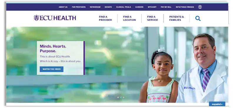
Vidant Health's website design stands out in the healthcare industry. The following features make it the best:
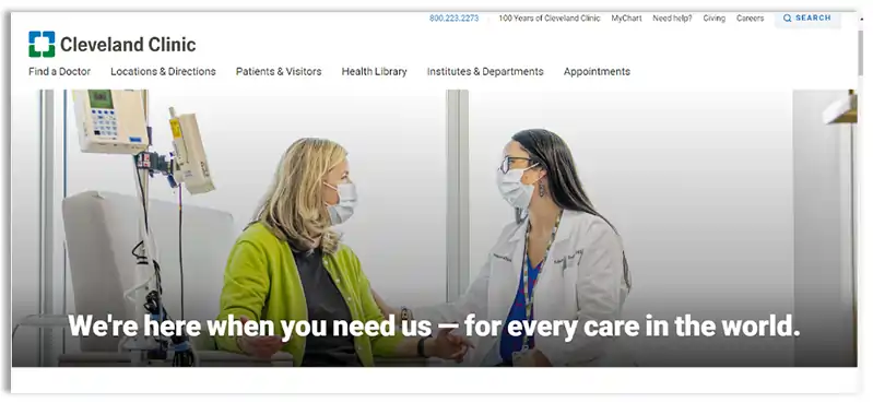
The Cleveland Clinic's website is also a top contender in the healthcare industry, offering the following features that make it stand out:
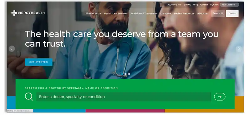
Mercy Health's website stands out for its use of engaging graphics and imagery and its careful attention to color choices. Here are some reasons why Mercy Health's website is one of the best:
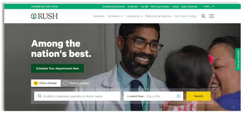
Rush University Health Medical Center's website design is simple and functional. Here are the key features:
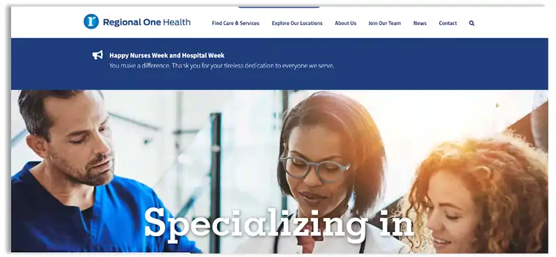
Regional One Health website stands out for its use of visual storytelling through immersive and dramatic videos. Here are some features that make it a standout healthcare website:
With changing times, the demand for better websites is also increasing. A good healthcare website design will ensure you can connect with potential patients seamlessly while delivering the intended message.
When the features are appropriately used, you can get the best healthcare website design that is not only responsive but also informative. From informative content and clear CTAs to engaging visuals and user-friendly navigation, these elements are crucial to creating a website that resonates with your audience and stands out from the competition.
But don't just take our word for it. Put these tips into action and see the difference these can make for your healthcare website design.
And if you need help creating a website that truly represents your brand and aligns with your audience, connect to Janbask Digital Agency, the best web development company. We're dedicated to delivering exceptional website design services that empower your healthcare business to thrive online.
Interested in our Healthcare Web Design & Development Services?

1. How to create a website for healthcare?
Creating a healthcare website can be a daunting task, but taking the support of the best web development company can make it easier. The steps to be followed include:
2. What domain are healthcare websites?
Healthcare websites typically fall under the .healthcare or .health domain. However, they can also use domains such as .com, .org, or .net. The domain you choose for your healthcare website should reflect your brand and mission.
3. What are the five features that most good medical websites have?
The five broad features of a medical website include the following:
4. Why is having a responsive design important for a healthcare website?
With more and more people accessing the internet on their mobile devices, having a website that is optimized for different screen sizes and devices is crucial to provide a good user experience.
5. How can online appointment scheduling benefit healthcare providers?
Online appointment scheduling can save time and streamline the booking process. It can also reduce no-shows as patients receive automatic reminders and can easily reschedule or cancel appointments online.
O
Great tips on website design. I am definitely going to implement them on my website.
K
I loved reading the article
P
Interesting tips! Enjoyed the blog very much.
J
I totally agree that providing all the necessary information is very important for any visitor to a website.
K
SEO definitely plays an important role in getting your healthcare website recognized.
A
Interseting
E
Good content
F
Quite useful
F
I had tried countless weight loss methods, but nothing worked until I found this incredible product. It helped me shed an impressive 40kg, going from 115kg to a healthy 75kg. Don’t miss out on this life-changing opportunity. click here to order now!