
There was a young man named Sam, who had just joined as a sales lead at some daily convenience goods selling company. His experience on the cover letter explicitly explained his past experiences of turning leads into impactful customers.
In the new job, he was assigned a few targets, where he had to interact and convince a bunch of prospects to buy their goods. During interaction with prospects, he sprinkled his irrevocable charm that compelled almost every prospect to say “yes” for his offerings.
Days went by, the prospects who said clear yes didn’t show up for the final purchase.
He was shocked to see why almost all the prospects who said yes didn’t appear for the purchase.
What do you think happened here? Was Sam’s sales pitch weak? No, it wasn’t.
The reason for failing customers was an aging website. The company’s website wasn't up-to-date, it looked like a dead zombie that hasn’t been operational since 2003 (because its copyright said “last updated in 2003”). Just after disconnecting the call, the prospects went up looking for their virtual existence and landed upon a website that looks like an extinct species of web 1.0. With random playing media, splash pages with some logo, last blog entry on a few years back, cluttered designing, slow loading pages, and a thousand more things might have been the reasons for such incompetent results. Do you think all these will ever persuade a target to hop onto any business kind? We don’t think so. And so did SAM realized.
Poor SAM! If his company had some splurged some on website redesign services, guess they didn’t have to end up paying so much hidden costs in terms of poor conversions.
“Keeping an updated website is immense in the age of ultra-modern customers”
Looking to redesign your website?

Virtual landscape evolves in every fraction of seconds. It’s imperative for online businesses to understand that ‘being dynamic is the key’. A website that once made doesn’t mean is sufficient to carry business for years to come. Every website needs some timely revamp based on trends, designs, elements, features, shaping in the current target market. Updates and maintenance are a continual part of website lifecycle and thus, can’t be ignored, as they help with:
In the continuing post, we will highlight the areas that are driving off your potential customers and needs some serious attention.
Let’s transpire 10 clear signs your website is aging & require quick makeover from website revamp services
Is your web page taking an eternity to load (beyond 3 seconds is an eternity)? Looks like you haven’t optimized your website’s speed in tolerance capacity of - search engines & visitors.

Search engines, as well as the audience, are very particular about the loading speed of the web pages. If your website is somewhat taking longer than 5 seconds to load, you are likely to drive away 60% of your visitors (whoa! That’s a lot).
And search engine crawlers wouldn't make efforts to suggest such sites in the user’s query as well. Because they don’t want to break the user experiences.
Why your website could be loading at tortoise speed?
Is this the case with you too? You need to consider restructuring the elements of your site with designers of website redesign services. Ask your designers to bring edits to the areas that are taking heavy space. You may get hands-on image and media compressing tools or software. That does a great job of shrinking pieces to minimum file size and extreme quality.
40-60% of users prefer to have their queries resolved over smartphones or tablets. If your website in today’s time is not at all mobile responsive, chances are you’re losing heavy business. As viewers and search engines wouldn't hop onto your website.

Sings your website is not-at-all mobile-friendly:
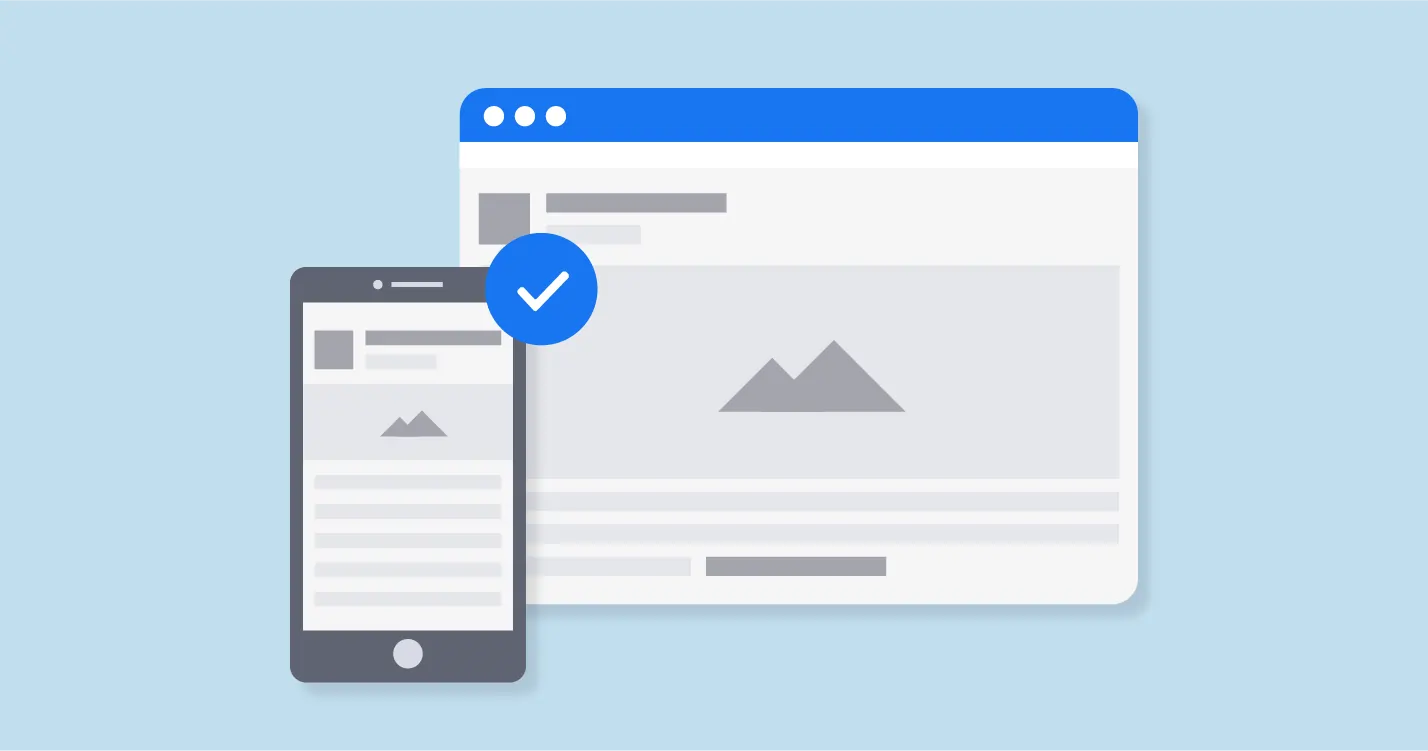
So what does a mobile responsive website looks like?
Search engine Google has its mobile-friendly test tool available that helps to measure the responsiveness of a website. And even foretells the areas where the website is losing traction with the users and search engines kind of responsiveness.
If your website is not at all mobile-friendly, chances are you will never win the user's attention. It’s a high time to modify the website as per mobile compatibility standards and avoid risking the prospective customer base.
Your website is still based on old-age basic HTML codes. Where to tweak even a point of information, you have to ask a webmaster to do so. And then has to mess up your entire website’s codes to bring in the said change. And this is the reason why you are lacking behind in updating fresh content and media files.

Are you stuck in the above jargon? If so, escape from it. As users and search engines today are way too modern. They won’t wait for your site to put up new content or bring in changes after so long. It’s not that they don’t have time, it’s just the rest of the competitors are way faster than you think. And while you are reading this line, someone somewhere might have revamped their site and put up fresh content pieces to their webspace. And might even have landed up with good leads till now.
Ok so how to resolve this?
Your website needs to take major help from the artists of a website revamp services. Who would migrate your website to popular content management systems (CMS) like WordPress or Magento. Where you can easily modify, edit, or publish content without getting dependent on webmasters.
While if you want extra functionality or features, your designers can add tons of customized plugins and extensions. Which will extend your site’s functionality to a next level.
Your website is still based on old-age basic HTML codes. Where to tweak even a point of information, you have to ask a webmaster to do so. And then has to mess up your entire website’s codes to bring in the said change. And this is the reason why you are lacking behind in updating fresh content and media files.
Are you stuck in the above jargon? If so, escape from it. As users and search engines today are way too modern. They won’t wait for your site to put up new content or bring in changes after so long. It’s not that they don’t have time, it’s just the rest of the competitors are way faster than you think. And while you are reading this line, someone somewhere might have revamped their site and put up fresh content pieces to their webspace. And might even have landed up with good leads till now.
Ok so how to resolve this?
Your website needs to take major help from the artists of a website revamp services. Who would migrate your website to popular content management systems (CMS) like WordPress or Magento. Where you can easily modify, edit, or publish content without getting dependent on webmasters.
While if you want extra functionality or features, your designers can add tons of customized plugins and extensions. Which will extend your site’s functionality to a next level.
Website is a business’s best marketing tool that can help bag good convertible leads. But for that, a website’s elements, layouts, and designing need to be on fleek.

But looks like your website structure is all distorted. There is no proper finishing, alignment and proper spacing. You are still using gigantic flash and java elements. You don’t do cross-linking and you are missing on your call-to-action button.
If you have reached a plateau in sales number, chances are your website is dying. Look at those high-end competitors and compare what elements you are still lacking with. And think of additional elements you can add to look one-notch higher than the competitors.
Ask your designers to give your website an edge over competitors to save from losing potential business.
A difficult to navigate or twirl around website is a complete no-no for online users. If your website is failing at forming a smooth path for users to navigate through, chances are you will forever lose them.
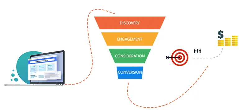
Your website needs to be intuitive and well-directioned for every user. Their journey from reading the information to end up buying the product should be clear to follow.
If your website checkout process is too complex or the call-to-action button is invisible - your users will dive off with frustration.
When visitors on your website are struggling hard to find answers to their queries, then it’s time for a redesign.
Analyze your website through different devices & browsers. Assess how can you make the path easy for the navigators. And then ask your revamp artists to restructure your website as intuitive, easy-to-navigate and well-linked to every element.
“Weave a brand story that’s explicitly yours”
Your website should be the clear reflection of your brand story.

If your website is missing on certain elements that are mirror to your brand journey - chances are, your audience won’t connect with you on a deeper level.
Your website needs to infuse certain elements that could become your individual identity. That reflects your specific style. That could make you different from your key competitors.
If you think your website is just about basic texts, fonts, media, and information - there you need to redesign a brand story.
And Whenever you plan to update or improve your brand identity, make sure to improvise your website at first.
“Transform your outdated website before your visitors bounce off”

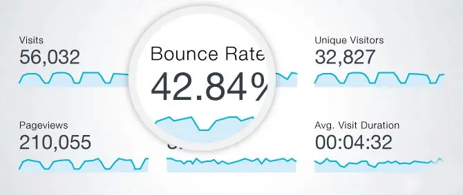
So things were fine yesterday but lately, your website traffic has been in a complete mess. You just realized that even the loyal viewers are diving away from your website (because they found someone better). And no new visitors are holding too long onto your website. Visitors are bouncing off with lightning speed.
This means your visitors aren’t finding your website enough to satiate their queries.
Reasons why your users could be flying away>>
If you feel your website has all these symptoms, then it’s time to consult some serious website redesign services, who can amplify your website as per the capacity of ultra-modern users & search engines.
Also, ask your designers to integrate your website with a certain analytics tool. To timely get notified on traffic speed, sources, demographics, reasons for bounce rates and more.
“To keep your audience engaged, you need to put what’s engaging”
If your website is old-built, chances are it’s missing on a lot of engaging factors or elements. The audience loves exploring a website that’s fun to ravel through. You need to support and embed features that are engaging and users of all backgrounds commonly demand.
So if your website is just about boring information and few multimedia here and there. You need to redesign your website with some oomph elements:
“In the virtual world, data or information is the biggest asset for any third-party hacker”

Websites that deal with regular exchange of user information or data are susceptible to a data breach.
And since your website is built via an old web ecosystem, your chances of being prone to data breaches are very high.
And once the breach is done:
Why waste those millions, years and efforts when you can save yourself early. By redesigning your website, you will be introduced to more enhanced security protocols to your site. Your website will be infused with hack-proof plugins that top IT structures are already using.
Introspect your website, compare and contrast it with your key competitors. Do you see those gaps? Do you think it is not even as good as theirs? Do people often tell you your website looks dull and unexciting to navigate through?

If your answers to all these questions is a big “yes’, then your website needs a major transforming.
It’s simple, if your website is outdated, doesn’t embed engaging elements & doesn’t even resonate with users’ expectations --- you will never win wealthy business.
If you think your website is just perfect as it is, then just a refresh is only what you need. But if you think it’s costing your business in the above-mentioned ways, then it’s high time to transition your website from “old-fashioned” to “ultra-modern”.
There is nothing like “a website that lasts forever”. Every website at some point of time needs some timely conscientious efforts to update and edit it as per the evolving interests of netizens. There is never a day in website lifecycle when a website can be called “just perfect”. Regular updating, maintaining, and upgrading are its ongoing part and parcel.
And those who fail to incorporate these timely touch-ups often lag in the competition. The above mentioned points are wake up alarm for the site owners who are still wondering what’s the need to restructure their website.
Considering a ground-level website re-building has infinite pluses than minuses. An improvised website will give users an enhanced user experience and look & feel. Along with an edge over contemporary websites.
Even the search engine appreciates & ranks a website that’s updated and modified as per the evolving trends. Re-building a website will help you score top-notch ranking and high-paying customers.
To embark on countless opportunities and heal your aging website, consult JanBask Digital Designs as your personal website revamp services providers. Where we will work hard on your website to regain its USP & you just have to make way for more business.
Want to know how we can redesign your website from scratch?

Looking to Create a Custom Website?
Leave a Reply