
Getting a website up and running is such a demanding task. There’s no fixed template, no standardized design and many, many (many!!!) options to choose from. First, you gotta decide the name of your website, then you have to find the right template, then get snappy content and images, and finally, you have to figure out how to get people on your site. But perhaps, the most difficult decision is to figure out whether or not you need animation in your website design. While you want to bring people to your site and keep them engaged, you also don’t want to distract or confuse them.
The idea of a “perfect website” is seeming more and more elusive, isn’t it?
But don’t give up just yet. If you know why animation is used on websites and when to use it, you will win half the battle. Finding the right web designing services team that supports your ideas is how you’ll win the rest of it.
…and this article will help you understand these aspects in detail.
Looking to create your Animated Website Design?

First things first, don’t confuse website animation with cinema animation. Unlike talking dogs or running coyotes in cartoons or movies, web AI animation mostly revolves around adding a certain effect to a text or an image on a website to change its property (induce motion, change the color or opacity of an object, make images grow or shrink, etc.). It could be as simple as a text that glows when you hover a cursor over it or as creative as a carousel of beautiful images that slide on the top of a page. The main goal of animation is to keep viewers engaged.
But the inherent benefit of animation in web design is not limited to its aesthetic appeal. Studies show that customers process motion visuals 60,000 times faster than text. In fact, some studies have also shown that out of all the information transmitted to our brain, 90% is visual and the human eye can register 36,000 visual messages every hour.

There are several benefits to using animations in web design:
But just like yin and yang, there is a balance that your website must strive to achieve. Adding animations is all fun until it isn’t. You have to get the timing just right - too fast and the animation will be jarring, too slow and you can slow down your website loading time and confuse visitors.
This brings us to our next section, figuring out when to use animation.
TL; DR:
|
That’s about the gist of what we’re going to talk about in detail below.
Use animation on your website where you want to offer:
Use animations to improve the usability of your website for first-time visitors. Functional animation, in this case, drives the viewer’s attention to possible interactions. Take a look at how Asana uses animations to guide its first-time users to create tasks.
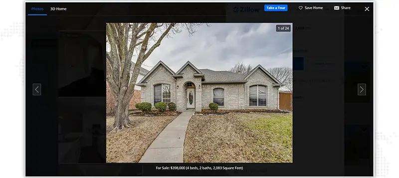
Use website animation to focus the attention of the viewer and call out a specific part of the webpage. You must’ve seen this happen often when you click a picture on a photo gallery on a website and the rest of the page darkens to help you focus on just the image.
Here’s an image of a house on Zillow, check out how everything else in the background has been darkened when you click on the house image.
You can incorporate website animation to convince your users that the website interface is working or to garner a reaction from your viewers. The best example would be that of Facebook and the way it offers a choice of animations to its users.

Another reason to use animation in web design is to intimate users of any incoming messages, follow-backs or comments on the website. These draw the attention of visitors on site and lead to clicks.

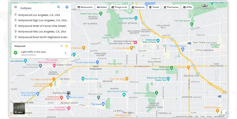
Use animations to show users their relationship with the content on your site. Doing so will help them gain more context and expand their virtual space. Google Maps does this beautifully.
When contemplating using animation on your website, follow these five pillars to improve the usability of your site. Below we discuss some of the hottest web animation techniques to create incredible website designs.
Website loading times can be frustrating for many users. While it may not be possible to always reduce the loading times, designers often use animations to keep visitors engaged. Progression animations work by keeping the user engaged by creating the illusion of a shorter wait time. Animations like a gradually progressing bar across the page or a funnel that keeps getting filled as content gets loaded are all great examples of such animations.

Hover effects are great and practical if you want to convey that an element on your website is interactive. They trigger animations when a user hovers a cursor over an image or a product on a webpage. Some of the animations include zoom in, zoom out, slide, the appearance of text, rotate, blur and grayscale. The hover animation in web design simplifies the overall navigation, improving the user experience.
The navigation elements are intuitive directions for the user. They help simplify the complex hierarchies on websites and bring clarity to users. With an animated menu, you can structure your content and allow users to delve into information without losing the site hierarchy. Navigational animations also make it easier to find your site’s content at different levels and make pages more accessible.

This is a rising website animation trend that keeps visitors engaged through optical illusion. In this technique, the images in the background move slower than the pictures or images in the foreground. By adjusting these movements, a three-dimensional effect is created since the eye views closer objects as bigger than those far away. This way, website developers create an immersive experience for visitors.

There are many ways to induce motion within text or textual fields, the most common ones being a shake or nod on an icon. By adding motion animation, you increase your chances of visitors performing the desired action. Motion animations can be used on many parts of the web design including menus, forms, CTAs and feedback fields.
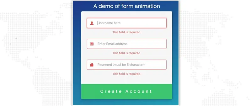
Have you ever tried to fill out a form and missed filling in a field? It throws an error, usually pointing out what you missed filling out. This is an interesting animation that’s added to encourage users to fix their errors quickly. By combining validations and tooltips, developers are able to add animations to input fields.
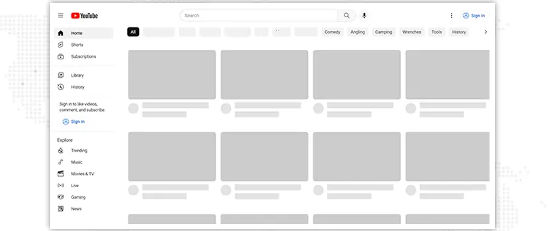
These animations are visual placeholders that appear before a website’s page loads completely. Skeleton screens provide a low-fidelity preview of the actual page, giving an illusion of quicker rendering times. They appear like wireframes; the basic layout appears first and then the content is gradually populated. You must have seen this happening on YouTube very often.
Adding animations to transitions between site pages can enhance the experience of users. The concept is quite simple: there is an animation whenever a user leaves a page to go to another page. If these transitions are added to the site using ajax, they can also help reduce the page loading times.
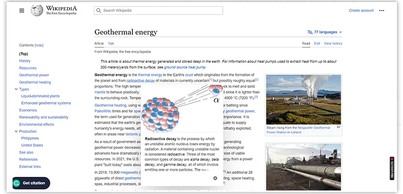
These are text-based animations that are triggered by user’s actions on an image. For example, if you hover your cursor over hyperlinked text on Wikipedia, it shows brief but additional information to glean more context around whatever you searched for. This way, the user doesn’t have to go through the unnecessary back and forth between site pages.
This is another popular animation in web design that many websites actively use. The idea is to encourage visitors to keep reading with subtle content animation. When done right, this animation can showcase information hierarchy, stimulate exploration and keep users delighted and engaged.
These are just a few of the many, many ideas that you can dabble in when it comes to website animation. As long as you’re not overdoing it, the sky is the limit, truly!
Now that you have a better understanding of what animation in web design can do for your site and business, let’s take a look at some of the best website animation trends of 2023 and beyond.
Here’s a roundup of 3 of the hottest and best website animation trends that will dominate the internet in 2023.
In essence, kinetic typography is simply moving text. But if done right, it’s so much more than that. You can add bring your text to life and set the tone for your brand messaging with kinetic typography, captivating the attention of users.

Microinteractions are website animation elements that get triggered and change the interface when users interact with them. These are a refreshing shift away from passive, static content that users have become bored of looking at. Microinteractions serve design styles focusing on an intuitive customer journey.

Another fantastic catalyst for an immersive user experience is animated scrollytelling. Basically, your website users are encouraged to stay on your website and explore it deeply by engaging with the animation on your site through scrolling.

Customers are getting tach-savvier every day and simple, heavy text-based websites just don’t cut it out in today’s digital competitive space. The demand for edgier, more engaging and unique interfaces is higher than ever - and this is why web designers and UI developers are stepping up their game significantly.
If you’re just starting out, then it's always better to take the help of experts. At JanBask Digital, our web design services experts have decades of experience in creating websites that leave a lasting impression. Get in touch with us to schedule a free consultation today!
Website animations are moving images and texts that draw the attention of visitors and encourage them to take certain actions. There are several kinds of animations in web design, ranging from text that glows when you hover your cursor over it to animated scrolling webpages.
Too much animation can be distracting to the visitors, failing to convey the intended information. It can also make your website slow.
Below is a handy checklist to consider before you begin to animate your website:
Answers to questions like these will steer your vision in the right direction.
There’s no fixed turnaround time on this. We strongly suggest getting on a call together to figure out the scope of work and set deadlines accordingly.
Of course, just write to us at info@janbaskdigitaldesign.com and we’ll share the best websites we’ve worked on from our portfolio with you!
J
That_geeky_developer: Web animations are cool! They’re also fun to add during coding.
E
Animatronix_39: Good blog, sharing it on my FB.