In today's fiercely competitive digital landscape, your website isn't just a virtual storefront; it's the ultimate gateway to success. But fear not, for we bring you the most cutting-edge and powerful web design tricks that will do more than just capture attention – they'll supercharge your sales and amplify your profits like never before!
According to the latest industry statistics, businesses with a well-optimized website experience a staggering 10x increase in online sales compared to their counterparts with lackluster designs. In an era where every click counts and every second matters, the success of your B2B venture hinges on your ability to captivate your audience from the moment they land on your site. So, join us as we reveal the game-changing B2B website design and data-driven insights that will turn your website into a conversion powerhouse.

Unlock the Power of B2B Web Design?
The consumer buying journey, or the customer or buyer's journey, refers to the process consumers go through when making a purchase decision. It involves the stages a potential customer experiences, from the initial awareness of a problem or needs, through research and evaluation of potential solutions, to the final purchase and post-purchase evaluation. Understanding the consumer buying journey is crucial for designing a website with B2B website best practices that cater to the needs and preferences of your target audience at each stage. Let's explore the typical stages of the consumer buying journey:
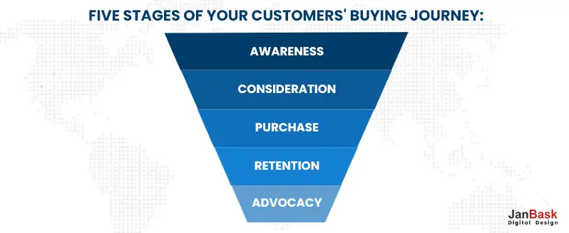
Awareness
At the beginning of the journey, consumers become aware of a problem, need, or opportunity. They might have encountered an issue or realized a desire for something new. They must know specific solutions or products to address their needs during this stage.
Consideration
In this phase, consumers have clearly defined their problem or condition and are actively researching and considering various solutions. They explore different options, products, or services available in the market. They compare features, prices, and reviews to determine which solution best suits their requirements.
Decision
At this point, consumers have narrowed down their choices and are ready to make a decision. They may have a preferred brand or product in mind, but they could also be comparing final offers, discounts, or incentives before committing to a purchase.
Post-Purchase
After making the purchase, consumers enter the post-purchase evaluation stage. They assess the product or service's performance and whether it meets their expectations. Positive experiences during this stage can lead to customer loyalty, while negative experiences can result in customer dissatisfaction.
A well-designed website can be a powerful tool to propel your business ambitions forward, but beware - a poorly executed B2B web design can just as easily shatter your dreams. Join us as we uncover the detrimental impact a bad B2B website design can have on your business, and learn how to avoid these pitfalls to achieve online success.
Our company offers top-notch web design services to create visually stunning and user-friendly websites for businesses of all sizes.
By implementing these cutting-edge strategies, you'll unlock the full potential of your B2B website, captivate your target audience, and witness a remarkable 10x surge in your online sales.
With most internet users accessing websites through mobile devices, a responsive design is crucial. Your website should adapt seamlessly to different screen sizes and resolutions, providing an optimal user experience across devices. Additionally, focus on optimizing the site's loading speed and ensuring robust security to build trust with your visitors.
According to Google, 53% of mobile site visits are abandoned if a page takes over three seconds to load. Therefore, optimizing website speed is crucial for reducing bounce rates and improving user experience.
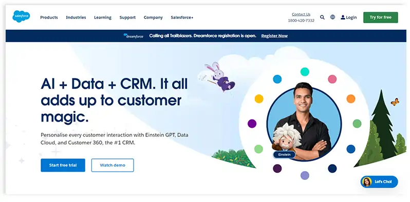
Example: Salesforce excels in responsive design. Their website maintains a consistent and user-friendly experience, whether accessed on a desktop, tablet, or smartphone. It loads quickly and uses HTTPS encryption for enhanced security.
Your website should reflect your brand identity consistently. Consistency in colors, typography, imagery, and tone of voice establishes brand recognition and fosters trust among your audience. Reinforce your brand message throughout the website to create a cohesive and memorable experience.
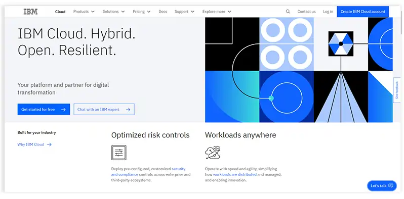
Example: IBM maintains consistent branding across all its web pages. The use of their iconic blue color, the IBM logo, and a clear and professional tone create a unified brand identity.
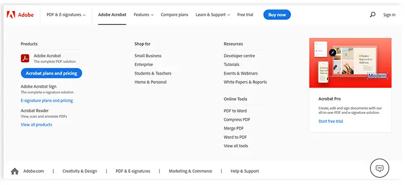
Intuitive navigation is crucial for helping visitors find the information they need quickly and effortlessly. Avoid cluttered menus and opt for a clear and organized navigation structure. Utilize dropdown menus, breadcrumbs, and internal linking to enhance user navigation.
Example: Adobe employs a well-structured navigation system. Their website uses a top-level menu with dropdowns for various product categories, making it easy for users to explore their offerings.
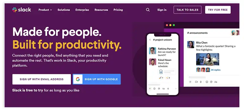
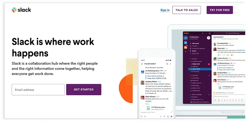
A clean and minimalist design enhances the user experience by reducing distractions and emphasizing essential content. Focus on clear, concise messaging and use whitespace effectively to create a visually appealing and uncluttered layout.
Example: Slack embraces a minimalist design on its website. Their homepage features a simple design with minimal text, a striking hero image, and easily scannable sections.
High-quality visuals, such as images, videos, infographics, and illustrations, can significantly impact engagement and understanding. Use visuals strategically to showcase products, explain complex concepts, and evoke emotions that resonate with your target audience.
A report by Adobe revealed that 39% of users will only engage with a website if images take less time to load or if the layout is attractive. High-quality visuals are vital for keeping visitors engaged and interested.
Example: Zoom utilizes visuals effectively on its website. They showcase images of people in meetings, demonstrating the practicality and ease of their service.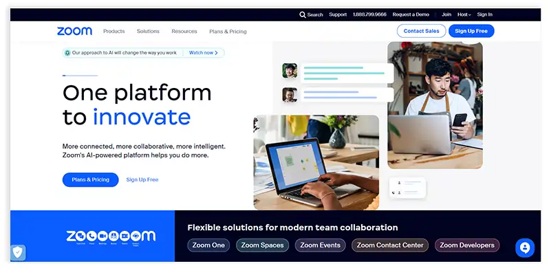
Craft your website content with a focus on highlighting the benefits and value your products or services bring to your B2B customers. Address their pain points and demonstrate how your offerings can solve their challenges and drive positive outcomes for their businesses. Use clear and persuasive language that resonates with your target audience.
According to a survey by CXL Institute, 95% of B2B buyers consider content quality as a crucial factor when evaluating vendors during the decision-making process.
Example: Slack's website effectively communicates benefits by stating, "Slack: Where work happens." This simple tagline conveys the value of their platform as a central hub for collaboration and productivity.
Customer testimonials are powerful social proof that can build trust and credibility. Featuring testimonials from satisfied clients on your website can influence potential customers' decisions and reassure them that they are making the right choice by choosing your B2B products or services.
A report by Invesp shows that 72% of consumers say positive testimonials and reviews increase their trust in a business and its offerings.
Example: Salesforce prominently displays customer testimonials on its website, showcasing the success stories of various businesses that have achieved remarkable results with their CRM solutions.
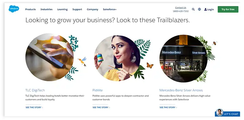
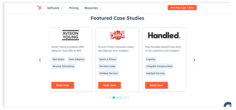
Case studies delve deeper into how your products or services have positively impacted real clients. They provide detailed narratives of challenges faced, strategies implemented, and the outcomes achieved. Case studies are persuasive tools that can demonstrate your expertise and showcase the tangible results you can deliver.
Example: HubSpot has a dedicated section on their website for case studies, presenting in-depth success stories that detail how their inbound marketing and sales platform has helped businesses achieve growth and success.

Ensure your B2B website is accessible to all users, including those with disabilities. Make sure the website is compatible with assistive technologies like screen readers and follows accessibility guidelines to offer an inclusive and user-friendly experience to all visitors.
WebAIM's survey on web accessibility found that approximately 98.1% of websites have detectable WCAG failures, underlining the importance of focusing on accessibility to cater to a broader audience.
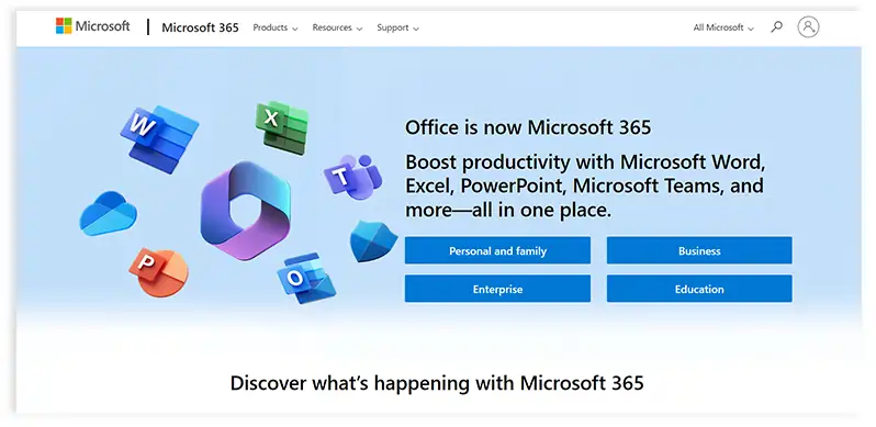
Example: Microsoft's website is designed with accessibility in mind, following the Web Content Accessibility Guidelines (WCAG). Their commitment to accessibility ensures that users of all abilities can access and navigate their site effectively.
In a report by Demand Gen, 95% of B2B buyers chose a vendor that provided ample content to navigate each stage of the buying process. Investing in valuable resources can attract and nurture leads through the sales funnel.
Understand and cater to the various stages of the B2B consumer funnel, which consists of the Top of the Funnel (ToFu), Middle of the Funnel (MoFu), and Bottom of the Funnel (BoFu):
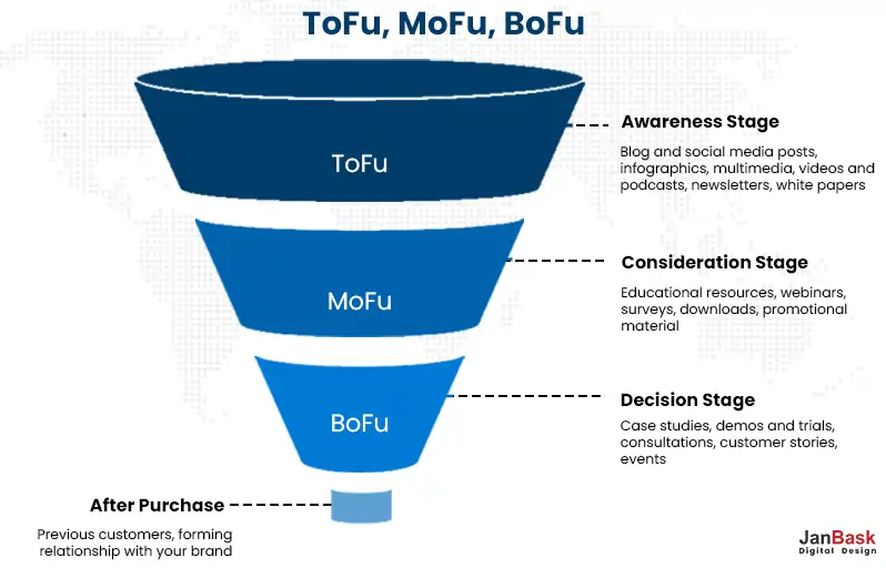
Top of the Funnel (ToFu): At this stage, potential customers are in the awareness phase and are seeking solutions to their problems. Provide informative and educational content to capture their attention and establish your authority in the industry.
Example: Moz, a provider of SEO software, offers a wealth of educational content in the form of blog posts, guides, and videos, helping businesses understand SEO and its importance.
Middle of the Funnel (MoFu): In this stage, leads are evaluating different solutions and considering your offerings. Offer more in-depth content like whitepapers, webinars, and case studies to showcase your expertise and nurture leads towards a decision.
Example: Marketo, a B2B marketing automation platform, provides informative webinars and eBooks targeting leads in the consideration stage, offering valuable insights and positioning their solution as the go-to choice.
Bottom of the Funnel (BoFu): At the decision stage, leads are ready to convert into customers. Offer personalized content like product demos, free trials, and consultation calls to help them make the final decision.
Example: Intercom, a customer messaging platform, provides interactive product tours and personalized demos to help prospects experience their platform firsthand before making a purchasing decision.
Your value proposition is a clear statement that conveys the unique value and benefits your B2B products or services offer to your target audience. It should answer the question, "Why should customers choose you over your competitors?" A compelling value proposition instantly communicates the core value you bring to your customers, setting the tone for your website and overall marketing strategy.
Example: Mailchimp succinctly defines its value proposition on its website: "All the marketing tools you need to grow your business." This simple statement communicates that Mailchimp provides a comprehensive set of marketing tools, appealing to businesses looking for a complete solution.
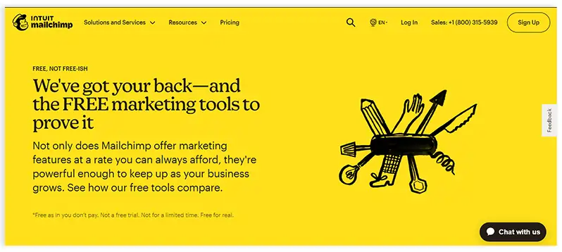
CTAs are essential for guiding potential customers through the buyer's journey. Create tailored CTAs for different stages of the sales funnel, offering valuable content that addresses their needs and encourages them to take the next step. Effective CTAs can significantly increase ecommerce conversions.
A study by CXL found that a minimalist design with a clear CTA increased conversions by 232%. Simplicity and clarity in design can lead to better results in driving actions from visitors.
Example: HubSpot implements lead-nurturing CTAs across its website. They offer free resources, such as eBooks and templates, in exchange for contact information, which allows them to nurture leads through email marketing campaigns.

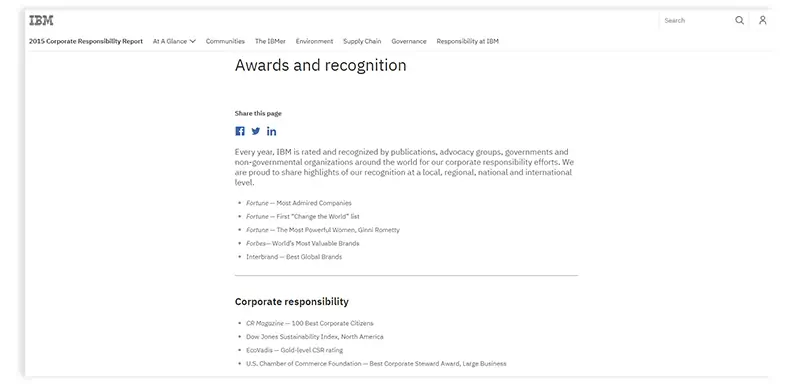
Building trust is paramount in B2B transactions, where decisions often involve substantial investments and long-term commitments. Showcase your expertise, experience, and industry authority through customer testimonials, awards, partnerships, and certifications to instill confidence in potential buyers.
A study by the CMO Council found that 87% of B2B buyers said online content has a moderate to major impact on their vendor selection process. Providing valuable resources can influence purchase decisions.
Example: IBM's website features a section highlighting their industry recognition, awards, and partnerships, demonstrating their credibility as a leading technology provider trusted by top organizations.
Clearly and concisely present your products or services, highlighting their unique features, benefits, and how they address your customers' pain points. Use compelling visuals and informative content to showcase your offerings' value to businesses.
Example: Oracle effectively emphasizes its products by offering detailed product pages with clear descriptions, use cases, and interactive demos to help potential clients understand their offerings.
Offering valuable and engaging resources can attract and retain potential customers. Provide whitepapers, case studies, webinars, blog posts, and video content that address industry challenges, provide solutions, and position your brand as a thought leader.
Example: Adobe's website features many engaging resources, including tutorials, articles, and inspiration galleries that showcase their creative software's capabilities and offer valuable insights to their target audience.
If you're looking for professional website design services, our team of experts can help you craft a compelling online presence that resonates with your target audience.
By incorporating these tips into your B2B web design strategy, you'll create a perfect online platform that not only attracts and engages B2B buyers but also facilitates lead generation, data analysis, and strategic decision-making.
Capture the attention of B2B buyers from the moment they land on your website and provide them with a compelling reason to stay and explore further. Use a visually engaging design that aligns with your brand identity and showcases the value of your products or services right away. Utilize eye-catching visuals, clear headlines, and concise messaging to convey your unique selling points and how you can address their specific pain points.
Pro Tip: Incorporate interactive elements, such as quizzes, calculators, or product demonstrations, to keep B2B buyers engaged and immersed in your website experience.
Content marketing is a powerful tool to establish your authority, educate your audience, and build relationships with potential B2B buyers. Create valuable and informative content such as blog posts, whitepapers, eBooks, and webinars that address industry challenges, provide solutions, and demonstrate your expertise. Leverage SEO B2B websites' best practices to ensure your content is discoverable by search engines and attracts organic traffic.
Pro Tip: Implement a content calendar to maintain a consistent stream of high-quality content and promote it across social media and email marketing channels to reach a wider audience.
Investing in professional B2B website design and development is crucial for creating a polished and functional B2B website. Collaborate with experienced designers, developers, and user experience experts to ensure that your website is visually appealing, user-friendly, and optimized for conversions. A professionally designed website instills confidence in potential buyers and enhances your brand's credibility.
Pro Tip: Prioritize mobile responsiveness and conduct user testing to identify any usability issues and make necessary improvements.
Having a dedicated blog or resource area on your B2B website can provide a treasure trove of valuable information for your target audience. Regularly update the blog with industry insights, thought leadership pieces, case studies, and customer success stories. This not only keeps your website fresh and relevant but also positions your brand as an authority in your field.
Pro Tip: Allow users to subscribe to your blog to receive updates, and encourage engagement through comments and social media shares to foster a sense of community around your content.
Incorporating email newsletter sign-up forms strategically throughout your B2B website is a powerful way to capture leads and build a loyal audience. Offer valuable incentives, such as exclusive content, industry insights, or special offers, to encourage visitors to subscribe. Ensure that the sign-up forms are prominently displayed, user-friendly, and integrated with your email marketing platform for seamless lead generation.
Pro Tip: Personalize the sign-up form based on the visitor's browsing behavior or interests to improve ecommerce conversion rates.
Content optimization is vital for driving organic traffic to your website and improving search engine rankings. Conduct keyword research to identify relevant and high-traffic keywords related to your industry. Use these keywords strategically in your articles, blog posts, and website copy to attract your target audience and provide valuable insights.
Pro Tip: Create pillar content or comprehensive guides that cover essential topics in your industry, serving as a valuable resource for B2B buyers.
Implement robust tracking and analytics tools, such as Google Analytics, to monitor user behavior and gather valuable insights. Analyze website traffic, user engagement, e-commerce conversion rate optimization rates, and other key metrics to identify areas for improvement and make data-driven decisions to enhance your B2B web design.
Pro Tip: Set up goals and funnels in your analytics platform to track specific actions taken by visitors, such as form submissions or downloads.
Optimize website forms to collect relevant information from potential leads while keeping them user-friendly and easy to fill out. Use conditional logic to show or hide fields based on the user's previous responses, providing a personalized experience. Set up email notifications to receive instant alerts whenever a form is submitted, ensuring timely follow-up with prospects.
Pro Tip: Consider using progressive profiling to gather additional information from leads over time, avoiding overwhelming them with long forms initially.
We specialize in providing innovative web designing services that cater to the unique needs and goals of our clients, ensuring a seamless user experience.
1. What is B2B website design?
B2B website design refers to creating and optimizing websites specifically tailored for Business-to-Business (B2B) interactions. Unlike B2C (Business-to-Consumer) websites that target individual consumers, B2B websites cater to other businesses, organizations, or professionals as their primary audience. The main goal of B2B website design aims to provide a seamless and effective online platform that showcases products or services, facilitates lead generation, and nurtures business relationships.
2. What are B2B website design best practices?
B2B website design best practices are a set of guidelines and strategies aimed at creating effective and high-performing websites that cater specifically to the needs of B2B audiences. These B2B websites' best practices focus on elements such as clear CTAs, responsive design, content marketing, establishing credibility, and providing valuable resources to engage and convert potential B2B buyers.
3. How to improve ecommerce conversion rates?
Here are some effective strategies on how to increase conversion rate ecommerce:
4. How do clear CTAs impact B2B website performance?
Clear and compelling CTAs guide B2B buyers through the sales funnel, encouraging them to take desired actions, such as signing up for newsletters, requesting quotes, or scheduling demos. Effective CTAs help improving ecommerce conversion rates, generate leads, and facilitate a smoother user journey, ultimately boosting online sales.
5. How does content marketing benefit B2B web design?
Content marketing is a powerful tool in B2B website design as it helps establish authority, build trust, and educate potential buyers. Valuable content, such as blog posts, whitepapers, and webinars, positions your brand as an industry expert, attracting and engaging B2B buyers, and nurturing them through the decision-making process.
6. Why is establishing credibility important for B2B websites?
B2B buyers make substantial investments and long-term commitments, so establishing credibility is vital to gaining their trust. Testimonials, case studies, industry recognition, and partnerships help build credibility and confidence in your offerings, leading to increased conversions and stronger business relationships.
7. How can valuable resources like a blog or resource area benefit B2B website design?
A blog or resource area on a B2B website offers a wealth of valuable information to potential buyers. Regularly updating it with industry insights, success stories, and thought leadership content enhances your brand's authority and relevance. This fosters a sense of community around your website, encourages repeat visits, and can lead to increased lead generation and online sales.
8. How much does it cost to build a B2B website?
The cost of building a B2B website can vary significantly depending on several factors, such as the complexity of the design, the number of pages and functionalities required, the level of customization, and the expertise of the web development team. A simple B2B website with basic features may cost anywhere from a few thousand dollars, while more complex and custom-designed websites with advanced functionalities can range from tens of thousands to several hundred thousand dollars. It is essential to consult with professional web development agencies or freelancers to get accurate cost estimates based on your specific requirements.
9. Is B2B profitable?
Yes, B2B can be highly profitable for companies that effectively target the right market and provide valuable products or services to other businesses. B2B transactions often involve larger order sizes and longer-term contracts, leading to substantial revenue potential. However, success in B2B requires a deep understanding of the target audience, strong relationship-building skills, and the ability to deliver exceptional value to clients. Implementing effective B2B marketing strategies, investing in customer satisfaction, and continuously innovating can contribute to long-term profitability in the B2B sector.
Mastering the art of B2B website best practices is the gateway to unlocking unparalleled success in the digital landscape. As you venture forth to create a powerful online platform, remember that every pixel, every line of code, and every strategic decision plays a pivotal role in captivating your audience and driving exponential growth.
At the heart of this transformative journey lies the expertise of professionals like JanBask digital design, a leading web design service company. Our B2B website designing services focus on delivering captivating and functional websites that reflect your brand's identity and drive measurable results for your business.
Infuse your website with the magic of seamless navigation, captivating visuals, and a compelling value proposition. Together, let's redefine the online landscape and craft a B2B website design that sets your business apart from the competition.
Interested in our Web Design & Development Services?

P
Nice motivational blog, really helpful for future entrepreneurs, and the listed tips are valuable and worthy.
J
Glad you found this useful! For more such insights on your favorite topics, do check out JanBask Blogs and keep learning with us!
J
Thanks for giving such great B2B design tips to enhance my website. I was looking for such a post for a very long time.
J
Glad you found this useful! For more such insights on your favorite topics, do check out JanBask Blogs and keep learning with us!
D
Earlier I was really confused as to whether I should try these B2B website tips or not. But the detailed explanation in this post has cleared all my doubts.
J
Thank you so much for your comment, we appreciate your time. Keep coming back for more informative insights. Cheers 🙂
J
Must-read blogs to people willing to take their B2B website to new heights, have some great ideas that really inspire me.
J
Glad you found this useful! For more such insights on your favorite topics, do check out JanBask Blogs and keep learning with us!
J
In how many months can I see effective results if I follow your suggested B2B design tips. Do you have any idea?? Please let me know!
J
Hi, Thank you for reaching out to us with your query. Drop us your email id here and we will get back to you shortly!
J
Do you guys help in setting up a B2B business? I wanted to know because I want to hire your team for my organization as I am not familiar with the process well and will require professional help. Please let me know!
J
Hi, Thank you for reaching out to us with your query. Drop us your email id here and we will get back to you shortly!
G
My friend and I were seeking information on B2B web design ideas for a long time but could not find anything relevant. Then one of our colleagues shared the link to your article. I must say you have shared some effective ideas, I am impressed!
J
Thank you so much for your comment, we appreciate your time. Keep coming back for more informative insights. Cheers 🙂
W
Overall a nice blog, I was seeking information on the same for many days but could not find anything relevant. Then I came across your blog and found it really interesting and impressive. Thanks, team!
J
Thank you so much for your comment, we appreciate your time. Keep coming back for more informative insights. Cheers 🙂
C
I am new in the B2B business and also don’t have much information about marketing strategies. Also, the team that I had hired didn’t respond well. Can your team help me with some more effective and useful marketing ideas!!
J
Hi, Thank you for reaching out to us with your query. Drop us your email id here and we will get back to you shortly!