
Are you crafting any ads? Writing email copies or reviving blog posts? To accomplish the ultimate goal of driving sales, leads, and revenue? How will you do that? The best way is to use powerful call-to-action phrases!
In the present era, the average attention period is about 8 seconds, down from 12 seconds from way back in the year 2000. So, powerful CTA words can help grab the prospective audience's attention and convert them into actual leads.
Without good call-to-action phrases, your digital marketing campaigns can’t convert visitors or readers into actual subscribers, leads, customers, or supporters. Poorly drafted CTA phrases annihilate all online marketing efforts.
So, are you eager to know how to do it?
In this blog post, our experts in digital marketing services will share everything you need to understand about creating the best CTA phrases and how using the best call-to-action phrases, you can guide your visitors through the buying process.
Let’s take a look at these compelling B2B call-to-action examples

Looking to Improve Your Sales Conversion Rate?
Call to action buttons are the tabs you use on your online marketing pages, such as landing page, advertisement page, web page, etc., to achieve your end goal, which is converting a visitor to a prospective lead and then a customer. There are two main functions of good CTAs: they inform their readers what to do to join or subscribe, and they inform their readers why they should hit that CTA button examples.
CTA is the first thing that catches the attention of any visitor, and therefore you need to be very careful with what kind of B2B call to action examples you want to have.
Here are some types of CTAs that you can consider for your website such as:
Companies run different marketing campaigns, like ads, web copies, blog posts, etc., to connect with prospective clients and inspire them to take action.
No doubt, it's excellent for visitors to view your ad or click on your website, but once the visitors do that, you would like them to take the next step, and it’ll need some kind of prompting from your company.
Companies can better implement their traffic by collecting visitors’ personal information, which allows businesses to 1. Personalize their content for every user, 2. Reach out to their customers through different channels such as email, and 3. Start to sell their products or services.
Thus, once users submit their personal information, they indicate their interest in your company and enter your sales funnel.

Companies collect this information via creative call to action buttons.
Good CTAs play various roles depending on where they’re in your sales funnel
A call to action is a marketing tool that boosts web traffic to an organization’s site. Moreover, good call to action buttons is meant for:
You can use the best CTA buttons across your business websites that target potential audiences who visit your websites. Whereas you can use CTAs in the below-mentioned places:
Before you write your website's call to action (CTA), you should first determine the goal you’re trying to achieve:
Once you know what you desire to do, you can prepare a strategy about how best to do it. Moreover, the best call to action phrases are brief, and we would recommend using solid verbs.
B2B call to action examples is used as they are used to speak directly to the user. Instead of creating a weaker CTA words like click here may not serve you excellent outcomes.
To create the best all to action phrases, you must use more particular words that speak directly to the desired outcomes. For example
Here’s a look at a few different and best Call to action button examples that you can refer to for better results:
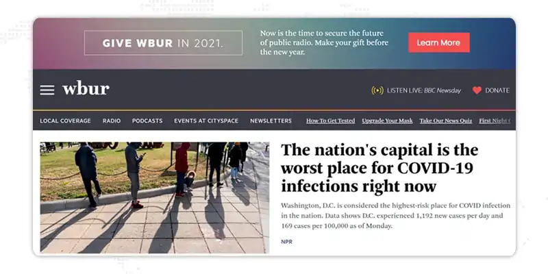
In fact, for better understanding, you can prefer a few renowned companies like NPR as it uses some great B2B call to action examples all over their webpage. The above picture shows a bright red button that invites you to learn more about their car donation program. Just below that, a red heart donation call to action example that clearly implies you have one if you click appears over the word “donate.”
In the white space below, NPR tells you that they are supported by multiple listeners and comprises yet another link to make a donation further.
NOTE: All of these B2B call to action examples serve one purpose, which is to get people to donate money to them.
To assist you in identifying what's effective and what's not, we've listed out examples of 50 powerful call to action phrases. Let's explore these:
Here is a screenshot taken from the DBS website that shows one of the best B2B CTA examples of Big Ass Fans. It’s one of the most amazing B2B call to action examples essay of how you can use compelling action verbs in a delightful way to entice your audience—

Here is another one of the most compelling digital marketing CTA examples used by JanBask Digital Design, as it uses something out of the box to tantalize the curiosity of the visitor. It is not using words like sign-up, follow us, etc. “Let us Build your brand” does it not sound tempting to hit this button? Surely it does.

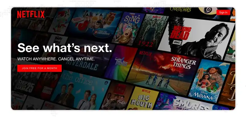
This is one thing that never lets you down. When you offer something free to anyone, people will likely sign up for it. Here is the best call to action essay examples taken from Netflix, which tempts users to sign up by offering a free one-month subscription.
Users cherish seeing CTAs that welcome them to buttons like “Show Me More” and “Show Me How.” It reminds the client that they are receiving an advantage as well. Numerous Non-profit and cause-based associations have seen remarkable outcomes from creative call to action phrases like “I agree” in light of the fact that they urge the client to adjust their qualities or objectives to the association.
Here is a screenshot taken from wishpond explaining the above philosophy – this strong CTA example says “Build My Page,” which gives an excellent personalized approach.

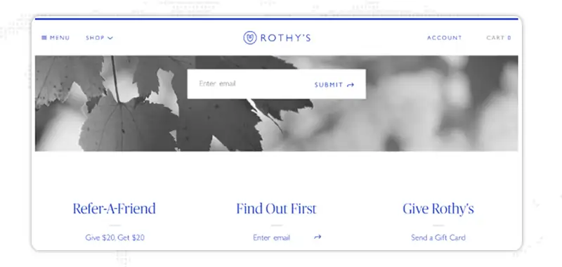
Many of your customers or users wish to know about anything new at the earliest opportunity to stay up to date, which is the bait you can use to lure them. Here is an example of Rothy’s website, where you can see the best CTA for lead generation.
Here is a compelling CTA example of Zoho academy, that uses straightforward CTA words, i.e., “WATCH INSTANTLY.” But it is attractive due to its good color combination and matching with the headline.
This is one technique that always works, add your client’s name to your creative call to action buttons Moz, and make them feel valued. This is an age-old practice in marketing and has seen great success. Let us review the B2B CTA examples screenshot taken from DropBox.

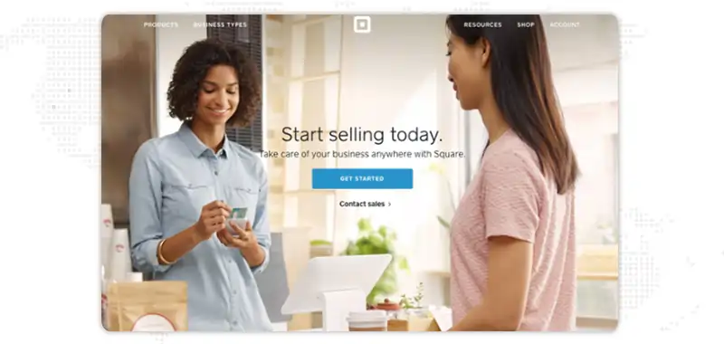
Providing strong CTA words is not enough, you need to be very careful about its entire view, i.e., surrounding graphics; text font, etc. Here are some really good CTA examples taken from the website of Square.
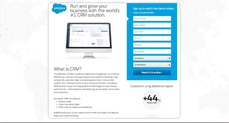
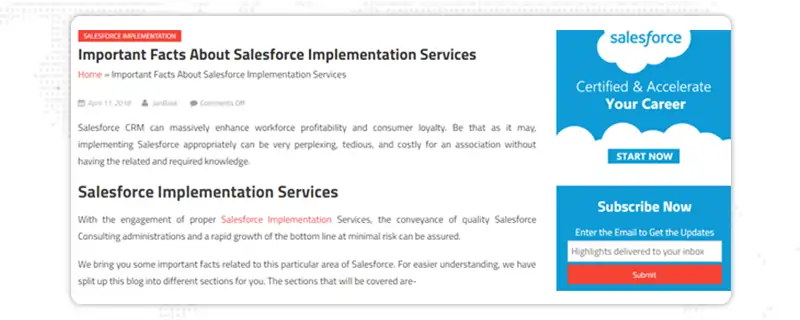
Salesforce has definitely set a perfect example for this. Their CTA for services button and the sign-up page is to the point, no extra things are required. Which in turn makes the user very happy by not typing or going through hassles.
The intention behind good CTA words is to draw in visitors and transform them into leads; hence, you’ll need to put a CTA in an area on your site that sees a lot of new guests, such as your blog. The best places you could put a CTA are towards the end of a post, in the sidebar, and as a gliding pennant in the corner. Here is a screenshot of a digital marketing CTA, that was taken from the website Hubspot explaining the same.

You can use social media sharing buttons as they are an excellent way of lead generation. It is an easy way for visitors to be in touch with your company, and you can even put up buttons on different social media platforms to log in via Facebook, Instagram, etc. Here is a screenshot explaining the call-to-action examples for social media.
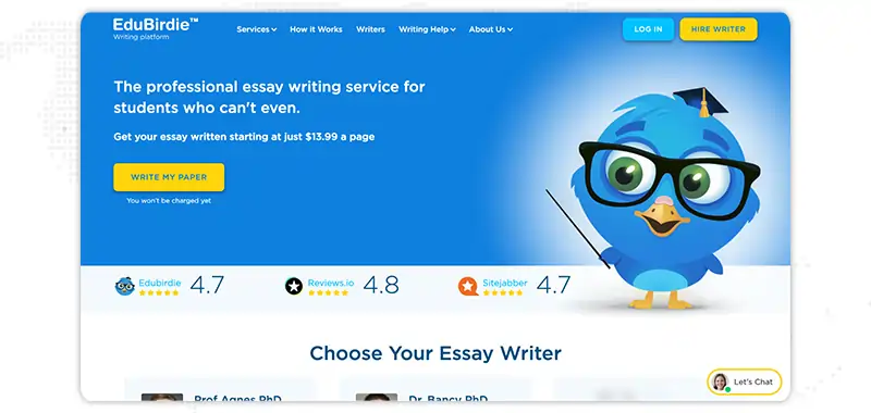
Many visitors think in terms of numbers. They love to see how much time they save or money they would save. Stats drives them. Try to include that. Here is a screenshot taken from a website called EduBirdie showing a call to action in an essay.
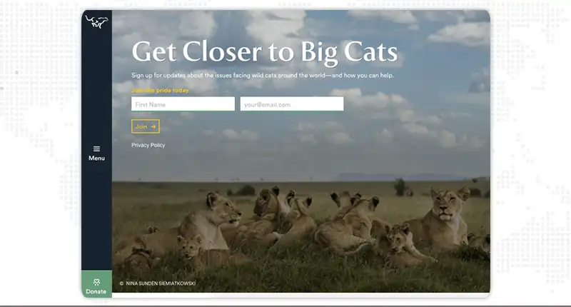
Here is an example of a website that works in the area of saving cats around the world. To target like-minded people and see what they have used in their CTA words, they have used the term “Join the pride today”.
Here is another good example of a compelling CTA words that looks pretty compelling for a visitor to hit your CTA definitely. This is the CTA OF Huemor, and it looks really cool!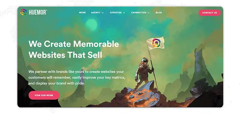
Lure your customer by placing the best points about your organization. This will definitely provoke him to hit your CTA; here is an example of CTA for services from Thrive Market.
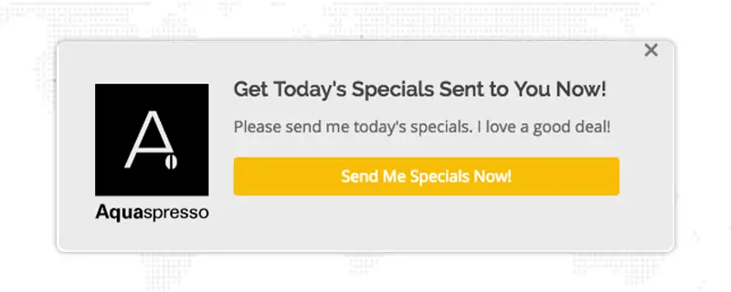
People love exclusiveness. And in this example, we see CTA for services by Aquaspresso and see how they have smartly bartered the email address of their customer by giving them info on specials.
Here is an example of Dollar Shave Club in their CTA for services, they’ve used the word try instead of join, which is a little less committal as you can leave if not satisfied with the trial.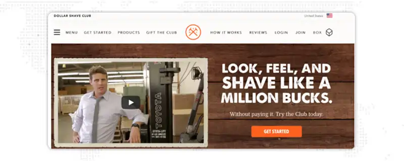
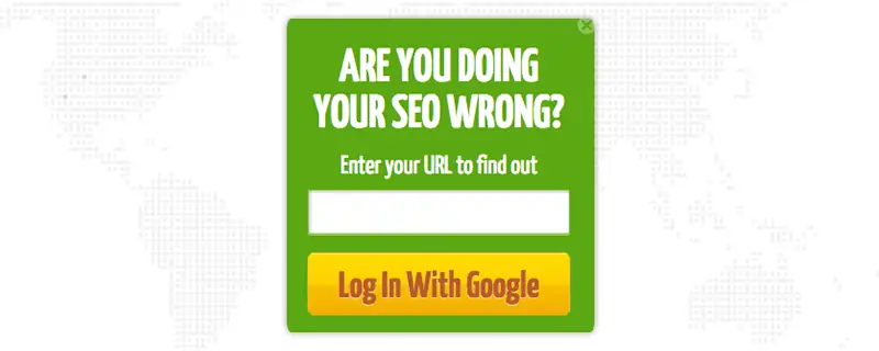
At times, it is good for your business to fill the mind of the visitor with doubt. Trust me no one wants to be wrong. Give them a strong CTA that then helps them clear that doubt. Here is one of the best call to action essay examples of QuickSprout.
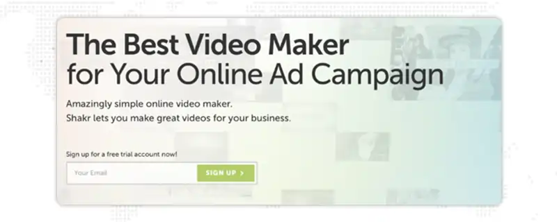
One another great way is to have your entire message condensed into two or three-pointers wherein your visitor knows what he will get in just a few seconds. Here is a great CTA example of Shakr.
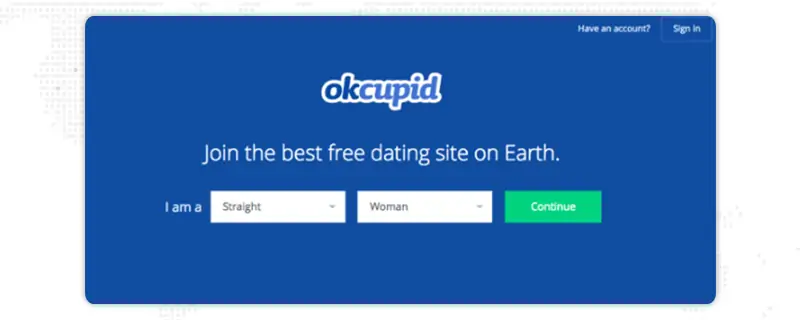
Let’s see the landing page call to action examples of OKCupid which is extremely short and casual and gives you a sense of ease.
You can also use effective call-to-action phrases that promote an event so that you can spread more awareness about that event. Here is a screenshot of an example of one such compelling landing page call to action examples taken from the website of Hubspot.

Instead of using the cliché words such as ‘sign up’ ‘take your trial’ etc use action words such as grab, take, claim, etc. They give a sense of freshness to your visitor. Here is an example of Udemy's call to action education explaining the same-
Here is an example of a good and strong CTA on the page of Evernote, the CTA tab is large, outstandingly displayed, and is not contrary to anything else on the page.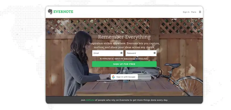
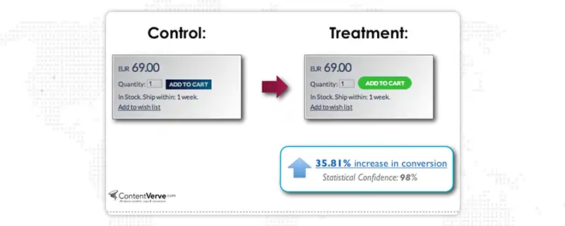
Anything that puts you apart helps even a different shape of the button. This is because your visitor craves novelty. Here is an example of ContentVerve wherein they have used a rounded box CTA for lead generation instead of the normal rectangle.
Here is a wonderful example of the best call to action phrases for services by slack which inculcates a scenario wherein the user feels at a no-risk/high-reward situation for new subscriptions-

Another good way of generating leads is by placing the best call-to-action phrases for services in your blog section. Here is a good example of that-
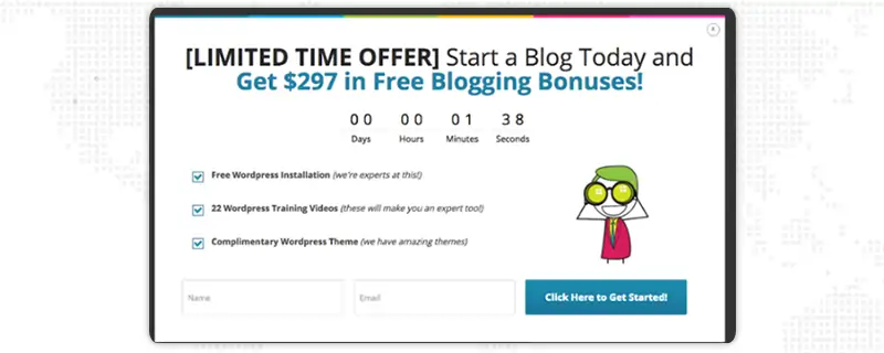
Nothing gives you a chance to have more leads than creating a sense of urgency by placing a timer on the B2B call to action examples. Here is a good example of the best landing page call-to-action examples for websites, a screenshot taken from the website of WordPress-
Here is an example of the best call to action phrases for services of the EPIC website. They display their work through videos and their lead generation call to action button is very friendly as it says “Let’s start a new project together” this gives a sense of friendliness. Here is a screenshot-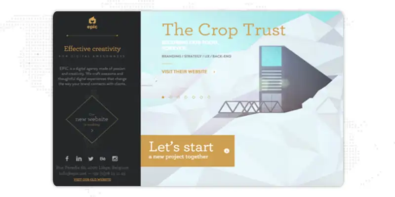
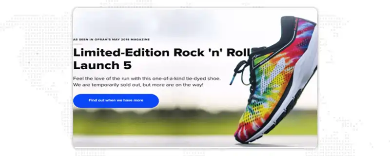
An opportunistic CTA holds more chances of getting clicked because it is human nature that they do not want to miss an opportunity. Here is a good example of Brooks Running wherein they use this powerful call to action words-
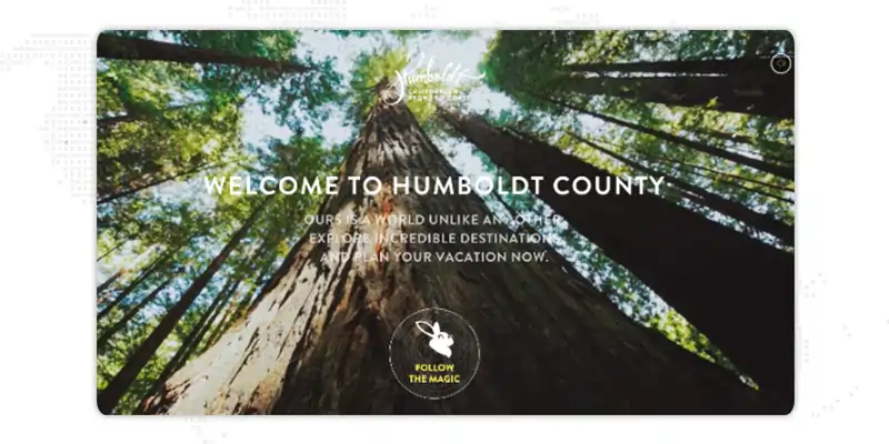
People love fiction and fantasy, use creative CTAs that can totally arouse that part of their brain and give you a good lead. Here is a wonderful example of Humboldt County wherein their compelling CTA says- “Follow the Magic” isn’t it fantastic?
You can also garner the power of multiple CTAs on one page, but the challenge here is that you need to be extra cautious to balance it properly. Uber is doing a wonderful job with that take a look at their creative CTAs-
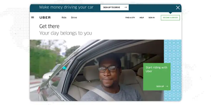
Below you’ll find the list of the best lead generation call to action button examples leveraged by top websites:
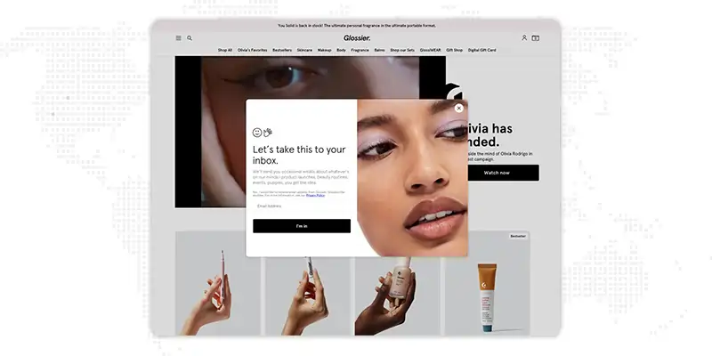
Tiffany Aliche runs “The Budgetnista,” is a personal financial educator and author, and provides content that elates her audience. She’s also proficient at building inviting CTAs. Just look at the language she uses instead of only putting simple “Sign Up” CTA words that entice her audience to click-

This beauty brand showcases realistic images of women with different skin types. If you look at the following screenshot, you might feel that their landing page call to action examples is an overlay that pops up when the visitor starts to scroll down their website.
The CTA words they’ve used makes readers want to stick around.
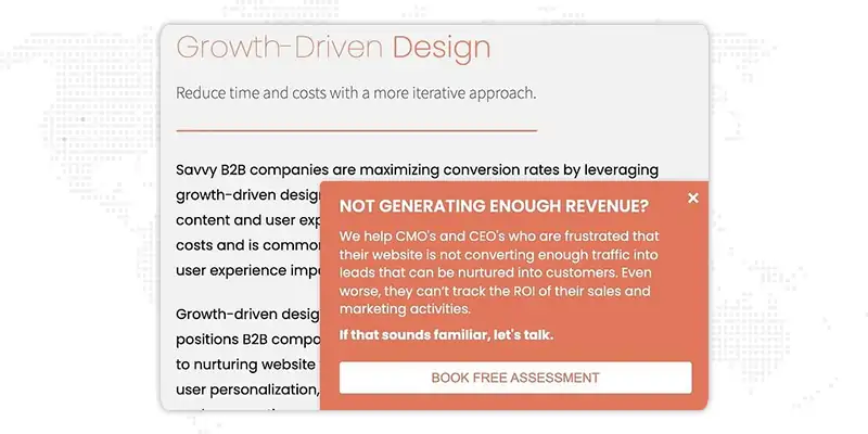
It is a growth agency and HubSpot partner that intends to help B2B businesses grow and revive their customer's journey to enhance sales. Look at their slide-in lead generation call to action example to book a free assessment.
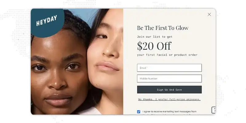
In the facial sector, Heyday is slightly rebellious because of its minimalist, simple approach. This approach can be seen in their CTAs too. Look at their “sign up and save” CTA button examples, which are persuasive as well as humorous.
Do you love to flip through beautiful vacation homes during your spare time? VRBO is the best place to do that. They make good use of aspiring aesthetics and exquisite locales.
The strong travel call to action example adds a dash of adventure for people who could be interested in hiring a vacation home. 
It’s a streaming giant opted for a dramatic approach with their CTAs. let’s see how the powerful CTA draws your attention to the promotion.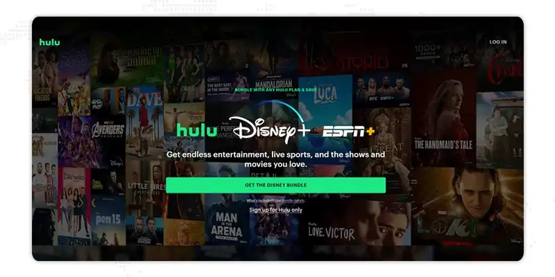
This apparel company uses good CTAs that are appealing with a clever play on words, combining Spanish as well as English. They also keep it fresh using a clean, pink-and-white color combination that emits youthfulness and freshness. 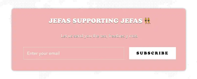
The CTA in the following screenshot, will make you feel fuzzy with the college background of consumers wearing their garments including an adorable dog that really draws readers' attention.

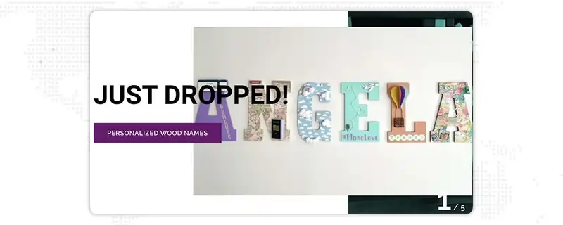
They try to grab the attention of visitors using “Just Dropped” written in big bold letters to let the readers know about their new products on offer. After that, they combine it using creative CTA button examples that describe what the product is all about.
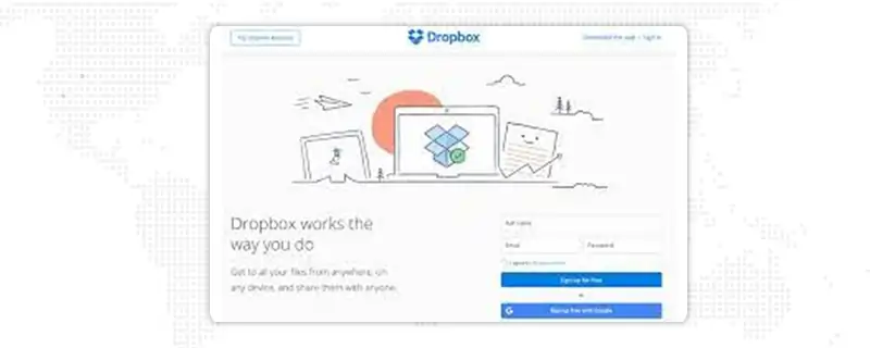
Just look at how aesthetically they’ve used a simple design with negative space and a blue CTA button examples that makes it stand out from everything else. Also, the logo of Dropbox and CTA are the same, which makes it easy for the users to interpret the call to action as “sign up for Dropbox.” that’s one creative CTA.
They have used slide-in CTA button examples to grab the reader’s attention when scrolling through their blog post. A banner slides in from the bottom of the page, along with a CTA to subscribe to their blog. What’s best is the creative use of getting expert leadership tips directly to your inbox.

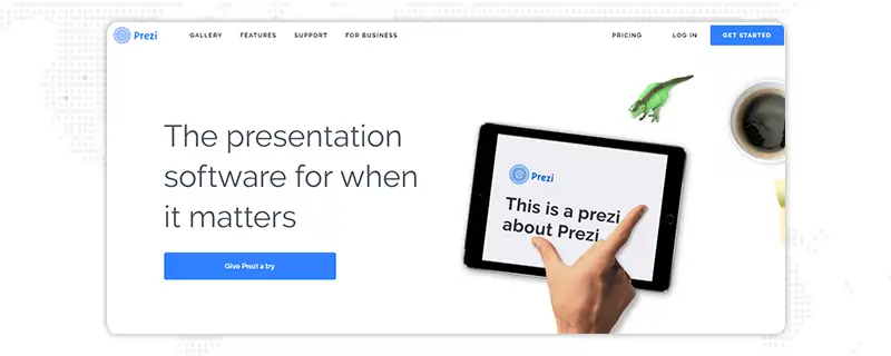
The brand Prezi is also into simplistic design look. You can see a green dinosaur with dark brown coffee with a black and white design accompanied by the only other color is bright blue, which is a similar blue to their main logo.
That bright blue color is deliberately placed on the homepage as the CTA button: “Give Prezi a try" and the other CTA button is- "Get Started," both of them direct the visitors to a similar pricing page.
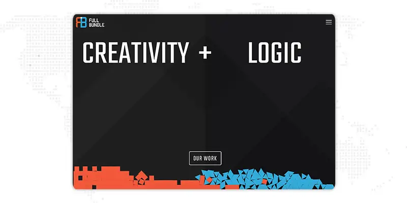
This brand has creatively used negative space to make its primary call to action button pop. The white-colored CTA with the phrase - “Our work”, stands out on the dark grey background. They have chosen strategic CTA as they mainly exist to develop their client’s online presence and also, it's important for them to showcase their work. Because of that, most people visit their website.
People working at Panthera look for users who are really concerned about wild cats internationally and wish to join a team of people who think similarly. To select those people mainly, the language they’ve used speaks to big cat lovers - “join the pride today.”
You’ll notice that the page is very simple, containing an “On-page form”, with 2 simple fields and a button asking people to “Join” (again).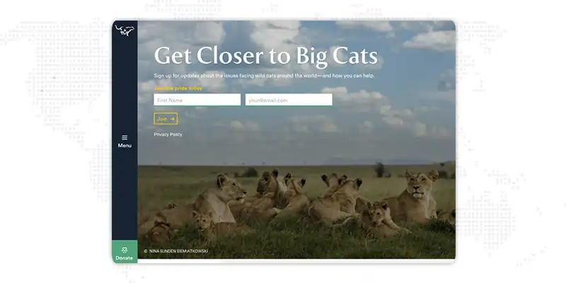
Here’s a unique, fun, and creative call to action button example that inspires people to click. Visitors like personalization and this type of B2B call to action examples essay are pleasantly surprised and feel like a tempting game.
A “Play” button icon next to the text provides a hint to the visitors that they’ll be taken to a video.

Majority of company websites around the world offer visitors an opportunity to start a free trial, but the call to action button on this website not only says “Start a Free Trial”, but also says “Claim Your Free Trial.”
The difference in CTA words might look subtle, but look how personal the other CTA phrases is “Claim Your Free Trial.” furthermore, the word,” Claim” indicates it might not be available for long, creating a sense of urgency in visitors to grab that free trial when they can. 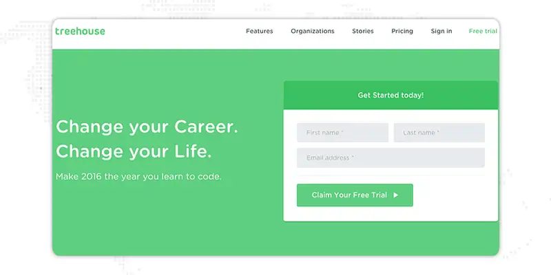
IMPACT Branding & Design has used an educational approach, and the B2B call to action examples is mainly fascinating they haven’t used any action verbs, but still, they manage to invite people to click. 
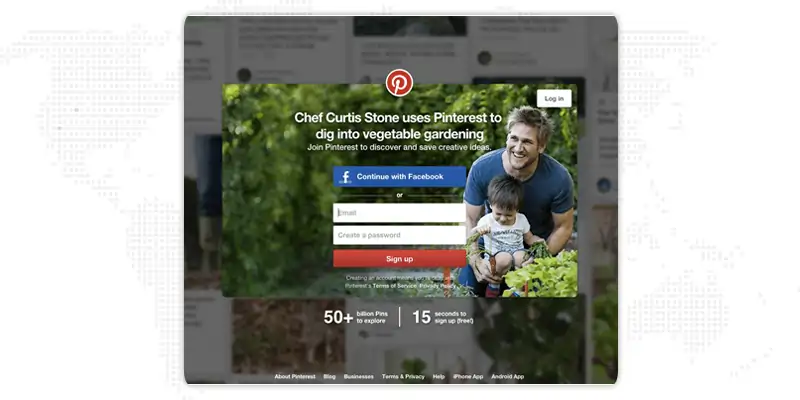
You have specific options when it comes to signing up for Pinterest: via Facebook or via email.
If you already have a Facebook account, Pinterest desires you to do that first. How would I know? Because the blue Facebook call to action button comes first and is noteworthy, colorful, and noticeable because of engrained logo and color.
Coherently, when you log in via Facebook, Pinterest could pull in Facebook's API data and collect additional information about you than when you log in via email. You will see an exquisite CTA.
This brand belongs to J.Crew, and always has a unique web design, taking eCommerce web design to another level, and the B2B call to action examples essay used on their website is no exception.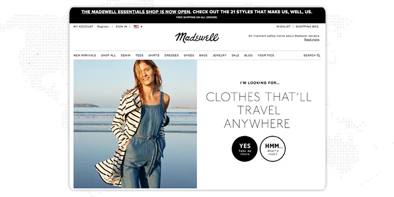
As we have looked at some fantastic B2B CTA examples, here are 5 quick tips for creating the best call-to-action phrases.
Quickly tell your targeted audience precisely what you want them to do. Let’s suppose, for example, you have an eCommerce website; you can start your CTA with words like “order,” “shop,” or “buy.”
To induce a strong response from your targeted audience; try to create excitement-producing CTA phrases like “ Flat 50% off” or “Join to get Cashback Instantly.”
Tell your targeted audience exactly what’s in it for them. Bind your value proposition, giving your targeted audience incentive that inspire them
There has been a lot of talk about the psychology of color in the CTA. You should choose your call to action button color that stands out from your competitor so that the audience knows exactly where they need to click to take action.
It is essential to keep your call to action (CTA) fresh to be effective. Continuously run A/B tests to check which call to action buttons Moz are getting clicks and which don’t.
Once you’ve created your strong website CTA examples, whether, in email, pop-ups, or sprinkled throughout your blog posts on your business website, you’ll be required to make sure they’re performing for you. Efficiently.
Moreover, you can double-check using website visitor analysis tools or by connecting with our professionals.
These B2B CTA examples show that having a powerful and well-crafted call to action can give your website a new life.
Call to action is a huge tool available to you. If you use it correctly, you can reach unfathomable heights as these are the primary steps towards your lead generation as well as conversion rate optimization. Good website CTA examples can take you and your business a long way as it is the first instance wherein the customer is willing to give you his information. It is the first step towards having faith in you. Be careful with what you put as your CTA. You can contact our website design services experts at JanBask Digital Design, whenever you face any challenge.
Interested in our Website Design Services?

1. What is the call to action in an essay?
A call to action is an invitation for a visitor to take some desired action. You may often see B2B CTA examples in persuasive writing. Also, using a strong CTA in an essay will help get the reader to do what you wanted him to do from the start.
2. What is CTA in digital marketing?
A call to action (CTA) is used as a prompt on a business website that tells the user to take some particular actions. Having a call to action on your website is usually written as a command or action phrase, such as 'Sign Up' or 'Buy Now'. However, it generally takes the form of a button or hyperlink.
3. What are some effective website CTA examples for an e-commerce site?
Here are some creative CTA examples that you can use on an e-commerce website such as:
4. What are creative call-to-action phrases?
Here are some creative call to action phrases that you can use to get huge traffic:
5. How to write a call to action in an essay?
Here are some points you should consider while writing a strong call to action in an essay such as:
J
great post!
E
Very well-written blog on B2B CTA examples. Awesome article for beginners who make these buttons
R
It is one of the best blogs on B2B call to action examples with 50 powerful call to action phrases, that give us clarity to improve understanding in terms of this topic.
K
This blog on landing page call to action examples helps us make a more creative call to action button that helps reach out to more traffic and accumulates better leads. thanks for sharing it.
A
As always you did a great job by creating detailed information on 50 powerful call to action examples which is definitely useful for almost everyone! I’m bookmarking it!
T
As always a great post. I love the way you explain things using examples.