
Your website serves as the business card for your company in the digital age. It expresses your perspective on the style of each piece of content and promotes your brand through the use of colors, fonts, and images. Many frequently overlook the crucial function of your website's navigation. Many people frequently overlook the crucial function your website's navigation plays in establishing your online presence.
The primary function of site components like menus, navigation bars, and dropdowns is to anticipate searchers' needs and direct site visitors to the material they are interested in. However, navigation items also give you a chance to develop your online brand further.
In this article, we have discussed the best sections to introduce dropdown menu design on your website:

Looking to Create a Custom Website?
You will notice that websites with drop-down menus are frequently used on blogs to arrange categories and tags. Why? As per web design services the volume of information that drives blogs, and the drop down navigation design must be as simple as possible to accommodate it.
In the end, a drop-down menu example aids in gathering links, such as classifications, of design components, for instance as the sidebar.
The most popular method for organizing all pages in a particular category is to use pulldown menus. In essence, this sub-navigation dropdown makes the user journey convenient. All of the numerous categories for a specific website area are contained in a drop down menu design.
Website design services can organize all pages in a user-friendly way to improve your customers’ journey.
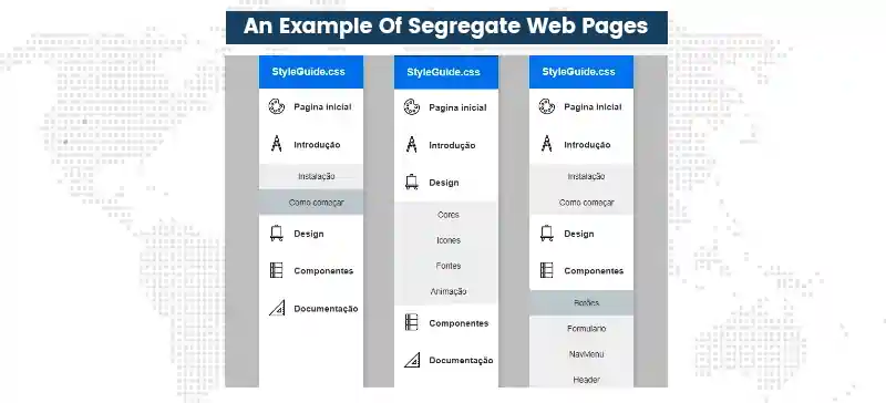
Website drop down menu is a trending eCommerce website feature used to display products or product categories. The drop down navigation is a user-friendly feature that is simple to understand by all customers, making it the ideal method for categorizing products. This is exactly what web designing services propose for the best eCommerce website experience.
Website designing services can offer a layout where a user can click on a drop down to display an obstructive menu that was previously hidden. You can show the sign-in component first as pulldown menus are a part of the navigation.
This is a fantastic technique to remove this substantial component from the layout without degrading usability.
However, professional web design service experts have observed many contend that a clickable menu is superior because it is so much more practical.
A hover menu requires the user to keep the pointer over it at all times due to the way it is designed. The hover menu shuts if the user takes their eyes off it. So it is preferable to use a dropdown menu design that can be opened by clicking a button, and closed by clicking the same button again.

A guide on CSS-Tricks demonstrates how to make a layout more appealing. You should definitely take a look at it because it is a fantastic website with drop down menu with just a click-to-activate/deactivate feature.
Fundamentally, there are two methods for using the drop-down menu: hovering over it or clicking to make it active. A hover menu is superior in terms of design and usability.
A drop-down menu should appear smooth and without causing any disruptions. The menu ought to appear right away. Several websites make the error of having their menus so "heavy" that hovering over them takes longer than a second to load.
Effects during transitions are one more element that can look incredibly fantastic. Try inserting a wipe-down or fade-in before the menu instead of just having it appear. Just make sure the changeover is seamless and quick.
You'll see that Microsoft performs a poor job of designing a smooth menu. Look attentively at the illustration below. When the main drop down menu is loading, you'll notice that the edges of the menus to the left are still discernible.
The dropdown menus lag a little bit when you go between buttons in the navigation, which is ugly. Of course, not all browsers experience this, but none of them ought to.
Fleet Feet is a run-specific shop with a sizable eCommerce platform on its website. Using a navigation dropdown menu to divide up different shop categories was made obvious when we were building the website.
A full-width dropdown menu design displays numerous alternatives in a single panel. This is a more simple option than having a different dropdown menu design for each content area on a website with several categories.
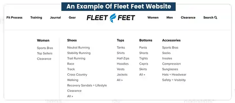
Visitors to the Fleet Feet website can select the gear, women, or men tabs to view pulldown menus that direct them to the shopping pages for a variety of related products.
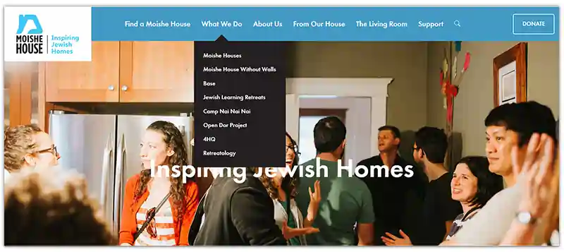
They avoided grand menus and multilayer designs when developing the Moishe House website, placing a higher value on simplicity. Jewish young adults can live in intentional communities thanks to Moishe House, a nonprofit organization.
We implemented sleek black pulldown menus to add organization without detracting from the overall modern and clean style of the site.
The dropdown menu design dynamically glides and retreats from the navigation dropdown bar when a visitor's cursor is over it, maintaining the whimsical atmosphere of the website.
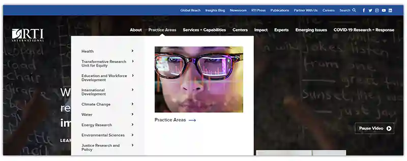
This website is developed for a global nonprofit organization that carries out scientific research. RTI's website has a ton of content, so they required a menu that would make it simple for users to find and access all of their key sections.
Utilizing an interactive dropdown menu design with a third level of tabs, we were able to achieve this. This indicates that behind the main list, in each option, are smaller categories. Site visitors can quickly go to the pages they're interested in by using the third-level alternatives.
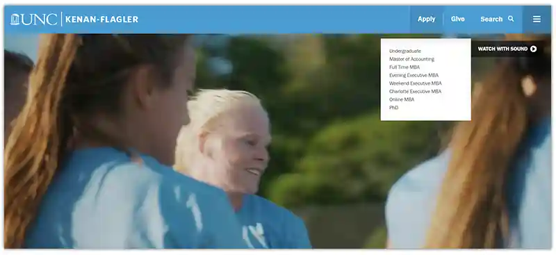
Web design services created a special website dropdown menu layout for Kenan Flagler, the business school at UNC-Chapel Hill, that enables visitors to see nested items without having to hover over them or click again.
The second-level alternatives are simply indented below their parent category in this web design practices. Visitors to the website won't miss pages that cover crucial subtopics because of the obvious nesting.
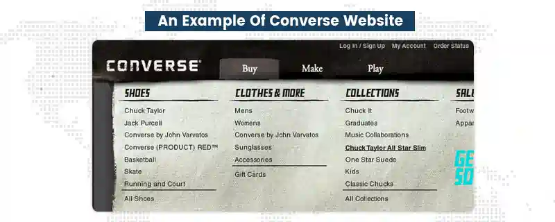
The top navigation bar on the Converse website pulls in broad menus for a significant vertical vibe. This combination works well because it enables the company to provide a wide range of options without confusing website visitors.
This example is one of our favorites since it brilliantly employs animation to make the text come to life. Even though the animation is minor, it adds a ton of personality and speaks to the brand's inventiveness.
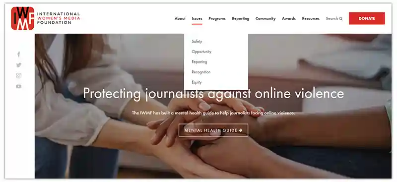
Website design services created pulldown menus for the International Women's Media Foundation using a minimal, contemporary design, similar to Moishe House (IWMF).
An NGO called the IWMF educates and aids female journalists all around the world. Simple pulldown menus were the ideal technique to convey their data without any clutter because they have a variety of programs and fundamental problems.
The orange highlight and red underlines that show up when you hover over menu items are amusing added features. The menu builds subtly on the brand and aesthetic of the company through its use of color.
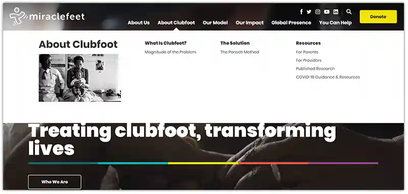
Web design services recently unveiled a brand-new website designing solutions for MiracleFeet, a global NGO that offers clubfoot-affected children medical care. MiracleFeet has a dropdown menu design like Fleet Feet, but each dropdown menu also has a featured image that depicts the NGO in action.
The dropdown website navigation images are compatible with the brand and the visual emphasis of the website.
The dropdown menu design at Santa Cruz Bicycles goes one step further by being entirely composed of product specifications and photographs. This is a fantastic strategy for a bike company.
In addition, the photographs make it enjoyable to browse and simple to locate a particular item. The other dropdowns' usage of graphics to spice up categories such as wheels and gear is another thing we enjoy.

As visible, the dropdown menu design has a lot more uses than simply being functional. They can reflect the requirements of a company and its website visitors by being lighthearted, somber, visually appealing, or basic.
While not every style is appropriate for every project, whether you're an active startup or a law firm with a lot of content, JanBask Digital Design would be happy to work with you to discover the dropdown menu design that's best for you.
Please feel free to contact us!
Looking for Web Design Service Specialist?

Q1. How Can You Choose A Dropdown Menu?
The dropdown menu selection process consists of varied parameters. You need web design services that can understand your business and highlight the right products and services on your website through pulldown menus.
Q2. What Is The Aim Of Pulldown Menus?
The user can select one value from a list using a drop-down list, sometimes referred to as a drop menu, drop-down menu, or pull-down list, which is a graphical element of control comparable to a list box. A dropdown menu list highlights one attribute when it is inactive.
Q3. How Long Should A Dropdown Menu?
Dropdown menu designs have so many possibilities, but there are three basic problems: no overview - users may find it difficult to discover the information they need when faced with over 20 uncategorized alternatives because it can be intimidating and scary. You can hire web design services for seamless design.
P
Thanks for this insightful article.
L
How can you help me with pulldown menus?
J
Thanks for your interest our team will definitely help you, please contact at info@janbaskdigitaldesign.com
J
I was always amazed with dropdown menu design and this is an informative extract.
C
You have a skilled team.
J
Thank you Colin.
R
Your web design services have boosted my business.
J
Thanks for your feedback, Rafael.
K
Thank you for sharing realistic ideas for my business.
j
One of the best places to eat in Las Vegas without spending too much is Denny’s. Their Las Vegas Strip location has a full menu that includes breakfast, lunch, dinner, and desserts—all available 24/7. I recently came across this updated Denny’s Las Vegas Menu 2025 with prices and calorie info. Super helpful if you’re planning your meals ahead of a Vegas trip! https://dennysmenu.us/dennys-10-dollar-menu/