
Users form an opinion about your website in about 50 milliseconds. They decide whether to stay or go at that point. This is where a website’s homepage plays a prominent role. An online store's homepage represents nothing less than the soul of a brand. It establishes credibility, informs potential customers about your website's sales, increases visitor engagement and conversions, and highlights important Calls-to-Action.
On the other hand, if the best practices aren't followed for your eCommerce homepages, it could result in lost customers. Visitors will leave if they cannot find the critical information they require.
Therefore, you must ensure your website's user experience is at its highest through an effectively designed homepage. Fortunately, we will discuss how e-commerce website development services using their best practices can craft a high-converting homepage in this blog.
Interested in our eCommerce Web Design & Development Services?

A good eCommerce website should always attract visitors to stay and expand your brand worldwide. To do so, you should analyze how well your best ecommerce homepage design pulls visitors in or pushes them away. You can do this by checking your bounce rate which means the overall percentage of people who leave your site after seeing only one page.
The average bounce rate for eCommerce websites is considered to be 45.68%. This means almost half of your new potential visitors will never explore beyond the first page they see.
Also, while decreased this bounce rate can enhance your revenue. You should know that every brand has a different target audience as they sell various types of products/services. This is why you should choose strong strategies from our lineup that perfectly fit your brand the best.
Now, Let’s take a look at some principles that are a must for every eCommerce business’s success.
Visitors tend to get suspicious when they browse unfamiliar websites. it makes them concerned that their personal information may fall into the wrong hands or that they might get duped from the products they purchased. Thus, every website page should demonstrate that you run a genuine and trustworthy company.
Here are a few ideas for how websites can increase trust in their homepage:
The most successful eCommerce brands have memorable homepages and easy navigation. They have sleek, modern designs with vibrant, bold colors per their brand book. Visitors simply love to stay more on websites with appealing home pages.
Striking visual appearances encourages customers to finish their purchases and shop more. What ignites that sense of delight and propels a brand forward? The best marketing tools in the world will not help if your website homepage disappoints them.
With 7.1 billion mobile users worldwide, an increasing number of people are performing online transactions via smartphones, tablets, and other mobile devices. Mobile users are conducting online searches and engaging in mobile eCommerce transactions such as shopping, paying bills, and booking tickets.
With the rise of mobile eCommerce, eCommerce websites must now take a mobile-first approach to web development. A mobile-first strategy entails designing a website for smaller screens first, then progressing to larger screens. A responsive design, which allows on-site elements to automatically adjust and rearrange themselves to fit the screens of different devices, is part of the approach.
This responsive web design approach helps the website's content be displayed in a user-friendly manner. It eliminates the need for users to perform operations such as zooming, panning, resizing, or scrolling while browsing the website. It improves the user experience on the website.
When designing an eCommerce homepage, always remember what users expect and what they find most useful. They can find things more quickly and efficiently if they can navigate easily.
From the placement of the search box to the placement of the menu and toolbars, the design elements must be logical and intuitive. Users should be able to navigate between pages easily. This contributes to a positive user experience and ensures they remain engaged while browsing your site.
eCommerce websites design ideas are now crucial to the success of any business. Business owners switched from physical storefronts to digital solutions to sell online during the pandemic, which helped them improve their customer base and revenue by 55%.
Making an eCommerce site requires considering the website's overall design, from the aesthetics to navigation and accessibility, regardless of whether you are just starting out or already have a brick-and-mortar firm. These factors are important for leaving a positive and flawless experience. Let’s discuss some top eCommerce sites examples for better understanding.
To help you develop a website, we list the 3 best eCommerce sites examples with superb design and functionality for your inspiration. Let’s have a look:

Nike is one of the online fashion stores that can be a great reference and inspiration for other e-commerce fashion stores. This brand's eCommerce site example is good to understand the "less is more" principle from the navigation to the filtering choices. It uses much white space, picture blocks, and a simple background to make the products stand out.
Best Design Elements
Key Takeaways
Reach out and complete your sales by enabling visitors' checkout for a faster purchasing experience and lower cart abandonment rates, so rev up your website.

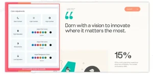
Display is a digital agency that works with companies in the disability sector. Their eCommerce website design ideas supports web accessibility and diversity using warm tones, accessibility features, and gentle animations,
Best Design Elements
Key Takeaways
Make sure your website is user-friendly and accessible to a range of users.

Notebook Therapy sells Korean and Japanese stationery with its e-commerce website. This Shopify-built website largely plays around with pastel photos and illustrations to maintain consistency with the product branding, as the company is recognized for its adorable designs.
Top Design Elements
Key Takeaways
Understand your brand personality and your target market, and then apply the appropriate elements to your eCommerce site. Use emojis and designs to your advantage to trigger specific emotions in the audience so they can relate to your eCommerce site.
It is not difficult to create an eCommerce website. However, it can turn into a rocket-assembling task without the proper elements. While different industries may have very different designs, certain features must be present every time.
If you want to increase conversion rates for small business websites, these are the absolute must-haves for your homepage.

At first glance, the website theme of your eCommerce web design company should clarify to visitors what type of business you are. If you're new to website development, you should know that most eCommerce website builders have labeled their themes according to industry. As a result, when you launch your eCommerce website, you can easily select and customize a theme that suits your needs.
Amazon and the New York Times have very different home pages. One showcases the most recent best sellers in various product categories, while the second features breaking news worldwide.
You're not on Amazon to catch up on the latest news. You've come to shop. Similarly, if you're on the New York Times website, you're probably not looking for bargains.
 What comes to your mind when you see a bite in the apple?
Could you think of the brand Apple? Probably Yes!
And what are the affiliations that come to your mind when you hear, see,
or listen to this brand?
Rebellious, Cutting-edge innovation, disruptive, and creative. Right?
That is not by chance. Some of the world's largest corporations spend billions of dollars yearly to market their brands and make them more memorable. While you may not have the marketing budget of a Fortune 500 company, you can still take steps to improve the visibility of your homepage.
The first step is to design a professional logo that reflects your brand identity. You can collaborate with logo design services such as JanBask Digital Design.
For example, choosing the right color palette is critical to boosting your identity and distinguishing yourself from similar brands. However, creating and placing a logo on your homepage is only the beginning. When you create a great design, you should use it across all your marketing materials to maintain consistency.
A good eCommerce homepage design should directly relate to your company's goals.
What do you want your visitors to do when they show up on your homepage? Subscribe to a newsletter or product blog or fill out a lead form. Setting goals is essential for converting visitors into potential customers.
Here's how Shopify uses a goal-driven design on its homepage to generate more leads:

The homepage makes it simple (almost too simple!) for visitors to sign up for a free trial. Look at their call to action examples, where the CTA is visible, the colors are appealing, and the images entice visitors to take action.
Consider your goals and how you can implement a design that facilitates them if you want your eCommerce website designing solutions to increase conversion rates.
A contact information form on the page is one way to eliminate any uncertainty. The best way to demonstrate that you can be reached is to display your phone number, email address, and business address.
Giving your audience a means of communication will exemplify that your company is legitimate. Furthermore, making your communication form stand out will make it easier for them to contact you if a problem arises. This fact is demonstrated in the infographic below:
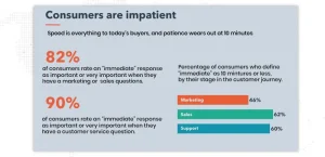
Customers can feel secure knowing that assistance is only a phone call away. Of course, to be effective, you must keep your promises and be available at the times you specify. Poor customer service can lead to lower conversion rates, and people would ignore your eCommerce even if you have great products. So, devise a workable solution, avoid overpromising, and try to expand your customer support as soon as possible.
With almost half of the world's population on social media, it has become a marketing channel you can't afford to miss.
Your prospective customers have at least one social media channel to communicate with their peers and follow their favorite brands.
Users also spend an average of 74 minutes daily on social media sites such as Facebook and Instagram.
These minutes can be critical for your brand because they allow you to build meaningful relationships and increase customer loyalty, through social media marketing.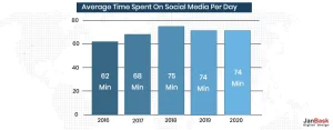
As a result, social media allows you to build a following for your company while also engaging with your audience in a more personal manner.
Visitors find it easier to follow you by including links to your social profiles.
You can entice them with great content and even provide more personalized customer service via direct messaging.
Adding social media profiles to your website's header or sidebar is an excellent way to promote them.
![]()
Your homepage is quite often the first point of contact for many visitors. When you think about it, it's like a corridor with many doors leading to different places.
However, if these doors aren't labeled, your visitor won't know where they lead. As a result, they may become perplexed and leave your website.
Navigation elements such as header links are essential for guiding visitors through your site. Adding them allows them to access, browse other pages, and visualize their location.
As you can see, your homepage can help your website's overall success. To convert your visitors, your eCommerce website design ideas require more than a navigation bar and a contact form.
You'll need the best homepage web design practices to nail your site every time. Making these changes to your homepage is critical if you want to increase conversion rates. Furthermore, professional website design will help retain customers and reduce acquisition costs.
For building an eCommerce website with WordPress, you'll need to purchase a domain, sign up for hosting, and install WordPress to sell your products using WordPress. This guide will walk you through each step of that process and more!
Unsurprisingly, most businesses prefer to create an e-commerce website with WordPress because it's a popular, robust, and scalable platform. But in addition to good web hosting and dependable plugins, you also need create ecommerce website in WordPress.
Let’s look at the nine steps to launching your e-commerce website design ideas with WordPress:
You'll need to set up a WordPress site if you don't already have one for building an eCommerce website with WordPress. Then you can convert it into a fully functional eCommerce store.
You must take three actions in order to achieve that:
A free SSL certificate must also be installed on your website in order to allow the secure HTTPS protocol. There are many sites that offer quality hosts like Godaddy and Hostinger. It usually just requires clicking a single button. Learn more about it through this comprehensive guide on SSL certificates.
How to build a WordPress eCommerce website? Use WordPress plugin for e-commerce capabilities, called WooCommerce. It has a rating of 4.6/5 from more than 3000 users, and there are more than 4 million active installations. It's fair to say that it's quite well-liked, and it's easy to see why.
To begin with, it's free. WooCommerce is an open-source platform created by a community, much like WordPress. While some 'extensions' (like the ability for users to book appointments) may require a fee, you can transform your website into an online store without spending a dime. That contains:
We'll proceed with the installation and configuration process as if that's what you'll be using for the time being and make the following assumptions: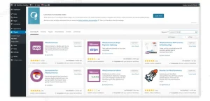
This enables your payment setup and automates taxes. Your basic configuration is sorted. Now it's time for you to add products.
Your "theme" serves as the fundamental layout of your web content. To create eCommerce website in WordPress, you may completely customize your website; by changing or adding to the HTML code, you could easily end up with something that doesn't resemble the initial design.
However, unless you're an expert coder who relishes the chance of total customization, it makes sense to pick a theme that resembles your desired finished product as closely as possible.
In other words, even if it means paying money for a high-end design from a third-party website, choose a theme you like that will be useful for your e-commerce website. It will ultimately save you trouble!
Even though there are many fantastic third-party websites, ThemeForest and Elegant Themes are two of the most well-known for selling themes.
It's time to get to the more enjoyable responsibilities, like choosing a theme, once you have a significant variety of products ready. You can proficient in WordPress theme development using the best tools and practices.
How to build an eCommerce website with WordPress? From your dashboard, you may browse the theme directory, where you can find a range of free WordPress themes:
Add a premium theme to your website with below mentioned easy steps:
You are now prepared to go and move to the next step of adding products to your WordPress theme.
You are now prepared to begin adding products because your store actually looks like an eCommerce store.
You still need to adjust a few things, but seeing your first live product is always inspiring. Please take note that if you import a complete Botiga demo site, Botiga will also import some sample products. When you've added your own products, you can use these example products as inspiration and then remove them.
Go to Products Add New to create a new product.
Please enter the product details. Pay close attention to these areas in particular:
Additional details, including inventory, dimensions and weight, linked products, and other options, can be configured using the tabs in the Product data box.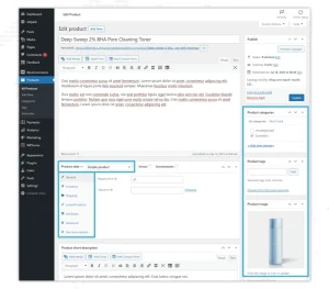
You can always go back and change these details if you make a mistake, so don't worry.
When everything appears as you want it to, press the Update or Publish button just like you would for a blog post. Your product will go live on the storefront as soon as you complete that.
All you have to do is repeat the procedure to add more products.
Here are three plugins for online stores that we really recommend in addition to WooCommerce:
How to make an ecommerce website with WordPress? Having the best online store in the world won't mean a thing if nobody can find you online. Yoast SEO is a useful plugin that will help you increase your search engine rankings, giving you the best chance to be on page one. Search engine optimization, or search engine optimization for smal businesses, is the process of making minor adjustments to your website that will enable search engines to better "read" and "understand" your material and, as a result, "prioritize" it.
When you accept credit cards, the security risks to your website increase. Even though there are free security plugins available (like Wordfence), we think that this is an area where a little extra cash should be spent. The Securi plans, which start at $199 a year, must be installed to utilize the free plugin from the WordPress plugin directory.
P.S. - We probably don't need to emphasize how crucial website security is. Therefore, don't mark it as "too hard"; instead, utilize this manual to learn how to safeguard your WordPress website
It has been repeatedly demonstrated that social proof is one of the most important factors in convincing customers to take the desired action, which in this case is to buy your products. Once Site Reviews is enabled, users can post reviews on your website.
Adding plugins to your website is quite simple:
Now is the time to edit the text on your key pages. To find these crucial pages, select "Pages" and then "All Pages."
Make sure to read our comprehensive guide to writing for the web, filled with tips from copywriting professionals.
However, for now, we'll focus on a few different types of material. You'll be well on your way to building a successful online store if you master everything on the list below.
If you master everything on the following list, you'll be well on your way to creating a successful internet store:
Microcopy, also known as "UX copy," is the small amount of navigational copy, error messages, and "calls to action" (CTAs) that appear on your website.
This is the most important aspect of your website. It leads visitors through your website and reassures or persuades them at crucial moments (like just about they are making a payment).
Take your time and carefully craft this. Consider the thinking of your users at each step of their website navigation best practices. For instance, a button saying "Find out more information" or "Have a browse" next to your product on the homepage could be more relevant and persuasive.
Since your user is still likely not ready to purchase, a more pushy message like "Buy now" might be very off-putting.
These ought to be succinct, informative, and helpful—and, as the name would suggest, descriptive. Consider all the details you need to know, especially those that aren't obvious from the product pictures, especially when you're looking to buy the product. Use bullet points to separate the information and maintain consistency in the format and content across all items.
The caliber of your product photography will determine whether or not your website is successful. Use a high-quality camera and a plain background for the best outcomes. It's a general cliche that the more product photos, the better. Keep the photographs and descriptions constant to maintain the consistency.
WordPress actually asks you to choose a privacy policy page before making your site public which is a crucial part of any website. Fortunately, you can use a helpful template that is readily available.
Just go to "Settings," select "Privacy," and then click "Check out our guide." Simply choose the appropriate page from the dropdown menu below.
Here are three plugins for online stores that we really recommend in addition to WooCommerce:
How to make an ecommerce website with WordPress? Having the best online store in the world won't mean a thing if nobody can find you online. Yoast SEO is a useful plugin that will help you increase your search engine rankings, giving you the best chance to be on page one. Search engine optimization, or search engine optimization for smal businesses, is the process of making minor adjustments to your website that will enable search engines to better "read" and "understand" your material and, as a result, "prioritize" it.
When you accept credit cards, the security risks to your website increase. Even though there are free security plugins available (like Wordfence), we think that this is an area where a little extra cash should be spent. The Securi plans, which start at $199 a year, must be installed to utilize the free plugin from the WordPress plugin directory.
P.S. - We probably don't need to emphasize how crucial website security is. Therefore, don't mark it as "too hard"; instead, utilize this manual to learn how to safeguard your WordPress website
It has been repeatedly demonstrated that social proof is one of the most important factors in convincing customers to take the desired action, which in this case is to buy your products. Once Site Reviews is enabled, users can post reviews on your website.
Adding plugins to your website is quite simple:
Now is the time to edit the text on your key pages. To find these crucial pages, select "Pages" and then "All Pages."
Make sure to read our comprehensive guide to writing for the web, filled with tips from copywriting professionals.
However, for now, we'll focus on a few different types of material. You'll be well on your way to building a successful online store if you master everything on the list below.
If you master everything on the following list, you'll be well on your way to creating a successful internet store:
Microcopy, also known as "UX copy," is the small amount of navigational copy, error messages, and "calls to action" (CTAs) that appear on your website.
This is the most important aspect of your website. It leads visitors through your website and reassures or persuades them at crucial moments (like just about they are making a payment).
Take your time and carefully craft this. Consider the thinking of your users at each step of their website navigation best practices. For instance, a button saying "Find out more information" or "Have a browse" next to your product on the homepage could be more relevant and persuasive.
Since your user is still likely not ready to purchase, a more pushy message like "Buy now" might be very off-putting.
These ought to be succinct, informative, and helpful—and, as the name would suggest, descriptive. Consider all the details you need to know, especially those that aren't obvious from the product pictures, especially when you're looking to buy the product. Use bullet points to separate the information and maintain consistency in the format and content across all items.
The caliber of your product photography will determine whether or not your website is successful. Use a high-quality camera and a plain background for the best outcomes. It's a general cliche that the more product photos, the better. Keep the photographs and descriptions constant to maintain consistency.
WordPress actually asks you to choose a privacy policy page before making your site public which is a crucial part of any website. Fortunately, you can use a helpful template that is readily available.
Just go to "Settings," select "Privacy," and then click "Check out our guide." Simply choose the appropriate page from the dropdown menu below.
Once you're fundamentally satisfied with how your site works, it's time to launch it (remember, you can always "Preview" pages to see how they'd look live).
The simple part is now!
Select 'Settings' > 'Privacy'. Once your privacy statement has been uploaded, you can make your site "Public."
WordPress and WooCommerce can be upgraded with new additional functionalities using plugins and extensions.
The WordPress core is expanded with the help of the plugins. The entire website is affected by changes made to WordPress plugins. WordPress plugin development can help you see more increase in online sales.
Additionally, WooCommerce is upgraded with extensions and plugins. Extensions for WooCommerce are solely applicable to the WooCommerce portion of the website. But there are also e-commerce-specific plugins (with or without WooCommerce) and WooCommerce-specific plugins in the WordPress plugin repository.
Through plugins available in the WordPress plugin repository and WooCommerce extensions available on the WooCommerce website, one can add new e-commerce features.
Typically, WooCommerce extensions fall into one of four major functional categories:
WooCommerce extensions can be found in various ways, including functionality and collections.
WooCommerce provides a set of suggested extensions referred to as WooCommerce Essentials.
Extensions called WooCommerce Essentials were selected by WooCommerce to serve as the building blocks for an effective e-commerce website.
Some of the essential functionalities are:
Ask a set of questions before choosing a WordPress and WooCommerce plugins and extensions
One of the most critical web design mistakes an e-commerce website can make is to pile so many features that conversion rates start to decline.
Extensions and plugins must download additional code and scripts to the user's browser to function. A webpage takes longer to load as more code and scripts are downloaded, which slows down the e-commerce experience.
A smart, competent developer can get around these problems by only downloading the content that each page requires. For instance, if a webpage doesn't contain a contact form, there is no need to download scripts and fonts linked to one.
Ensure that every extension or plugin is necessary because it's still commonplace in the software development industry to add scripts to every page.
The web is always evolving, as are our interactions with it. High-quality content is the success recipe and the foundation of any eCommerce website development is one that looks forward to keeping pace with the current generation of buyers. You can start to increase conversions by empathizing with your customer and their experiences on your website.
Promoting your customers' viewpoint, and offering them all the assistance you can to champion your efforts to lead from the front. Fight for more useful content, fewer features, and less extraneous stuff. Keep an eye on how people are interacting, what they are looking for, and which sites they are leaving from. Make the most of every data point you can gather to enhance the online buying experience for your customers.
Making your products and information approachable to your customers online is an important aspect of staying relevant, and it goes beyond simply participating in social media conversations.
Put just as much effort into enhancing the content you already have as you do in producing new stuff. The effort will be reflected in your sales figures.

Looking for eCommerce Website Development Services?
1. Why Is It Important For Business Owners To Create An E-commerce Site?
People today have a very limited amount of time to make in-person purchases. They prefer to shop online and browse on their computers or mobile devices. Having an e-commerce website for your company will assist you in barging into the industry and making a mark with your unique products/services.
2. How Can I Choose The Best Platform For My E-commerce Business Website?
You must consider a few fundamentals that may help you choose the best platform for your business before starting your e-commerce web development. Always take into account the items that you are selling. While some e-commerce platforms can manage inventory management and a variety of product possibilities, others cannot. Before choosing a platform, look into the design possibilities, payment methods, website security, tool integration, features, and pricing.
3. Why Is E-commerce Needed For Any Business?
Nowadays, e-commerce is quite popular since it gives businesses a wide range of choices, from marketing opportunities to increasing the selection of products that contribute to sales. You can simply set and achieve goals with an optimized and well-designed e-store and give your consumers round-the-clock customer care to contribute to sales and increase the business bottom line.
4. What Are The Important Things That Can Turn Browsers Into Buyers?
Create your website to be more oriented towards buying rather than engagement and traffic. Let your visitors immediately see your products rather than hiding them behind a wall of marketing materials. Putting the terms and conditions on a page will make it appear more expert. Along with your contact details, list your return policy, security precautions, encryption methods, and payment options.
5. Is There Any Limit On The Size Of My Product Or Customer Database?
No, there are no size restrictions as a result. The major advantage of having an online store is expanding your consumer base as needed while adding an infinite amount of products and catalogs.
D
Thanks for the quality guide. Also, I recently read an article on how to properly customize your homepage. It’s good at attracting customers. Recommend it.
https://blog.codeharbor.dev/2023/01/19/e-commerce-website-development-part-2-main-page-navigation/