Here are some stunning eCommerce website design examples to help inspire you to build your website
If you are an eCommerce brand owner, you would know the importance of having a well-designed eCommerce website to ensure that your business is booming. A well-designed eCommerce platform will help your potential customers to have trust in your brand as well as stay longer on your website. Moreover, it also leverages the opportunities to shop online, especially for those customers who cannot visit your store offline.
Your website serves as an online storefront for your company and the first point of contact for potential customers. Therefore, your eCommerce website design is crucial in making a good first impression. All the more, a successful eCommerce website always helps to drive more traffic and even increase sales on your website. Selling online can be difficult without the best eCommerce website design.
In this article, we will discuss some of the best-designed eCommerce websites and a few ideas on how to improve your existing eCommerce website.

It is true that with the pandemic, the number of people who prefer shopping online to offline has drastically increased. If you look into some of the recent studies and their numbers, you will be surprised to see that there has been a huge increase in the number of people shopping online. Take for example, in the past two years since the pandemic hit the world, Walmart's internet sales have increased by 97% and Amazon's sales and profits increased by 40%.
Since there is an increase in online shopping, you must focus on creating an enriching online shopping experience for users. For this, you can no longer provide anything less than an excellent UI experience and superior graphic design to your customers.
To build an e-commerce website, first organize, develop, and arrange your information and products so that they appear their best on the Internet. In other words, the first impression of your website should convey trust in the products and services you offer. 48% of internet users base their opinion of a company's credibility on its e-commerce web design.
Numerous factors contribute to the success of an eCommerce site, and in this article, we will be addressing what they are and how to improve your current location or launch a successful one.
When it comes to building an eCommerce website, however, some fundamentals must be addressed first. Let’s dive into it.
While building a website, it is always good to ask multiple questions to help you understand what are your needs and final goals. Addressing various kinds of questions will also help you to design a website that best suits your target audience and performance better. If you are designing your website, consider these 3 questions to help build your website better.

Looking to Create an eCommerce Website?
When you start a business, it is always important to consider your demography which includes your target audience. Unless you determine your target audience, moving further to build your online presence would be a difficult task, especially when you design a website. Consideration of the target audience while designing a website is important for the following reasons:
Overall, considering your target audience while designing a website is crucial for creating a website that effectively meets the needs and preferences of your customers.
Your website design must address your target audience. Understanding your target audience's needs, preferences, and behavior is essential in creating a website that effectively resonates with them and meets their expectations.
A website design that addresses your target audience will:
In conclusion, addressing your target audience in your website design is crucial for creating a website that effectively connects with your customers, drives conversions, and builds brand loyalty.
Another important factor to consider while designing your website is to see that your website is not cluttered with information. A cluttered website can be overwhelming for users, making it difficult for them to find what they are looking for and potentially leading to a negative user experience.
Here are a few tips for avoiding a cluttered website design:
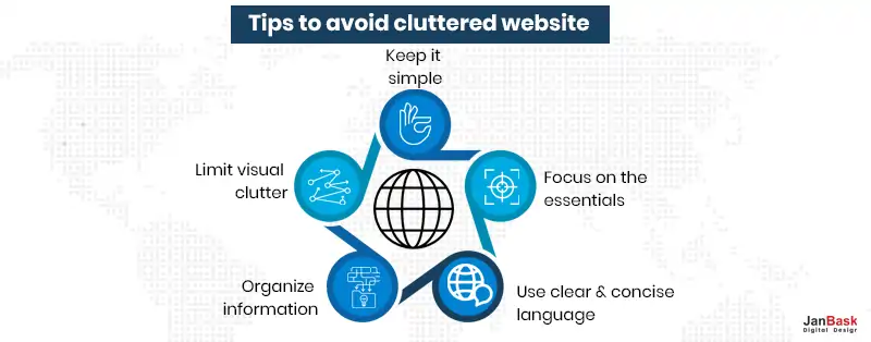
By avoiding clutter, you can create a website that is visually appealing, easy to use and provides a positive user experience for your target audience
Mobile responsiveness refers to the ability of a website to adapt and adjust its layout, content, and functionality to different screen sizes, devices, and orientations, providing an optimal user experience on mobile devices such as smartphones and tablets. A mobile-responsive website is designed to automatically adjust its appearance and layout to the screen size of the device being used, allowing users to easily navigate, read content, and interact with the site without having to zoom in or scroll horizontally.
Mobile responsiveness is becoming increasingly important as more and more users access the internet on their mobile devices. By designing a mobile-responsive website, you can ensure that your site provides a positive user experience on all devices and enhances your reach, visibility, and accessibility to a wider audience.
Keep your design clean, simple, and uncluttered. Minimalistic design is a style that emphasizes simplicity and functionality, using minimal elements to create a clean and uncluttered visual appearance. Minimalistic design can help establish a clear and recognizable brand identity, making it easier for users to understand and remember your brand. It is also often more mobile-friendly, as it requires fewer elements and allows for a simpler, more streamlined layout that works well on smaller screens.
Moreover, a clean and uncluttered design can help draw users' attention to the most important content, allowing them to focus on what is important and reducing distractions. Minimalistic design can provide several benefits for a website, including a better user experience, improved loading speeds, mobile optimization, clear branding, and easier maintenance.
Use high-quality images to showcase your products and make them visually appealing. Besides making a website more visually appealing and engaging, high-quality images play a crucial role in helping customers make informed purchasing decisions. Good-quality images can help customers understand the product better, reducing the need for additional information or clarification and increasing the chances of a sale. You can increase the chances of a sale, as customers are more likely to purchase a product they have a clear understanding of.
High-quality product images are crucial for a website, as they provide a visual representation of the product, increase credibility and professionalism, improve customer understanding, and enhance the overall shopping experience. It's important to invest in high-quality images to ensure that your products are represented in the best possible light and to increase the chances of making a sale.
Navigation is a critical component of a website, as it helps users find and access the content and features they need. It helps to create a positive user experience by making it easy for users to find what they're looking for and complete tasks on the site.
Navigation helps to make a website more accessible by providing clear and intuitive pathways for users to find content and interact with the site. Clear and well-structured navigation can improve a website's search engine optimization by making it easier for search engines to understand the site's structure and content. It's important to carefully consider navigation when designing a website to ensure it meets the needs of users and helps to achieve the goals of the site.
A call to action (CTA) is an essential element on a website, as it helps to convert visitors into customers and drive business goals. A well-placed and well-designed call to action provides a clear direction for users on what action they should take next, making it easier for them to complete a task or make a purchase.
A strong call to action can help increase conversions by encouraging users to take a specific action, such as making a purchase or filling out a form. Encourage users to take action by placing clear calls to action, such as “Add to Cart” or “Buy Now”, throughout your site. By including a clear call to action, it becomes easier to measure the success of a website and make data-driven decisions about future improvements.
Offering personalized product recommendations to users based on their browsing and purchasing history is important for several reasons, including improved user experience, increased engagement and conversions, customer retention, and better data insights. By leveraging this information, websites can create a more personalized and engaging shopping experience for their customers, leading to increased sales and customer loyalty.
Personalized product recommendations offer a more relevant and customized experience for users, helping them find the products they are most interested in and increasing the chances of making a purchase. By providing personalized recommendations, a website can build stronger relationships with customers and encourage repeat visits and purchases.
Moreover, personalized recommendations can provide valuable data insights, such as which products are most popular among specific groups of customers or which products are most frequently purchased together.
Optimize your site for speed to ensure pages load quickly and keep users engaged. A fast-loading website provides a better user experience, as users can quickly access the information they need without waiting for slow-loading pages. Slow-loading websites are a major cause of high bounce rates, where users quickly leave the site due to frustration with slow load times.
A fast-loading website can help to reduce bounce rates and increase engagement. Fast page load time is a factor in search engine rankings, as search engines like Google prefer websites that load quickly.
A fast-loading website can lead to increased conversions, as users are more likely to complete a purchase or take other desired actions when the site loads quickly. With the increasing number of users accessing websites on mobile devices, fast page load times are especially important to provide a positive experience for mobile users.
Establish a strong brand identity by using consistent colors, typography, and imagery throughout your site. A strong brand identity helps to differentiate a company from its competitors, making it easier for consumers to recognize and remember the brand. A strong brand identity can increase brand awareness, as it creates a consistent and memorable visual and messaging system that can be easily recognized by consumers.
A strong brand identity can help build customer loyalty, as consumers are more likely to choose a brand they recognize and trust over one they are not familiar with. A strong brand identity can help improve a company's reputation, as it conveys a professional image and creates a positive perception of the company and its products or services. A strong brand identity can increase credibility, as it helps to establish the company as a trusted and reliable source of products or services.
Include customer reviews and ratings on your product pages to build trust and credibility. Customer reviews provide social proof and help build trust in a brand, as they give potential customers an idea of what others have experienced when using a product or service. Online reviews can help improve the user experience by providing valuable insights into a product's strengths and weaknesses, which can help guide purchasing decisions.
Positive customer reviews can increase conversions, as they help to build confidence in a brand and encourage potential customers to make a purchase. Customer reviews can provide valuable feedback for companies, which can be used to improve existing products or develop new ones that better meet the needs of customers. Customer reviews can help increase visibility, as they can improve search engine optimization and make it easier for potential customers to find a brand online.
Streamline the checkout process to make it quick, easy, and secure for users to complete their purchases. A simple checkout process provides a better user experience, as it minimizes the number of steps required to complete a purchase and makes the process as straightforward and stress-free as possible.
A complicated checkout process is a major reason for shopping cart abandonment, where customers abandon their purchases before completing the checkout process. A simple checkout process can help to reduce shopping cart abandonment and increase sales. With an increasing number of customers shopping on mobile devices, a simple checkout process is especially important to provide a positive experience for mobile users.
The home page of a website serves as its primary focus. It's significant because it's often the initial point of contact that visitors have with a brand. A homepage gets more traffic than any other page on your site because it is the first thing visitors see when they arrive. Therefore, you need to make a good first impression with your eCommerce homepage design. To accomplish this, you must concentrate on two distinct aspects. The first step is to create a more visually appealing homepage than your competition. Second, discover a technique to deal with the short attention span of customers. Online surfers form their first impressions of a website in just 3 seconds.
So, how do you go about doing that? Well, the answer is with the help of a well-designed website!

The following features are common among top-performing e-commerce homepages:
Though it appears straightforward, the structure outlined above is not fixed. Two things will influence the design of your homepage: the nature of your business and the tastes of your target audience. Many factors influence a visitor's impression of a website, including color schemes and font sizes, type pacing, and style spacing. As a result, website abandonment rates increase exponentially when the design of the site fails to meet users' expectations.
Now that you have an idea about the various elements of an eCommerce website design let’s go through some e-commerce web design examples. Your online store will benefit from looking at our list of the top 10 e-commerce websites to keep an eye on in 2023.

Harry Hambley launched KETNIPZ as an Instagram comedy, and it has since grown into an empire. Bean, the protagonist of the comic, has appeared in murals, tattoos, and on social media in various forms. In keeping with the character of the comic, the website features bright, eye-catching colors and entertaining typefaces. This company has a solid grasp of how to reach its intended market.
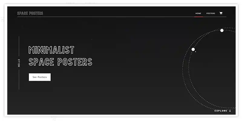
Selling space-themed minimalist posters, Space Posters is an online store. The website's design is a fantastic match for the store's merchandise. There is an animation that resembles planets in orbit and playful typography on the simple black-and-white website. Those interested in Space Posters' simple posters are not likely to be misled by a website with a slew of design components or bright, dramatic colors.
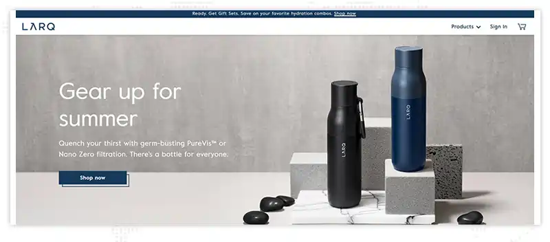
LARQ is a great example of how well-designed product images can help a company make sales. The brand's great copywriting and eye-catching design combine to create one of the top e-commerce web designs. The LARQ water bottle comes with a plastic waste calculator so you can figure out how many plastic water bottles you've saved from the trash by using it.
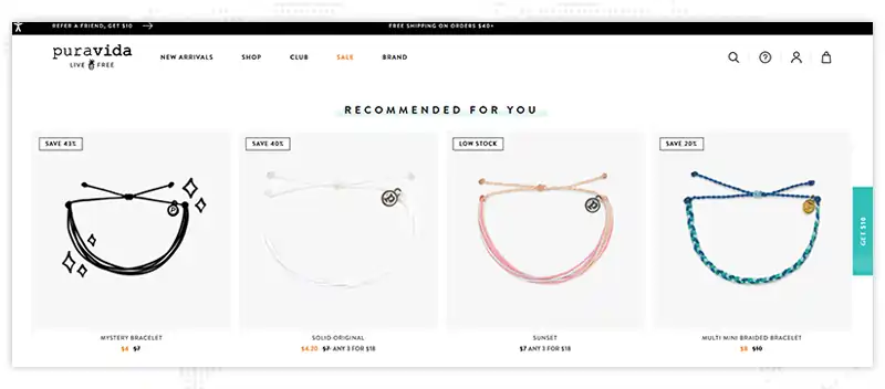
The brilliant colors on the Pura Vida Bracelets homepage are the first thing you notice. As you continue to browse the site, you'll come across client testimonials, stunning product photos, and calls to action designed to entice you to make a purchase. At the top of the page, there's a message that says "Free shipping" or "10% off your next order" when someone refers you.
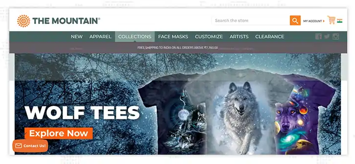
As an e-commerce site, The Mountain boasts the best features. Easy-to-navigate menus highlighting the most important product categories encourage investigation. It is a good practice to add a service banner under the header to alert customers about delivery terms and probable delays.
Using the hero slider, you can quickly see what's new, especially during the holidays. The Mountain has done an outstanding job of categorizing all of its products to alleviate the overpowering sense that many e-commerce platforms may cause.

Hebe is a clothes boutique with a physical location in New Zealand. Authentic New Zealand-made ethical clothing is the focus of the shop's efforts. Hebe's product photos are stunning, as you'd expect from a high-end clothing company. In addition to an eye-catching hero image and easy-to-read fonts, the site itself is visually attractive and easy to navigate.
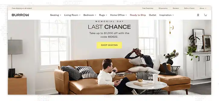
When it comes to its home page, Burrow, an online retailer of modular furniture, goes with a clean, uncluttered look. As you can see, their product photographs speak for themselves. After a few more clicks, you'll come across a video of two ordinary customers unpacking their new furniture. It makes them appear friendly and simple to work with.
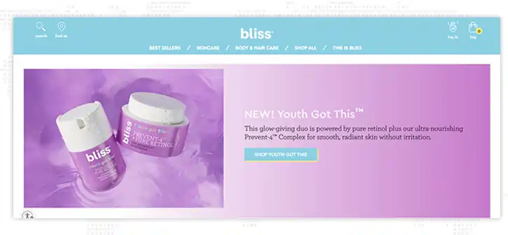
Bliss is a skincare brand that makes you feel as if you're living inside a unicorn, and its products are free of animal testing. The colors are both bright and cheerful, but they also have a delicate, pastel feel about them. The products are shown on a white background to ensure that they may be seen clearly.
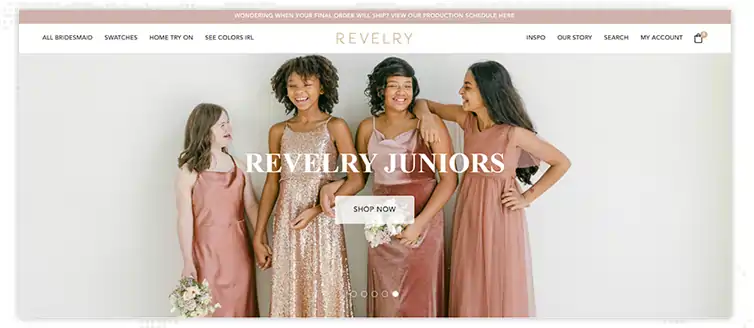
Wedding party dresses are the specialty of Revelry. Visitors are enticed to buy or order swatches by the hero photos that scroll across the top of the website. The menu includes a lot of options, but they're spread out across the left and right sides of the page, so it's not as daunting. Products are displayed in a way that is both entertaining and intriguing. The video demonstrating the ability to try on clothes at home is one of our favorite parts of this eCommerce site.

Skullcandy uses a sleek, opulent look by masterfully balancing vibrant colors with a characteristic black website design. Video reviews and specifications make it simple to learn about products. Although Skullcandy's core market is audio, viewing their website is an enjoyable sensory experience because of their great use of images, material design components, and video.
The process of creating an e-commerce website is now more straightforward than it has ever been. It's no longer the arduous, time-consuming process that kept many large and small businesses from engaging in the Internet marketplace.
Creating a successful e-commerce website is all about making substantial changes. Create prototypes of the most crucial pages first. To see if you can come up with any alliterations, try them out with your team. Launch a fresh appearance and ask your customers for their feedback.
In order to focus on the creative aspects of the project, you can hire an e-commerce website design company, and to take care of functional and performance needs; you will need an e-commerce development company. Create a unique identity for your website with the help of its design. In order to establish a color palette that reflects your brand and aesthetics, you have the freedom to choose your own color scheme. To see if a website is effective, conduct an A/B test.
Interested in our Ecommerce Services

1. What are the key elements that every eCommerce website should have?
An eCommerce website should have a clean and intuitive design, easy navigation, high-quality product images, detailed product descriptions, a search bar, customer reviews, a shopping cart, a secure checkout process, and multiple payment options.
2. What are some effective design ideas for eCommerce websites?
Some innovative web design inspiration for eCommerce websites include using high-quality product images, incorporating user-generated content such as customer reviews, utilizing white space to make the website look clean and uncluttered, using a bold color scheme that reflects the brand, and making sure the website is mobile-responsive.
3. How important is the mobile responsiveness of an eCommerce website?
Mobile responsiveness is incredibly important for eCommerce websites, as more and more people are shopping on their mobile devices. A website that is not mobile-responsive may be difficult to navigate on a smaller screen, resulting in a poor user experience and lost sales.
4. How can I make my eCommerce website stand out from competitors?
One way to make your eCommerce website stand out from competitors is to create a unique and memorable brand identity. This can include using a distinct color scheme, typography, and imagery that aligns with your brand values and personality. You can also differentiate yourself by offering exceptional customer service or unique product offerings.
5. Should I invest in a professional web designer for my eCommerce website?
Investing in a professional web designer can be a smart move for startups looking to create a high-quality eCommerce website. A professional web designer can bring expertise in user experience, web design trends, and eCommerce best practices to your project, resulting in a website that is both visually appealing and functional for your customers.
P
Amazing blog, everything has been thoroughly explained.
N
Great examples
J
Thanks Martin!
M
Thanks! This blog has given me some great inspiration.
A
Can you tell me which would be the best technology for designing a furniture eCommerce website?
J
Thanks for your feedback! You can contact https://www.janbaskdigitaldesign.com/contact-us for your queries.
A
My website is WordPress based and it has some great templates and customization options.
J
Thanks Andera, glad you found it helpful!
J
This was a very informative blog and I really enjoyed reading it.
J
Thanks, Julia!
P
Great write-up on ecommerce best practices to build your online business.
L
Insightfully article.
J
Well written article.
C
Love reading this article on online marketing.
R
Excellent blog article.
A
Your analysis of 10 Winning eCommerce Website Design Ideas To Launch Your Online Store was well-structured and informative. The point about Three Questions to Consider While Creating A Web Design was particularly relevant.
While exploring further, I came across this page: https://mobisoftinfotech.com/services/ecommerce-development , which provides a thorough overview of ecommerce integration services, ecommerce technology consulting, and e-commerce website development services that could be quite impactful in the current market.
I would value your thoughts on how e-commerce migration services might play a pivotal role in advancing the IT sector.