Since you’re here, we know you may have a standard eCommerce website that has been up and running for a while without many conversions. What good is an eCommerce website if it can’t generate profits and revenues for your business? It’s even worse if you’re unable to recover the costs of even setting it up in the first place. What should you do now? Pull the plug on all your time, efforts, and money spent and call your eCommerce venture a failed business?
Are you sure you want to give up so soon?
Because what if we told you that you have yet to explore all your options? There may be some fail-proof hacks that can turn around your online business to boost your conversion rate of e-commerce. Sounds too good to be true, doesn’t it? Don’t worry; we don’t promise what we can’t deliver. If our stellar ecommerce track record is anything to go by, this blog is the ultimate resource that will change your life forever–or at least that of your eCommerce website. So, get strapped and start reading!
Finally, what you’ve been waiting for has arrived. Without wasting further time, peep into the list of the best hacks to increase eCommerce conversion rates.
Unlock Higher Conversions: Learn Easy Tips & Hacks!

Easily stand out among your competitors by highlighting what sets your brand apart. Yes, we know you may have heard this before, perhaps even implemented it, but let’s cross-check whether you’ve done it right. Here’s a quick checklist for your reference
✅Is your eCommerce website content and layout memorable and recognizable?
✅Are your products, services, and informational content valuable enough to your target audience?
✅Can you pledge to deliver value to your customers consistently over time?

Your USP should reflect your business approach and essence because nothing puts off customers more than disingenuous propaganda explicitly created to sell something, especially in the age of a hyperconnected digital reality. Before you realize it, your brand’s insipid lack of conviction would already do the rounds of chat forums and tarnish your eCommerce’s hard-earned reputation. So, take our advice and avoid canned messaging and drab statements.
If you have thoroughly considered the great commandments of crafting a unique USP before, maybe what you’re genuinely lacking is some creative inspiration. In that case, you can take the example of The North Face. Can any modern business guarantee products that last a lifetime? Well, here’s a brand that can assure that.
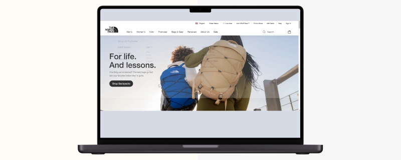
The North Face offers a lifetime warranty to its customers, which provides for a repair or replacement of an item if it is faulty, whereby this is only one way in which they prove their commitment towards sustainable products. If an item cannot be fixed, it heads off into an outlet store or gets donated as a means of disposal like recycling – this practice shows that what they mean by saying life long really means foreve
This one’s a no-brainer, considering you must pitch your offering quickly before your site’s visitor leaves out of boredom, frustration, or any other reason. Thus, you must provide straightforward and compelling content above the fold to nab your visitors’ attention quickly. Your design format should include an attractive hero image, a compelling call to action, and an irresistible copy with a suitable headline that quickly delivers your message. How about an example to help you understand what we mean?
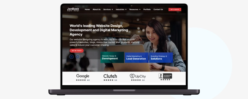
Take JanBask’s home page, for instance, with its screen-wide carousel of static images and videos combined with its short copy. Did you notice the agency’s services at the bottom of the screen? The design incorporates curiosity and inspires action right from the get-go! This sets expectations from the user and encourages them to keep going. Moreover, optimize your website for speed, Google’s Core Web Vitals, and other technical aspects.
However, designing an attention-grabbing hero image for your eCommerce website is just one part of the equation. You must take other steps to push your visitor down the funnel to take your desired action. Take a look at those steps:
Sorry for bringing a “duh” moment to your attention, but so many eCommerce web designers miss the point that we had to! It’s one thing to know and sell to your target audience, but it's another to incorporate your target audience’s pain points into your web design. Suppose you have used a generic website builder or solicited the services of a sketchy web designer who used a templated service without understanding your needs. In that case, your target audience will likely not find your website valuable enough. And this will spell doom for all your eCommerce conversion ambitions despite other metrics taken care of. For example, here’s how target audience segmentation works:
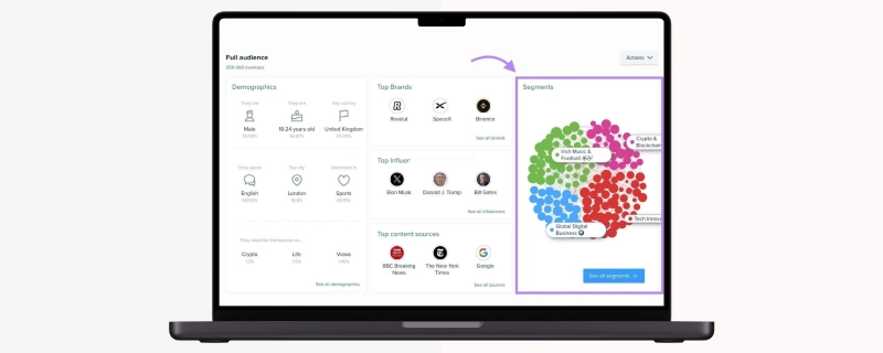
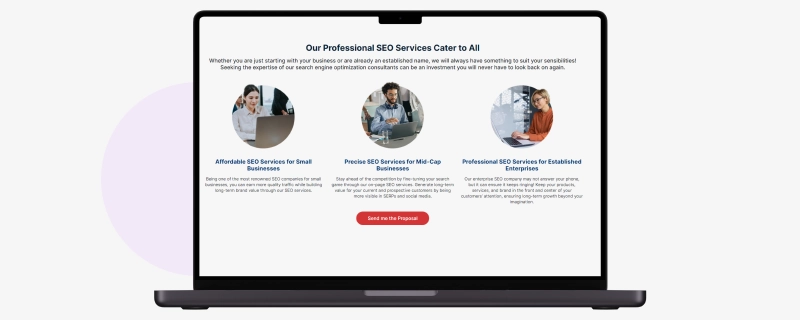
With this information, you can design your website to ensure that you’ve touched base with everything your visitors may be interested in. For example, JanBask designed its SEO page to appeal to businesses of all sizes.
Your product pages are the ultimate test of your eCommerce efforts. They are where a casual visitor confirms their interest in your business. Therefore, leave no stone unturned to motivate them to complete their purchase. So, with such a wide range of design features and elements that you can include, what should you choose that screams “Buy now!” Here’s where subliminal psychological influencing played out through the right colors, font, and images come into play! Take this for example:
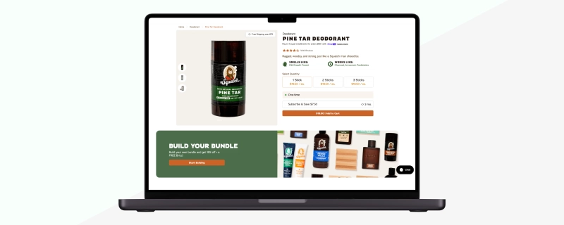
Dr. Squatch’s product pages are crafted to encourage shoppers to buy multiple items per visit. The men’s personal care brand offers various opportunities for users to add more products to their cart. Notice how the main product’s image occupies most of the vision area, with other products occupying the second most occupied area of the visible screen. Here’s a leaf from their eCommerce web design book that you can swear by heart.
You must pay attention to the basic tenets of user experience for eCommerce websites to create a site that truly converts. To start, you must ensure a three-level hierarchy where the Home Page occupies the top of the category. This should be followed by category (level 1), subcategory (level 2), and product pages (bottom of the hierarchy)
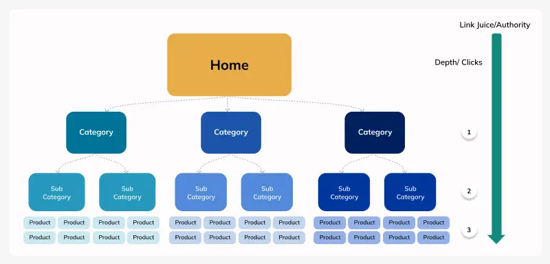
You must also ensure that you research and use industry-specific keywords, add contextual links, and remove all orphan pages. Lastly, the “breadcrumbing” technique can improve site navigability. What is “breadcrumbing?” It is the path a user takes while navigating a website can be accessed at any step.
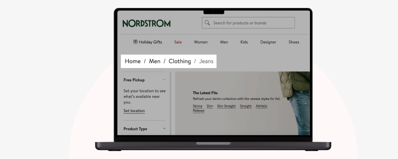
Breadcrumbs are crucial as they allow users to easily navigate back and forth between products and categories, improving the overall user experience. To optimize your site structure, you can add breadcrumbs and include structured data to display them in the SERPs.
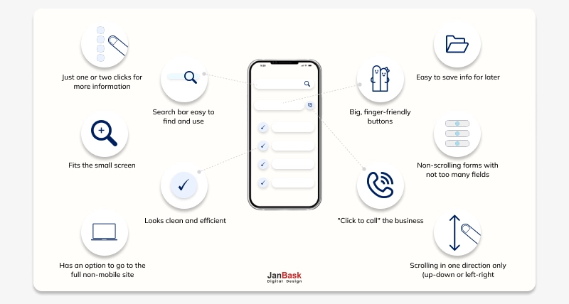
Today, most Internet users browse the web through their smartphones and other mobile devices than through others. So, if you don't design your website for a pleasant mobile experience, you risk losing many potential buyers. Here’s a mobile web design template for your reference:
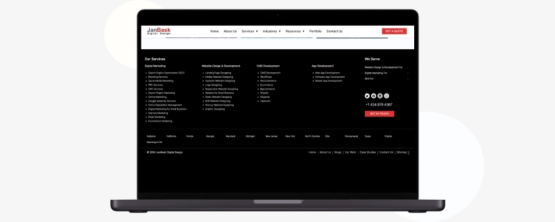
Displaying your contact details prominently on the top and bottom of your website helps your customers easily clarify any doubts that may hinder their purchase decision. Thus, such a simple act can boost your conversions significantly. How can you do it? Look at how JanBask has displayed its contact number at the bottom of its website.
Your contact details also add a touch of authenticity to your enterprise, where visitors can be comforted by the fact that you can be contacted just as easily as if you were in a physical store.
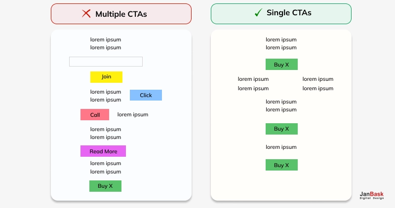
Ever heard of analysis paralysis? You’d get your site visitors into this by including multiple calls to action (CTA) throughout your website. Check out the image below to get what we mean:
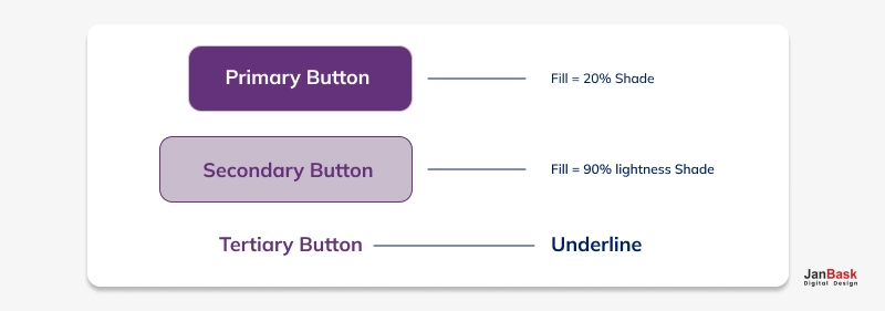
Even if your website’s CTAs do not look anything like the above, you still need to consider how you use your “secondary” CTAs instead of the primary ones. What are secondary CTAs, you may ask? They are alternatives to your primary CTA, which should be prioritized second, as the name suggests. They are designed to delegate your visitor’s decisions according to their purpose.
So, how should you place your CTAs? Take a look at Red Bubble’s home page, where their CTA is placed according to the Awareness, Interest, Desire, Action (AIDA) model.
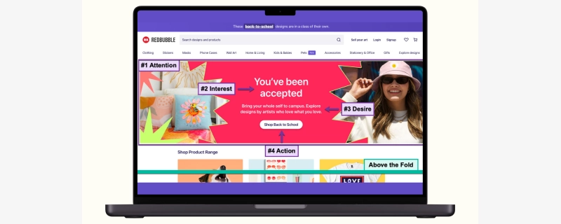
This image of a large, colorful banner draws your attention right from the first sight. The next thing that will attract you is the heading “You’ve been accepted.” This is because it contains the boldest font on the screen; it addresses you directly by saying “You’ve,” and you become curious to know what you could have done to be accepted. After that, right below this headline is a smaller print saying, “Shop Back to School,” which is a compelling CTA.
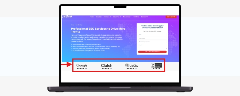
When there’s https in the URL bar, it means the site is safe. But those who are not knowledgeable in tech might fail to notice these browser cues. As a result, there is a need to have visible trust seals such as Norton and Better Business Bureau (BBB) recognized by many people.
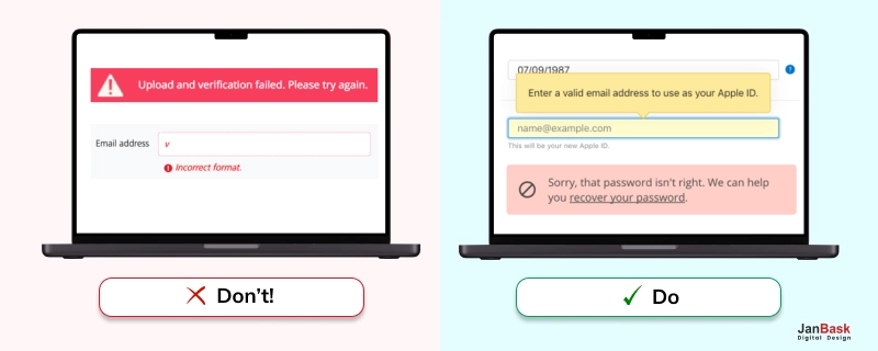
Next, if a user forgets to fill in one of the fields during the checkout process, remember to keep the error messages polite. Being rude to them just because they overlooked that field is not the best thing to do; it may make you sound condescending by featuring such messages as marking the missed field red or putting an asterisk plus some transactional message. To help users get back on track, you can be more explicit and kind instead of formal tones.
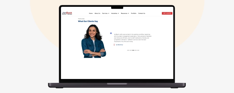
Brands with a direct-to-customer market should consider getting customer ratings and reviews since the primary purpose of an in-house e-commerce platform is to increase sales. According to research and previous studies, individuals are willing to buy products from organizations that upload customer reviews about their services or products.
Furthermore, many do not trust other word-of-mouth advertising because when several people have recommended certain things, such recommendations become popular or shared within the community. This type of social proof can help you know whether to buy a product because of the first-hand information from those who have undergone such experiences. Look how JanBask did it:
You might have underlying unconventional questions regarding the niche you’re targeting. But once you provide these online visitors with ready answers, they will always come to view your site as a reliable platform for gathering data on how they need to help themselves. See how JanBask does it:
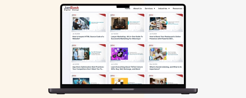
Please don’t assume that your customers know all the fancy terms surrounding your business; what you sell doesn’t matter. The other pages for eCommerce content marketing give you ample chances to explain things further and educate without necessarily offering products. This makes them more comfortable and informed about your product category; hence, they can buy with assurance. Again, once someone buys something they have needed for years, they tend to be happy having recognized the need before purchasing and fulfilling it through what they already have. It is also advantageous to create an SEO-friendly glossary for the same reason people will come across our e-commerce website.
There are some e-commerce sites that only show the number of items added to the cart by the user. Nevertheless, it may be considered as one of the best practices in e-commerce checkout to show the visitors what they have added. When clients see the list of things they are just about to check out with, they will keep being motivated every now and then to proceed with the transaction.
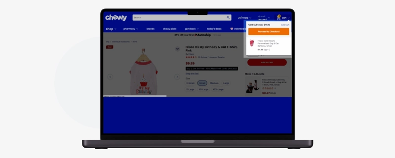
Excellent ecommerce checkout designs are simple, straightforward, and intuitive. They have all the necessary information customers require to make a quick, easy, and secure checkout. The checkout process must be devoid of interruption, distraction, or friction points. An excellent visual design also helps your checkout page. The page's aesthetics should promote efficiency, ease, and better user experiences while embracing concepts such as hierarchy and scalability.
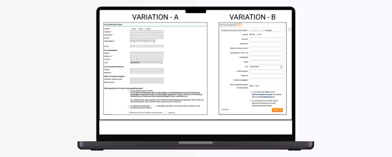
Usually, ecommerce live chat appears like a small, pop-up window provided by most ecommerce sites to enable their businesses to respond instantly to consumers' questions. It plays a huge role in customers' online shopping experience since it makes them feel that their purchases are a bit safer. Your team on customer support has to keep their eyes open on this live chat software so that they can see inquiries made by clients regardless of how small they might be or complaints raised by them.
In product terms, conversion is the process whereby one undertakes a particular activity, for example, buying something, joining something, or reaching another goal the product team sets. For a product, this would indicate the user's level of commitment and success at meeting its objectives through user interaction. Through monitoring and analyzing conversions, product teams can better understand how people use their products, enabling them to make decisions to improve user satisfaction while increasing conversion rates.
In eCommerce, the conversion value represents the money realized through actualizing sales on a site or a platform. It is arrived at by multiplying an average purchase value with the number of transactions carried out. This measure makes it easier to evaluate how efficient an eCommerce site is and how much income it can generate from its online undertakings.
An important metric in measuring e-commerce success is the conversion rate, the proportion of website traffic that completes a desired action, such as making a purchase, signing up for the newsletter, or looking for more details. Quantifying this ratio helps evaluate how effectively an e-commerce site turns visitors' interest into accurate results.
One way for businesses to improve their conversion rates is to make their e-commerce site more welcoming, simplify the checkout process, give good reasons for users to buy from them, make better use of product descriptions, include reviews on all products they offer, and use marketing techniques that affect only specific groups.
In e-commerce, a reasonable conversion rate can change significantly depending on the business sector and specific goals of a particular company on the internet. Generally, the standard figures are between 2% and 5%. By contrast, anything 10% and above is considered fantastic conversion rates.
As the conversion rate for its platform fluctuates wildly among its vendors due to various variables such as their distinctive business models, target industries, and customer base, Shopify does not publicly disclose a specific rate.
The reason why Amazon does not disclose its conversion rate is essentially the same as that of Shopify, albeit the company is known to have significantly enhanced its conversion rates because of its broad customer base and convenient online shopping.
While conversion rates for online stores vary, they usually range from around 2% to 5%. Several factors can affect this percentage, including:
In ecommerce, Key Performance Indicators (KPIs) are very important because they give metrics that can be measured to assess how well or poorly an online business is doing. They are essential For understanding different parts of a business, such as sales, customers, and effectiveness. Take, for instance, the conversion rate of e-commerce. The percentage of people who visit a site and buy something there went up from 1 % last year to 2 % this year; likewise, average order value surged too.
Ecommerce rate can be calculated by dividing the number of completed transactions (or conversions) by the total number of website visitors and multiplying by 100 to get a percentage.
Prepare to take your online store to the next level with these amazing e-commerce web design tips! Through building a visually appealing and easy-to-use site, adding irresistible call-to-action buttons, designing it for mobile devices, as well as refining the checkout process, you can attract more visitors who will become repeat customers. These revolutionary tricks will make your online store thrive in the internet world! But if you need a more advanced approach backed by eCommerce expertise, JanBask is just a call away!
Interested in our Ecommerce Services?

B
It’s quite an informative blog ! But I have a question: What is a good ecommerce conversion rate? Some say it’s 5%, some say it’s 2%. Can you please elaborate on this section
R
Thanks for this insightful post. I was looking for that type of information because I am new to e-commerce and really desperate to know how to boost my conversion rate.
A
Hey, it’s a lovely blog about ecommerce Website Optimization. I have a small business and I can say these steps are essential in boosting conversion rates. But if you are new, it’s always advisable to start with the help of a good ecommerce web design company.
T
Earlier I was really confused how to make my eCommerce business successful. With this eCommerce Website Optimization guide, I could get a lot of amazing tips and tricks to grow my platforms.
G
Must read blogs to people willing to start eCommernce business and planning for the same, have some great ideas that really inspire me.
P
In how many months can I see effective results in my eCommernce business if I follow your suggested tips. Do you have any idea?? Please let me know!
M
Do you guys help in setting up an eCommernce bsuiness? I wanted to know because I want to hire your team for my organization as I am not familiar with the process well and will require professional help. Please let me know!
S
My friend and I were looking to start an eCommernce business for a long time but could not find anything relevant. Then one of our colleagues shared the link to your article. I must say you have shared some effective ideas, I am impressed with!
Z
Overall a comprehensive guide post on eCommerce Website Optimization, I was seeking information on the same for many days but could not find anything relevant. Then I came across your blog and found it really interesting and impressive. Thanks team!
M
I am new in the eCommernce business and also don’t have much information about optimization strategies. Also, the team that I had hired didn’t respond well. Can your team help me with some more effective and useful conversion ideas!!