Are you looking to stay ahead of the curve through user interface design? Are you interested in having a website design that elevates your brand image? Then learning about what new technologies will shape the future of UI/UX design is crucial. UI design focuses on creating visually appealing and intuitive interfaces that enhance user experience.
Integrating thoughtful UI design elements such as intuitive navigation, visually appealing aesthetics, and interactive features into your website can create a seamless and engaging user experience that keeps visitors returning for more. So, if you want your website to stand out from the competition and leave a lasting impression on your audience, investing in UI design is a must!
In this blog, we will discuss what Nex Gen UI Design is and explore the process, how it relates to User experience (UX), and how you can implement it. Let’s get started!
UI Design is an acronym for User Interface Design. This design style anticipates what consumers need to achieve their goals on your website. Your website is the starting point for enhanced user experience.
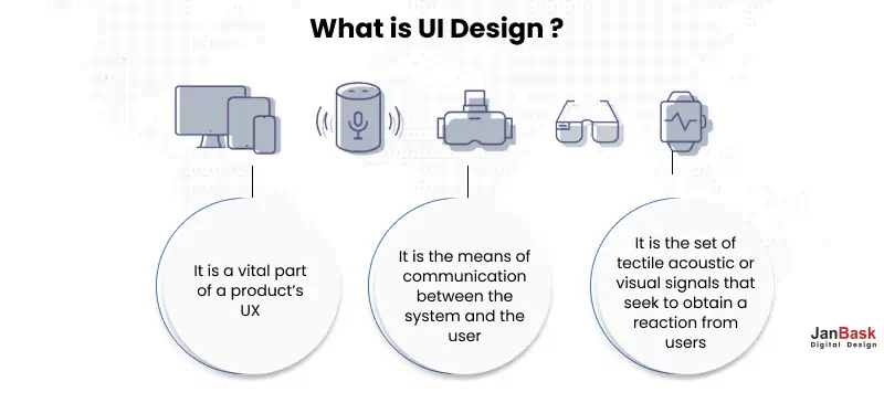
A crucial part of UI design is implementing features that make the user journey easy on your website and help them take decisive actions. Prospective customers should be able to navigate and use your site without any hindrances. UI design focuses on the interaction of your audience with your page. This is where you create your site so your audience can quickly locate information as they navigate it.
To understand the complexities of the future of User Interface Website Design and how it might help your business to prosper over the decades to come, let us understand the prominent trends concerning the question-
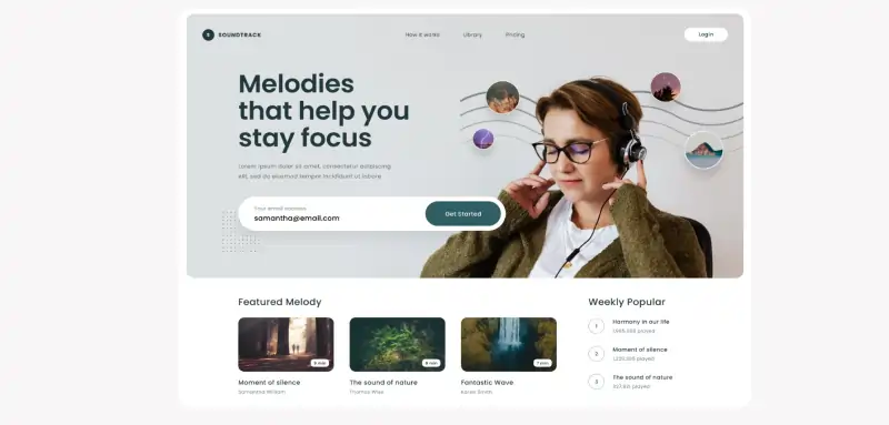
A hero image is a large, eye-catching image that dominates the top portion of your landing page. It's the first thing users see when they visit your website, making it a powerful way to capture their attention and encourage them to explore further.
There are several advantages to using a hero image in a user interface website:
Incorporating a captivating hero image into your above-the-fold content can greatly enhance your website's appeal and effectiveness in capturing attention and driving conversions.
Siri, Alexa, and Google Assistant have all shown the capabilities of a Voice User Interface. This, however, is only the tip of the iceberg. Not only will these bots use Voice UI in the coming decade, but a wide range of mobile apps and websites will also use this interface to improve engagement. This is paving the way for a screen-less experience, allowing users to utilize these apps and websites even when they cannot access their devices, such as while driving, exercising, cleaning, or resting! Here are several compelling reasons why businesses and websites should prioritize optimizing for voice search:
Rising Adoption: Voice-activated devices and voice assistants are becoming ubiquitous. Millions of people use voice search daily to find information, make inquiries, or perform tasks. Failing to optimize for voice search means missing out on a growing user base.
Changing User Behavior: Voice search changes how people interact with technology. Users tend to phrase voice queries more conversationally and use longer, natural language queries compared to typed searches. Optimizing for voice ensures your content is discoverable by these users.
Local Search: Voice search is often used for local queries, such as "Find the nearest coffee shop" or "What's the weather like in my city?" Optimizing for voice can help businesses attract nearby customers and increase foot traffic.
There is no question that Virtual Reality and Augmented Reality will dominate the foreseeable future. Numerous industries will join hands with Virtual Reality and Augmented Reality to attract end users, improve efficiency and effectiveness, and reduce redundancies in business operations. Classic case is of how real estate websites use AR & VR to enhance their digital footprints
Virtual Property Tours: VR allows potential buyers or renters to take virtual property tours from the comfort of their own homes. They can explore properties as if they were physically present, giving them a more realistic sense of the space and layout.
Interactive 3D Models: Real estate websites use 3D models and renderings to create interactive property showcases. Users can navigate through different rooms, zoom in on details, and even rearrange furniture to visualize the space according to their preferences.
AR Property Overlays: AR can be used to provide additional information about properties when users point their smartphone or tablet at a physical building or property listing.
This is just one of the cases, if your website has not explored the utilization of AR &VR you may be missing out of some serious numbers.
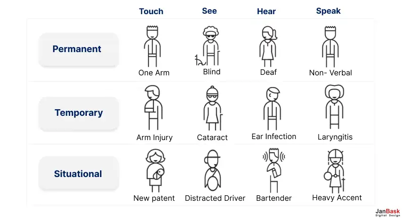
Between 2018 and 2060, the population of adults over the age of 65 in the United States will nearly double, from 52 million to 95 million (rising from 16% of the population to 23%). Similar trends are happening in countries throughout the world. And as people who grew up with technology age, the differences in how they interact with websites, apps, and other digital products will be harder to predict. Inclusive design takes all of the above into account
Inclusivity has been the key phrase of the twenty-first century, and as the world becomes more global, the emphasis on inclusive designs will only grow. Every company and its UI/UX team will work hard to ensure that its platforms - including website design practices, social media accounts, and applications - are elegantly designed to respect every user.
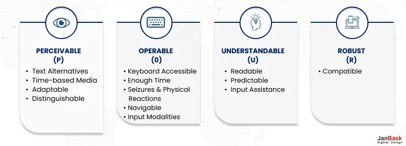
If not followed, a lack of inclusivity can quickly lead to a business's failure, regardless of the quality of its offerings!
Moving ahead let's have a look at some of the classic examples of user interface design, may be an additional dose of inspiration!
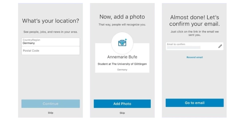
The LinkedIn app has an easy-to-use interface that is consistent with the company's branding: you easily recognize the typeface, blue and grey color scheme, and icons used on the website.
The app excels in its user onboarding flow in particular. When the user chooses to create their account, they are taken through each step of the process. Various screens prompt users to fill out their personal information, confirm their email addresses, follow LinkedIn groups and thought leaders, and accept suggestions to expand their professional network. While each screen briefly explains what they are being asked to do, users can skip some steps that can be completed later.
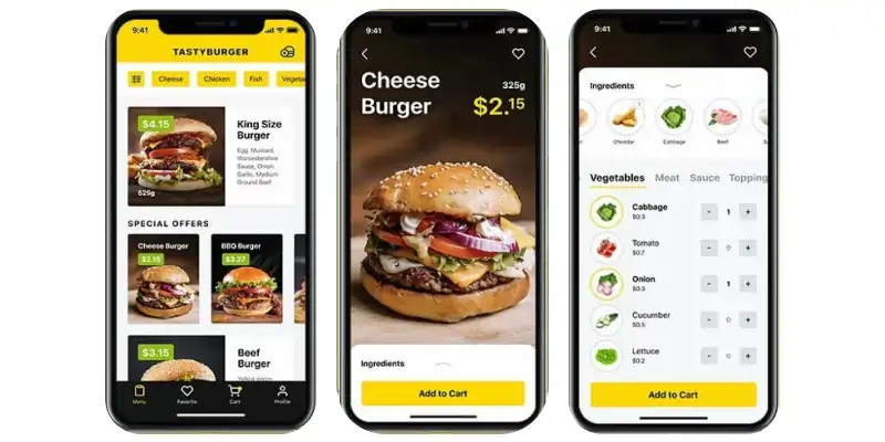
This UI is intended for two types of users: those who want to browse and those who know exactly what they want to order. There are filter options, images, and crucial information, including cost, for people who want to browse. After selecting a product, consumers can view its ingredients and alter it by selecting the ingredients tab. Color accents highlight prices and calls-to-action like "Add to Cart" for quick scanning and checkout for users who know exactly what they want.
These websites must have something in common that they could deliver such exemplary user experience, Explore the UI design principles you can follow to turn your website into a case study!
While each application requires a unique interface, a few fundamental principles guide every project, whether it's a website design trend, web development, or ui user interface website design. Here are some of the thump rule design principles. Most of these design principles overlap, so we have condensed and summarized them below for you.
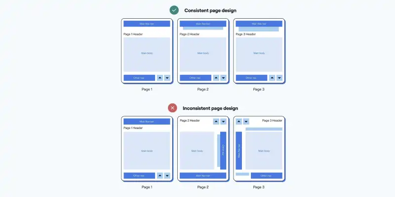
Consistency in the colors you use, the typography and font styles you use, the animations you create, and even the tonality and voice you use results in an overall cohesiveness in your interface, which is vital for both the user experience and your brand identity.
For example, suppose the button text on one form is "Submit," and the text on another is "Send." Your users might have to guess whether these terms mean the same thing. Making all form buttons copy "Submit" or "Send" will ensure internal consistency, which is one side of this approach.
The other one is external consistency. That is, you should adhere to the conventions of other products to avoid forcing your users to learn anything new. For example, almost any website's navigation has a Home menu. This is a link to its home page. Consider the navigation option "Home." Most users would guess it's the webpage, but only by taking an extra second or two to figure it out. By adhering to the patterns established by other websites and applications, you can avoid increasing the user's cognitive load in this manner.
One significant consideration for user interface design tools is that you want to give users a sense of control over the interface. Hence, they spend more time exploring and learning the application." This includes allowing them to make mistakes and undo their acts. Popups, for example, should include prominent close buttons, checkout pages, fast and precise ways to go back or modify cart information, editors, undo and redo choices, and so on.
Here's an example of a lightbox popup that allows users to input their email address or click.

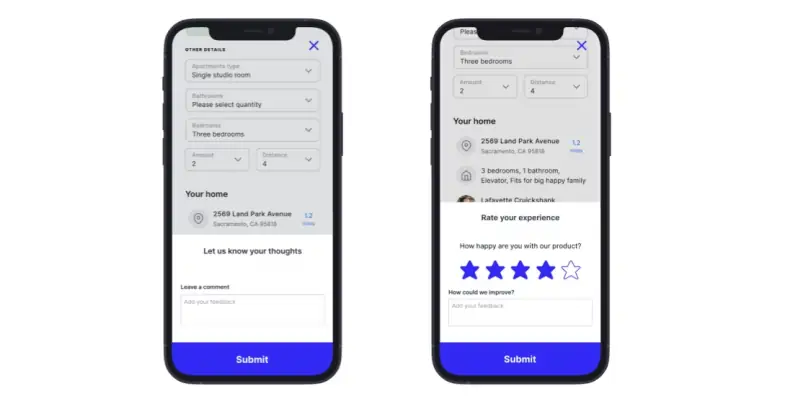
Another technique to boost user confidence is to provide feedback as they navigate and engage with the interface. A loading animation that informs the user that their request to see the website was successful and that the content is being retrieved could be the initial point of feedback. There are numerous additional ways to tell the user.
Consider an order confirmation message on an e-commerce site. Informing the user that their order has been confirmed can create a sense of relief or comfort. If a user is unsure whether their order was successful, they may try again and duplicate it or leave before placing it.
Another example is showing users how close they are to receiving free shipping before they check out." Wrap Life gives this vital information to set the user's expectations for the ultimate cost and to persuade users to spend more.
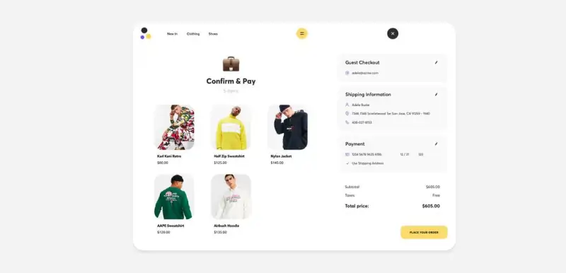
A user interface experience cannot simply allow users to make mistakes and then stop; it must also allow them to recover from those mistakes." This is when error messages come into play. An error message that uses simple language and clear pictures to explain the problem and provide a solution will help users understand, rectify, and prevent repeating the same mistake.
The "incorrect password" notification on a login page is a typical example of an error message. This notification frequently advises two solutions to the problem: one, try entering your password again, or two, reset your password.
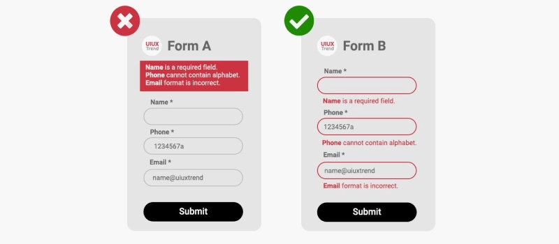
The below website simply provides the error message that either the email or the password is incorrect. The user can choose the correct combination or reset the password.
Giving users autonomy while still allowing them to navigate the interface and complete actions successfully is a sign of a perfect UI design. That is why there are processes not only to respond to problems but also to prevent them. You can avoid problems by giving the user undo choices, required steps to confirm their personal or financial information, warning messages, or constraints that prevent them from completing the action.
Consider the usual constraints that you have while creating a password. Typically, the password must have a specified length, comprise a combination of letters and digits, include at least one special character, and be unique. You can only create a password once you complete these prerequisites. This prevents users from creating passwords already chosen by others, or your application cannot accept or process correctly. It also serves as a security precaution.
Another prominent example of error prevention is incorrectly filling out a form. You won't be able to submit the form if you leave a necessary field blank, for example. Instead, you'll receive an error message instructing you to examine the form and remedy the issue. Below is an example.
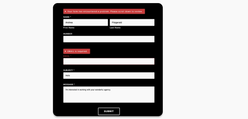
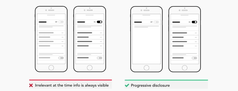
To keep the user interface website simple, avoid using shadows, effects, or other decorative features. It means that when developing the interface, keep things as simple as possible. Consider what features must be included to allow users to fulfill their tasks. Anything else will compete for the user's attention and is best avoided.
Assume you're working on an interface for a content management system. Some users may have extensive expertise with different CMS platforms, whereas others may have never used one. That is why it is critical to design for both professionals and amateurs.
Beginners can be started with demos or tooltip suggestions and experts with shortcuts and other accelerators. All of these features should have the ability to be skipped or exited at any moment. Users who require tutorials can use the demo and suggestions, while more advanced users can jump right into using the platform and its shortcuts.
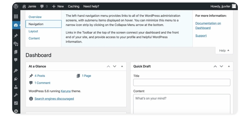
WordPress is a great example. Beginners can use the Help tab to get information on the dashboard's navigation, layout, content, and links to support forums or documentation. More sophisticated users can just minimize this tab.
Understanding users' pain points is a critical first step in the UI design (and UX design) process." It's not just demographics. The most essential questions are not how old they are or where they live. You must understand what your users require (even what they may not realize they require), their expectations, and the problems they face while taking up their tasks and responsibilities. That way, you would be able to design a user interface that is both basic and effective.
Data and analytics take a back seat; instead, empathy is essential in understanding human consciousness. Interviews, online surveys, and user testing sessions are just a few methods for learning about the people who might use your website. These findings will inform every stage of the user interface design process.
Once you've completed your interviews, surveys, and user testing, you have much information about your users. Creating user stories is one method to use and organize this information. User stories define a primary goal the user wishes to achieve using the program. They are usually one sentence long and take the following format: "As a user, I want to... [some goal]. Here are some examples of user stories in action.
Think of it as a consumer who wants to purchase something from an e-commerce store. What are the user format stories that you would take:
Identifying user stories first ensures that the application's design and functionality are dictated by the user's needs and behaviors, rather than the other way around.
Now that you know what the user wants and needs, you can list the UI elements and features essential for the user to achieve their goals. Web designers refer to this as "the interface inventory." You need fonts, images, media, tables, forms, buttons, a navigation system, and anything else that goes into creating an interface.
It is suggested to capture screenshots of these components and assemble and classify them in a PowerPoint if you and your team have already produced some of these components or used them in other marketing collaterals. At this point, you could notice any inconsistencies — say, you developed a button with rounded edges, but another team member designed it with square edges — and start identifying patterns. This will significantly simplify the UI design process.
As you complete your interface inventory, you can spot common design patterns. In software design, design patterns are general solutions to reoccurring problems. They are not code but rather a model or explanation of how to solve a problem that may be applied to various circumstances.
Assume the issue is that a website has several sections but not enough room for a navigation menu. In that instance, a vertical dropdown menu may be a viable option. Identifying these patterns will aid in the consistency and efficiency of the user interface design process.
A prototype is a semi-functional layout that provides a high-fidelity preview of how the actual application's interface will look and feel. Most prototypes don't feature all of the app's functionality, but they illustrate how the app will work and allow clients and other stakeholders to browse around the interface. With the prototype, UI designers and other stakeholders may present and discuss how the elements might work, test their ideas, and make modifications. At this point, UI designers often pass off their concepts to a developer to begin implementing.
Learning about these design tools will help you make an informed decision about why suits your needs. However this can be a heavy task, Consider working with a website design company that is stuffed with all the tools, resources, and infrastructure to support your needs and gives you time to focus on major business processes.
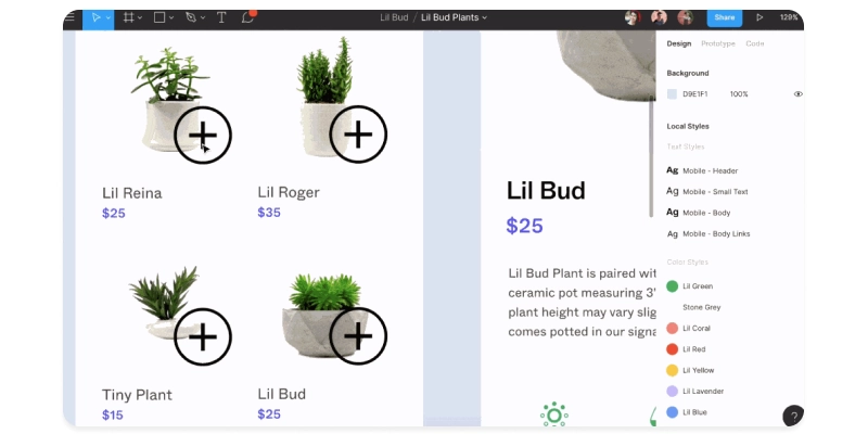
Figma provides UI designers with powerful design features. Using the limitations feature, you can generate animated prototypes quickly, adapt them to multiple screen sizes, and reuse elements across projects. You can even co-edit the same project to ensure you can provide and respond to feedback while designing.
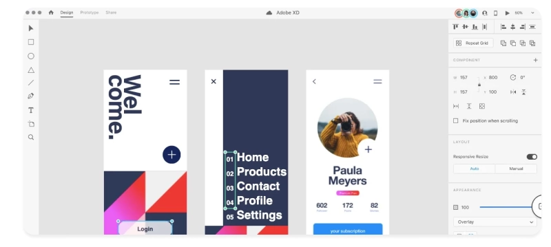
Adobe XD is an all-inclusive solution for UI and UX designers. You can wireframe, animate, prototype, collaborate, and do various other things. Like Sketch and Invision Studio, Adobe XD is vector-based, allowing you to create high-fidelity designs for different screen sizes. Individuals and businesses can choose between free and premium plans.
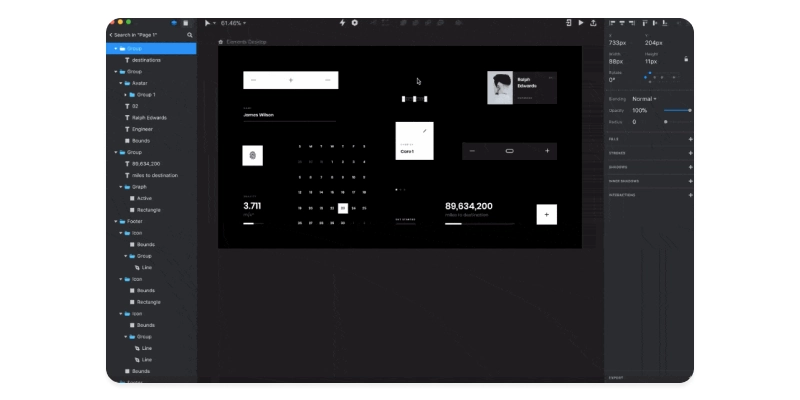
Among UI designers, Invision Studio is one of the most popular free prototype tools. Invision Studio, like Sketch, is a vector-based application. This means you can effortlessly develop, tweak, and scale your high-fidelity, interactive prototypes to match any screen. You may share your designs with clients and teams using Invision Studio's Boards features so they can comment directly.
That is the beginning, your journey to create a lasting impression on the digital landscape begins from here…
1. What is User Experience (UI) Design?
An interface is the visual gateway a client encounters on a digital device - the 'front end' that facilitates interaction. At its core, user-centric design is the human-centric approach to crafting an experience that resonates with your customers. It encompasses various design elements that shape what users observe on the screen, such as carefully chosen typefaces, harmonious color schemes, captivating animations, appealing graphics, and intuitive buttons. Paying meticulous attention to these details ensures an immersive and delightful user experience.
2. How a UI website design services company can help with better user interface design?
A website design services company can play a crucial role in improving user interface (UI) design in several ways. A well-designed UI is essential for providing an excellent user experience (UX) and can have a significant impact on a website's success. Here are ways in which a website design services company can help with better UI design:
User Research and Analysis: Conduct user research to understand the target audience's needs, preferences, and behavior. Analyze user feedback and data to identify pain points and areas for improvement in the current UI.
User-Centered Design: Focus on creating designs that prioritize the needs and expectations of the end-users. Develop user personas to guide design decisions and ensure that the UI meets users' specific goals.
Information Architecture: Organize content and navigation in a logical and intuitive manner, making it easy for users to find what they're looking for. Create clear and concise sitemaps and user flows to map out the website's structure.
Wireframing and Prototyping: Create wireframes and prototypes to visualize the UI layout and functionality before development begins. Iterate on these designs based on user feedback and usability testing.
Visual Design: Develop a visually appealing and consistent design that aligns with the brand's identity. Choose appropriate color schemes, typography, and imagery to enhance the overall aesthetics.
Accessibility: Ensure that the UI is accessible to all users, including those with disabilities, by following web accessibility guidelines (e.g., WCAG). Implement features like alt text for images and keyboard navigation.
A Professional web design company can help improve UI design by following a user-centered approach, conducting research, creating intuitive layouts, ensuring accessibility and responsiveness, and continually refining the design based on user feedback. A well-designed UI contributes significantly to a website's success by enhancing the user experience and engagement.
3. What is the Future of UI design
The future of UI (User Interface) design is likely to be shaped by various emerging technologies, design trends, and changing user expectations. While it's challenging to predict with absolute certainty, here are some key directions and trends that are likely to influence the future of UI design:
Immersive and Spatial Interfaces: Augmented Reality (AR) and Virtual Reality (VR) are likely to play a significant role in UI design. Designers will need to create interfaces that seamlessly blend digital elements with the physical world, offering immersive experiences.
Voice and Conversational Interfaces: Voice assistants like Siri, Alexa, and Google Assistant are becoming more integrated into our daily lives. UI designers will need to create conversational interfaces that can understand and respond to natural language.
Gesture-Based Interfaces: Gesture controls and touchless interactions are on the rise, especially in public spaces and smart homes. Designers will need to craft intuitive and responsive interfaces that rely on gestures for navigation and interaction.
There is more to how the future is unfolding for UI designs, one of the best UI website design companies can ensure innovative UI designs for your website.
We engage with user interfaces daily, whether it's an e-ticket booking website or an e-commerce app. A good user interface design can differentiate between a good and a bad user experience. Understanding and using UI design principles, as well as website design rules, such as simplicity, navigability, consistency, and user-centricity, as well as employing the correct tools, can assist you in creating the most significant interface for your product.
Confused about which user interface design company to consult? How about JanBask? With their expertise in extensive web design skills, you can get more than you bargained for!
Interested in our Web Design & Development Services?

P
I’m really excited about the future of user interface design with these next-generation UI tools. It’s incredible how much more intuitive and user-friendly interfaces are becoming.
L
These new UI tools will make designing interfaces much easier and more efficient. I can’t wait to try them out for myself.
J
The ability to customize and tailor interfaces to individual users will be a game-changer. It’s great to see technology becoming more user-centric.
C
Using AI and machine learning in UI design will make interfaces even more responsive and adaptive to user needs. This is definitely the future of design.
R
The future of UI design will be all about creating seamless, intuitive experiences that feel effortless for the user. These new tools are definitely a step in the right direction.
L
thanks for info