
With an estimated 754.99 million visits, PayPal gets the most users on its website. So, it's clear that having a top-notch financial website design is more important than ever. So, whether you're a seasoned investor or just starting, check out the list of the best financial websites for all your financial needs!
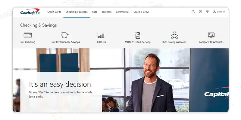
What makes Capital One financial service website part of our list?
Capital One 360's website design showcases its brand identity with the bold use of its signature red color. The site's homepage features a clear and easy-to-use navigation system that guides users to the information they need. Capital One 360's design also includes interactive tools like a savings calculator and a retirement planning tool, making it easy for users to take control of their finances.
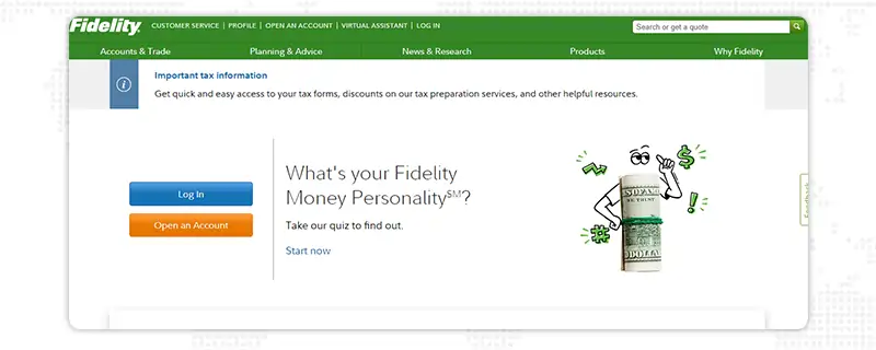
What Makes Fidelity Investments' Website Design Stand Out?
Fidelity Investments' website design is sleek and sophisticated, featuring a minimalist look focused on showcasing its financial resources. The site includes a range of market research, investment insights, and financial planning tools. So, overall it's a mobile-friendly website. The site's design makes it easy for users to access the information they need to make informed financial decisions.
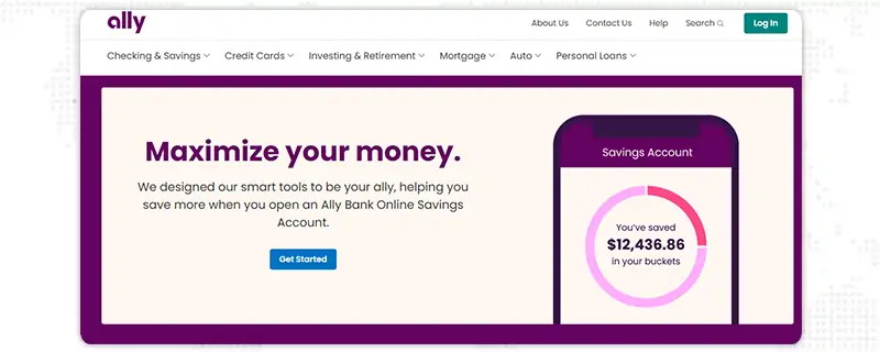
How Ally Bank Financial Services Web Design Gets Better User Engagement?
With a bright and bold design, Ally Bank's website is a true standout in the financial services industry. The homepage features engaging graphics and clear navigation, making it easy for users to access the information and resources they need. The site also includes a range of interactive tools, including budgeting and savings calculators, to help users take control of their finances.
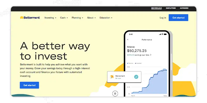
What Makes Betterment Website Design a Must-See for Financial Services Companies?
Betterment is one of the top financial websites that prides itself on its user-centered design. With a focus on helping users achieve their financial goals, the site features a range of interactive tools and resources, including a comprehensive investment planner and retirement calculator. The site's modern and clean design makes it easy for users to access these tools and resources and take control of their finances.

What Sets TD Ameritrade's Website Apart in the Financial Services Industry?
TD Ameritrade is one of the best financial websites that are both professional and engaging, focusing on providing users with the information they need. The site includes a wealth of research, investment insights, and financial planning tools, all of which are intuitive. This makes it accessible to investors of all levels.

What Makes Robinhood's Financial Website Design a Game-Changer?
Robinhood's financial website design features a modern and minimalist look with a focus on simplicity. The site's homepage includes clear navigation and various interactive tools, such as a stock simulator and market insights. These features help you to know trends and when to invest in the market.
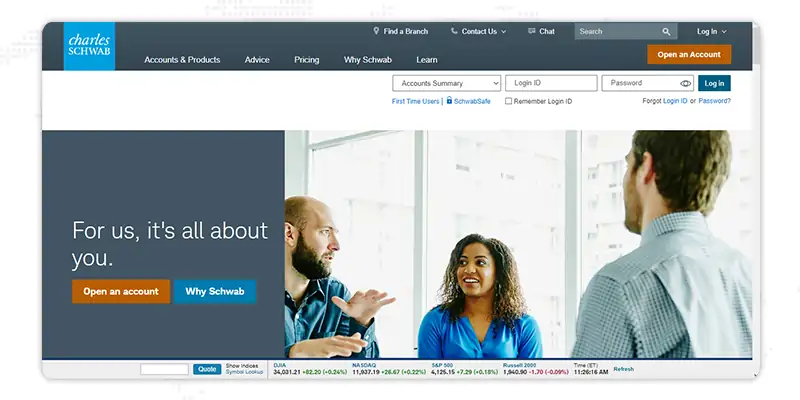
Why is Charles Schwab's Website Design Modern and Trustworthy?
Charles Schwab's website design is sophisticated as it features a clean, modern look with a color palette of blues, grays, and white. This gives it a professional and trustworthy feel. The site's homepage includes financial planning tools, a portfolio analyzer, and investment insights. Overall, Schwab's website design showcases the company's commitment to offering great services to its audience.

E-Trade is a Wealth of Tools and Educational Content?
The homepage of E-Trade includes a clear navigation system with a variety of tools and resources available for users. The site also includes a wealth of educational content, including articles, videos, and podcasts, to help users stay informed about financial markets. In terms of visuals, E-Trade's website features clean lines, large typography, and a well-organized layout. This creates a visually appealing and sets it apart as a top choice for online investors.
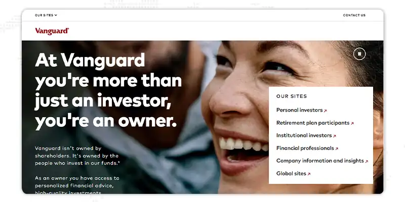
Why Vanguard is A Solid Example of a Comprehensive Financial Website?
You'll be impressed by Vanguard's website as it covers features like retirement plan participants, institutional investors, financial advisors, and whatnot. It also differentiates itself from other financial companies' websites using the pressroom option. The pressroom includes all the news and announcements about Vanguard. Hence, viewers can learn about investment advisory arrangements, Opportunities Stock Funds, Liquidity Factor ETF, etc., with the help of this feature.

Why should you consider taking ideas from the Mint Financial Solutions Website?
Mint financial solutions have a financial web design with a light but elegant green-colored background. It includes their mission, goals, CTA, and services like finance and lending, accounting, financial advisory, etc. And the best part is that they've used their original data about Local Financial Specialists, Tax returns, and a number of clients. Not only this, but the website of Mint Financial Solutions also has brands they've partnered with in a few years.
In the modern digital landscape, a financially-focused website is indispensable for businesses seeking to establish a credible and profitable online presence. As such, the design of such a website must be optimally functional, leveraging various elements to attract and retain visitors, instill confidence, and convert leads into customers. With these considerations in mind, here are several tips for constructing an effective financial services web design.
Minimalism refers to the practice of using a stripped-down design that prioritizes simplicity and cleanliness. This approach can enhance the visual appeal of a financial website and facilitate easy navigation, helping visitors quickly find what they are looking for. Additionally, a minimalist design can lend an air of professionalism and sophistication, establishing the business as a reliable and trustworthy entity.
About 3.37 Billion users used visual and video content in 2022. So, this content can be leveraged to engage visitors and communicate information in a more compelling manner than text alone. This can include charts, graphs, images, and videos that showcase financial products or services in an interactive and easily digestible format. Incorporating such elements can also help break up long blocks of text, making your website one of the best finance sites.
Ease of navigation is critical for a financial website, as visitors should be able to quickly find the information they are seeking without becoming frustrated or disoriented. This can be achieved through the use of clear headings, intuitive menus, and logical page structures, as well as providing multiple means of accessing important information, such as through search functionality or quick links.
Social proof refers to the influence other people's opinions and actions have on our decisions. In the context of financial web design, this can take the form of customer testimonials, social media integration, and trust badges. By demonstrating that others have found success with the business, visitors are more likely to feel confident in making their own financial decisions. Connectivity refers to the ability of a website to connect with other platforms, such as social media, email, and live chat. This can increase visitor engagement and provide additional avenues for communication and support.
Security and safety are critical concerns for financial websites, as visitors entrust the business with sensitive personal and financial information. As such, it is important to implement robust security measures, such as SSL encryption, and to communicate the measures in place to protect customer data. This can help to instill confidence in visitors and reduce the risk of fraud or data breaches.
SEO, or search engine optimization, refers to the practices used to improve a website's visibility and to rank in search engine results pages. By incorporating relevant keywords, optimizing meta descriptions, and improving website structure, a financial website can be more easily discovered by potential customers. CTAs, or calls to action, refer to elements on a website that encourage visitors to take a specific action, such as filling out a form or making a purchase. By strategically placing CTAs throughout the website, a financial business can increase conversions and drive revenue.
Financial concepts can be complex, and it is important to communicate information clearly and concisely so that a broad audience easily understands it. By using simple language, avoiding industry jargon, and breaking down complex information into easily digestible sections, a financial website can be more accessible and engaging for visitors.
With the increasing use of mobile devices for online browsing and transactions, a financial website must be optimized for viewing on smaller screens. This can include responsive design, which adjusts the website's layout based on screen size, as well as streamlined navigation and concise content for a more streamlined mobile experience.
The technical aspects of a financial website, such as load time, site structure, and code quality, can significantly impact the user experience. A financial business can reduce the risk of technical issues by ensuring that the website is fast, secure, and built using best practices. A website design and development company uses these technical aspects to give you the best sites.
Finally, it is important to provide multiple support channels for visitors to contact the business, such as email, phone, and live chat. It can help build trust and peace of mind, as well as provide a means for visitors to ask questions and receive assistance with their financial needs. 75% of website users prefer live chat over any other support channel. Hence, you should never underestimate this feature for your website.
Interested in our Financial Website Design Services?

The best financial website design should comprise a carefully curated collection of key elements that align with the user's needs, goals, and expectations. Here we've listed the essential elements your website should also have.
Data security is a crucial aspect for any financial website, particularly for banks and financial companies. The companies handle sensitive information such as personal and financial data of their clients, and any breach of this data can have serious consequences. It can not only lead to legal and financial penalties but also damage the reputation of the financial company. So, the website should use strong encryption techniques to protect sensitive data such as account numbers, passwords, and other personal information. Also, it should have a secure login process that includes two-factor authentication, strong password requirements, and lockout features after multiple failed attempts.
The About Us section of financial websites is a vital component that conveys the brand story, its ethos, and the values that it represents. It introduces the company and its history and provides users with a comprehensive overview of its services and offerings. This section should be visually appealing, well-structured, and easy to understand, conveying the brand's unique identity and personality.
The FAQ page is a critical element of any financial web design, as it provides quick and easy access to answers to common questions that users may have. This section should be well-organized and clearly structured, offering concise and accurate answers to user inquiries. It should also be updated regularly to reflect changes in the financial market and to ensure that the information remains relevant and up-to-date.
Integrating social media platforms into a financial website design is a crucial aspect that can greatly enhance user engagement and increase brand visibility. These links should be prominently displayed, allowing users to connect easily with the brand on various social media platforms, such as Facebook, Twitter, LinkedIn, and Instagram. This can foster a sense of community and establish a connection with users, leading to increased brand loyalty and advocacy.
The financial tools section of the best financial sites is a resource-rich area that provides users with a comprehensive collection of tools and calculators to help them manage their finances more effectively. This section should include a variety of financial calculators, such as retirement calculators, investment calculators, loan calculators, and savings calculators. These tools should be accurate and provide users with immediate results, allowing them to quickly and easily compare different options.
The logo should be timeless and designed to remain relevant and effective for many years to come. It should not be overly trendy or dependent on current design trends that may become outdated over time. Your website logo should be consistently displayed, creating a cohesive and uniform brand image. It should also be displayed across all other marketing materials, such as business cards, brochures, and social media platforms.

So, these buttons serve as the primary mechanism for guiding users toward completing a desired action. These buttons should be prominently displayed, with clear and concise language, and positioned in a way that makes it easy for users to find them. Some common examples of CTAs include "Get a Quote," "Apply Now," "Sign Up," and "Learn More."
A financial website's testimonials and reviews section is a powerful tool for establishing credibility and building trust with users. This section should showcase real-life testimonials and reviews from satisfied customers, highlighting the benefits and value of the brand's services and offerings. The language used in these testimonials should be natural and relatable, allowing users to connect easily with other customers' experiences.
The Contact Form should connect with the brand and its representatives. This form should be prominently displayed, simple to use, and accessible from multiple pages throughout the financial service web design. It should also include clear instructions and fields for collecting relevant information, such as name, email, phone number, and message. The Contact Form is critical for establishing a connection with users and fostering open communication.

With these statistics in mind, it is clear that having a strong online presence is essential for the success of financial companies in today's digital age.
A financial website company can help businesses of all sizes in this with their wide range of website development services.
With their state-of-the-art infrastructure, industry exposure, and highly trained team of experts, they have the expertise to build custom websites. They can offer a range of services, including website design, development, content creation, and search engine optimization, to ensure that the website is visually appealing and optimized for search engines.
A website design and development company can also provide ongoing support and maintenance services to ensure that the website stays up-to-date and secure. With their help, your websites can establish a strong online presence.
Your financial services website design is the face of your brand and an essential tool for attracting and retaining customers. With these examples as a source of inspiration, you can get powerful financial website design that effectively communicate your brand message.
If you're looking to create one of the top financial websites that stands out from the competition and provides a seamless user experience, working with a team of experts with the skills and knowledge to bring your vision to life is crucial. Partnering with a fintech web designing company like Janbask Digital Agency is the best solution.
With years of experience in the field and a deep understanding of the financial industry, they can offer you the best service and guidance in creating a conversion-focused financial services website that will take your business to the next level. Don't wait any longer; reach out to Janbask Digital Agency today and transform your online presence.

1. How does website design impact the success of a financial services business?
A well-designed website can help build trust with potential customers and effectively communicate your brand's message. On the other hand, poorly designed financial websites can harm your brand's reputation and negatively impact the success of your business.
2. What are the benefits of working with a digital agency for financial services website design?
A website and development company has the skills and knowledge to create a conversion-focused website that meets your specific business needs. They have experience working with businesses in the financial industry and understand the challenges and goals of this market. A digital agency can also offer valuable insights and guidance in website design, search engine optimization (SEO), and other critical areas that can improve the success of your financial services business.
3. How important is mobile responsiveness in financial services website design?
A mobile-responsive financial web design ensures that your content is easily readable and accessible, regardless of the device used. It also provides a positive experience for your customers and improves their engagement.
K
Very insightful
A
Well researched and highly intuitive
A
Simple language and easy to understand