

Everything, from healthcare to education to government organizations, can now be accessed over the Internet today. However, federal and local government organizations continue to face challenges regarding government website design and what it should look like.
The regulations and legislation that form the basis of a government website necessitate that web designers know a little bit more about them and user experience while developing a government website.
But what does it mean to provide a good user experience? What lessons can governments glean from web design best practices, and how can they apply them?
User Experience is a term used to describe the application of design and development strategies that enhance users' ease of use and enjoyment when interacting with a website. And UX has been overlooked by government websites in the past.
Designing a government website can be challenging, but the best government website design services can help you succeed in this sector. Also, we've put up a list of top tips for designing top government websites, including examples of the best designs to take inspiration from.

Looking for Responsive Design for Government Websites?
What is the difference between designing a government website and a business website from a perspective of UX and usability? One major difference is for whom it is developed!
A business website performs well when it comes to engaging, onboarding, and navigating for the respective audience.
On the contrary, a government website should serve all the citizens, catering to every aspect, such as-
Important Tip:
In order to develop the best-designed government website, its important to focus on providing an all-inclusive user experience to all citizens. It must serve the purpose and fulfill the user's expectations; why?
The answer is simple - To develop “TRUST!”
People with varying levels of hands-on experience with the web, technology, and websites visit government websites. Even though it's essential to remember that several users will look for seamless UXs as they experience when they visit business/corporate/non-state-run websites.
That type of user-friendliness and intuitive UXs feel familiar to most users nowadays. Therefore, providing similar types of experience could help in developing trust. And trust is very important if you wish citizens to engage with the website confidently.
So, provide a strong UX if you wish to develop strong trust and encourage users to interact with the website.
Also, having limited resources might sometimes create issues; therefore, we’re sharing some helpful tips for designing top government websites.
Visual coherence is a critical part of optimizing your government website. All of your website's pages should have the same look and feel. Visitors become suspicious of the material they see on a website with a visually pleasing homepage but links off to low-quality internal pages. As a result, people are much less inclined to make use of your information and services.
There should be a uniform look to the visual elements of a website design, such as typefaces, logos, images, and banners on every page of the site. You should also make every effort to adhere to the state government website design guidelines outlined in your style guide while developing your web-based applications, web forms, and payment portals.
Most government websites aren't built to work with all browsers and devices. In light of the fact that mobile devices account for more than half of all website traffic, the current state of affairs is problematic. Find the mobile vs. desktop traffic statistics here. Half of the people who visit your site are trying to squeeze and zoom in on the content in a form they can read and interact with. Therefore write website content that’s easy to read and understand.
Make your website mobile-friendly from top to bottom if you don't want a substantial number of your visitors to leave due to usage difficulties by taking the help of mobile website design and development services.
It has become increasingly important for governments to ensure that their websites are accessible to people with disabilities. Therefore, in addition to 508 compliance and WCAG compliance, state and local governments are increasingly expected to adhere to the ADA Compliant website design.
To avoid penalties and litigation, you should choose an ADA-compliant design to avoid breaking the rules for government website design. When it comes to folks who have trouble reading small print, this can make all the difference in the world. It should also be possible for people with visual impairments, such as blind people, to utilize a government website without trouble.
Depending on the country, government websites should be bilingual. Building fluid and intuitive bilingual government websites is important. When designing a top government website that will be available in many languages, it's imperative that the site function properly in both languages. Additional requirements include that the content is understandable and written in the style of all the languages on your site.
A strong navigation system is essential for any website, but this element is even more necessary for government institutions due to stricter restrictions and rules. You should analyze the current site and its analytics data if you're reworking an existing website.
A good place to start is to find out how current visitors use the website. As soon as you begin mapping and wireframing, look for instances where the navigation and page architecture may be improved.
There is a growing risk of valuable data being exposed and leaked due to cyber-attacks and data breaches on government websites. Your website is continuously at risk of information theft, hacking attempts, and data loss if you don't have a secure government CMS in place. Check out the reasons to choose custom CMS for your website here.
Things start to get interesting and complex at this point. Different countries may have their own laws, rules, and other papers in place to govern online design. Each and every one of them could directly affect your design process. For this reason, you must do your homework and be well-versed in the relevant policies and legislation to prevent legal snags.
When it comes to designing top government websites, governments should set the standard by using a customer-focused approach. Consider every online encounter as an opportunity to learn how to serve your citizens better digitally. Also, use a flexible CMS so that you can respond to citizen feedback and continually enhance the user experience design.
The best government website design is easy to navigate, has a lot of helpful information, and is easy to find. Therefore, the easiest way to optimize a service-oriented government website is to use simple and straightforward material.
When it comes to government website designs, the adjectives like, “exciting,” “modern,” “engaging,” and “user-friendly” aren’t used normally. But having said that, noteworthy government website designs are present!
A functional and aesthetically pleasing government website design isn’t a prerequisite, but it certainly impacts the UX. A visually appealing and successful government website can boost user satisfaction and simplify product or service delivery. It can also decrease government expenses and the demands of public servants.
This blog post is concerned with the best government website designs examples in the United States and UK and analyzes exactly what these websites did right.
So, without further ado, let's get started!
White House is the United States government's official website. It's a great way for the general public to have an inside look at how the current government works. It provides information about administration and executive offices, news announcements, White House history, and an overview of the administration's top priorities.
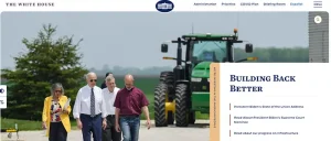
The White House website is easy to navigate and visually appealing. A single-column layout breaks down information into manageable chunks. Visitors can easily view the content on a variety of devices, such as smartphones, tablets, and huge desktop monitors.
The official portal of California's DMV (Department of Motor Vehicles) controls the state's use and sale of automobiles. It provides a wide range of online services, such as driver's licenses, vehicle registrations, and identification cards for the general public. It also provides online tools for driver education, safety guidelines, studies and reports, and DMV offices.

In addition to clear text, visuals, and user interaction signals, the California DMV portal is well-rounded. However, it does so in a very well-balanced manner. It's noticeable when visitors join the digital transaction procedure because of how clean the interface is.
The United Kingdom's government website, gov.uk, serves as a single repository of information for all of the country's agencies and public bodies. The public can access government services and information, as well as news, communication, statistics, and consultations, through the website.
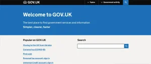
This website has a lot going for it, from its fast loading times to its well-organized services and material, to its consistency in communication, but most significantly, its focus on user experience.
State.gov is the official website of The Department of the United States. Among its various responsibilities are the prevention and elimination of international terrorism, the defense of American interests, and the implementation of foreign policy goals.
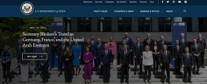
The website serves as a gateway to a wealth of information for a diverse range of users, including international tourists, visa applicants, students, and employers, state.gov is also aesthetically pleasing.
Typography, layout, and color from graphic design are combined with interactive aspects and responsive design from the Web to create this hybrid design. As a result, this is one of the best government websites design in terms of visual appeal.
As part of the California Department of Water Resources and California Water Agencies, the Save Our Water website serves as a portal for a state-wide water conservation program called Save Our Water. Using drought and climate change information and tools, the website aims to spread the word about the importance of conserving water in California.
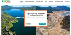
The Save Our Water website uses less mechanical and stiff shapes, colours, and text in favour of more humanistic and organic designs. The campaign's fundamental message is conveyed through the usage of these visual design elements.
Utah.gov is an outstanding example of the best designed government website with respect to UI and UX design. This website exceeds the expectations of normal look and usability as its home page excellently represents the grace of the state of Utah.
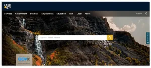
What makes this government website stand out from the rest is-
Brilliant use of high-quality photographs of the state of Utah in the background, eye-catching website design where all the elements and photographs merge perfectly, menus and different sections of the website are easy to locate and browse.
The National Oceanic and Atmospheric Administration website holds a world-class federal government website design providing high-level functionality and uniformity. The menus provided are compact, leaving ample space for related photographs and relevant information.
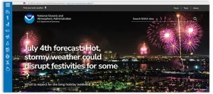
This government website also makes use of branding services, iconography, and color theory to meet the purpose and motif of the website.
What makes this government website stand out from the rest is -
Simple, easy-to-operate, and well-ordered UI, responsive web design, on-brand color scheme, and usage of iconography.
The Internal Revenue Service website is a prominent example of how the best federal government website should look like. The government web design agency is accountable for this website exactly knowing what it is designing, illustrating professionalism and polished design at its prime.
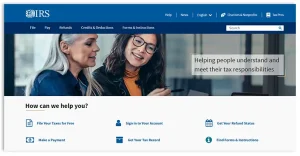
What makes this government website stand out from the rest is -
Polished features along with professional design; this is a very useful and easy-to-operate government website; the conventional blue, Gray, and white colors are used, which suits the official motif of the site.
The State of Mississippi Government website is indeed one of the leading government websites with respect to UX and UI. Its polished and most relevant design, easily attainable chatbot, and search box are benevolent.
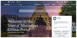
The visitors can easily traverse to whatever section or information they’re looking for. So, what makes this government website stand out from the rest is - an eminent search box as well as a chat box for effortless navigation, appreciative usage of blue hues and dazzling colors, and excellent background photographs.
The United States Postal Service website is identified as a world-class federal government website due to its intelligent use of color and graphics. This website itself consists of an aesthetically pleasing website design for government with blocks, buttons, icons, illustrations, etc., that breathe life into the website.
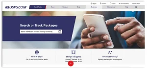
What makes this government website stand out is that current and modern graphics are featured in its website design and graphics, brave use of tone colours together with conventional blues and greys. The user interface and user experience are well-optimized to make sure to offer easy and effortless navigation to the desired services and information.
Colorado, one of the best government website design companies, has gone above and beyond designing a government website that focuses on what Colorado City has to make available through Silverthorne!
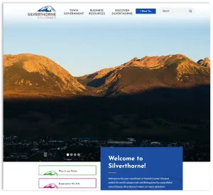
It is one of the most prominent government website designs with respect to the user interface as well as user experience, making it easy for visitors to find information about local activities.
What makes this government website stand out from the rest is that it highlights scenery and citywide activities, making it unique. Smart usage of buttons, calendars, and blogs to guide visitors excellently. Visually appealing usage of bright colors and graphics.
The National Aeronautics and Space Administration and its logo are prominently displayed in pop culture, appearing on T-shirts and caps. No doubt, the federal government agency does have a few of the very well-known branding around. It is an excellent government website because it accurately captures the identity of NASA.
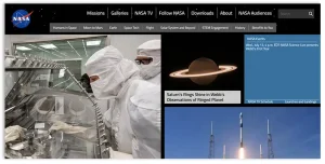
What makes this government website stand out from the rest is - easily recognizable colors and backgrounds that suit the logo and brand of NASA. Attention-grabbing placement of fascinating space photographs, with a seamless navigation process.
This website is a by-product involved in engaging scientists and inventors on the earth. Aside from the colours and illustrations, the government web design company tried to use iconography to create an impact with the help of distinct groups.
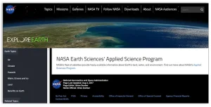
What makes this government website stand out from the rest is - the creative use of personalized iconography and the unique choice of colors that fascinates younger and present-day audiences. Valuable information is easily accessible to the public.
The Kansas City, Missouri Government website is most prominent with respect to the user experience and user interface. Current news also features on its landing page, optimizing user engagement.
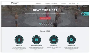
What makes this government website stand out from the rest is the clever utilization of buttons and up-to-date website content relevant to presenting hot topics interesting use of turquoise blue rather than conventional blue hues.
It is the most striking local website design for government example because it is a well-planned website that features hints of teal besides a matching flash of yellow. The City of San Jose government website is visually appealing in itself, coherently improving from top to bottom.
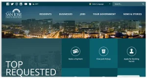
What makes this government website stand out from the rest is -
Excellent use of green-blue basic colors, monochromatic colors, and flash of yellow accents. Restricted use of white as a background color helps in reducing visual fatigue. It is a close-knit government website design from top to bottom.
This Police Department Texas website is another one of the most outstanding examples of the best designed government websites, with respect to user interface and user experience. This website is not only optimized for usage, but also its mobile-friendly web design company is accountable for designing highly compelling mobile usage.
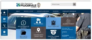
More like well-known web applications and mobile applications, it looks great on different types of devices and not just desktop screens.
What makes this government website stand out from the rest is -
Adapts well to any type of device, and has an interesting use of buttons and menus, can easily link to social media platform pages of the police station.
One of the most outstanding federal government web designs with respect to aesthetic appeal is - The U.S. Navy Government website! A bold photograph of a U.S. Navy Zumwalt-class destroyer converts the website design from practical to breath-taking.
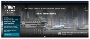
What makes this government website stand out from the rest is -
Bold use of suitable background photographs and clearly noticeable links to different social media platforms and pages. Highly polished and easy-to-operate website layout.
Even though government websites provide information and deliver services to the citizens, they could also market different programs and initiatives, similar to the Clean Drive California website.

This highly polished and influential website is one of the best government website designs for simplifying change.
What makes this government website stand out from the rest is - this website is completely dedicated to marketing the Clean Drive initiative and incentives. Excellent and visually appealing usage of iconography, graphics, color, etc.
When it comes to best government website designs, the United States Department of Agriculture website absolutely sticks out because of its prominent utilization of colors. This website draws inspiration from various things like food, nature, agriculture, and everything this website is related to and represents precisely. This results in a refreshing feeling instead of being irrelevant.
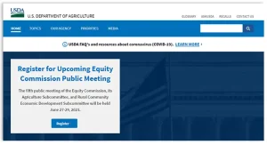
What makes this government website stand out from the rest is -
Bold use of bright colors, which draws inspiration from nature, produce, and agriculture, and the excellent utilization of buttons, iconography, bright colors, etc. The website design flow is seamless from top to bottom.
The New York State Government website is truly an astonishing government website with respect to user interface and user experience design. Accessing or finding information related to desired topics is convenient and easy.
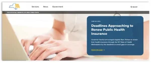
What makes this government website stand out from the rest is - the prominent use of corresponding blue and yellow hues, strikingly showcasing the existing initiatives and crucial services related to citizens, simple website layout is easy to operate and always available.
Excellent usage of videography and animation on sites are the latest website development trends. The City of West Hollywood government site is no exception! It showcases the aforementioned kind of media. Its homepage showcases a timespan of a city when the night-time begins.
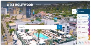
You could see a bold use of videography that transports website visitors to West Hollywood.
Suitable usage of dusky hues matching the sunset and the minimalistic web design that is easy to operate.
This website is an example of one of the best designed government websites with respect to layout. It clearly features all the elements and is not cluttered, which is why it is easy to operate.

Every section of the website or button on the website has been precisely placed, with relevant images or icons and smart descriptions.
The State of California Department of Motor Vehicles website is an exceptional local government web design example worth mentioning. This unique and innovative government website makes use of abstract illustrations that attract a younger audience who pursues brand-new design trends.

This website makes use of the latest abstract art, having a very simple and clean web design showcasing opposite colors.
It's understandable why developing government agency websites might be difficult for web designers. However, when it comes to developing a product, it can take a long time and require much research to get started.
The secret to designing top government websites is to keep the exterior simple while maintaining complexity inside. As a government website, it must adhere to all applicable laws and include all the qualities that make it a government website.
There is no need for government websites to be difficult to use. Consistent, responsive, and accessible design is becoming the norm in the private sector, and citizens demand the same degree of service in the public sector. It's up to you, as a government agency, to take advantage of the growing availability of best practices in government web design and to put them into effect.
As a government website design company, we are well-versed in government agencies' difficulties in developing and maintaining user-friendly websites.
Jan Bask Digital Design, one of the best website design companies, has worked on several high-profile government website design and development projects as a trusted local government website design company and advanced system integrator. If you'd want to get started on improving your government agency's website, feel free to get in touch with us. You can also check out our complete website design checklist for the year 2023.
Looking for Government Website Design Company?

A
I never hoped to see such a great piece of information on designing a government website. Nice piece.
A
The examples are really great!
K
I strongly believe that a simple and easy-to-navigate website is the key to keeping users on your website longer.
P
I have had a lot of issues navigating through the state website because of the language options. I think the government website should have multiple language options for all types of users.
O
Nice piece!
V
Thanks for sharing informative article.
R
I never hoped to see such a great piece of information on designing a government website. Nice piece.
T
The examples are really great!
M
I strongly believe that a simple and easy-to-navigate website is the key to keeping users on your website longer.
R
I have had a lot of issues navigating through the state website because of the language options. I think the government website should have multiple language options for all types of users.
O
Nice piece!
K
I never hoped to see such a great piece of information on designing a government website. Nice piece.
A
The examples are really great!
T
I strongly believe that a simple and easy-to-navigate website is the key to keeping users on your website longer.
B
I have had a lot of issues navigating through the state website because of the language options. I think the government website should have multiple language
C
Nice piece!