
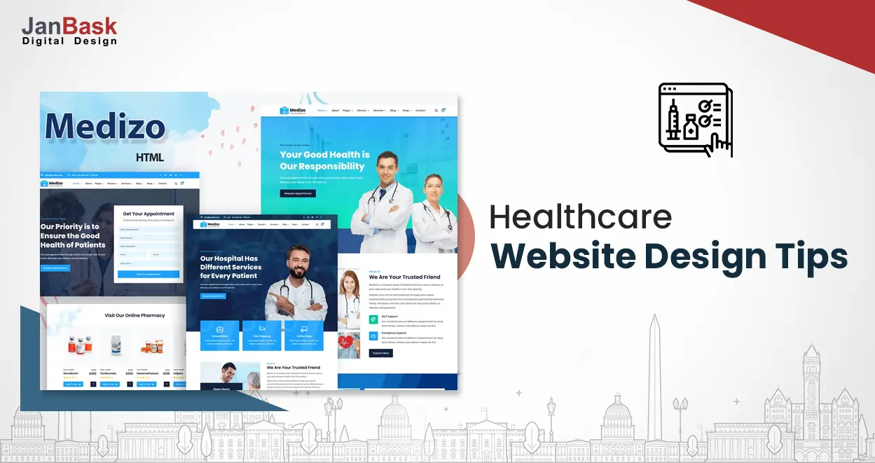
Are you looking for a dynamic and interactive healthcare website design? Are you unsure about the functionality and performance of your current website? We can get you on the right track and design a website that is uniquely catered to your needs and practice.
The healthcare landscape has taken a dramatic leap. And the businesses in the healthcare sector need to be bolstered by high-functional and dynamic medical websites. A website design can say a lot about the type of practice you operate. If it’s well organized, attractive and invites people to get in touch with you, it can be a tremendous boost to both your practice and your reputation. That’s why design should be a high priority when you’re ready to build your own website.
Why?
In today’s digital age, the healthcare industry is at a turning point where it is primed for disruption. Most people still prefer to find the right medical information online. This is why and this is where a well-designed medical website can make a difference. A pediatrician’s office may be painted with brightly colored walls and consist of a built-in play area for toddlers, while a doctor who specializes in cardiac may display framed photos of heart images. Offices are designed to appeal to the practice's population, and healthcare web design is no different.
Without stepping through your doors, patients cannot recognize what is special about your medical practice. With trending medical website design principles along with usability best practices, medical sites can create a niche. They can be a brilliant platform to show prospective patients what your practice has to offer and the level of care they can expect when they come in for a visit.
A patient experience trends report from doctor.com shares that nearly 37% of healthcare consumers are deterred from a medical practice that has an old-fashioned or hard-to-navigate website. Healthcare consumers expect to see fully functional, dynamic and modern website design conventions on every healthcare website they visit, but they also notice what makes one medical practice different from another.
Medical web design is like a virtual lobby – an inviting website that streamlines and facilitates action steps (online appointment scheduling, easy-to-access physician profiles, patient onboarding paperwork, and online bill pay) will make an excellent impression on visitors and also augment the whole patient experience. Such efforts can keep your website at the forefront of design, rank well, and convert better. Keep reading to learn more about some of the key design principles for medical websites.
Picture this if you want to schedule a dentist appointment what is the first thing you will search for? One of the first things you may do is run a quick search for dentists before scheduling an appointment. Many healthcare consumers start their journey by finding providers online. So, it’s straightforward; if you build an online platform that provides accurate medical information, people will value it. As you take steps to revamp your website, you also want to evaluate how well your brand personality is reflected.
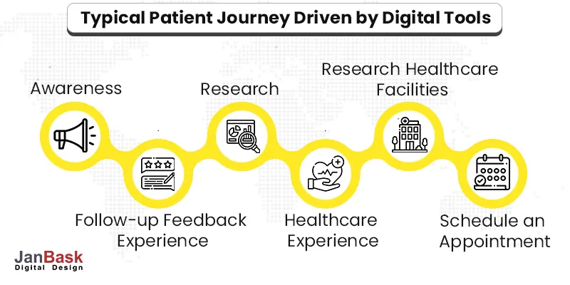
This article will provide you with the ultimate web design guide for healthcare websites. It will help you create a personalized experience that is engaging, easy to use, and meet the needs of your digital-first patients. And as a bonus, we have concluded the article with a handy list of some of the most successful healthcare design trends at the forefront of the medical industry’s digital landscape.
Here’s a peek into some crucial statistics.
Looking for the Impact of Modern Healthcare Website Design?

According to a study, 74% of people are more likely to return to a website if it is optimized for mobile devices. Here’s another statistic highlighting that 85% of adults think that a company’s website should be as good or better than its desktop website when viewed on a mobile device. Responsive web design allows pages to automatically format and function well on a smartphone.

You can apply the (KIS) keep it simple web design principle and choose a minimalist design. Furthermore, you can consider using a CMS that offers automatic mobile responsiveness. A simple design most often contributes to faster load times and happier consumers.
Implement these tips for a mobile-friendly medical website design:
At JanBask, we employ people who have years of experience in creating and developing websites for niches. With us you can be rest assured that your brand personality and core mission come across strongly to the viewers.

Do you employ interactive content to influence the patient’s journey? Are you wondering why you need one?
Well, interactivity can help boost engagement and also achieve your conversion goals. Here are some remarkable stats.
What can you do to make websites interactive?
Interactive forms, clear CTA buttons and patient portals are great ways to make your website interesting and interactive. Such options can help your website to outshine the competition. Our talented team of web developers and designers have the right skills and expertise to make your website highly engaging and interactive. Moreover, your site should provide a patient portal that encourages your patients to take up more active roles while managing their care.
Picture this--consumers devote a lot of time online, and if they can’t find information easily on products and services, it can be an annoying experience. Someone who’s sick and looking for medical assistance will never struggle to find solutions with an unintuitive website.
According to a recent study, 94% of consumers indicate that easy navigation is the most important website feature. If the navigation is easy, then users can immediately find information, saving time and effort.
What’s the solution?
When creating your website, there are certain navigation tools used to create the best possible healthcare web design and our team of experts at JanBask Digital Design know exactly how to do it. Let’s take a look on the following tips:
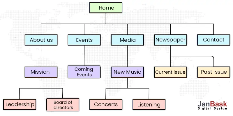
Our team of experts at JanBask have the right skills to represent your practice in a very compassionate way and allow visitors to easily locate the content that's most relevant to their needs.
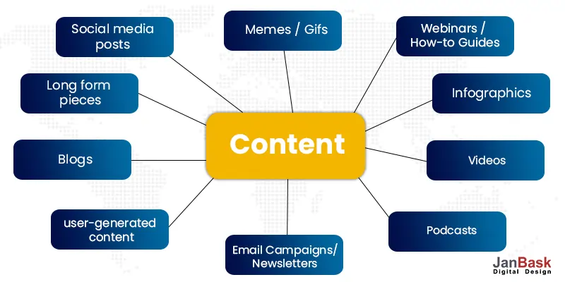
Your website might look exactly as you’d hoped—but that doesn’t mean it’s ready to go live. When you provide valuable content, it can allow patients to take care of their health needs. It will also inspire first-time visitors to click through content on your site and also encourage existing patients to visit often. According to Neil Patel's marketing statistics page, content marketing costs 62% less than traditional marketing and generates about three times as many leads.
Consider sharing valuable content such as the following:
What Can We Do For You?
With a diversified team of subject matter experts and seasoned writers, we can help you to share valuable content through curating regular blog posts, featuring a Q&A page, and adding patient reviews. Testimonials are among the most prominent features that can be added to boost your potential patients’ confidence in your care.
Pictures used aptly can speak a lot more than words. Text-only posts can get monotonous. You can spice up engagement levels with compelling imagery. As a result, a site with visual content will perform better than one without it. In fact, posts that include images produce 50% higher engagement than text-only posts. What this means is that any website with visual content will perform better than one without it.
Let's walk through three key tips for making your visual content looks class apart to your patients and other visitors:
What can we do for you?
There’s an art to choosing the right photos and images for various sections and pages of your healthcare website. At JanBask, we employ both web designers and art directors to select and fine-tune imagery patients can identify with. We take the responsibility to make your web pages look consistent and rich with vibrant photography that helps incite excitement.
When you choose a medical web design, remember that it can define and differentiate you from your competitors. It is best to have a clear brand message that stays with your website visitors. Often, people visiting have very little time to search for in-depth information. So, you must make the most of that short slice of time to reaffirm your brand message.
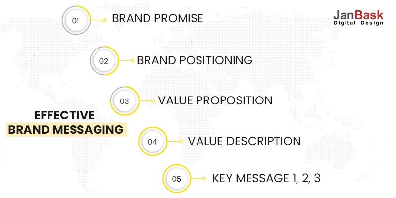
Let's walk through a few key elements for accomplishing clear brand messaging in your medical web design:
What can we do?
At JanBask, we can create and develop web pages that are a perfect combination of vibrant colors with neutral colors that blend in the visuals. Our team can help you to clearly define your brand and position and ensure that all elements are blended together to accurately communicate what your practice stands for and who it serves.
Today’s consumers are cautious. Security settings will warn them when they are about to enter an unsafe site (one not protected with Hypertext Transfer Protocol Secure, or HTTPS).
First and foremost, your website must be HIPPA compliant. Before you can focus on which healthcare website design elements get patients through your doors, you have to ensure the safety of all patients, new and existing. As a medical practice, you have the responsibility to protect any information transmitted to and from your systems over the internet. Clearly communicating that patient data is secure on your website and that the means of transmission is HIPAA-compliant puts your visitors at ease.
At the same time, you have to ensure that your website adheres to web accessibility policies. An accessible medical website design is pertinent to getting in front of more potential patients, especially if you serve individuals with disabilities.
Let's take a look into a few of the key requirements set forth by accessibility guidelines:
How can we help you?
The moment you decide to handover your website work to us, be rest assured that all guidelines and rules will be followed and adhered to. Our team will make sure no stones are left unturned to create and boost your website. Our web designer and developer will go that extra mile for you to push your website ahead of the pack and make it stand head-and-shoulders above your competitors.
Load speed can make or break a website. Today, loading is not just a matter of preference, but it is critical to your medical site’s success. In fact, a 1-second delay can result in a 7% reduction in conversions.
It’s quite simple: the longer a webpage takes to load, the more it will increase the bounce rates. In short, you need to focus on optimizing website speed.
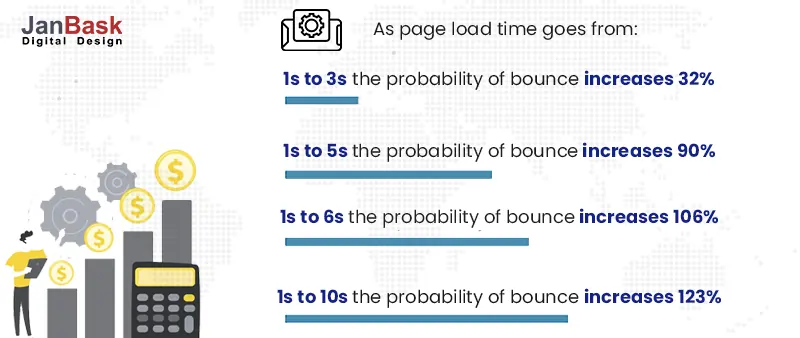
Here’s an attention-grabbing insight. According to a study, pages loading within two seconds show an average bounce rate of 9%, and pages loading in five seconds have bounce rates to the tune of 38%.
To quicken your load time, let's explore a few options that can be easily incorporated into your medical website design:
What can JanBask Digital Design do for you?
Our talented team can optimize your mobile page speeds as much as possible, as it is still the preferred method for browsing. We use tools like Accelerated Mobile Pages (AMP) that allow mobile pages to load much faster.
Plus, we can quickly try limiting and compressing images and reducing the number of redirects by measuring with Google’s free PageSpeed Insights tool. The results highlight potential loading issues and adjust your web pages to minimize load time.
An extensive feature set is critical to the success of your medical site. Here’s a quick peek at some must-have features.
Here are some quick tips for don’ts in website designs.
When it comes to your healthcare website design, patient behavior and expectations should always come first. Sometimes, doctors write or design websites with their own preferences in mind. But always remember: you are not the patient.
Ultimately, as healthcare professionals, you can discover the power of a well-designed medical website that can empower patients with cutting-edge digital initiatives. With the right technology solution provider like JanBask, the medical website designing journey can be very meaningful. We keep your mission care model at heart and improve patient outcomes, quality of care, and boosting ROI. We, at JanBask have helped many healthcare businesses with impressive digital solutions. With ample experience, we know what works for healthcare providers and understand the needs of your practice as well as your patients. Let’s talk for more details.
You can quickly turn your medical website into a useful tool for your healthcare business. All you need to do is strategically use the medical web design principles and stay tuned to changing trends. Hopefully, you can take these medical website design tips and implement them on your website to improve the overall performance and increase new patient leads.
Uncover the Impact of Modern Healthcare Website Design

E
Great read. Thanks for sharing
K
This blog has everything I was looking for. Good one
A
I see a lot of new information in this post. Keep it up
J
Thank you! Stay connected for such insightful blogs.
A
It is worth sparing time to read such nicely curated blogs
J
Thanks for your feedback!