Does anyone you know ever go without looking up medical advice online? Of course, that was meant to be a rhetorical question. The internet has become the first line of defense in times of need.
60% of online users say they've relied on Google for quick answers at some point.
Especially in the medical field, word of mouth was widely regarded as an effective advertising strategy. To attract new patients, doctors and nurses gave exceptional service to their current clientele, who would then hopefully leave positive online reviews.
Although word of mouth used to be an effective marketing strategy, it is much less effective in today's market.
Because of this, those in the healthcare industry can't afford to dismiss the role that digital presence can play, especially when armed with a persuasive landing page. Post-click landing pages are a proven strategy for turning casual browsers into loyal customers.
If your medical practice requires expansion, you must take the initiative to find new patients. Today, healthcare web design services look at the medical field and how post-click landing pages attract new patients and promote consultations.
Want to create Landing Pages for Healthcare Organizations?

You and your potential patients can both benefit from using health landing pages. One could say it's a win for both parties.
People today have a greater understanding of their medical requirements and are also savvy enough with search engines to find the information they seek. They aren't looking for a generic page listing all the services available; rather, they want to find what they're looking for immediately.
Making a landing page for a specific service helps you attract visitors more effectively. In addition, it is easier to track the success of your paid campaigns if each one has its own unique landing page.
Landing pages are the connecting link between interest and taking action.
A medical landing page is the backbone of its conversion strategy. This term is used generically to refer to any page on which a user first lands when navigating a Healthcare website. A Google search might reveal that as the primary landing page.
However, according to the marketing definition, a landing page has only one function. It's a standalone web page designed to serve a specific marketing purpose.
To reiterate, there may be multiple landings, each serving a different purpose. While the exact structure of a landing page may differ, it's useful to think of it as an enlarged call-to-action advertisement. This page can either convince the visitor to continue shopping or register their contact details for future follow-up.
If you are looking for a top-of-the-line, creative, and result-focused medical website design agency, then you have come to the right place!
Landing pages, like any other type of content, require specific elements in order to perform well and, more importantly, convert.
An effective medical landing page will have one primary call to action centered on the page's unique selling proposition (USP). Offer the reader something they won't find elsewhere, something unique and compelling that the competition doesn't provide.
Let's take a look at some guidelines for creating healthcare landing pages that attract visitors and ultimately result in sales.

Both the headline and the subheading should be attention-grabbers.
Readers need to understand how this will benefit them. Describe the benefits they will experience from utilizing these features or how they will be met. Make use of a summary list of bullet points and supporting details.
Make an engaging visual representation of the services that convey information, enhance the narrative or demonstrate the benefit. Even a short video presentation can increase interest and sales when added to healthcare landing pages.

Many people seek reassurance from knowing that others share their views and behaviors. Testimonials, case studies, reviews, comments, and response statistics are good ways to show how other customers have contributed.
Maintain a clean and simple aesthetic for your healthcare landing page. Note the most important details. Anything that doesn't directly contribute to your healthcare landing page's main goal should be removed. User experience (UX) is paramount, and everything you publish must tell a story about your company's mission and goals.
We live in a mobile world, so it's important that when we market our products and services, we do so with mobile users in mind first. These days, you can't afford to let your business die without a mobile-friendly website design. You can satisfy the demands of today's mobile society by adhering to Responsive Web Design (RWD), which is an approach to medical website development that prioritizes compatibility across platforms, devices, and browsers.
Our healthcare website design company is a refined way to increase your visibility in the market. As experts in the best healthcare website design, we provide tailored results for all budgets and needs.
The primacy of directness in first aid. The same principle applies to healthcare landing pages, whose ultimate purpose is to provide information as quickly and accurately as possible. You must ensure that the visitor to your landing page is not lost. Visitors should be able to quickly find the content they're interested in and be led there without any unnecessary detours.
When using your medical landing page, patients should be able to quickly and easily find the information they need to schedule an appointment, make a purchase, or register for a medical-related event. Optimize your healthcare website so that people can take immediate action based on their interests.
If you're in charge of a hospital or clinic, you should make filling out the contact form a breeze.
The inclusion of a contact form or a calendar can enhance the effectiveness of your landing page. Visitors can either leave contact details for you to get in touch with them later or schedule a meeting with you right there on the page. The less hassle a potential patient has to go through, the better.
Avoid creating forms with an excessive number of fields by instead focusing on creating funnels to guide visitors smoothly and directly to the desired destination. Avoid losing them or leading them astray.
The purpose of your landing page's call to action copy is to get people to take the next step, so make sure it stands out. The call-to-action (CTA) must be robust, obvious, and captivating so that the visitor is not left in doubt about what they should do next. The request could be for the recipient to sign up, schedule an appointment, redeem a coupon, register, watch a video, etc.
Your site visitors shouldn't have to dig too deeply to find what they need.
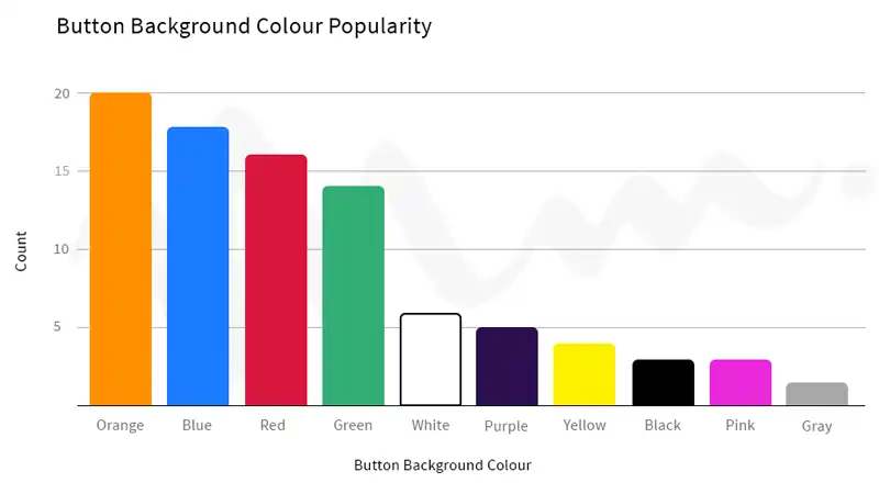
The color of the button's background, in addition to the copy, can help users zero in on the CTA more quickly. The smoother the experience, the happier the guests. Concentration on what matters, with fewer distractions, is facilitated by CTA that is straightforward, well-designed, and easy to understand.
Although you may do some of your healthcare company's marketing online, most patients will visit a physical location for their care. You have a physical location and a method of contact, whether you're a dentist, a general practitioner, an oncologist, or any other kind of medical professional. All of this information should be included on your medical landing page so that visitors don't have to worry about anything.
The best medical website design will lead to better web rankings, more web traffic, and higher conversions. Whether you're a doctor, clinic, hospital, or other healthcare organization, we can build the perfect site for your needs.
Our medical website design company offers medical website design, logo design and branding, strategic planning, web marketing, internet marketing services, and other professional digital solutions.
In order to demonstrate how these recommendations can be put into practice, we will examine some successful healthcare landing pages and provide healthcare web design tips, user experience, and content.

There is nothing flashy or distracting about this medical web design; it's simple, clean, and effective. Initial impressions are crucial, so it's important to use relevant images and maintain a consistent layout. You can directly dial the number by clicking it. Instantaneous scheduling is possible through FaceTime or any other predefined means of communication.
Putting a large image with some sort of animation in the header is a novel way to get people interested in doing something on a landing page. The headline is clear and conveys exactly what compels a reader to scroll further.
In response to clicking the CTA button, visitors will be taken to a page where they can learn all there is to know about the subject of their interest and schedule an appointment.

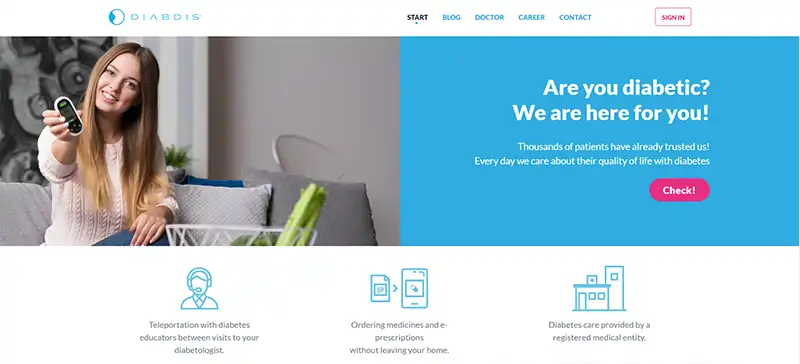
The header section of Diabdis is a model of design and copy relevance to its offerings. The headline copy's advice to "Are you diabetic? We are here for you!" is a straightforward answer for those who have been looking for one. Icons illustrating product advantages are also included in the header, providing site visitors with instant and more precise details about Diabdis's offerings.
The headline is direct and to the point, informing readers that they can obtain adequate medical care for a reasonable price every month.
Free is mentioned in the copy for the CTA button.
To get a free quote, fill out the 2-field form by selecting the appropriate option from the respective drop-down menus and clicking the CTA.

The comparison of prices and services is the stated goal of this page, which is made abundantly clear by the headline. Visitors know exactly what to expect after clicking the CTA because the form only asks for their zip code. A stock photo vibe isn't too strong in this picture. The text defines Obamacare and outlines the steps necessary to enroll your loved ones.
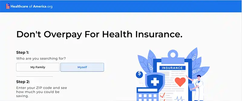
The headline effectively conveys the content of the page to the reader.
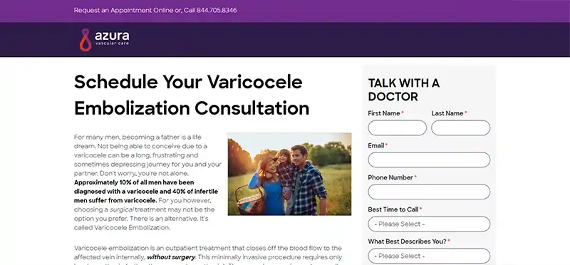
Since male patients are the target audience, it makes sense that these photos were taken during fertility treatments. The color of the CTA button stands out clearly against the background. Information about the prevalence of varicocele and the advantages of consulting with a doctor are highlighted in bold. The form is clear and direct.
The fertility clinic information is associated with Stanford Hospital, and the Stanford Medicine logo reassures site visitors that they have found the right place.
If a visitor has any further questions after reading the information on the page, they can simply click the button and give you a call. Mobile visitors will find this feature especially useful. The text on this page explains what Stanford Fertility Center can do for prospective parents.

No matter if you manage a medical center, sell medical supplies, or host healthcare-related events, the best landing pages serve people and give them what they want. Keep in mind that the information and the means by which it is conveyed should be as straightforward and instantaneous as possible.
A landing page's entire user experience should be geared toward solving the visitor's issue, providing helpful hints, or otherwise satisfying the visitor's needs. A healthcare landing page must be well-thought-out, accurate, and tailored to the needs of the target audience.
After reading this article, you should be able to take what you've learned and apply it to the practice of creating a healthcare landing page. You can talk to our landing page design company to make stunning, effective landing pages for your healthcare business.
Looking for Healthcare Website Design Company?

A
Thanks for giving me an idea on Effective Healthcare Landing Pages.
A
Interesting information.
A
This information is crucial. Creating a landing page dedicated to a particular service allows you to drive traffic more efficiently. If you use landing pages in paid campaigns, having a different page for each campaign helps you monitor their effectiveness better.
J
Thanks Adonis, Glad you found it helpful!
Z
I was looking for Starting a Healthcare Website Design, found the right Away here.
A
I strongly agree with your statement, that a landing page’s entire user experience should be geared toward solving the visitor’s issue, providing helpful hints, or otherwise satisfying the visitor’s needs. A healthcare landing page must be well-thought-out, accurate, and tailored to the needs of the target audience.
J
Thanks Aidan, Glad you found it helpful!
A
My search is completed and I found the useful information I need.
K
I understood that the role of landing pages in healthcare organizations are important.
E
Very interesting and detailed.
F
This article is very helpful for all of us. Some people think that writing Effective Ways to Fundamentals Practice of Medical Landing Pages is easy. But I know how difficult it is to come up with ideas and turn them into meaningful and interesting content.
C
You have the potential to be an amazing writer. I encourage you to keep writing as much as you can, get even better, and show the world what you have to offer. This was a great article with a unique point of Fundamentals Practice of Medical Landing Pages.
K
Your team presented their ideas and thoughts well on the topic of Fundamentals Practice of Medical Landing Pages. I have heard so many times that your team’s article is just Exceptional Magnificent. I’m becoming your biggest fan. Thank you for sharing this excellent article.
R
Your topics are always interesting and educational. We have especially enjoyed the Fundamentals Practice Of Medical Landing Pages programs. My friend shared this article. It was well-written and contained sound, practical advice. I look forward to reading your next informative work. Thank you.
K
I have heard so many times that your team’s article is just mind-blowing. We especially enjoyed the Fundamentals Practice of Medical Landing Pages programs. My friend shared this awesome article. But, after seeing you I realized that writing can be a better option, too.