
Many times you must be wondering why your website has a higher bounce rate even though the website looks perfect to you. Ask yourself, does the website really has an appealing homepage design and is user-friendly? In this write-up, we will discuss and analyze what exactly your homepage lacks and how to reconstruct the page. “Homepage” is one of the most important landing pages of a website that showcases the real goal and branding of a business. It gives a clear message to its target audience.
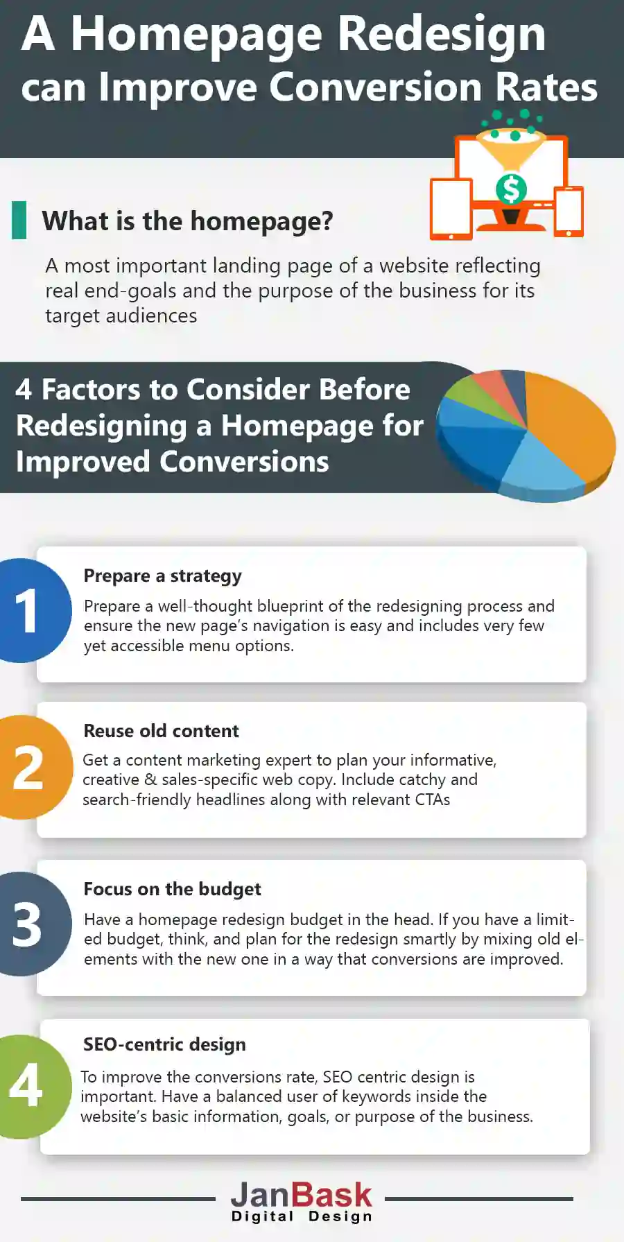
It is not very easy to reconstruct a page without a proper plan because your page might need to be upgraded but some of your existing customers are still familiar with the current page. So, first, you need to prepare a blueprint for the redesigning process, it should be done carefully because your main purpose is to generate new leads, visitors, and customers.
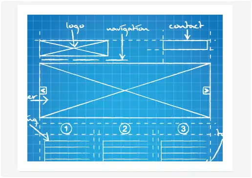
Your homepage is the threshold for the visitors and the focal point of all your business deals and subscription. The navigation should be very easy with few menu items and the main page should be one click away for the users. To attain this goal a well- thought blueprint should be in place.
When you are all set to start reconstructing your homepage, the first question that comes up is whether to use the current content or re-frame the entire content. To begin this task you need to work on content strategy and mind it, it’s not an easy task. You need an expert in content strategy where less is more with the clear objective of selling your products and services to the user without letting him know.
To improve your homepage content, try to focus on the trust-building factor as your brand-building tactic. So, you can use some of your old content which proves to be successful in bringing visitors to your website. The other thing you need to do is edit and restructure your entire home page content.
Catchy Headlines: Your main landing page must have a very unique and reader-friendly headline so that it should match the user’s prime search option. The benefit of having an effective headline is that he will click on other pages and reach CTA. This is how JanBask digital design showcase what they exactly do and what the user wants they carry that service.

Effective Call-to-Action: You should provide your visitors with the right way of taking an action or responding to the request. Some catchy phrases like Subscribe now, Try for free, or Shop now is very responsive from the visitor's point of view. CTA should not be confusing and navigation should be perfectly connected to the customer's needs.

For this purpose, you can get your content strategist and content writers to churn out the best and worst part of your webpage. It should be creative, informative as well as sales-specific content with crisp writing.
Now when you are all set up to reexamine your home page or prime page, it’s time to think about the expenditure part. As a company, you must have a budget allocation for remodeling, but if you are a small business this job might turn expensive. For this, plan your budget so that it is not going to affect your savings. Less is more, under these circumstances get your all resources to work in a specific way which not become a burden but an enjoyable creative task for the team.

You can get used to your old page content and can mix and match some images but the motto is “renew”, so make this happen in a smarter way by taking design, image, and content into consideration.
When we talk about a higher conversion rate, SEO is the best practice to be used wisely. Why wisely!! Because keyword stuffing is not preferred when Google analytics takes the organic search in mind. For this aspect, your content should have a balanced equation of preferred keywords and an increased conversion rate scenario.
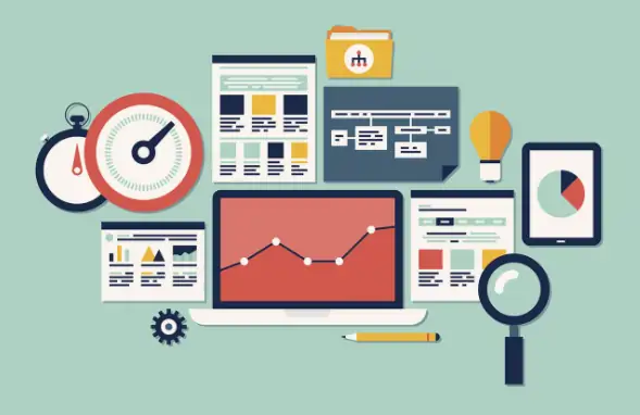
Many times a website's home page lacks the basic information, goal, and purpose of the business. The audience feels deprived of useful details about a product or service when we try to overuse the optimization process.
To conclude, this write-up always keeps in mind to design your home page flawless and update to the present consumer need. Redesigning is a very tough job because it needs resources to brainstorm the best page out of a failed one.
Keeping these above points into consideration will definitely help you to achieve the goal of a perfect homepage. However, strategy and budget are the two factors that are pivotal for the redesigning process.

Leave a Reply