
Each of us has experienced the agony of filling out many forms, which we ultimately gave up on due to their complexity. A sign up form might be straightforward or intricate. Forms must either be created by you or filled out by you. There is no way to prevent them, whether it is through media platforms, SaaS, or eCommerce. They are a component of our daily digital lives and website design services know it better!
Because customers are accustomed to completing sign up forms, even little errors in the layout or the details you want can have a significant impact on your conversion rates. Web designing services can provide a helping hand in designing them the right way!
However, before seeking professional web design service guidance, it is important to understand certain aspects:
Looking for the Best Web Design Company?

To access particular information or sign up for a service, visitors must complete a sign up form, which might be a webpage, survey, document, or popup.
Sign up forms can serve a variety of functions. Still, they often have one common objective: gathering personal consumer data from users in exchange for premium content or services.
For several websites, sign-up forms serve as the gateway to all subsequent conversions, which is what most web design services will inform you. This is especially true for models that are freemium or subscription-based.
Because completing these forms is a requirement before making a purchase, therefore, eCommerce websites rely on them.
Website design services knows that conversions occur on signup forms. In other terms, sign up forms encourage economic growth. You can also refer to a guide on how to increase the conversion rate for small business websites.
Web designing services understand that forms are how businesses interact directly with potential clients in the digital age. They gather emails, basic user data, and leads, and distribute content as part of their initial encounters.
Forms, in essence, are at the heart of many digital experiences:
Knowing this, it should be no surprise that ignoring paperwork is bad for any firm. In reality, even a single error can quickly cost large corporations millions in lost profits per website designing services.
For instance, a travel firm discovered that, as evaluated by analytics after correction, adding one extra line in their registration form was expensive and cost almost 12M$ per year.
It takes time to figure out what's wrong with a form, and only a professional web design service can design the right sign up form and its process. Your web design services must do A/B tests on your signup forms to determine the most appealing to your users.
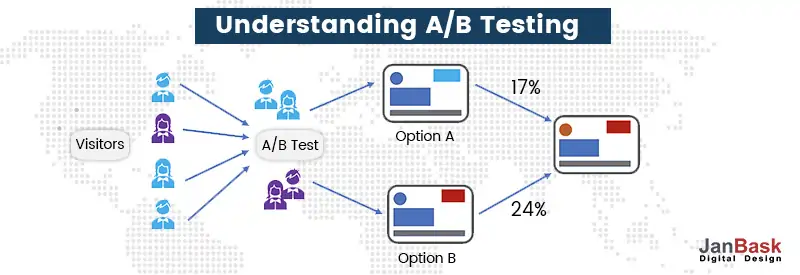
You can use an A/B testing tool to swiftly test different sections of your website or aspects of your sign-up form. Your web design services can easily suggest the right solution, monitor your ROI dashboard for insights, and start improving your conversion rates.
One of the most important digital marketing strategies is to acquire new customers, and if you’ve started a new marketing campaign but not getting enough leads or conversions. Creating sign forms will help you collect them.
The sign up form best practices will help you grow your contact list legitimately and drive more traffic to your website. So let’s first look at the main types of sign up forms.
One should not ignore emails since they’re excellent touchpoints. These types of sign up forms are aimed at generating email addresses to improve your email list and create potential leads.
By designing a simple sign up form and by providing some valuable information through your email content, you can encourage your potential customers to participate in short and crisp information exchange.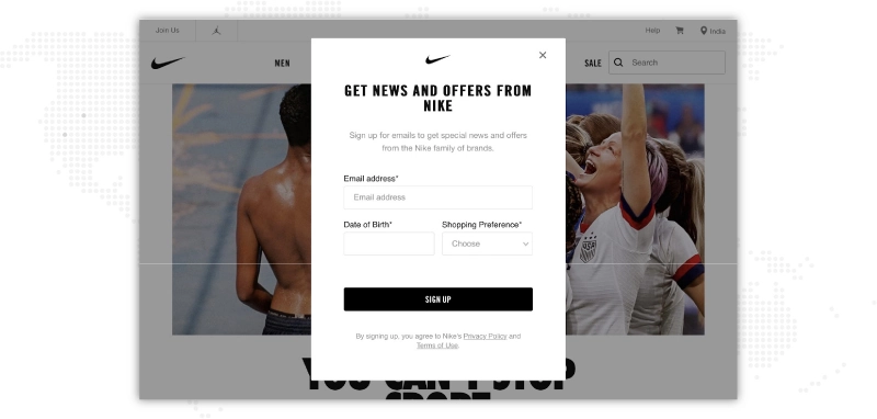
These types of forms are important for eCommerce websites since they’re the last hurdle before any product is purchased. Here’s an example sign up form.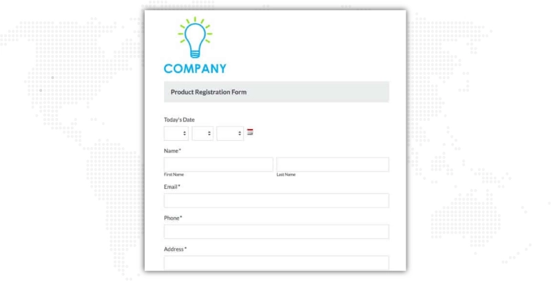 It's a best practice to show the actual product, very clearly, when designing a product sign up form and also showcases the security features to provide peace of mind to your customers. It's also a best practice to reduce the eCommerce product forms to the bare minimum in order to reduce the shopping cart abandonment rate.
At times, delivery and payment options could be isolated to improve the efficiency of the checkout process.
For any subscription-related online business, subscription sign up forms are an integral part, since it is where the conversions take place. But having said that, it's not always easy to convert any visitor into a paying customer. Here’s an example sign up form.
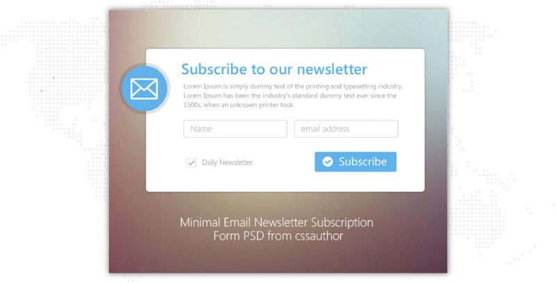
Often, SaaS and subscription-related digital companies require time to make their potential customers aware of it, which is why subscription sign up forms are important. For these types of forms, it's always crucial to remember the major information you’re searching for and offer value by providing a demo or free trial.
These types of sign up forms differ from subscription sign up forms as they don’t always bind the user via a subscription. The service sing up forms are mostly aimed at converting the most number of visitors into customers. For that to accomplish, another important tool that can be used is a social media sign up method.
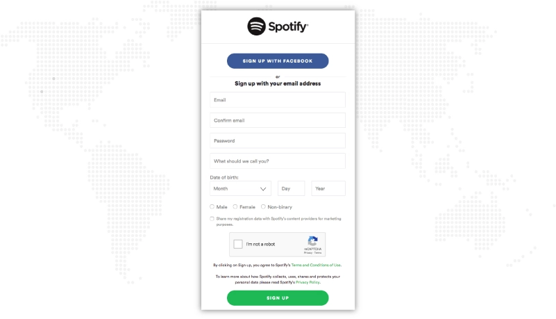
Providing visitors with a quick alternative solution to register using social media can help in multiplying conversion rates.
The purpose of any sign up form is to present an opportunity to the website visitors to choose to communicate with you or learn more about your business. A good signup page design makes this process of opting in simple and straightforward, increasing the number of conversions. But what exactly makes the best sign up forms?
The following sign up form best practices will help you create signup form that takes you closer to your desired outcome: more leads.
So, without further ado, let’s get started!
Even if utilizing a JavaScript lightbox can lead to more sign ups, check to make sure it doesn't collapse by tapping on the gray section around the form. You can check out sign up form examples to get a better idea.
Use a "Close" button instead to ensure that the individual only shuts the lightbox on purpose. If a reader unintentionally clicks away from the form, you don't want to abandon them. Website design services believe it's a minor design adjustment that could significantly impact.
The best sign up form example is easier to fill out if your labels are positioned above the fields. By keeping the viewer's eyes traveling from left to right to seek and navigate your form, this design method helps you make the signing up process for a service as easy as possible for users.
If you don't have much vertical room, website design services can align the labels to the right but arrange them to the left. This sign-up form design is visually pleasing, and the simplicity draws the user in without wasting too much time.
Users frequently fill out a whole form improperly by accident, submit it, and then realize they committed several errors.
The best sign-up forms inform the user that a field is wrongly filled out as they proceed through the form rather than forcing them to go through this additional step. Your web designing services will recommend that you don't let them submit it before all of the sections have been filled in correctly.

This essentially boils down to user experience design and ensures the audience's registration procedure is quick and simple. They won't likely fill out the sign form again if they have to fill it out from scratch.
Microcopy is a series of succinct, impactful sentences that address key queries that consumers may have when they fill out your form.
These include queries like "Will I get several emails if I register for this?"
Use microcopy,is less prominent content that quickly responds to the user's most pressing questions, to do so. Any hesitation someone might have that keeps them from signing up can be reduced by responding to these questions.
Choose a sign up form design where users can feel more at ease while they fill in details if you provide full disclosure and keep their concerns at bay.
A professional web design service will utilize a CTA that explains what they'll be gaining from the signup form being sent in instead of the standard "submit" or "send" commands.
Perhaps use the CTA "Join the Discussion" if you want them to be able to start posting comments on your forum.

This can give your signup form design a personalized touch, and it can be useful if you have a range of website signup forms displayed to your audience across your website.
Make sure users understand exactly what they will receive after completing your sign up form.
This aligns with microcopy and provides every piece of information a user needs.
What is your aim to create a signup form?
Do people join up for a monthly or weekly subscription? How long will they be participating in the trial?
Small elements that to you may appear self-explanatory must be explained in detail for the readers. Although the vague language may be brief, your web design services will make it understandable to the reader to avoid confusion or irritation in the future.
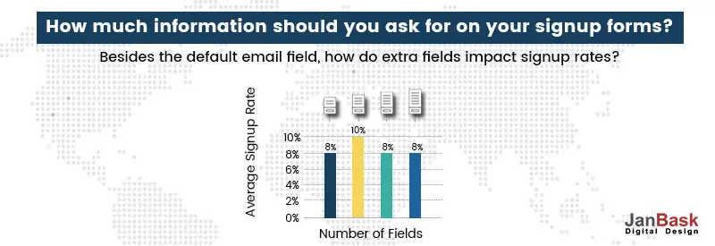
Although it might seem simple, the objective is to reduce not just the number of questions in your form but also the size of the page it is on, which is important. You can check out small signup form examples for a better understanding.

The completion rates may increase if you relocate some stuff to the side or display some of it when the user hovers over it. Make sure that the sign up form design does not block your readers' whole visit by making them scroll down the page; the sign up form design should be a brief halt on their path through your page.
Conversion rates may increase if other well-known businesses or people already utilize the service or if you can provide significant statistics to persuade others to sign up.
It might influence readers' decisions if they know they aren't alone and that many other people already value being a part of your community.
When classified information is being submitted through the best signup forms, using security badges from companies like McAfee can be helpful. Your website design services can provide credentials that can be useful in this area.
Everybody should be worried about their digital security, and giving your users that confidence and encouraging them to sign up is one of the sign up form best practices. Simultaneously, your website design services assure their enduring brand loyalty.
On large websites, introducing Facebook integration is found to boost sign up rates by up to 200%. If it relates to you, try it out, and create a signup form with a Facebook sign up. It can serve as a life raft when consumers are asked for information.
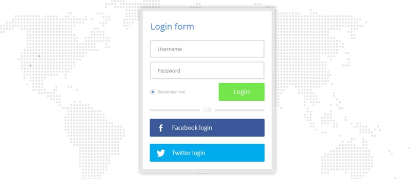
Instead of having them fill out identical information on your website signup forms, you may acquire it from their profile. This little change helps the audience sign up forms as quickly and easily as possible.
When a prospective lead is completing a sign up form, you wish to present them with a simple and end-to-end UX, and it can be achieved by using a single-column sign up form. 2 columns sign up form might distract readers or might make leads to misunderstand fields. Here’s a signup page design example.
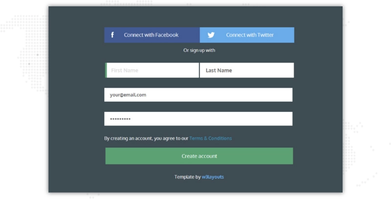
You must add more than one field on one line when the questions are closely related and it makes sense for your users to fill them after one another. For instance, you can place first and last name fields next to each other.
Have you ever filled out a sign up form and been asked to fill a specific field twice? Like password? No doubt it helps to assure security and accuracy on the sign up forms, but asking your users for similar information twice is not recommended, especially because other options can make the entire process tiring.
For instance, you could unmask passwords so your leads can double-check what they’ve entered before clicking submit button.
Sign up forms must fulfill a major purpose, i.e. to generate leads! In other words, removing distractions such as ads, additional wording, images or videos, etc., consider using a pop-up, separate landing page design, or a clean space on the website to make your leads focus on the task in hand -i.e. - to complete the form.
If you’re providing a free trial or a discount on a first-time purchase, weekly newsletter, or vital business-related information regarding new products or services, you must clarify the value of signing up on or around the signing form.
It’ll make your users enthusiastic about it and allure them to fill out all the fields.
CAPTCHA’s are tests that ask users to enter a code or recognize images in a photo before submitting a sign up form. They aim to identify bots and minimize SPAM. Also, completing a CAPTCHA could also be tricky, require time, and mostly frustrate users. Here’s a signup form design example which requires CAPTCHA.
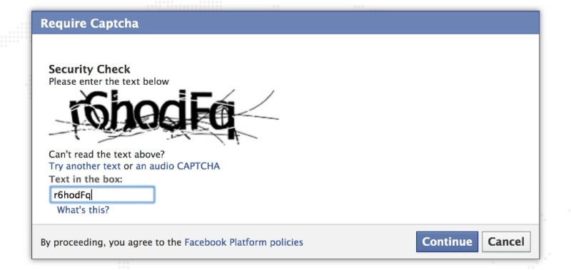
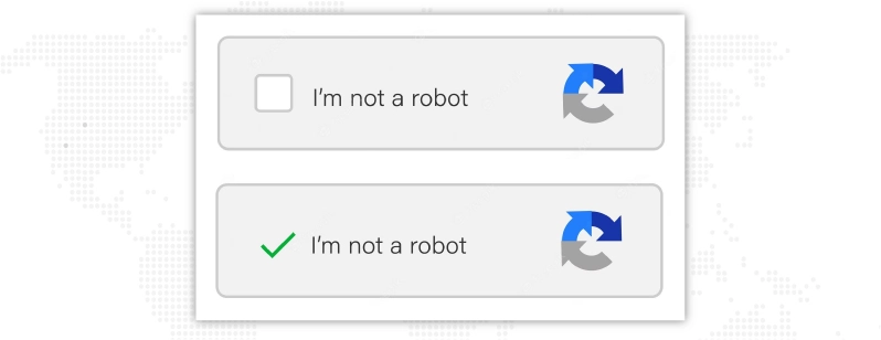
Also remember that they’re less useful than they once used to be as computers have evolved into imitating humans. If you’re stressed about SPAM, you can use reCAPTCHA, which lets your users to just check a box that states, “I’m not a robot” and continue with your work.
The competition is increasing as quickly as the conversion potential for all sectors. Online shoppers are inundated with options, often many good ones.
You require a very user-friendly and optimized landing page design to attract online visitors to your website. Obtain a sample sign up form from website design agency provided by JanBask Digital Design right away to start learning what makes your website visitors into subscribers.

Looking to Create a Sign-up Form for your Website?
How Can You Create A Sign-Up Page?
Use a benefit-focused headline, make all of your forms essential, ask for the information in steps whether it is absolutely necessary, think about utilizing a modal window, allow social autofill, and get rid of the placeholder text. Finally, seek a specialist in website signup forms who can help you with the procedure.
What Is The Purpose Of A Sign-Up Form?
Signup forms are found on web pages in form of popups, or modals, where users enter the information necessary to use a website's services. The website's features and operation will determine the kind of information that is collected. Email address, name, login, and password requirements are common on registration forms.
What Are Qualities Of A Good Sign-Up Form?
Your sign-up form ought to be simple to read and understand. Use simple fields instead of ones that annoy consumers. Don't wait till a user has made a mistake to instruct them; instruct them as they fill out the form. So people know what to do, post clear directions close to the field. To make your task convenient, hire a web developer.
R
I never knew Sign up forms had these varieties.
A
Thanks for sharing this information.
T
All these details helped me improve my page.
C
I am glad to meet your experts.
J
You are always welcome, Clayton.
F
You have a skilled and well behaved team.
Z
Great work folk! Keep sharing your expertise.
B
I never knew Sign up forms had these varieties.
S
Thanks for sharing this information about sign up form examples.
P
All these details about the sample sign up form helped me improve my page.
L
I am glad to meet your experts.
J
You have a skilled and well behaved team.
C
Great work folk! Very informative write-up on signup form examples! Keep sharing your expertise.