![9 B2B vs B2C Differences Nobody Explained You [2022]](https://www.janbaskdigitaldesign.com/blogs/wp-content/uploads/2022/01/Differences-Between-B2B-And-B2C-Marketing--300x159.webp)
You'll be amazed at the numbers when you examine your website's analytics. There appears to be a lot of traffic and visits.
But there's one thing that's always perplexed you. They don't translate into sales. Having said that, what might be the problem?
A small business's website is one of the most critical points of interaction with its clients. Customers should be able to purchase from your small business e-commerce site, sign up, or make a purchase. Therefore, regardless of the goal of your small business, conversion rate optimization is absolutely necessary.
You must engage and persuade people in order to get them to buy from you. But, ultimately, it all boils down to understanding human nature at its most fundamental level.
We did some research on website tactics that can help you in improving the conversion rate of your small business website. So let's get started on this game-changing conversation for business.
Before we jump on to how to improve the conversion rate of your small business website, let’s understand conversions first.
Looking to Optimize your Small Business Website For Conversion?

A conversion is the completion of an action by a website visitor that results in financial gain for the website owner and is prompted by a call to action (CTA) message. Your page's copy, design, and usability elements must all work harmoniously to convince visitors to take the desired action.
When a person who receives marketing material takes the desired action, we say that they have made a Conversion. Despite its prominence, conversion is not synonymous with revenue in the marketing funnel. Conversions can occur before a sale is made, and they show that a prospect has progressed down the sales funnel.
To further understand conversions, let's look at an analogy. It is imperative that a consumer will perform a specific action as soon as they step foot on your website. In the most obvious way, customers can buy your items and services.
Alternatively, they can sign up for newsletters, events, and a slew of other things. This is called a macro conversion. Consider this a necessary initial step in the conversion process. It is possible that the buyer will buy the merchandise if he enjoys the demonstration.
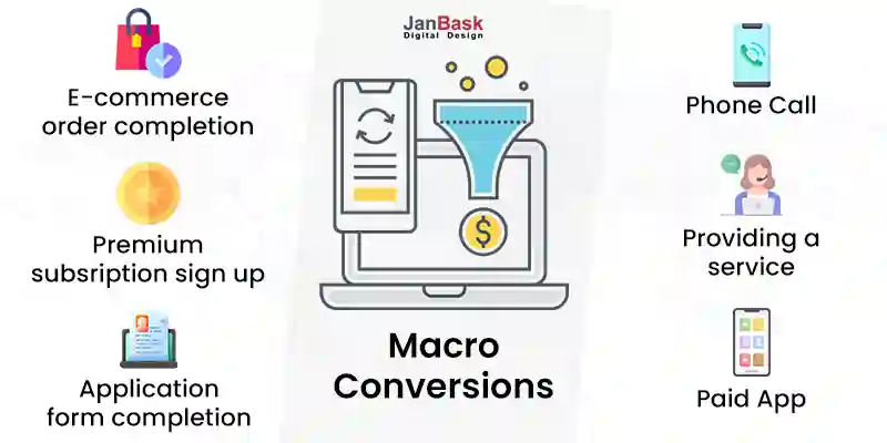
Getting people to come to your website is really important. However, if you don't get macro or complete conversions, your efforts will go in vain. There will be no return on your investment if you don't fix the problem.
Take the essential steps on your small business website conversion optimization strategy, and you'll go a long way.
Increasing the revenue generated by your website is easier when you have a high small business website conversion rate. For small firms that have high-converting websites, digital marketing and branding initiatives pay off more frequently. However, if you don't have the correct methods in place, a website won't instantly convert.
Here are 14 ways how to optimize your small business website for conversion.
Don't tinker with your website until you know what's wrong with it. The information you seek can be found through a website audit. Consider hiring a small business web design company as an investment.
Factors that will be examined include:
We stress the need to enlist the small business website design services of a professional. It will be a waste of time if you don't know what to look for.
By ignoring the fundamentals, you may be losing out on conversions. A website's visitors will leave if the pages take too long to load.
Performing regular checks and measurements must become standard procedure. It will give you access to a wealth of useful information.
There's a good chance that you're communicating with the wrong users. Before launching, how much time did you invest in learning about your target audience? Was there any data-based information that aided your decision-making process?
Web design trends that the web designer shared with you are certain to pique your attention. So, you went all out with the implementation. As a result, you now have a website that looks like it was designed in the present day.
It's safe to say that the designer didn't get it wrong. There are a lot of people coming to your site. In the end, however, they leave.
Creating a buyer persona is an important first step. Focus on the end customer, but don't neglect those who may play a part in the purchasing process
It's also important to know who your visitors are. Some are simply looking about. Macro conversions have the best chance of success when using such potential. In other words, this particular crowd requires a small shove in the right direction to win over.
The second category is those people who are willing to buy. They've done their homework, found a product they like, and are ready to buy.
It's possible that you've visited a number of e-commerce websites. Unfortunately, some of them can be a real pain to work with. Trying to find what you're looking for might be time-consuming. It's like trying to get water out of a stone. The more distractions there are on the page, the worse it gets.
It could be possible that ads and pop-ups only add to the commotion.
Despite your best efforts, nothing seems to improve. Instead, an exam-like experience awaits you at the checkout line. The site's creators appear to have spent a significant amount of time coming up with voluminous forms. You're even left wondering why some of the data is necessary.
Ask yourself one important question if you're an eCommerce business owner. How easy is it for customers to navigate your site?
Put yourself in the shoes of a consumer and see how it goes. It's time to go back to the drawing board if the consumer experience is tedious or unpleasant in any way.
Here's a thought. A sales funnel should be built. You'll gain a better understanding of the path taken by a potential customer this way. It's possible that you won't get a response if you try to get someone who is just browsing to sign up. But, now that they're aware, they're ready to buy.
At this point, you can pique their curiosity with demos, product details, and the likes. Trust, loyalty and better connections are all enhanced when customers are allowed to move through the funnel at their own pace.
And, if you can afford it, make use of the latest technologies. For example, the use of AI chatbots for customer care is excellent. Visitors to the site can expect prompt responses to any questions or issues they might have. The bots can also make product recommendations to make the buying experience more personalized.
Products are bought by those who have faith in what you are selling. However, trust is difficult to establish and may take time. That's why people turn to friends and family for advice before trying a new product or service.
Before making a purchase, they'll check out other people's experiences and testimonials. It makes things a step further. Site visitors expect to see security badges when they visit your page. It's amazing how often you've abandoned a website because it warns you that the connection isn't safe.
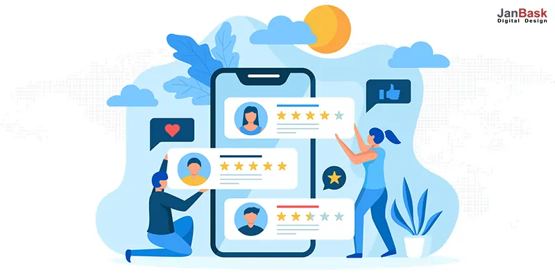
On e-commerce platforms, customers divulge a great deal of personal information. To them, it's vital that you're doing everything in your power to keep it safe. Therefore, using social proof to boost conversions on a website is essential.
A call-to-action( CTA), is essential if you want to increase your website's conversion rate. CTAs, as the name suggests, are designed to entice a user to perform a specific action.
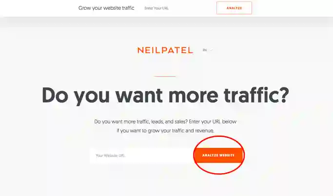
Do you know why it works so well? You provide the visitor the power to make decisions. They have the choice to act or not.
Now it's time to toy with the psychology of the web visitor. Persuade the buyer to click on the link you've provided. Here's something that a lot of people might not be aware of. You'll lose sales if you use the wrong words or phrases.
The first rule is never to make a demand on a visitor. As a result, words like sign up, download, or submit are out of the question. However, it is important to note that these are common words that can be found on a variety of websites.
Second, you lose the ability to tailor your experience. "Send me the details right away," rather than "Download Now," is a better CTA. Use 'I want to know more' instead of 'Click for more information.'
The following steps should be followed while creating a call to action:
CTAs have a fascinating psychological underpinning. Let's take a look at a few Call to action button examples that can give your website a new life. Improved small business website conversion can be achieved simply by following our advice.
Isn't it frustrating when a book you've read leaves you with more questions than it answers? The language is excessively specialized and lacks meaning. It's as if someone was attempting to brag about how well they write English.
It's time to simplify the conversation. Make an effort to be as concise as possible while still conveying as much information as possible.
Make sure to keep your online audience in mind. They will move on if something is unclear or difficult to understand. Write as if you were having a conversation with a friend.
In the same way, hard-sell language has the same effect. It's as if someone's got a pistol to your head and is pressuring you to buy something right now. Instead of emphasizing disadvantages, stress the worth of your material.
Make sure you have a distinct selling point. One that sets you apart from your competition. Forget about promoting the benefits of the product. Instead, emphasize the importance of demonstrating the advantages of a solution. This method will allow you to accomplish much more.
Website conversion for your small business website can come in a variety of forms. There should be both hard and soft conversions on a website, such as "subscribe to our newsletter," "like us on Facebook," or "read more here." Customers who are considering your product or service but haven't made up their minds about making a purchase need soft conversions.
Think about:
Ask yourself! Can the user learn more about your products or services, sign up for the newsletter, or follow you on social media through your small business website?
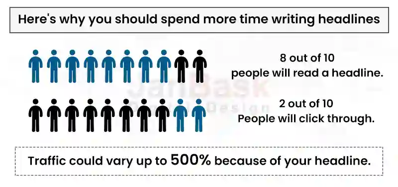
Headlines are critical because they pique the reader's interest and assist them to find their way through the page. This might be done in the form of a major banner with current promotions, product recommendations, a section highlighting the most popular products, and an option to follow us on social media.
As an alternative, a firm's homepage can be divided into sections for online booking, a list of the company's services, and numerous means for the user to contact the company. Although a website can be designed in a variety of ways, having distinct and ultimate home page headlines is essential.
What does it mean to say that something has value? As a small business, you want to convince customers that you're worth their time and money and that they should choose your company over your competition.
When someone arrives at your website, one of the first things they'll notice is your value proposition: the hero image. But unfortunately, clarity trumps inventiveness when it comes to a compelling value proposition.
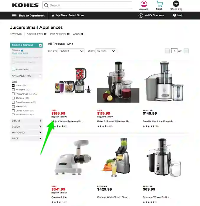
Listing your products in the right places is critical. The most common reason for website visits is to get an overview of a company's products or find specialized information about a product. Therefore, the products should be easy to locate, and the product descriptions should be clear.
An incentive-based website will convert more visitors than a non-incentive-based website.
Campaign-specific incentives, such as "this week's deal" or "holiday sales," are common. Sign up for our newsletter and get our latest eBook for free are examples of incentives.

Incentives are a good way to motivate people. Also, keep in mind that a discount isn't necessary for an incentive to be worthwhile. A newsletter tip can also be helpful.
As a result, one of the most important questions to consider before launching a high-converting small company website is: Are there incentives in place? If not, would it be possible to include one?
Many distinct design components are needed to convey the various aspects of a company to the public via a website. However, it's important to keep things simple and not become bogged down by the various components. Customers will be distracted from the message the website is trying to convey if it is littered with complicated details.
Keep each page dedicated to a single core offer for maximum impact. That means removing the navigation and other extraneous links from landing pages and shopping cart pages.
You can see if there are any roadblocks to conversion by looking at your page analytics. To find out where customers are dropping off during the buying process, check out Audience and Users Flow in Google Analytics. By enabling enhanced eCommerce in Google Analytics, you can gain even more insight into customer behavior.
When it comes to web users, attention spans are short. Users are more likely to abandon a website if they are overloaded with content. Because of this, distractions thwart the process of converting. Aim to keep your website functioning as simple as feasible in order to increase its conversion rates.
Regardless of how beautiful your website design is, it won't bring in customers if the copy is irrelevant and doesn't appeal to people. The written text is just as important as the visual presentation.
Video, infographics, and photographs that provide value to users are all examples of content. Text-based material, on the other hand, should be easy to read and understand. In most cases, overly technical or inappropriate content is ineffective at converting visitors into customers.
Use high-quality images as well when creating visual content. Make sure your message is conveyed through the best visuals and illustrations possible. This improves the user's experience and increases the likelihood of conversion.
Customers appreciate businesses that listen to them. The bond between your company and its customers is strengthened when a section of your website is devoted to customer service. Using a customer feedback system, you can learn about your consumers' experiences with your website.
Listening to their concerns and suggestions might help you enhance customer satisfaction and boost conversion rates. A properly coded section for adding reviews can be easily created by taking the help of small business web design companies.
One of the most important digital tools for small businesses is web design. There are billions of websites on the internet, which is a sign of its importance. Small businesses have found the use of websites to be beneficial in their day-to-day operations.
Create your online presence, sure, but see to it that your efforts pay off in the long run. A well-thought-out web design is essential for small company owners looking to attract, engage, and convert visitors. This is something that can be delegated to small business website design agencies or completed in-house.
Content on a website must be organized and distributed in a way that makes it easy for visitors to find what they're looking for. As a result, it is a cross-industry approach that incorporates a wide range of design expertise, processes, and tools. Graphic design, web development, and search engine optimization are all part of the web design process.
When it comes to creating a website that is both practical and visually appealing, web design is an art form that incorporates both of these aspects. The appearance and layout of a website are determined by its design. A well-designed website enhances your site's usability and aesthetics. It also aids in enhancing the image of your company among customers.
Web designers are those with specialized knowledge of web design and provide small business web design services. These professionals use various web technologies to create a seamless user experience. However, when it comes to your website, they focus on the visual and technological components in order to achieve your goals and expectations.
Small business websites, regardless of their industry or design style, need to meet certain criteria to be considered well-designed. A good website will have all of these features, while a bad one will not.
It is important for small businesses to have websites for a variety of different reasons. In order to create customer trust and support, it is important to have a high-quality, professionally-designed website.
Reviews from happy customers can be left on the website, which helps to build client confidence. Customers are more likely to buy from a company if they see these online reviews.
In addition, a website allows you to boost your company's marketing effectiveness. Since digital marketing has a substantially greater ROI than traditional marketing, it has been shown to be a highly effective means of marketing (ROI). In this way, digital marketing on the web can help your company reap greater marketing benefits at a reduced expense.
Additionally, search engines favor companies with well-designed and well-running websites. A website's target audience will be more aware of it if it has a high Google ranking. It is most favored to take the help of expert small business design services to get started.
While aesthetics are important, the ability to create conversions is one of the most important measures of a website's effectiveness. You should expect a higher conversion rate if you have a bigger percentage of visitors.
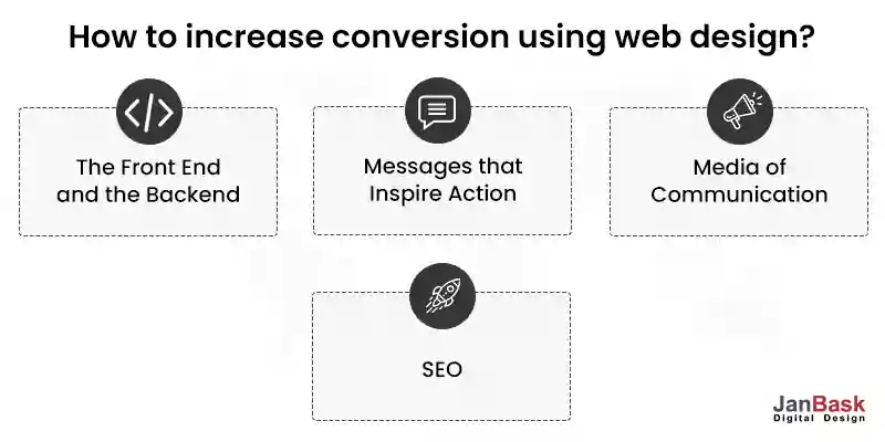
To construct a high-converting website, here are some design considerations:
Both the frontend and backend architectures should be mobile and desktop compatible. However, mobile devices are used by the vast majority of small company customers. As a result, mobile devices should be the focus of your attention.
Increased user engagement can be achieved with a website that operates effectively on a variety of handheld devices. A higher conversion rate translates into more revenue and profit for your company when your customers are more engaged.
Visitors arrive at your website with a specific purpose in mind. A call to action, or a road map, is necessary for them to get where they want to go. Simply stating what you want them to accomplish isn't enough. They need to know exactly what you want them to do.
Every website has a message to convey. However, there are alternative methods of communicating. It's typical for businesses to communicate via media like photos, videos, and podcasts. The most effective means of communication for a company should be selected. It is also possible to combine communication systems in order to improve performance. The more attention-grabbing the media, the more likely it is to result in a sale.
It's critical to have a high search engine result page (SERP) ranking. SEO strategies for small business increase traffic to a website by making it easier for users to find it. Consider both on-page and off-page SEO while designing your website. Your website's performance depends on both.
Having a well-designed and effective website can have numerous benefits for a small business owner. Your company's target audience will have more confidence in your company if it has a website.
You'll be able to get the most out of your digital marketing efforts without having to spend a lot of money. In the end, a well-designed website will raise user interest and encourage them to take action.
Your small business's bottom line depends on making your website more effective at converting visitors into customers. It's a sign that there's an issue when people come to your website but don't buy anything. Determine whether everything is working properly by conducting a site audit.
As a popular small business website design agency, we highly value producing cutting-edge websites that delight our customers. To ensure the success of small businesses, we provide them with assistance and support in every way possible.
Looking for Small Business Website Design Agency?

C
Amazing facts.
S
Well put information.
K
What all services do you provide under website design optimization?
H
What are the tools one can use to improve SEO?
D
How to check a website’s speed?
J
Hey Derek, you can contact on info@janbaskdigitaldesign.com