
The Internet has moved to mobiles, and there is no doubt the trend is here to stay. Mobile phones account for people spending one-third of their waking time on them. Making it one of the most important factors in mobile conversion. Hence it’s imperative to serve their requirements. Therefore as an owner of eCommerce, you must provide a great UX for your buyers because it is really very important for your overall success.
Since customer experience is the most crucial factor in any mobile application, when looking for web development services, ensure to check that they’re updated with the newest industry trends and statistics.
Because of ever-changing customer motivations and intentions, converting visitors into customers using mobile phones seems challenging. If yours is a B2B or B2C or an eCommerce store looking to get more sign-ups or to improve complete marketing strategy, here’s an ultimate guide on simplifying the implementation of CRO for mobile eCommerce businesses and converting visitors into leads.
When on mobile, people aren’t always browsing social media. They’re becoming increasingly dependent on their mobile phones and apps for doing simple searches, looking for destinations, some nearby stop shops. Many statistics driven by umpteen surveys and market research support these facts. And, these day it hase become much easier for business to get a personalized mobile by hiring a mobile app development company.
This is the primary reason for the sprawling of eCommerce businesses. But do all websites do well? Are all eCommerce businesses thriving?
Interested in Mobile Conversion Rate Optimization Services?

Going forward, it’ll be amazing for the world of eCommerce. If you’re planning to set up one for yourself, it's predicted that about 8% of all retailing transactions will happen through mobile phones in 2023. Which is expected to rise by 10% by 2025; that’s how the eCommerce conversion rates will shoot. This is huge and means the scope is bright.
No wonder the internet is growing daily; every 24 hrs, we get a 252,000 increase in the total no. of websites globally! So, by the time you end up reading this blog, there will be around 1.14 billion websites in the World!
But do all websites do well?
Will all eCommerce businesses thrive?
It is both exciting and scary. Honestly! The risk is high, but it can be tamed if you know how to play. As a business, you need to tighten your seatbelts and gear up for the magic. It has been predicted that the global eCommerce market will take over the retail segment. The game is not easy, and there’ll be a lot of bends and turns full of surprises.
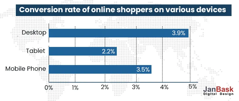
The businesses will have to work out possibilities per the most plausible trends of 2023. One of the most dominating trends is - switching to the mobile platform. We’ll have seen that being adopted by businesses already. There’s an obvious growth in mobile internet users. The growth is to such an extent that the numbers on mobile soon surpassed the ones present on the desktop.
It's important to track conversions for your business since it's difficult to fix what you don’t track. Also, there’s a big difference in your eCommerce store’s success if you track mobile conversions independent of desktop conversions.
Additionally, what influences a customer to convert using mobile phones isn’t always the same as what influences them to convert using desktop devices; it shows that mobile websites have their own complications, which might hurt their sales.
But before exploring which conversions are most important, let's first understand the term - “Conversion Rate Optimization.”
Simply put, CRO or Conversion Rate Optimization is the practice of improving the rate at which visitors perform desired operations, also called “Conversion” on your mobile website. The only discrepancy between conventional and CRO for mobile sites is that mobile CROs exclusively address improving mobile eCommerce conversion rates.
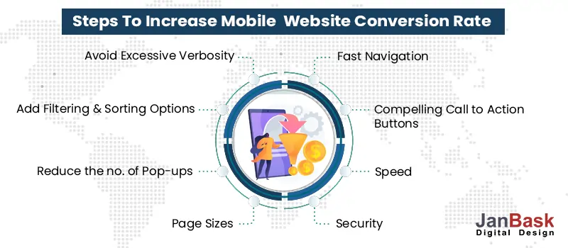
Using several different methods, you can optimize your mobile conversion rates. Still, to achieve desired results, no. of key steps are involved -
The major difference between turning desktop or laptop users and turning mobile users depends on the circumstances in which they’re used. Usually, a mobile query or question is to discover instant and relevant information related to a particular product, service, or company.
On the other hand, desktop users usually browse with far less immediate intent. After knowing this, when optimizing your mobile conversion rate, focus majorly on speed and productivity than conventional CRO tactics. It should also provide more accurate and brief content that can be easily accessed using mobile devices.
Despite the growth of internet traffic on mobiles, businesses cannot record an equal rise in conversions. It has been noticed that the number of incidences of abandonment of carts and bounce rates is way higher than that recorded on desktop versions of their apps or websites. What could be the possible reasons for this trend? Just think deeper. If people are opting to shop on these websites on a mobile interface, why is it that they do not end up making a purchase?
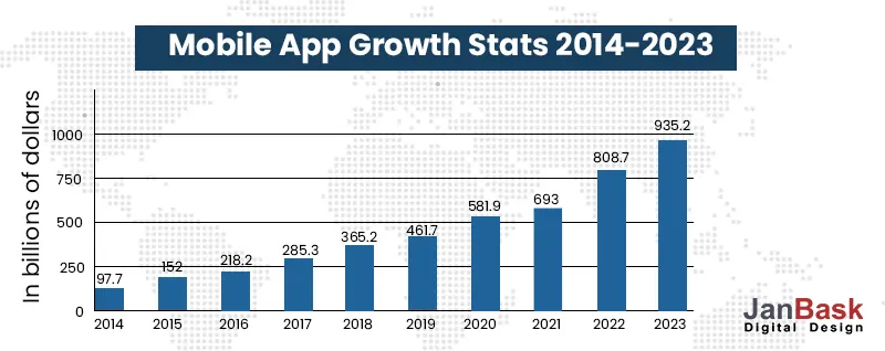
It has been a while since smartphones hit the market. Since then, there has been a huge growth in the number of websites and other businesses on the internet. People have become more experienced in using the internet and more adept at online shopping. Many apps have completely leveled up the game regarding customer experience and other expectations regarding the complete user experience.
Many eCommerce websites still need to deliver an optimized experience on mobile phones. As a result, they take a severe hit despite the investment.
So how can mobile experience be optimized for the best mobile experience that can maximize business conversions?
In a present digital world, where mobile matters more than anything else, follow the below UX best practices to boost your conversion rate and get a significant leg up on your competitors.
First things first. Responsive website design is your ticket to a great customer experience. Every business looking at sustainability for the future is looking at responsive web designs. People are now looking not only for compatibility for one platform but multiple ones.
They do not only want things to run but also to run well. It might sound crazy but going ahead; things will get even more complicated.
It’s all madness, as you may put it, but as a business, think, can you afford to build your audience on one platform and leave it on another?
As an internet user, you might have encountered various apps and websites that often confuse you about what to do next. Imagine you have already spent time selecting a few items and added them to your cart while you were traveling, and when it came time to check out, you could not find your coupon or be directed to other page suggestions. How will you feel? Do you think you will have the patience to redo the whole process if you lose your page or somehow things do not work out?
In most cases, you will not. People do not want to spend time on or even return to the same experience that took so much of their time. Most likely, you will lose that visitor forever and that so to your next big rival.
Another side to the same story is ill-defined landing pages. If you like an advertisement and reach a landing page that does not take you any further, you are bound to get upset. So, the trick is to work on every single aspect of your business. Well-designed and type-ahead kind of searches works best for mobile platforms. Remember, your online persona will be defined by the web experience you offer your people.
There is nothing to go subtle about it. This is your call to get maximum visibility and get people to see your business and know you more. Nothing is interesting if you keep it hidden in the text, that makes no sense. Hence, the call to action has to be apparent. It must be placed either at the top or bottom of the page. Why? Because ultimately, you mean business, and for your visitors, the whole effort of visiting your website and going through something becomes futile if there is no outcome. There has to be a step forward that will guide you through.
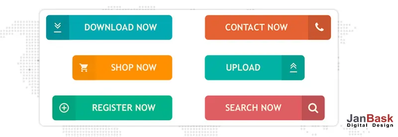
Many businesses keep their Call to Action on the homepage or landing pages. This is particularly done to give direct clues to the visitors to decide without much running around. It may sound too obvious but trust me; whosoever is online to make a purchase knows that you are there to make a conversion. And there is no point running in circles.
So, a good and prominent call to action, especially on a mobile platform, becomes highly essential.
Time is money for you and for your visitor. If you are looking at faster conversion, your visitor is probably looking for faster ways of decision-making and selling. So, why add unwanted delays? Whatever you do or add to your website, remember that it should ease the whole process. Nobody looks for delays and appreciates them. Hence, the golden rule is to add prompts. They work. They add a lot to your visitor's comfort in making a purchase. Take, for instance, if a mobile app can pick your location and auto-fill the Pincode, test if the delivery is possible, and suggest the next best option. Many apps have auto-fills for bank OTPs. Such a small prompt, but somehow the effect is huge.
Always remember that when you are thinking about customer experience, the little things will make a massive impact. You don’t always need to have something impeccable or out-of-a-box product, but a little attention to detail does the trick.
Even as a user, you must have stepped on apps and websites where the product is something you do not want to miss. Again, if you do not feel cared for well and are left to fend for yourself, you will soon lose interest in the product.
Many surveys have shown that filling in lengthy information forms and slips is a big put-off for many visitors. This may work in some cases on a desktop, but when on the go, over a mobile platform, it is completely unacceptable. Hence, you need to look for intuitive models that can auto-fill vital details from the browser to the user, saving a lot of hassle and time. This will be well-received and appreciated. Many businesses allow social logins to avoid going through any kind of user registration.
Security becomes a prime concern for all online purchases, especially on a mobile platform. I am sure many people, even you, at some point, must have hesitated to punch in your credit or debit card details to buy something on an unknown platform. This fear is not completely uncalled for. It is genuine and has to be acknowledged and well-factored in any check-out process.
Because of this, many businesses have introduced Google, PayPal, or even Apple accounts to enter their payment details and make payments. These providers ultimately provide vital customer details like shipping and billing addresses, completely eliminating the need to enter those details. Platforms like PayPal offers additional security to users. This helps win the users' confidence and is a big trigger for purchase decisions.
Mobile devices have limited bandwidth to work on, and any web page with less data to download is always a plus point. Although the size of pages has been consistently increasing every day, the optimal limit of 1.64 MB for mobile pages cannot be ignored.
Again, if your website does not adhere to this and has heavy pages that consume more bandwidth, it results in slower performance. It is a big put-off if such issues crop up on a mobile platform.
Research has suggested that such bloated pages result from heavy images that have not been optimized. There are many solutions available for the optimization of images, along with hosting and solutions for auto-scaling. Even the presence of redundant code can immensely lead to heavier pages, but this can be tackled for analysis and handling of the redundant code.
Hoping that you’ll have experienced this scenario - where, when you land on a site, it instantly gets confronted by a cookie consent message, including messages at the top of the screen, insisting you download their app, which covers around 80% of the screen space.
Another scenario is where an unsolicited popup message on your screen offers 15% off on a product you aren’t interested in purchasing. So to get to the site, you need to get through the cookie consent pop-up and the “15% off” pop-up message.
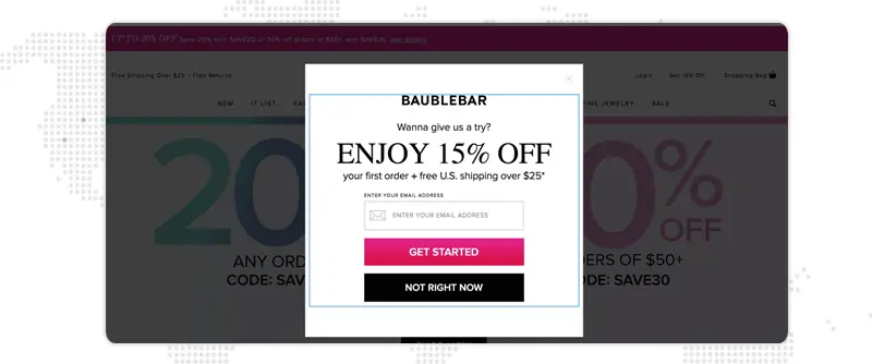
So, if you wish to visit this website, you must clear the obstacles of poor user experience. But few visitors, after experiencing such poor UX, might decide to return to the search engine result page and look for a better website that provides excellent UX.
For a mobile CRO, it's like a nightmare, and you must do everything to defend against it. Remember a few rules-
It's annoying to scroll through long, unorganized lists of items on small screens- specifically on mobile devices, such type of scrolling is intolerable. Therefore, including filtering and sorting options is the best solution for this issue, facilitating mobile users to seamlessly get what they’re searching for.
But if you’re offering only a few products, this might not be necessary, but if you’ve got a big product catalog with several types of products, then it’ll impact your mobile UX as well as conversion rates in a positive way.
It's always a good idea to avoid excessive wordiness because mobile users are impatient with wordy content and are more inclined towards easy-to-understand content that’s to the point, clear and correct.
Simply put, redirects are when site visitors click on a link and get redirected to other web pages. Therefore, if you’ve redirects on your website, it creates added HTTP requests and these requests can slow down your website’s load time. Therefore, ideally, try to remove them completely.
For a mobile website, you must have one HTTP redirect which takes visitors from the desktop website to the mobile website.
Images make for around 60% of a website’s weight and large-size images will drastically slow down your website’s load time. The size of every web page present on your website must be about 1 to 2 MB max. But surprisingly, most eCommerce websites' page size is more than 8 to 15 MB per web page.
In order to reduce the size or resize your web pages, compress images that fits the actual dimensions that are required, and save the images as PNG rather than JPG. Also, evaluate the total no. of images on your website, because more the images you’ve, the slower the page load time of your website.
When integrating e-wallet, ensure that your customer’s payment information is secure because around 19% of customers abandon their shopping carts due to security concerns over providing their payment information.

You’ll hurt the conversion rate if the buyer is required to click more in order to complete the purchase. Because of this Amazon has incorporated 1-click ordering an important part of the overall shopping experience. Therefore, make the purchase path as easy as possible for the buyers so that they can add desired products to their cart and complete the purchase.
If you include each web page from your desktop website to your mobile website, it’ll lead to a cluttered UX, therefore include only lead pages and if a buyer needs to delve further they can use the desktop website version.
As a website owner, you want your website to be more readable and understandable when it comes to mobile browsing. Therefore at the time of adding text to your website, break it up according to white space so that it can be easily readable and doesn’t lose its intention.
To turn your traffic into loyal buyers and boost your revenues, conversion rate optimization services like JanBask Digital Design are helpful. Improve your website engagement, conversion rates, and sales by conducting proper research and using behavioral analysis tools. We focus on your visitors and motivate them to act by improving sales for your company.
Our eCommerce CRO services will not only enhance the entire process of customer acquisition but also remarkably reduce the cost incurred on every acquisition. Are you today’s fastest growing company or wish to be one of them; then connect with us! With comprehensive strategic planning and a deeper understanding of each type of funnel to avoid leakages, our CRO expert company will help create brand loyalty and thus improve your brand conversions.
1. What is (Conversion Optimization Services) CRO For Mobile Sites?
It’s a method of improving the percentage of site visitors who transforms into your site's particular goals, objectives, and demands (KPIs) or, more comprehensively, conduct any needed action on a webpage.
2. On Which CRO Metrics Does Your Conversion Optimization Agency Works On?
Our conversion optimization agency works on a broad range of measurements, statistics, and research that’s used based on the website's objective, its capabilities inside a CRO hierarchy, etc. for instance, bounce rates, time spent on your website, video click recordings for tracking human behavior, A/B testing and much more.
3. Which CRO Tools Are Used By Your eCommerce CRO Agency?
To disclose crucial user information, an efficient CRO depends on strategic choices and the utilization of different technologies and solutions. Our conversion rate optimization experts make use of the following useful tools
Does your business need the best CRO expert company that offers comprehensive CRO consulting services? We are just a call away from you, contact us today!
4. Why Should You Choose Janbask Digital Design As Your eCommerce CRO Agency?
Our experts at eCommerce conversion rate optimization agency work on every detail required to provide you with excellent conversion optimization services which include -
5. To Which Domains Do You Offer Your eCommerce CRO Services?
Our CRO consultation agency aims at enhancing the conversions for your business irrespective of your domain, type of your business, or the type of website you own. We cater to a wide variety of domains including -
6. Which Steps Does Your E-commerce Conversion Rate Optimisation Agency Follow To Achieve The Desired Results?
Our CRO agency has been providing desired results to hundreds of clients for many years, using customized, data-driven conversion rate optimization services.
7. What Is A Good Mobile Website Conversion Rate?
A normal conversion rate is thought of as 1-2%, with closer to 2% or above being thought of as a good conversion rate. But having said that, mobile conversion rates are usually lower, therefore, having a conversion rate of 1-1.5% is considered respectable.
8. What Is Mobile Optimized Design?
It refers to redesigning components on a web page that suits mobile browsers, including things such as creating buttons or enlarging interactive components, or redesigning the content that fits in smaller browsers and reshaping images.
9. How to Increase mobile conversion rate using different?
All mobile CRO projects are basically different from each other and therefore they need different strategies. Consider the below steps when creating your strategy, irrespective of the project.
10. When Is The Right Time To Perform CRO?
Preferably, CRO must be an ongoing process of continuously trying to enrich and improve your website. At least, each month, you must try to analyze your website, bring forward some latest testing suggestions, and conduct new tests.
If you’re developing a new website, make use of CRO as a method of testing ideas on your current website to decide whether those features should be added to the updated website. If you’ve already invested in a new website, consider it to work satisfactorily, carefully monitor performance and conduct testing as soon as you can.
It is important for all online businesses to know eCommerce conversion rate optimization tips and generate more serious leads that mean real business. When life shifts to mobile, it levels up customer expectations. The pressures keep mounting on businesses, as many join the bandwagon daily. Many factors can be worked on to make an influence. Responsive web design, resizing the whole website, image optimization, lesser distractions, and consideration for security and bandwidth are some changes that will make a lot of difference.
Business means getting people to like what you sell and making the experience smooth. How you do it is up to you, but the best way forward today is to work on your mobile platform and optimize it accordingly. You can hire the best conversion rate optimization service agency like Janbask Digital Design which helps in increasing conversion rate. They will also help you improve your website performance on mobile devices hugely.
If you have something to share, do share it with us.
Looking for Conversion Rate Optimization Services?

R
Impactful Article on mobile website conversion! Thanks for sharing!
T
Hi, your conversion rate post is really very necessary for beginners, I always follow this website.
J
Thank you Tanner, for your feedback!
M
I just wanted to improve my mobile eCommerce conversion rate and your outline is simply the best. It’s easy to understand. Now i think I’ll be able to work on my website with more confidence.
R
This blog post on mobile eCommerce conversion rate optimization can be helpful in generating revenue.Thanks !
O
Its a very informational and comprehensive article, as according to you mobile conversion rate optimization isn’t a quick fix, to which I completely agree, but, is there a tool that can help us build a hypothesis for improving conversions on my eCommerce website?
J
Please contact at info@janbaskdigitaldesign.com for more information.
C
Does CRO work for B2B businesses with revenues less than $3mn dollars?
J
Thanks for your interest you can contact at info@janbaskdigitaldesign.com for more information.
L
I liked reading this blog. It’s very easy to understand.
J
Your blog made me learn a whole lot of new things which I was unaware of. Thank you!
J
Excellent blog! Helped save thousands of dollars on eCommerce consultation fees!
J
Glad, it helped you!
H
Majority of businesses just simply throw all the money they’re having on ads rather than concentrating on making the UX more better on the landing page.