
![]()

Have you ever accessed a web page where you spent a few seconds clicking through various pages before choosing to leave without completing essential actions? Most people engage in this behavior. Most people do that. Statistical data from Hubspot reveals that website visitors spend only 8 seconds on a webpage (Hubspot). Your entire ability to create an impact lasts a mere 8 seconds.
Having a page can produce exceptional outcomes by drawing attention and pausing viewers who naturally want to proceed to conversion action points such as subscriptions, downloads or buying activities. The power to stop visitors from scrolling and convert them into leads or customers rests within this special delivery page.
A landing page is an independent web page that serves one primary function. The landing page distinguishes itself because it differs from regular website pages. It’s the page. A solitary independent webpage exists to transform site visitors into either lead prospects or paying customers.
Our business gains a pivotal advantage through landing pages because of the following reasons:
And the beauty of it? Landing pages don’t have to be complicated. Whether you’re promoting an event, launching a new product, or growing your email list, a well-designed landing page works tirelessly as your 24/7 salesperson.
Let’s paint a quick picture:
And it works. Because people appreciate clarity and simplicity.
By the end of this blog, you’ll have a clear roadmap of strategies to create landing pages that grab attention and boost conversions like never before. So, buckle up! We’re about to dive deep into the proven tips and tricks that turn casual browsers into committed customers.
After our preparatory segment, we can now focus on evaluating the distinctive qualities of landing pages. Even though some people make that mistake, not all website pages qualify as landing pages. Your homepage? Nope. Your “About Us” page? Definitely not. A landing page stands apart because it functions as your primary weapon to drive visitors toward taking particular actions.
The fundamental components that distinguish landing pages from other website elements can be understood by analyzing what they consist of.
A visit to any store becomes more interesting when customers encounter this special promotion: “50% off shoes today only—grab your pair now!” A digital landing page serves the same purpose as a sign in real-life establishments. It’s direct, focused, and action-oriented. Passersby would ignore an overloaded sign that contains complete store merchandise lists while they would pay attention to focused marketing messages.
The landing pages best practices work best when:
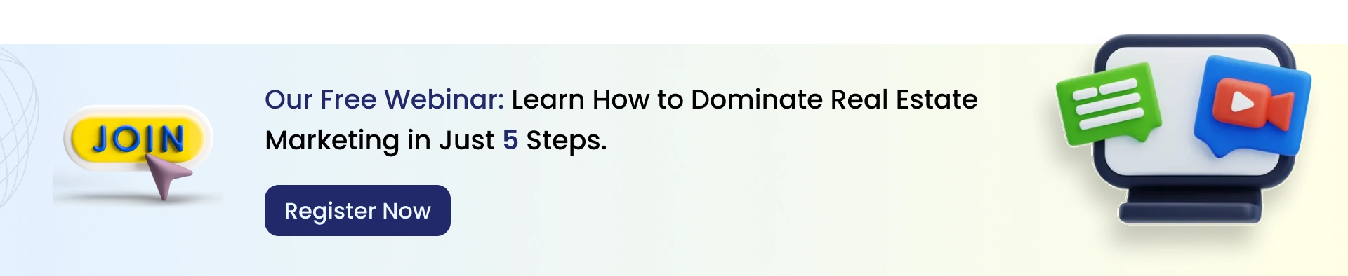
See an illustration with this specific example to understand the process better:
Your campaign targets "5 Steps to Master Real Estate Marketing" as an exclusive webinar information. A visitor will probably leave after seeing your generic page that contains various links pointing to blogs and case studies in addition to miscellaneous services. A message on the page presents the following statement for readers:
The page contains only a straightforward form requiring their name and email address. That’s it. Nothing else. A landing page design best practices deliver its purpose perfectly when it displays such an interface.
Understanding your audience represents the essential base that ensures the success of a landing page. Nobody can deny that a beautiful landing page alone is insufficient unless it persuades the appropriate audience since a purely visual page creates no meaningful connection within an empty online landscape.
Which approach is required to develop a landing page that communicates successfully? Knowing three critical elements comprises your audience grouping and their customer profile while focusing on marketing stages.
Who are you speaking to? This is the golden question. Your target audience comprises individuals who stand to gain the most from your provided offerings.
A buyer’s persona serves as your target audience; it needs a name, a face, and a detailed characterization. The semi-fictional portrayal is your ultimate customer representation, enabling you to understand his or her perspective.
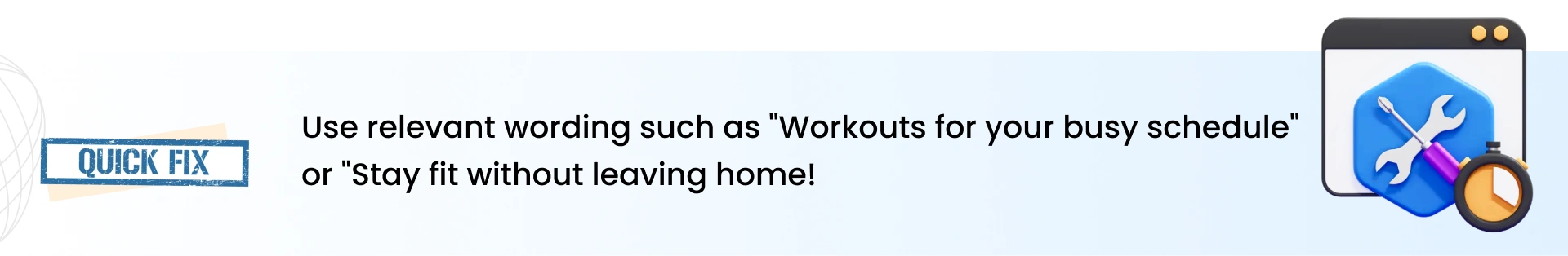
When making a fitness application landing page, consider these scenarios as your example:
Knowledge about the motivations and challenges of John and Emma will guide you in creating a landing page which directly engages them.
Let me refresh your memory about the marketing funnel guideline on how your prospects go from curiosity to commitment. Think of it as a journey that moves your audience from the very moment they notice your brand to finally taking some desired action, say making a purchase or subscribing. The whole funnel is composed of three major stages, each serving a specific purpose:
The funnel is divided into three key stages, and each serves a specific purpose:
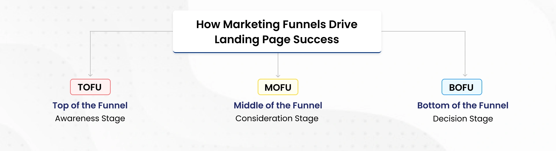
This is when prospects come across your brand for the first time. They are curious, learn, and seek answers to solve their problems. Your objective? Grab their attention and inform them.
In this phase, landing pages should focus on introducing a brand with values.
In this stage, leads have started showing interest in what you provide. It is about nurturing that interest with relevant information, demonstrating value, and establishing trust.
Now that your leads are aware of your brand, your landing pages need to deepen the relationship and keep them engaged.
The moment of truth is what this is: leads are ready to act, but they need to have that push in the tail-end, whether through an interesting offer, trial, or direct pitch.
Here’s where your landing pages need to turn interest into action through explicit, action-driven content that can get them across the line.
Why It Works: Adding urgency, a clear call-to-action, and trust-building helps eliminate hesitation and drive conversions.
By aligning your landing pages with the funnel, you are not just selling-you are creating an experience. Here's how the marketing funnel raises the bar on your landing page strategy:
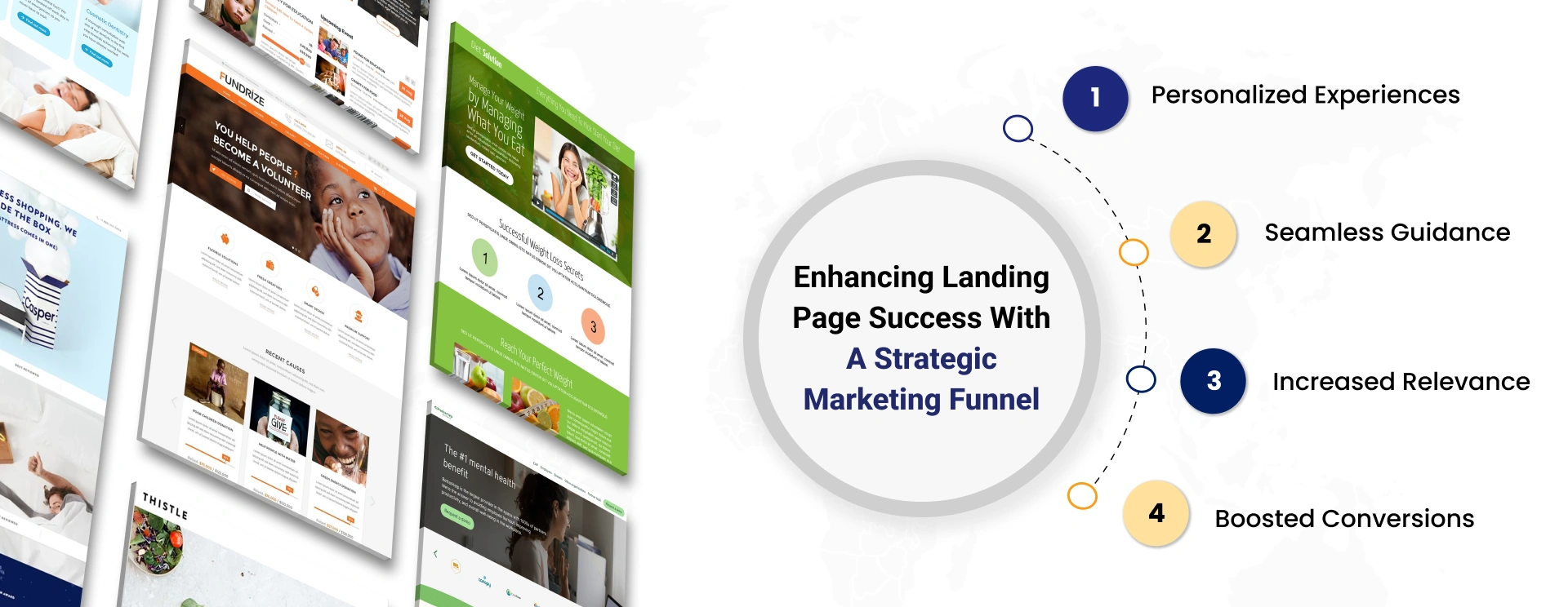
When you know your audience and have a defined buyer persona and the landing pages according to the marketing funnel, you'll stop at simply constructing a page and transitioning to crafting an experience.
The intentionality at each step of the funnel, every new touch, every interaction- you think important- makes visitors feel understood and increases conversion rates.
It's about guiding them on the journey in a relevant and impactful way-actually making them the hero in their story.
Ready to build landing pages that'll supercharge your funnel experience? Let's dive into actionable strategies for developing high-performing pages!
Now, down to business-the strategies. Crafting a high-converting landing page involves more than just slapping a few design elements together; it's a delicate balance of landing page strategy, psychology, and creativity. Your landing page is essentially your digital elevator pitch: you've only got a couple of seconds to grab attention and move people to exclaim, "Yes, I'm in!
Here's how to turn your landing page into a conversion powerhouse:
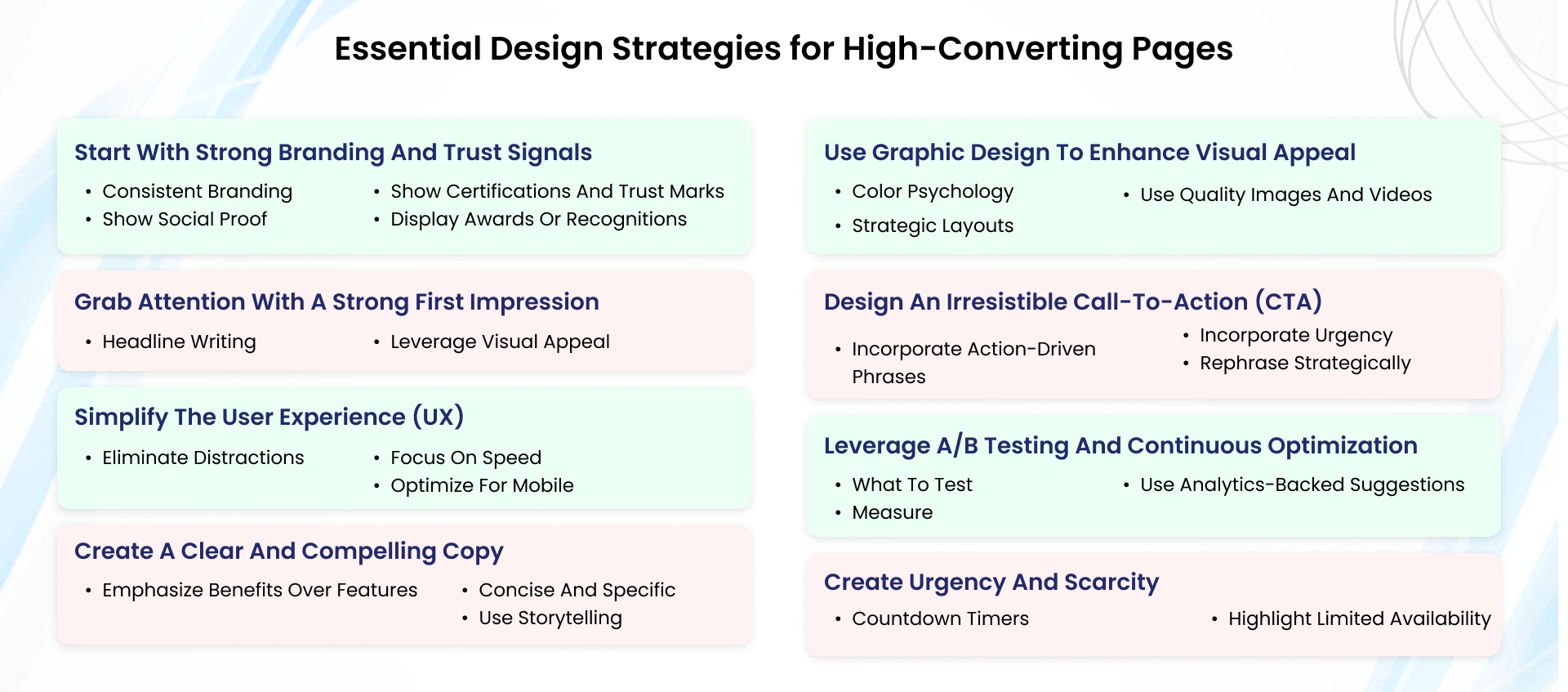
Your landing page should establish instant credibility and portray brand identity. Use all available resources for:
For instance: "Trusted by 15,000+ Happy Customers!"
Any trust mark such as SSL secured, Money Back Guarantee, or ISO-certified shields the visitor from taking any safety concerns.
You have but seconds to capture visitor attention. Your headline, images, and design elements must be seared into their minds.

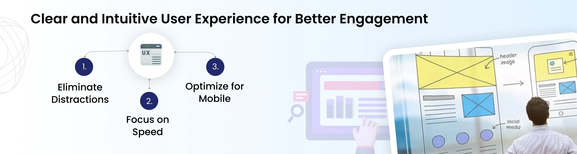
A clear and intuitive design means site visitors will catch what's important: your message and call-to-action.
The heart of your landing page is in its copy. It is supposed to transmit worth, relate emotionally, and inspire movements.
Aesthetics alone isn’t the essence of design; it is meant to make users perform actions.
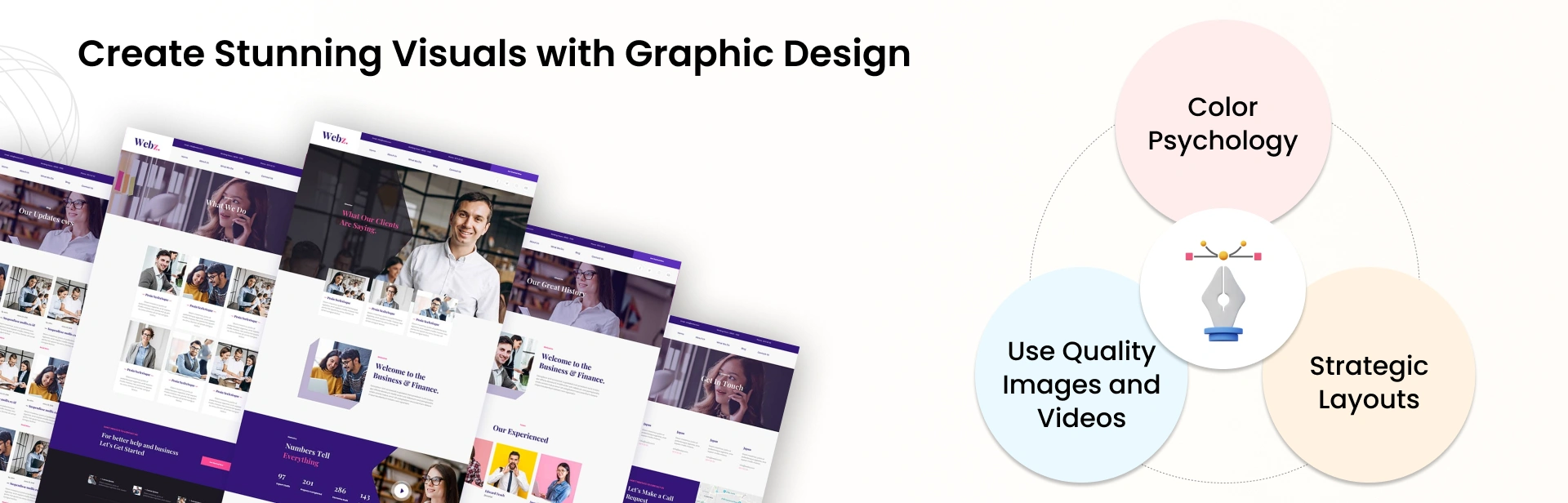
CTA is your conversion engine; hence, make it stand out.
Landing pages can become even more effective, so performing A/B testing is vital to refining your design and enhancing results.
This type of testing resembles a contest between two versions of the same landing page. Any one element (such as the leading title or button hue) allows you to maintain both versions unchanged.
Prompt visitors to take action immediately because of the urgency.
Therefore, when you combine these elements, you have more than just a landing page; it is also an experience that targets a specific group of people, evokes confidence, and leads to sales conversions at the end of it all. By compiling appropriate content matter, design, and optimization aspects, your landing page can be a powerful instrument capable of converting visitors into permanent clients.
You have a fabulous landing page, and you’re proud of it; it looks fantastic and contains all the right stuff. Now, you are ready to sit back and let the conversions begin. But the truth is this: even the best-designed landing page is never perfect. It’s through testing and optimization that real magic happens. Simply put, it’s what we do to a recipe to make it mouth-watering.
Now, we will look at ways to transform your landing page into a star performer.
Optimization requires complete knowledge of successful and unsuccessful elements. You need these indicators for your monitoring:

Here is an incredible reality: 57% of people will not refer a business due to having a poorly done mobile platform. (superoffice.com) Therefore, if your landing page is incompatible with phones, you miss out on possible conversion rates.
Metrics alone can be misleading in their interpretation. To understand the complete picture of your visitors’ actions (or non-actions), you need to look at their behavior in detail:
This is the case: optimization has no “set it and forget it” process. Static landing pages are constantly changing. Here’s what you should do:
Since you have gotten the hang of making landing pages that are high in conversion rate and optimizing them, let us now discuss equally essential things. A well-designed page may kill your conversions just by a couple of mistakes here and there. These errors happen more frequently than you might assume.
But no worries, I am here to help out with that. Listed below are the most frequent mistakes people make on their websites and ways of crossing them over as an expert.
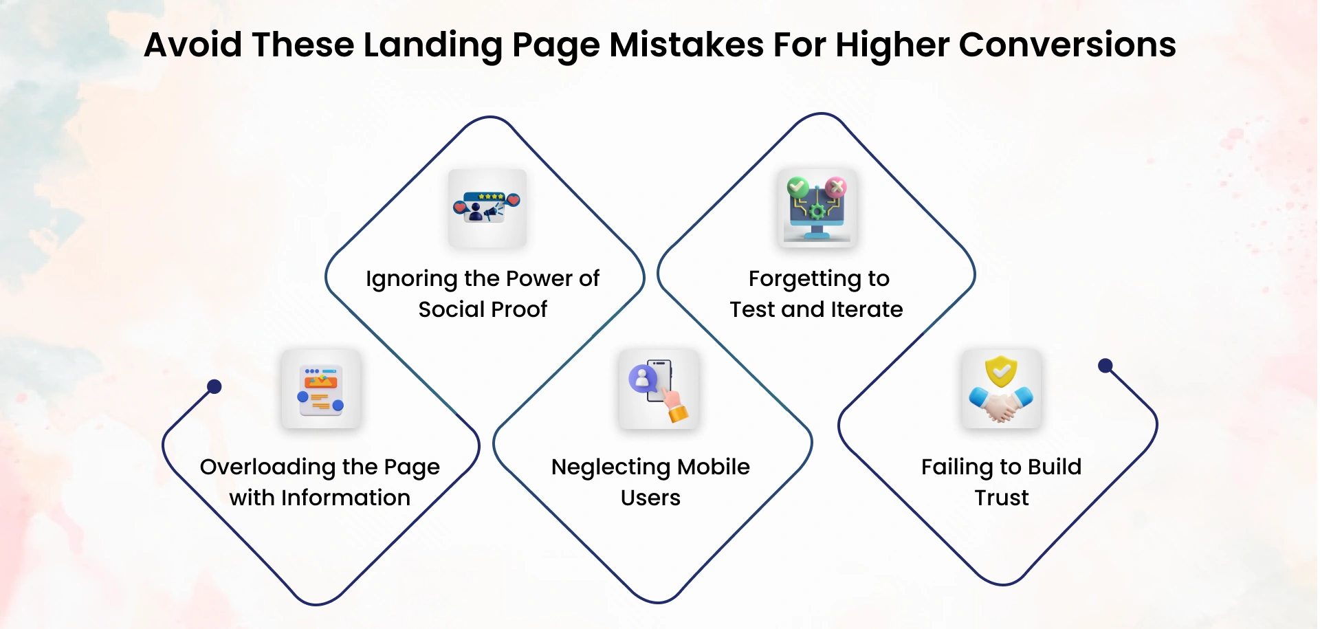
Have you ever visited a website with so much text and images that you cannot tell where to look? That’s what information overload is all about, which impacts conversions.
A landing page should be treated like an engaging conversation – straightforward without beating around the bush. You would not keep talking forever when you are face-to-face with someone, would you?
Here’s the deal: people are more likely to trust other people. If there’s no social proof on your landing page, you’re missing a huge chance of creating trust.
Given its importance, we've already brought this up, but it needed a dedicated space. If you do not optimize your landing page for mobile, you are pushing away half of your audience.
Let’s say you build a landing page and call it a day. Big mistake. Optimization is an ongoing process; ignoring it means leaving conversions on the table.
Would you share your personal information on a site that feels sketchy or unprofessional? Neither would your visitors.
Having discussed what a remarkable landing page should look like, let’s check out a few brands that have hit the landing page nail on the head. These examples are inspirational and come with invaluable lessons you can apply to your landing pages.
And yes, I’ve provided URLs for you to see. Ready to dive in?
Dropbox landing page: A masterclass in simplicity. It’s clean, clutter-free, and laser-focused on getting you to sign up.
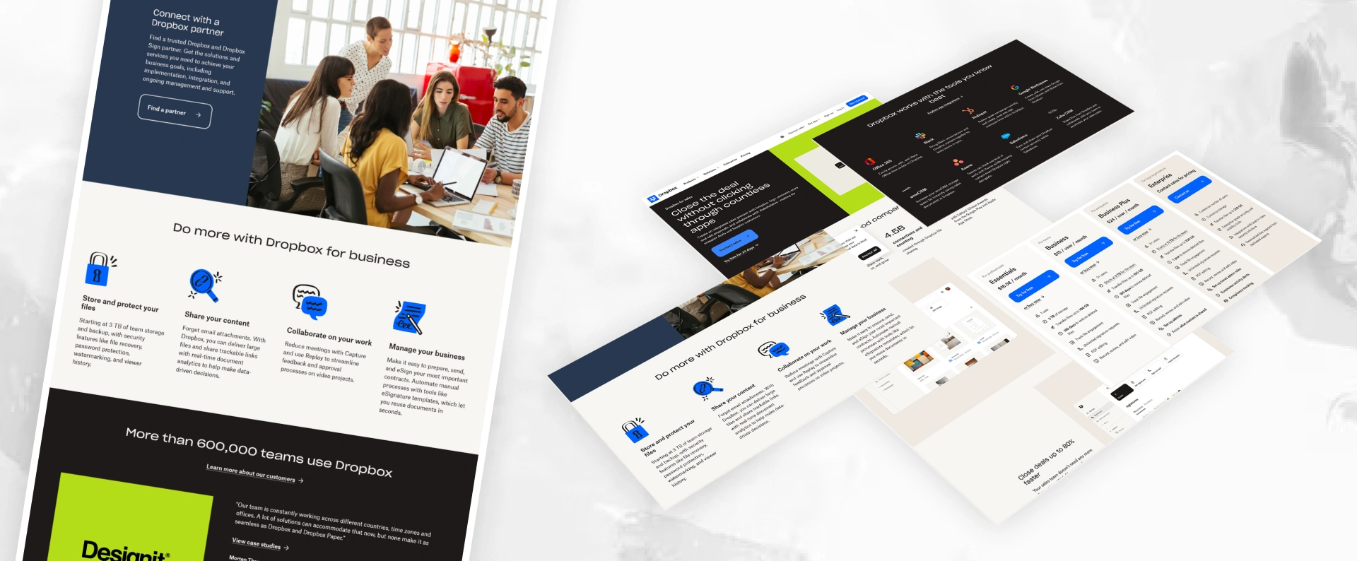
Visit their page here: Dropbox
The landing page for new hosts from Airbnb is emotional. They tap your curiosity, sense of adventure, and desire to make extra money — all at once.
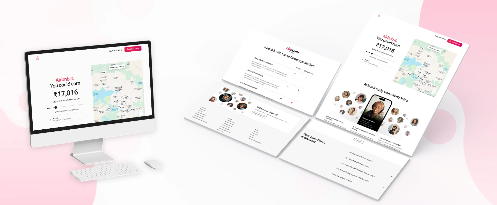
Explore Airbnb’s hosting page: Airbnb Hosting
HubSpot’s landing page for free CRM tools is packed with value. They’ve designed it to highlight benefits while subtly showcasing their expertise.
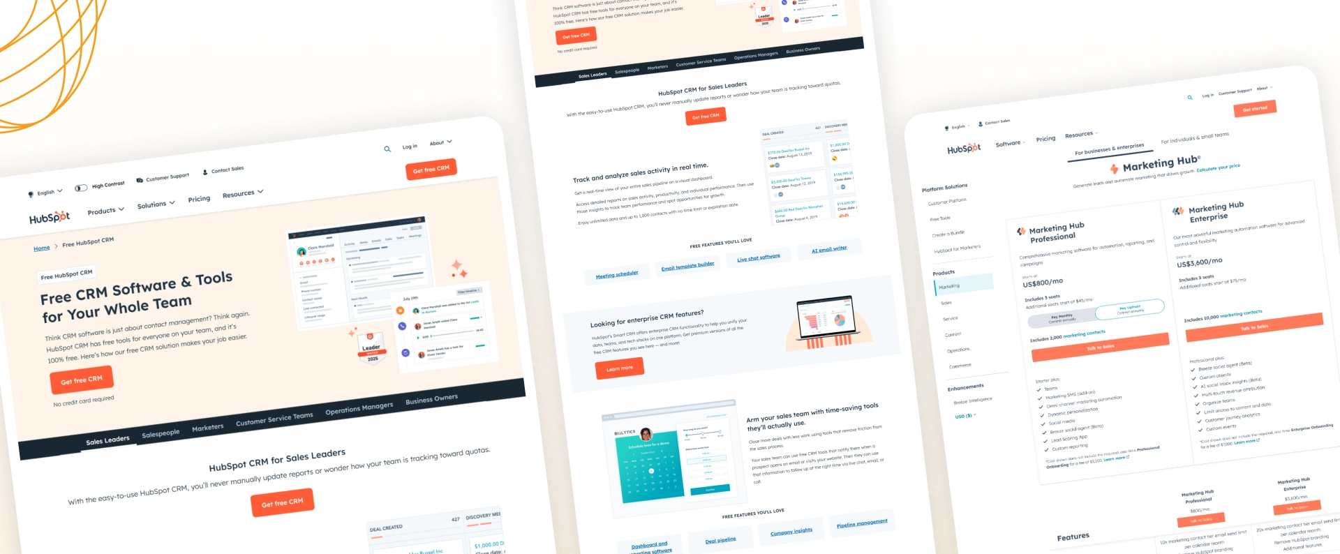
See the HubSpot CRM page here: HubSpot CRM
ClickUp’s landing page targets productivity enthusiasts, and they’ve done a stellar job of focusing on how their product solves pain points.
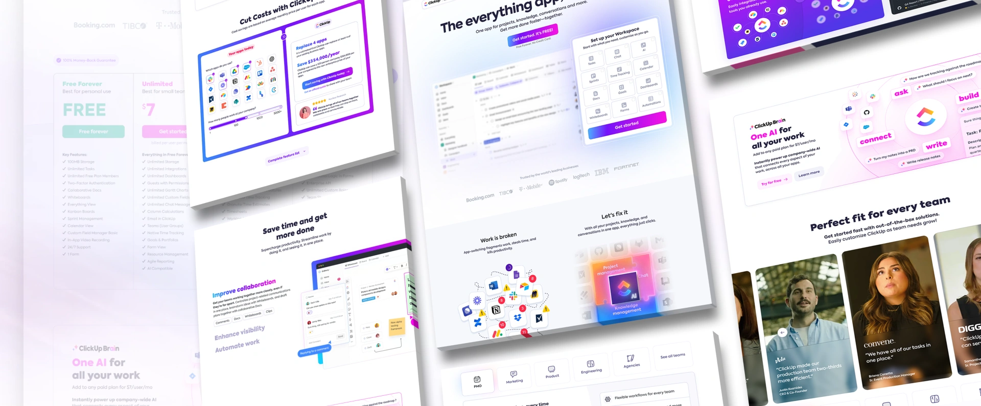
Check out ClickUp’s page here: ClickUp
Shopify’s landing page invites entrepreneurs to start their e-commerce journey with a sense of ease and professionalism.
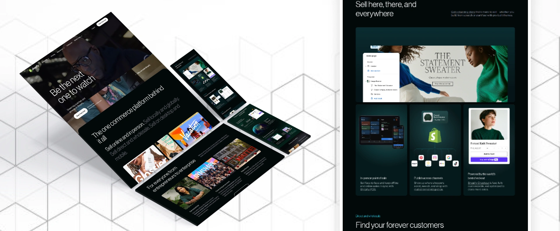
Experience Shopify’s landing page: Shopify
Below are some universal landing page advice gleaned from these stellar landing pages:
As for landing pages, it is all about balance, design, messaging, and user experience. These examples illustrate how, when you nail it, your page connects and converts.
So, finally, we have reached the end of our road. I hope you now have a new way of looking at landing pages and their genuine means of improving your business ventures. If you want to raise your leads or sales or grab attention, you might require a high-converting site, an essential marketing asset.
However, remember that creating a landing page for performance is not just a shelf system that works forever; it needs knowledge about who your clients are and what they want, followed by constant improvements to remain competitive.
And if you ever need a hand making it happen, remember—you’ve got a partner in JanBask Digital Design. Whether building from the ground up or refining an existing page, we’re here to help you create landing pages that look good and work.
Are you prepared for your strong landing page to go ahead and boost your company? Do not waste time. Contact us today for a free consultation; it’s time to start making that high-converting landing page that will assist you in meeting your targets.
I appreciate you reading this and look forward to seeing what you create!
Discover Proven Landing Page Strategies That Maximize Conversions!


With 9+ years in digital marketing, Simranpreet helps real estate and service businesses grow online with smart SEO, web design, and lead generation strategies. She shares practical, easy-to-apply tips to turn websites into powerful sales tools.
E
Simple, straight to the point, and actually useful. Loved how each best practice came with examples
M
Clear, concise, and very effective.
B
Super easy to follow—love how you included visuals and examples!