In the vast and competitive business world, a well-designed and helpful landing page can be the difference between a fleeting website visitor and a converted customer. Whether promoting a product or service or capturing leads, mastering the art of creating a landing page is crucial for any online marketer or business owner.
But what exactly is a landing page? Simply put, it's a standalone web page designed with a specific goal in mind – to guide and persuade visitors to take a desired action, such as making a purchase, subscribing to a newsletter, or filling out a form. Unlike your website's homepage or other pages, a landing page has a singular focus and lacks the distractions that might lead visitors astray.
So, get ready to dive deep into landing page optimization. We'll explore the key elements that help create a great landing page, share best practices and industry insights, and provide actionable tips to help you optimize your landing pages for maximum impact.
Are you ready to unlock the secrets of building highly effective landing pages? Let's embark on this journey with our web design services experts and transform your online marketing efforts into conversion-generating powerhouses.

Looking for Landing Page Design Services?
A landing page is more than just a page where users look for the required information. It is the essence of any website and a critical element for conversions. Let's understand a landing page through classic examples and what makes them stand out.
AirBnB's captivating landing page is designed to be a comprehensive resource for anyone intrigued by the idea of becoming a host. From the moment you arrive on the page, you're greeted with an array of compelling elements that make hosting feel within reach.
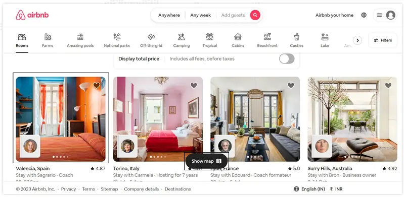
Let's explore the key features, navigation, and map elements that make Airbnb's landing page exceptional. The landing page prominently showcases Airbnb's core features, ensuring users quickly understand the platform's value proposition. These features include:
In a world where online information overload is the norm, Uber stands out with a landing page that understands the power of simplicity and skimmability. This meticulously designed page captivates visitors with its clean and minimalist aesthetic, making it easy to absorb the essential details.
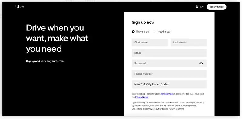
Dressed in a sleek black-and-white color scheme, the page exudes professionalism and approachability. Short, easily digestible sentences deliver the key messaging concisely, ensuring visitors can quickly grasp the benefits and value of Uber's services. The simple form takes center stage, making it effortless for users to take the next step and sign up for an account or request a ride.
By prioritizing user experience and focusing on clarity, Uber's landing page creates an immersive and frictionless journey for visitors, eliminating distractions and leaving them with a strong desire to engage with the brand.
Prepare to be captivated as Spotify takes you on a dramatic detour from its iconic green and black color palette with a landing page that speaks to a different purpose and experience. This bold departure from the norm serves as a visual signal to visitors that they are about to embark on an extraordinary journey.
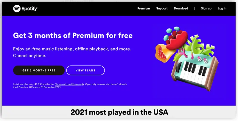
While the landing page's design may seem relatively simple, it ingeniously harnesses the power of stark color contrast to draw attention to the compelling text and irresistible call-to-action buttons. But Spotify doesn't stop there— they tantalize visitors with a curated list of the most played artists, songs, albums, and podcasts of the year. This strategic move not only showcases the breadth and depth of Spotify's content library but also entices visitors with the promise of endless entertainment and discovery.
By venturing into uncharted territory with their landing page design, Spotify unleashes their creativity and effectively promotes their platform as a hub of unparalleled audio experiences. It's a visual and auditory invitation that beckons visitors to join the Spotify community, explore new sounds, and curate their own sonic journeys.
Looking for the best landing page design? Our web design services team is committed to creating visually stunning and high-converting landing pages that leave a lasting impression.
The primary objective of creating a landing page is to persuade visitors to take a specific action. This action could be purchasing, subscribing to a newsletter, downloading an e-book, filling out a form, registering for an event, or any other desired outcome that aligns with your marketing objectives. Directing visitors to a dedicated landing page tailored to their interests and needs can enhance their journey and increase the likelihood of conversion.

Design and visual elements also play a crucial role in a landing page's effectiveness. A well-designed landing page incorporates aesthetically pleasing layouts, attention-grabbing headlines, relevant images or videos, and strategically placed call-to-action buttons. The overall visual appeal should align with your brand's identity and create a sense of trust and professionalism.
Additionally, landing pages can benefit from implementing social proof elements, such as testimonials, case studies, or customer reviews. By showcasing positive experiences and feedback from satisfied customers, you can build a landing page with full credibility and instill confidence in your visitors, further increasing the chances of conversion.
Another vital aspect of creating a landing page is its measurability. Tracking and analyzing the performance of your landing page is crucial for optimizing its effectiveness. You can gather valuable data on visitor behavior, conversion rates, bounce rates, and other key metrics using web analytics tools. This data allows you to identify areas of improvement, test different elements, and make data-driven decisions to enhance your landing page's performance.
If you're looking for a top-notch web design agency, our team of experts can create a great landing page tailored to your business needs.
A landing page offers numerous benefits that can transform your online presence into a conversion-generating powerhouse. This section explores why you need a landing page and how it can revolutionize your marketing strategy.
A landing page serves as a powerful tool to capture the attention of potential customers and convert them into valuable leads or loyal customers. In this section, we'll explore three key ways in which a landing page can help supercharge your business and drive impressive results.
One of the primary purposes of a landing page is to generate leads and acquire new customers. By offering a compelling value proposition, you can entice visitors to share their contact information in exchange for a valuable offer. Whether it's a free ebook, a discount code, or access to exclusive content, a well-crafted landing page can act as a lead magnet, attracting potential customers and building your email list or customer database. With this influx of leads, you can nurture them through targeted marketing campaigns, personalized follow-ups, and strategic communication to convert them into paying customers.
For example, an e-commerce store can make a landing page offering a discount coupon in exchange for signing up for their newsletter. This not only captures leads but also provides an opportunity to showcase their products and convert those leads into purchases.
A landing page is an ideal platform to promote and showcase your products or services effectively. Unlike a website's homepage that caters to a broader audience, a landing page can be specifically tailored to highlight a particular offering. By focusing on the unique features, benefits, and value proposition of your product or service, you can create a compelling case for potential customers to make a purchase or take the desired action.
For instance, a software company can build landing page specifically dedicated to a new software release, outlining its functionalities and demonstrating how it solves a specific problem for its target audience. By presenting a clear call-to-action and utilizing persuasive copy, testimonials, and visually engaging elements, the landing page can create a sense of urgency and encourage visitors to make a purchase.
In addition to landing page lead generation, landing pages provide a valuable opportunity to collect data and gain insights into your customers. Through form submissions or user interactions, you can gather demographic information, preferences, and specific interests that can help you better understand your target audience. This data can be used to segment your audience, personalize marketing campaigns, and tailor future product or service offerings to meet their needs.
Moreover, creating a landing page lets you track and analyze visitor behavior, engagement rates, and conversion metrics. By leveraging analytics tools, such as Google Analytics, you can gain valuable insights into the performance of your landing page, identify areas for improvement, and optimize your marketing efforts.
When optimizing your online marketing campaigns, our web design agency can help you create compelling pages that convert visitors into customers.
For businesses running paid advertising campaigns, creating a landing page can be a game-changer. Instead of sending visitors to generic website pages, directing them to a dedicated landing page that aligns with your ad messaging significantly improves campaign performance. It ensures visitors have a seamless experience and encounter a cohesive message, resulting in higher click-through rates, improved quality scores, and, ultimately, better return on ad spend.
Landing pages offer an opportunity to optimize your website for specific keywords and improve your search engine rankings. By aligning your landing page content with relevant search queries, you can attract organic traffic and increase your website's visibility. When you create a landing page having a singular focus, it provides a focused and compelling experience that search engines appreciate, leading to improved rankings and increased organic traffic.
A vital advantage of creating a landing page is incorporating a clear and compelling call to action. By strategically placing persuasive CTAs, such as "Buy Now," "Subscribe," or "Download Now," you guide visitors toward the desired action, increasing the likelihood of conversions. Well-crafted CTAs, combined with persuasive copy and engaging design, create a seamless user journey that drives visitors to take action.

Landing pages offer high measurability and allow you to precisely track their performance. By utilizing web analytics tools, you can gather data on conversion rates, bounce rates, time on page, and other key metrics. This data enables you to make data-driven decisions, identify areas of improvement, conduct A/B tests, and optimize your landing pages for optimal performance.
Wondering where to start from? Many web design companies like JanBask digital design offer various services, from responsive design to e-commerce solutions, helping businesses establish a strong online presence.
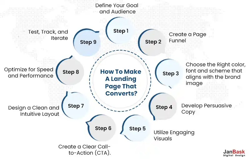
Creating a landing page that converts visitors into customers is an art and a science. It requires a strategic approach, careful attention to detail, and a deep understanding of your target audience. In this section, we'll delve into the step-by-step process of creating a landing page that captivates, engages, and ultimately drives conversions. By following these essential steps, you'll be well on your way to create a great landing page that delivers results.
Step 1: Define Your Goal and Audience
Start by clearly defining the goal of your landing page. Is it to sell a product, capture leads, promote an event, or encourage sign-ups? Once you have a clear objective, identify your target audience and understand their needs, pain points, and motivations. This understanding will guide your messaging and design decisions.
Step 2: Create a Page Funnel
A page funnel refers to the strategic layout and design of your landing page that guides visitors through a series of steps, ultimately leading them to take the desired action, such as making a purchase, signing up for a newsletter, or filling out a form. Here are some tips to create an effective page funnel:
Step 3: Choose the Right color, font and scheme that aligns with the brand image
Selecting the appropriate colors, fonts, and overall visual scheme to create your own landing page is crucial to develop a cohesive and appealing brand image. Here's how to make the right choices:
Step 4: Develop Persuasive Copy
The body of your landing page should be compelling, persuasive, and focused on the visitor. Communicate the benefits of your offer, address their pain points, and demonstrate how your solution can solve their problems. Use persuasive language, bullet points, and concise paragraphs to make your message easily scannable and digestible. Here are other things to consider when you create your own landing page:
Step 5: Utilize Engaging Visuals
Images, videos, and other visual elements play a vital role in capturing attention and engaging visitors. Use high-quality visuals that are relevant to your offer and reinforce your message. Showcase product images, testimonials, or demonstrations to build credibility and trust. Ensure that when you build landing page, your visuals are optimized for fast loading times to maintain a smooth user experience. Our website design services encompass everything from user-friendly interfaces to seamless navigation, ensuring your website captures attention and drives conversions.
Step 6: Create a Clear Call-to-Action (CTA).
Your call to action is the pivotal moment when visitors take the desired action. Make sure it stands out visually and is placed prominently on the page when you create your own landing page. Use action-oriented language and create a sense of urgency to motivate visitors to act. Experiment with different colors, button styles, and wording to optimize your CTA's effectiveness. For instance, "Get Started Now," "Join the Community Today," or "Download Your Free Ebook."
Step 7: Design a Clean and Intuitive Layout
A cluttered or confusing layout can drive visitors away. Opt for a clean and intuitive design that guides visitors toward your CTA. Use whitespace effectively to highlight key elements and create a sense of visual hierarchy. Ensure your landing page is mobile-responsive, as a significant portion of the traffic comes from mobile devices.
If you're collecting visitor information, keep the form fields brief and relevant. Ask for only essential information to reduce friction and increase form completion rates. For example, a landing page lead generation form may ask for the visitor's name, email address, and industry.
Therefore when you create a great landing page make sure to include social sharing buttons to encourage visitors to share your landing page with their network. This can help extend your reach and increase the chances of capturing leads or driving conversions.
Step 8: Optimize for Speed and Performance
Page loading speed is crucial for user experience and conversion rates. Optimize your landing page for fast loading times by compressing images, minifying code, and leveraging caching techniques. Regularly test your page's performance and make necessary adjustments to ensure a seamless experience for visitors.

Step 9: Test, Track, and Iterate
Creating a landing page is an iterative process. Continuously test different elements such as headlines, copy, visuals, and CTAs to optimize performance. Utilize A/B testing and track key metrics such as conversion rates, bounce rates, and time on page. Gather data and insights to inform your decision-making and refine your landing page for maximum effectiveness.

Our landing page design service focuses on creating visually appealing and persuasive landing pages that effectively engage visitors and increase conversion rates.
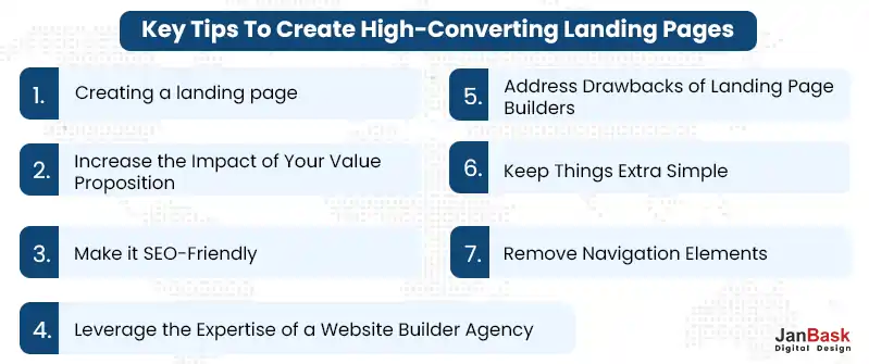
Creating a landing page that drives high conversions is an art that requires careful planning and execution. To help you achieve optimal results, we've compiled vital tips and strategies to elevate your landing page game. In this section, we'll explore practical techniques for creating a landing page, including leveraging the expertise of a website builder agency, addressing the drawbacks of landing page builders, and maximizing the impact of your value proposition.
Consider partnering with a web design agency to create a great landing page. These agencies specialize in designing and developing high-performing websites, including landing pages tailored to your needs. They have the knowledge and experience to create visually appealing, user-friendly, and conversion-focused landing pages that align with your brand identity and marketing goals. With their expertise, you can save time and ensure a professional and polished end result.
While they offer convenience, they can come with limitations. It's important to understand and address these drawbacks to create truly high-converting landing pages. Some common disadvantages of landing page builders include limited customization options, generic templates, and potential performance issues. Be prepared to invest time and effort in customizing templates, optimizing page speed, and ensuring seamless integration with other marketing tools. Alternatively, consider using more advanced landing page builders that offer greater flexibility and functionality.
Your value proposition is crucial in convincing visitors to take action on your landing page. To increase its impact, focus on the following:
Simplicity is key in landing page design. Keep your layout clean and uncluttered, focusing on the essential elements that drive conversions. Avoid overwhelming visitors with excessive text, images, or distractions. A simple, minimalist design with clear navigation and a well-defined call-to-action (CTA) will guide visitors toward taking the desired action. Emphasize the value proposition and benefits concisely, allowing visitors to quickly understand what you're off your product or service and why they should take action.

Optimizing your landing page for search engines is crucial for attracting organic traffic and improving visibility. Incorporate relevant keywords in your headline, subheadings, and body copy to enhance your page's SEO value. Ensure when you create your own landing page, it has a unique and descriptive meta title and description, which accurately represent the content and entice search engine users to click. Additionally, optimize your images with descriptive alt tags and ensure fast loading times to improve user experience and SEO performance. Our landing page services provide comprehensive solutions for designing, testing and optimizing landing pages to maximize your conversion rates and campaign success.
Our landing page services provide comprehensive solutions for designing, testing and optimizing landing pages to maximize your conversion rates and campaign success.
Here are some key considerations for A/B testing your landing page:
One of the most effective ways to keep visitors focused on your conversion goal is to remove navigation elements from your landing page. Navigation menus, links, and other distractions can divert attention away from your call-to-action and lead to a higher bounce rate. By eliminating these elements, you create a focused and uninterrupted user experience that encourages visitors to engage with your offer.
Consider the following tips for navigation optimization:
For professional and effective landing page designing services, our team combines design expertise and marketing strategies to deliver pages that convert and drive results.
Q1. What is a landing page, and why is it important for my business?
Ans:- A landing page is a standalone web page specifically designed to capture the attention of visitors and persuade them to take a specific action, such as making a purchase, filling out a form, or signing up for a newsletter. It is an essential tool for businesses as it helps drive targeted traffic, generate leads, and increase conversions. Unlike a website's homepage, a landing page is focused on a single objective, making it highly effective in delivering a clear message and guiding visitors towards the desired action.
Q2. How can I determine the goal or objective of my landing page?
Ans:- To determine the goal or objective of your landing page, you should first identify the specific action you want visitors to take. This could be making a purchase, subscribing to a service, downloading an ebook, or registering for an event. Consider your overall business objectives, target audience, and the stage of the customer journey you are targeting. Once you have a clear objective, you can align your landing page's design, copy, and call-to-action to effectively drive visitors towards that goal.
Q3. What are some key design elements to consider when creating a landing page?
Ans:- When creating a landing page, it's important to consider the following design elements:
Q4. How can I write compelling copy that engages visitors and drives conversions?
Ans:- To write compelling copy for your landing page, consider the following tips:
Q5. Should I include forms on my landing page, and if so, what information should I ask for?
Ans:- Including forms on your landing page can be an effective way to collect valuable lead information. However, the form length and the information you ask for should be carefully considered. Asking for too much information can lead to form abandonment. Only request the essential information you need to effectively follow up with leads. Typically, this includes the name, email address, and, if relevant, additional contact details such as phone number or company name. Keep the form simple and easy to fill out to encourage higher conversion rates.
Q6. What are some best practices for optimizing my landing page for search engines and improving its visibility?
Ans:- To optimize your landing page for search engines, consider these best practices:
Creating an effective landing page requires careful planning, attention to detail, and a thorough understanding of your target audience. By following the steps outlined in this article, you can create a great landing page that not only looks great but also converts visitors into customers.
Remember to keep your landing page simple, user-friendly, and focused on your value proposition. Incorporate high-quality visuals, persuasive copy, and a strong call-to-action to guide visitors toward the desired action. And don't forget to track and analyze key metrics to continually improve your landing page's performance.
By implementing these tips and best practices, you can create landing pages that not only generate leads and sales but also establish a strong brand presence and drive business growth. Our website landing page design services ensure that your landing pages are seamlessly integrated with your website, providing a cohesive and engaging user experience.
Interested in our Landing Page Design Services?

K
Great tips! I’ve been struggling with creating a landing page, but this article provided me with actionable steps to follow. Excited to implement these strategies and improve my conversion rates.
P
I never realized the impact of removing navigation elements on a landing page until now. It makes so much sense to keep the focus solely on the desired action. Definitely going to make that change on my landing pages.
O
A/B testing is a game-changer! I’ve seen significant improvements in my conversion rates by experimenting with different headlines, call-to-actions, and visuals. It’s amazing how small tweaks can make a big difference.
B
I couldn’t agree more with the importance of simplicity on a landing page. Cluttered and overwhelming designs can easily turn visitors away. Keeping it clean, minimal, and focused truly helps in driving conversions.
L
Tracking landing page metrics has been a game-changer for me. It’s fascinating to see how different elements affect the performance. Thanks to this article, I now have a clear understanding of which metrics to monitor and how to use the data to improve my landing pages.
A
I love how you’ve explained the importance of a clear and concise landing page. It’s amazing how such a simple concept can have a huge impact on conversions.”
A
his landing page blog is a valuable resource for anyone looking to improve their website’s conversion rates.
A
Thank you for sharing these valuable insights. Landing pages are a vital tool in the online marketing toolkit, and this blog empowers us to use them effectively.
J
I went through your article which was on the performance of the landing page. I would like to add some easy points which are as follows:
1.Improved User Experience
2.Increased Mobile Traffic Conversion
3.Faster Page Load Times
4.Enhanced SEO Performance
5.Lower Bounce Rates
6.Consistent Branding
7.Analytics and Tracking
8.Adaptability to Future Devices
These are some of the points which I want to include in your article. Readers, If you want to create your landing page, you can visit an IT company like Alakmalak technologies. They have 17+ years of experience in this field.
A
This blog post offers a fantastic introduction to the world of landing pages. It covers the basics while providing actionable tips for creating effective ones.
M
Thank you for breaking down landing page design in such a clear and concise way. Your post is an excellent resource for anyone looking to improve their conversion rates.