Show of hands, how many of these do you recognize?
![]()
I’m betting all of them!
These are some of the most recognized icons universally. That’s the power images hold over us.
Visual content grabs the eye of viewers and attracts them inside your store, towards your farmer market’s stand or on your website. In fact, having a visually appealing website becomes all the more critical if you want to stand out in the digital jungle. Using web design icons on your landing pages increases the chances of visitors converting into leads. But it’s not just us. All good web design services companies try adding icons when they create landing pages.
But why is this so?

Looking to Create a Your Landing Page Design?
A Stanford University research shows that 46.1% of the people they studied believe that the design of a website is the top criterion for establishing whether the company is credible or not. The study of course goes beyond just visual elements in web design services but shows just how important typography, icons, layout, and color schemes are.
Icons don’t just serve an aesthetic purpose on your website. They support the content on your page by conveying information in a nutshell. As the images so aptly showcase above, instead of writing Search, Print, or Save, you illustrate it through icons. In the process, you attract the attention of viewers and uplift the aesthetics of your page.
Using icons for web design becomes even more important when you have a landing page to create. If you want to learn how to design an effective landing page, remember the words of Neil Patel,
“You need a landing page to achieve a particular goal, whether that’s building your brand, growing your email list or making a profit. At its core, it facilitates some type of opt-in process.”
And that is exactly what an effective landing page icon layout helps you achieve! With icons, you optimize the navigation of your landing page, ensuring more visitors and ultimately, more leads.
In this article, we highlight some common tips on how to create website icons and how to use them on your landing pages.
Yes, lists are boring.
No, your landing pages can’t leave out lists.
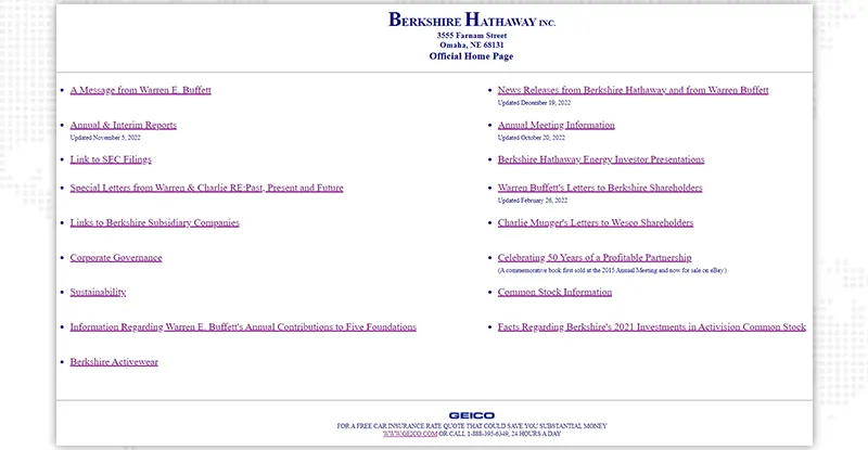
What you CAN do is to make your lists look stupendous and more interesting with web design icons. Take a look at the website below. You’d expect Warren Buffett’s company to do a much better job with web designing services, but unfortunately that’s not the case here. This information could have been presented in a much, much better fashion and icons would have really taken the content up a notch.
Now take a look at Mailchimp’s landing page. The bright colors, the great images and good copy attract you all at once, not to mention the creative icons they use to promote their USPs.
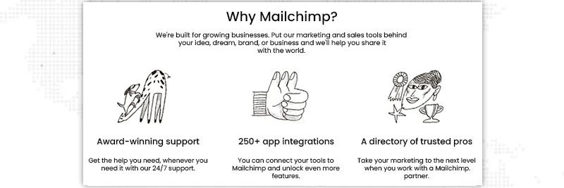
Maybe you have an upcoming product launch or a new conference and you’re creating this landing page to get people to sign up. Icons are a great way to highlight the benefits or salient features of your products or services without making the page too clunky with content.
Salesforce has done an excellent job with this section on their homepage. Not only are they making it easier for customers from all over to feel included with cute and clear logos and text, they’ve gone one step further to include demo videos about each of them.

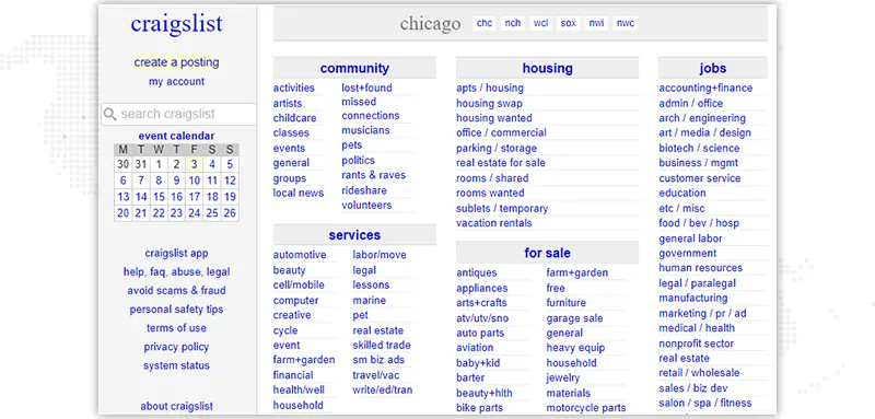
Craigslist, on the other hand, could have done a much better job of listing categories on their site. We love you craigslist, but surely a few icons would have improved the overall aesthetics.
Anyone who has ever worked on a landing page knows how they differ from the normal site pages. The information is very direct, to-the-point and written with the aim to generate form fills or bring leads. Call to Action buttons (or CTAs) are therefore, makers or breakers of any landing page. CTAs have two main components - design and content. Multiple studies have found that both of these elements affect the conversion rates significantly.
That being said, you can create quirky icon-based CTAs that immediately impress your site’s visitors. Take a look at this animated CTA button on Amazon’s home page. It’s a clickable button that takes you directly to the payment page. Notice how the text is minimal and direct and the icon image is bigger and colorful. Not to mention that green tick sign adds a feeling of assurance.

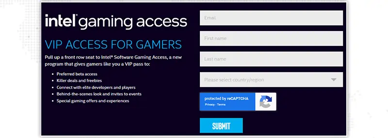
Regular, plain old CTAs work too as the one below on Intel’s website. But if you think about it, Intel doesn’t really need to build a brand anymore, right? Just the name’s enough. If you are a startup or a small to medium business, then you should definitely strive to give a better and more unique experience to your customers, shouldn’t you?
One of the biggest challenges that marketers face when they create landing pages is to not make the copy sound too sales-y. But since the inherent role of landing pages is to attract leads, there’s often conflict between intent and content. Web design icons come in to rescue the copy here as well. Relatable icons that act as visual metaphors entice visitors and help add an emotional, human side to an otherwise transactional marketing tool.
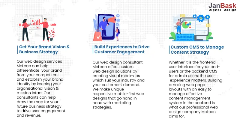
Take a look at our Website Design Services page, for example. Notice how the icons portray what we say in the headings below. With colorful images, we show that the team behind this website cares about your business. Subconsciously, you visualize us as working together just as the people in the icons. Now, imagine having your first meeting with such a wonderful perception of your web designing services team. That would certainly be a rich experience, won’t it?
While most social media icons are widely recognizable, many landing pages still feature the channel names instead of icons. This means that you don’t need to explain to your visitors what would happen if they clicked the blue bird or the red and white P on your landing page.
Including social media network buttons on your landing page allows your visitors to create a buzz in their own circles through the old fashioned word of mouth. For example, you could include an ‘Invite Your Friends’ CTA with a customizable invite link to share on social media handles for your next conference. This way, not only can your attendees register for your event but also garner the attention of other potential attendees.
Take a look at how Entrepreneur does it on their blog section.
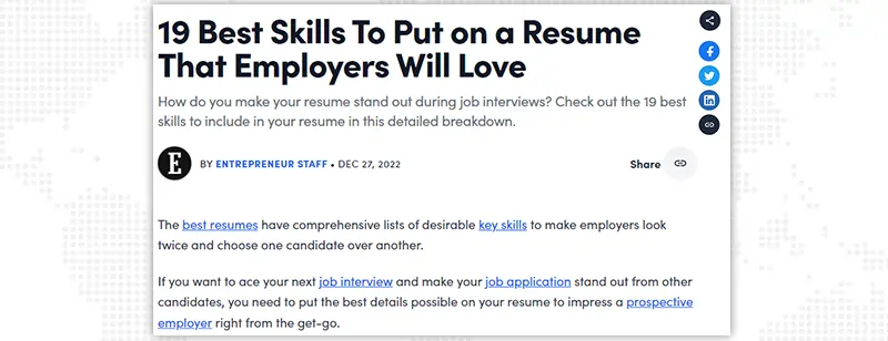
Such web design icons are minimalistic, non-interfering and give more freedom to readers to share only that content which they relate with. This type of visitor advocacy will not just bring in more visitors, but will also gradually establish you as a thought leader within your industry.
Use these tips to incorporate web page icons into your landing page design to get the most out of your promotional efforts. If you’ve read this far, let’s now find out how to create website icons for your landing page.
Here are our favorite icon repositories to find the best and most creative icons for your landing page.
This awesome website boasts a massive collection of images, vectors, mockups and landing pages icons and you can search these by subject or by formats. You can also filter your search results by free or premium collections. The web page icons range from simple to complex, offering a choice of colors, fillers or lines.
What we love about Freepik:
This is another great website that our website design services team uses frequently to find amazing icons. Flaticon has over 9 million vector icons, stickers, interface icons and animated icons as well as editable illustrations, presentation templates and videos and motion graphics. All icons can be customized to fit both personal and commercial requirements.
What we love about Flaticon:
Who hasn’t heard of Canva? It’s the most popular banner and icon design platform for people from non-design backgrounds. Whether you want to create a banner for your landing page or find a great icon to add to your site, Canva is the go to option. While the premium, subscription-based interface offers many benefits, the free version has several options if you’re just beginning out. From basic line-based icons to complex symbols, Canva has thousands of free icons that will uplift your landing page.
What we love about Canva:
So, there you go. These are three of our most trusted and recommended websites to find web design icons. Can you think of others? Maybe you know a website to find icons that’s even more awesome than these. Don’t forget to share them with us in the comments below!
Creating an impressive landing page is not rocket science. Original copy and attractive web page icons are the only two weapons you need in your creative arsenal to win this battle. However, if you are still new to this entire process, we highly recommend using professional web design service to help you out.
Looking to create your Website Design?

A splash page is a popup banner that covers the entire screen of any website. These overlays are typically used to inform people about an upcoming event or convert a visitor. On the other hand, a landing page is a standalone page on your website or hosted over a third-party software. While splash pages simply give a teaser of what to expect on the following screens, landing pages are designed to encourage visitors to take an action, such as sign up for a course, buy a product or attend an event.
Landing pages exist for one simple reason - to convert visitors into leads for your business. Based on what you’re trying to achieve, you can offer the following in return for information about your site’s visitors:
Web page icons improve the overall aesthetics of your landing page. Apart from this, they also:
Of course! You can add any kind of content on your landing page as long as it’s relevant to your marketing efforts and doesn’t hinder the user experience. Videos and images, as we’ve said before, engage the visitors much better and for much longer than plain text.
Our recommendation is yes, you should. Prevention is always better than cure - it’s much easier to attract visitors on a well made site than fixing a poorly designed website. Make sure to work with an experienced website design service provider like JanBask Digital Design.
It’s difficult to quote a price without understanding the scope of work involved. We recommend you take a free consultation with our web design services team for an accurate quote and turnaround time.
C
Jenny K.: You missed Shutterstock, The Noun Project and Smashicons.
F
Nerd Man: Landing pages seem so easy until you have to work on them, lol. But great blog, thanks!