
Do you have a mobile website for your business yet? If not, why should you be concerned? Because you need more than a desktop website to guarantee success for your business online.
The way people browse the web has changed. Many now use their phones as their primary computers instead of laptops or desktops. As a result, your business needs more than traditional website designs intended for desktops to rank on Google.
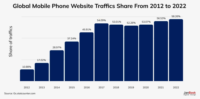
Moreover, Google recently updated its algorithm for mobile search results, penalizing websites that are not responsive and promoting those that are responsive. This move will lead to further shifts from desktops towards hand-held devices such as mobile phones, so we can assume there is no slowing down the process. Instead, it appears like a race accelerating towards achieving the ultimate goal of mobile design. So, how can you design your mobile website to stand out from the competition? You can either partner with mobile website design experts or take the long way toward learning about efficient hacks for mobile website design by reading this blog.
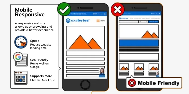
Mobile site design creates a webpage so that people who visit the site using portable devices with smaller screens, like tablets or cell phones, get maximum user satisfaction. A good mobile web design should enhance web traffic while limiting the number of visitors who leave without engaging with anything on its page due to adverse conditions.
Although web traffic continues to come from desktops worldwide, mobile browsing has become more popular. Therefore, it is indispensable for any profitable business to invest in a good mobile site design.

Looking to Boosts Your Mobile Traffic through Mobile Web Design?
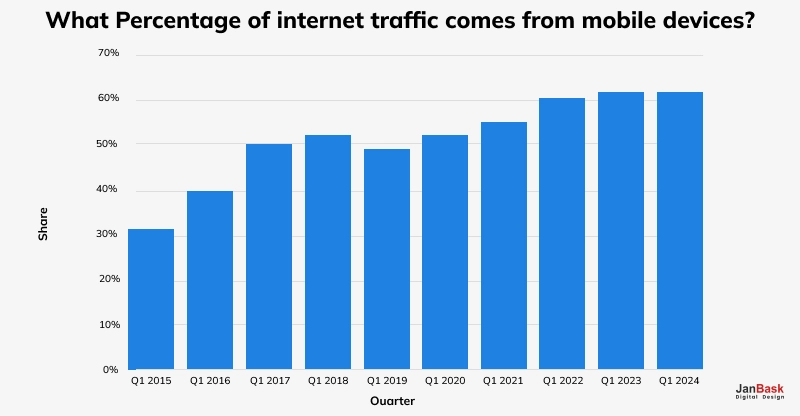
For now, mobile phones account for almost fifty-nine percent of total internet traffic worldwide. Statistically speaking, whenever your site is accessed, it is more likely than not accessed through a mobile phone rather than a computer. The number of people using phones continues to rise globally. In the opinion of experts, by 2025, about 7.49 billion people will have mobile devices at their disposal.
Ongoing changes in how people use the internet have made Google change its algorithm for searching so that websites that are mobile-friendly appear first, among other things. If your site is mobile-friendly, other users can access your information since it ranks higher than the rest.

Moreover, mobile website design helps improve user engagement and enhances chances for search engines to optimize eventually. To reach out effectively to the visitors, you should focus more on proper designs so they will like them more than anything else.
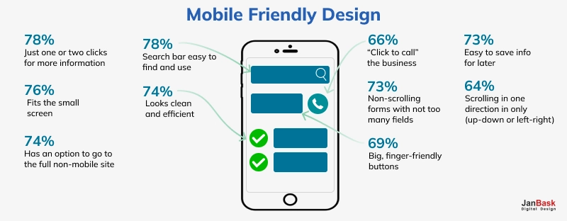
When it comes to mobile design, creating short content copies is a must. A reasonable length for a computer display could be massive on a small screen. All the content should be browsed through on your pages, and the only relevant information should be represented to the users, especially on the home page.
Keeping it simple helps prevent cluttering your site and enables the user to concentrate more on the calls to action. You must also check the text formatting, such as size, color, and font, to ensure its legibility on a smaller screen. For example, stylized cursive fonts look amazing on larger screens but become unreadable when scaled downwards.
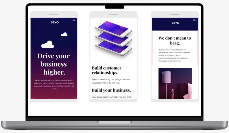
The average dimensions of a smartphone screen are 6.3 inches, whereas laptop screens vary from 11 to 17 inches, while desktop monitors always start at 20 inches or more. Therefore, mobile website design should consider that smaller screens are used to communicate with other users. Hence, it would help if you magnified your font size.
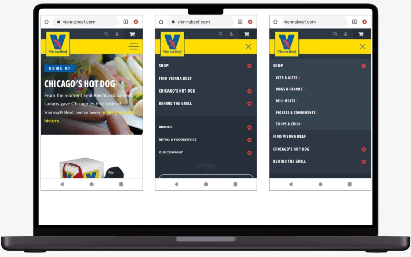
Less is always better in mobile web design. Pretty quickly into the site, a user should know where they want to navigate next. Only add more fancy or elaborate designs if necessary. For instance, if you have a lot of different pages on your website, it would be advisable to use well-placed vertical drop-down menus as an alternative option for easy navigation. See the image below for example:
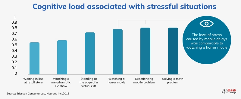
Your visitors' experience will be improved based on how fast your website loads. Depending on your chosen design, several methods will be used to enhance loading speed. For instance, you can minimize HTTP requests, enable browser caching, and use a content delivery network (CDN). If there are images, it is advisable to optimize them. If there are videos, host them on third-party sites and embed these into your page below, thus reducing their influence on the pages' duration.
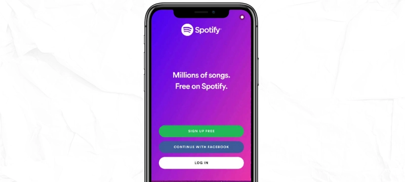
You know it's striking design if everything on the website mirrors your calls to action. Moreover, you will be safe when an action is visible from afar and is simple so that users can quickly identify what is being said. Mobile designs make them less clear if there is less clutter or if such prominent buttons are far from the user's field of vision.
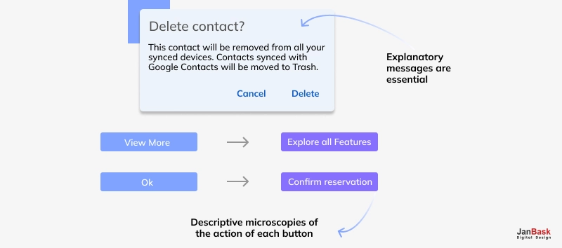
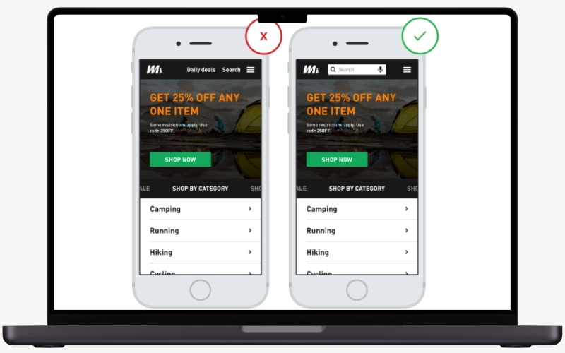
When it comes to thumbs, you should ensure that your buttons are of the right size to make it easy for users to activate them using their thumbs on purpose. Also, the buttons should be self-descriptive so that the users can know where they lead or what they do. For instance, use a magnifying glass instead of unknown symbols and images for the search function, as shown below:
Popups can give excellent results on PCs, but they may not be suitable on smartphones because they sometimes render poorly and are difficult to exit.

The exit-intent popup also does not work with hand-held devices since it is initiated when an individual drags or hovers his finger near the back button. Hence, it is recommended that such advertisements be removed from other sites' mobile versions.
Including search capabilities may be the ideal remedy for helping mobile visitors search for something as they keep visiting. It eliminates menus, allowing users to say what they want directly. Numerous designs of mobile websites have made a point of prominently featuring search boxes on top, putting them before other options. This could be an intelligent decision if your site has numerous pages and categories.
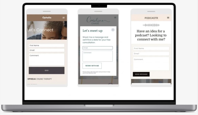
There are situations where to make a site mobile responsive; it is usually simplified, enhancing user experience. However, visitors could wonder if some parts or details must be included. To provide answers, make it easy for them to speak with you or a member of your team. Here are a few options:
What matters the most for your website? It is to earn higher rankings on SERPs. How to do it? By implementing the right SEO tactics, you make your site easy to find with simple search queries.
If you have a site that no one will ever come to know and find, what is the point of designing one? Right! So, in addition to delivering the best user experience, do focus on SEO for better results.
Having said this, it is also essential to,
That was all about how to design mobile website. Let us keep the ball rolling with the mobile website design best practices.
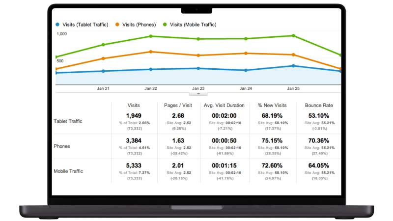
Regularly test your website against several mobile phones with different dimensions for perfect fit. If you can use Google Analytics, it provides more insight into how visitors interact with a website. Knowing which parts are ignored helps tidy up the user interface and eliminate unnecessary things. On the contrary, identifying how most people navigate your website should assist in making it better.
A suitable method for identifying the differences between mobile and desktop designs is to look at two variations on the same site.
Typeform's desktop website has a horizontal sticky menu across the page. A minimal Typeform logo is in the far left corner, while to its right lie some clean login and sign-up buttons, which make it easy for new users to create an account or log in.
A dull-white hue provides the base for the login button, which contains black writing, while the sign-up button has a reverse color arrangement that enhances visibility. With its drop-down menu, the sticky menu has other significant parts of the site, such as products and templates, all placed in its center. The expandable features apply texts instead of fixed keypads to prevent attention from deviating from other CTAs, like logging in and signing up.
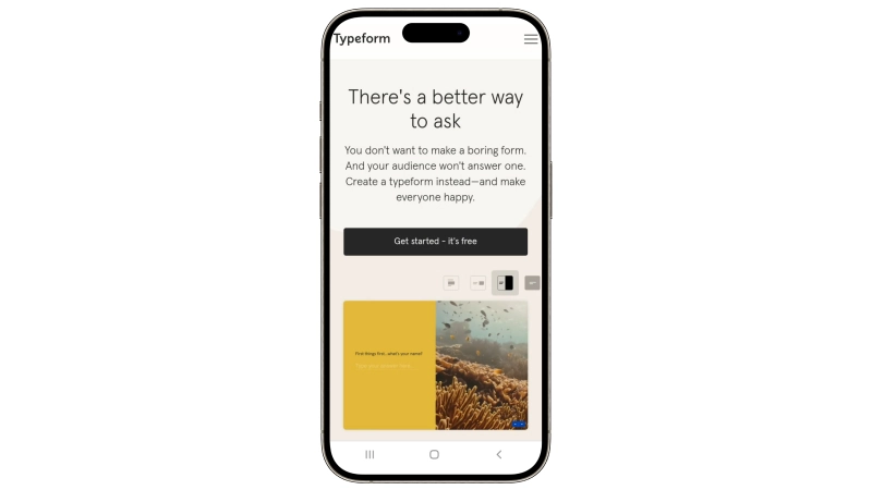
The same horizontal menu could never fit legibly into a mobile site. Typeform decided on a cleaner version —just their name on the left-hand side and a hamburger menu revealing the various navigation options when tapped. This approach makes the menu easy to see without being overwhelming.
The landing page elements on the mobile version of the Typeform Website are vertically arranged, making this slogan and CTA prominent. This arrangement also allows Typeform to follow its clean writing and calm colors in a manner that communicates concepts without drowning visitors in data numbers. It's all about restructuring the layout, navigation, and visual communication.
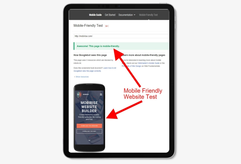
You can access Google's Mobile-Friendly Test website to test whether your site is mobile-ready. If your website fails such a test, you might lose essential visitors and possible customers. A specialized web company can interpret these findings for you and help suggest ways of improving those results.
It is time to reconstitute your site, render it mobile-friendly, and attract all lost browsers. What do we call a mobile responsive website design? Mobile-friendly designs (phone-ready designs) can be classified into responsive and adaptive.
Responsive design is a way of designing websites with an approach that will allow it to expand or reduce according to the size of the user's screen; this means you create a fluid design.
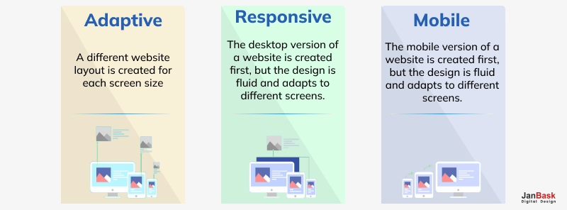
Adaptive design involves a different website tailored for mobile devices and another one suited for larger screens such as laptops or desktops. Designers and developers are often faced with discussions about which method is better for website building, even though the two approaches have advantages and disadvantages. Below are some benefits and drawbacks, plus samples of mobile website designs we've made for our customers.
To create a mobile-friendly website, one must apply responsive design techniques to make the site suitable for screens of different sizes. The images and contents should be optimized for faster loading speeds on mobile devices. Ensure that the touch elements are correctly spaced and simple for interaction. Have your website tested on multiple devices and screen resolutions to ascertain its usability. If starting from scratch, it is advisable to adopt this strategy of first designing from the perspective of a phone.
Image compression on mobile websites and browser caching can also reduce loading times. To prevent performance reduction:
Reduce heavy scripts and plugins. Your navigation must be easy to understand and friendly to the touch.
Use responsive design methods depending on screen size.
Test your site regularly and update it for compatibility with mobile devices or browsers.
For the perfect design of a mobile site, simplicity and usability should come first. It must have a simple layout devoid of any chaotic components. Responsive design applies so that it correlates with screens of all sizes and different orientations. You should ensure that buttons in touch are big enough to be comfortably accessed by different users. Load time must be fast, while navigation should be made as easy as possible. The main content and call-to-action items are the core pointers that must always be prioritized for easy accessibility regarding relevant information.
Regarding how much money it would take for someone to build a mobile website, it is hard to give a specific figure as this is determined by factors like complexity and features that one wants on the site. If you are looking at simple designs based on templates, expect something around $500, but if you want a highly customized and feature-rich web space, expect to dish out over 5k. This amount will also depend on who you work with, whether you are a freelance web developer or an established agency. However, there are other hidden costs, such as maintenance and site updates.
Employing a person for website construction often costs upwards of $1,000. Prices depend on how complicated the site is and what it has in terms of features and other specifications besides the designer's or developer's experience. On the contrary, straightforward websites with ordinary functions attract relatively little money, while customized sites with many capabilities or those that deal with electronic commerce are usually expensive. Continuous service maintenance and necessary alterations may also alter the entire expense.
If someone asked you about the cost of building a simple 5-page website, your best guess would be anywhere from $1,500 to $5,000. The price only sometimes remains constant and can be affected by design intricacies, unique components, or even the level of experience a developer has acquired over time. Websites that fall under this bracket include those with basic designs and hence charge less, while more personalized ones might end up sending people into bankruptcy due to their high pricing rates. Other extras like web hosting and maintenance might also be incurred with time.
To sum up, creating mobile sites calls for careful consideration of how clients will interact with them regardless of their device. Responsive design should be prioritized to fit different screen sizes, while fast loading time should ensure visitors are retained. Simple menus that can easily be clicked on with fingers make an excellent user interface system; moreover, constant testing on various devices helps one find out what went wrong.
In short, if you want your mobile site to be visually appealing and efficient, pay attention to these aspects because they can make or break its success regarding customer satisfaction and retention rate. Investing in these design principles may lead to better performance and efficiency for your brand's customers in the mobile space. Or better yet, contact an expert in the said design principles to skyrocket your business to newer heights.
Interested in our Website Design Services?

Leave a Reply