
Content Index
- Introduction
- Measurable Significance of Mobile Traffic
- Reasons stating why not having mobile-friendly website lower sale profits
- 1. Add-Customization-
- 2. Non-responsive Designs decrease the conversion rate
- 3. Audience Shift to Mobile Shopping
- 4. No Usage of Google Analytics
- 5. Lack of Personalization - Remoting your brand from the customers
- 6. More Citation of Unknown Words, Utter Confusion for visitors
- 7. Slow Loading Time of the Webpage
- 8. Use of Pop-ups and Sidebars
- 9. Ease navigation of the website by offering the guest checkout option
- 10. Abandonment of users without exploring to the fullest extent
- 11. Burial of website by mobile-friendly sites
- 12. Least Generation of Clicks through website
- Do conversions happen on the small screens too?
- Know the exact effect of “Mobile-Friendly Label”over the commercial websites
- Some Points to Remember while Creating Websites that benefit solely to your targeted audience.
- Conclusion
Introduction
If you are thinking of running an e-commerce website then you must be knowing that ranking your commercial website on Google ahead of competitors is the first step to success.
Though not all the search engine optimization tricks help in ranking your commercial site on the first page of Google there will surely be chances where the competition amidst other digital marketers.
One of the most amazing search engine optimization techniques is to stay on the top where the behavior of the user is determined. 
Measurable Significance of Mobile Traffic
From the detailed report of the ComScore Report, there has been the revelation that mobile traffic has overtaken the traffic emerging from the desktop.
In the year 2015, Google also valued mobile searches as the most effective key to generate traffic.
Since the traffic is considered to be the beginning of the stage where the channel for e-commerce sites has been led.
Reasons stating why not having mobile-friendly website lower sale profits
Let us start from the fact that in 2015, Google declared that the onset of traffic emerging from mobile phones has surpassed the usage of desktop and it has been recorded for the first time in history.
1. Add-Customization-
It implies that more and more users visit the commercial website through the channel of mobile phones other than laptops. If the commercial site of yours doesn’t remain friendly then there are chances that loading may be slower and this can be due to the lack of design also.
Since e-commerce sites rely heavily upon ad revenue. Thus, it is not difficult for one to realize how the decrease in traffic can lead to the loss of profits.
2. Non-responsive Designs decrease the conversion rate
Hurt SEO- In the aim to affect the user experience, non-responsive design over the website can affect the SEO rankings of it too. This is why Google often de-indexes sites that do not qualify Google mobile-friendly lists. It is one such test that often searches for the factors that detract from responsive designs like
- Usage of Flash
- Use of small font sizes
- Use of touch elements to coordinate together
Lack of Response from Viewers- Websites owing to less responsive design intend to drive fewer conversions and their rankings amidst other competitors decrease every passing day.
Loss of Revenue- If the websites owing to bad-graphics, fewer illustrations, and compose of less user-readable content then an organization can incur greater loss than what any business analyst could have predicted. 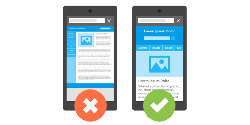
3. Audience Shift to Mobile Shopping
Lack of Mobile-Friendly Design- If the e-commerce site prefers to sell commodities directly through their home-page not consisting of CTAs (call to action) tools then it would be next to marking the nail in the coffin for the business.
Miss-Out the Information about Purchases- Although mobile shopping has become an impulsive act the lack of mobile-friendliness along with positive user information can let one miss out on the purchases.
4. No Usage of Google Analytics
Many times web-developers refrain from using Google Analytics tools as they remain overconfident of their website’s organic reach. Thus they aren’t able to track statistics of the exact number of site visitors visiting their page.
Reasons about why the lack of responsive design cost more money as expected-
5. Lack of Personalization - Remoting your brand from the customers
Local Businesses- Mobile users are the ones who are classified as a group of people who search for local businesses. According to the report of Deloitte, more than 58% of the consumers have started using the smart-phone to shop for the local goods and services.
Lack of information- Giant tech-companies websites like Amazon, Flipkart have been horses for the long-run because their custom-built websites support the function serving information to local users.
Lack of Customer Information-Less customization of websites restricts web-developers from gaining insight about consumer’s preferences and thus marks an end to his engagement in long-term planning.
No Feature of GPS, No Capturing of Leads
Companies that have benefited from their websites have preferred to use one source of communication which lies in embedding the GPS feature as the moment they deliver goods to customers automatically they get to understand the region’s buyers’ behavior.
6. More Citation of Unknown Words, Utter Confusion for visitors
Remember, your website is not the magazine or a newspaper that works in informing the readers or is viewed by the audience to impart learning.
Searches Specifies Specific Queries- As found from the Search Engine Land that many mobile searchers are quite specific about what they have to search on the website. Thus, if the published content is irrelevant to satisfy the demands of the users, then he/she may not scroll down or click on the close tab.
Limited Working Memory-An audience is not the herd that remembers almost everything, their memory remains limited according to their time of visit. Embellish your content with catchy headlines to garner the attention of readers.
State Benefits- Even if the product sample is about to get published, do add one line of benefit too, because the customer who buys a product comprehends its benefit too.
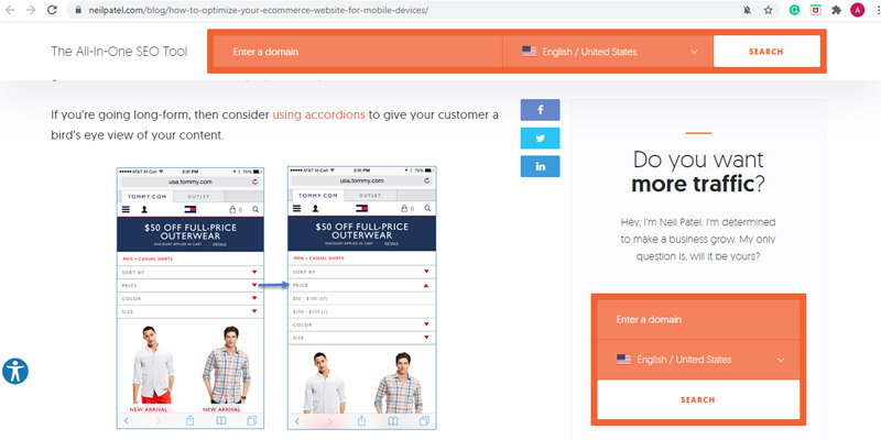
Use Accordions-A bird’s eye view for the published content specifying the product to users become more friendly when accordions are used to clarify the amount of price, type of materials, and much more minute information. It works as the small icon that opens-up the very moment a user clicks on it.
7. Slow Loading Time of the Webpage
Many times websites don’t function seamlessly and perhaps it is the reason that companies lose out on their heavy chunk of traffic.
No Use of HTML Local Storage Specification- This accounted as the major factor behind the ruining of the browser caches and content development networks that don’t blend well in reducing the loading time on mobile.
Less Preference to automated mobile accelerated solutions- If the size of images embedded on websites isn’t of appropriate size and resolution fitting then you can use tools like Pixlr for uploading the images but the impact of creative images to the audience would be far less. Thus, the web-developer must use automated mobile accelerated solutions.
8. Use of Pop-ups and Sidebars
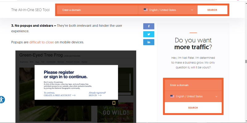
Hinder User Experience-Over usage of pop-ups after every click of the user hinders his interfacing experience and often lets him corner his thoughts that he was searching for. This is another way, let the companies lose out the traffic that they have been looking for.
Distract Users- Since side-bars distract users from searching and look awkward especially on the small screens, therefore, minimizing their usage tends to be a good option.
Access the option of disabling the pop-ups on mobile, if it is not available then use a link that can trigger the pop-up from within the published content.
9. Ease navigation of the website by offering the guest checkout option
Smooth Mobile Navigation- The addition of critical links on the blog posts of different product categories and embedment of mobile navigation of e-commerce sites collapses the source of unimportant links within the menu bar.
10. Abandonment of users without exploring to the fullest extent
Mobile users are very specific about the types of things that have been searching, they are more frequent in closing multiple tabs and in visiting different websites.
Less Attractive Graphics- If the uploaded images are of obsolete resolution or are quite simple then readers may not stick to the particular website for such a long period. As a result, he may not even consider re-visiting the site again.
Time-Consuming- Less usage of responsive designs make it more difficult for readers to explore the length and breadth of the website or even understand the business model and the reasons about navigation becomes quite difficult are as follows-
- If the text is too small to be read on a mobile device
- The web-page is divided into two sections
- The links are blindly linked together.
Perhaps, these are the major chunk of reasons that viewers clicking through your site might lose interest and without diving deep cannot find the exact offerings of your business model since the user experience will be accounted as bad.
11. Burial of website by mobile-friendly sites
In the race of no man’s land, it becomes increasingly difficult for the web-developer to constantly work-upon customizing the user-friendliness of the website and modify it more like a mobile-friendly website.
Significant Factor- As declared by Google this year that mobile usability is considered to be an important ranking factor. Implying that if an organization runs a non-friendly site, then it might get slapped by the algorithm penalty which could further tank the organization’s website rankings.
Specific Rankings- Almost all the web-servers have made it clear that their utmost preference would be granted to mobile-friendly sites that allow them to rank high in the search results.
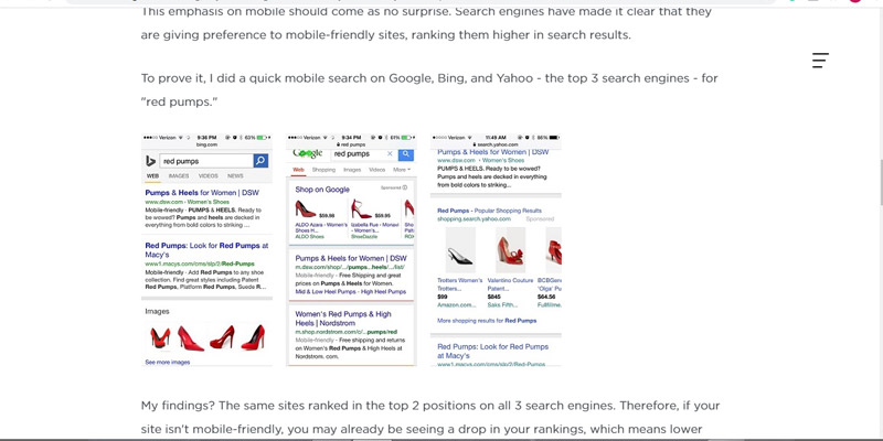
For example, if you search for the “red pumps” on three popular web-servers like Google, Bing, and Yahoo.
From the findings, you may find that all of these three web-servers are ranked in the top 2 positions on all the three search engines.
Thus, if the site doesn’t remain to be mobile-friendly then there is a chance that a web-developer may witness the sharp drop in the rankings that will further lower the online visibility and decrease the site visits too. Moreover, it also lowers the chance of converting visitors to online customers.
12. Least Generation of Clicks through website
There are times when a website ranks well but often gets subjected to being a non-profitable website that garners less money. This in turn happens because of the responsive design.
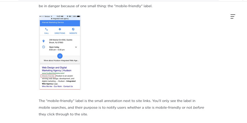
The need for “Mobile-Friendly” Label- A web-developer can easily access the “Mobile-Friendly Label” as it works lies the small annotation which is next to site links. This type of label is only visible in mobile searches.
Purpose of “Mobile-Friendly” Label- Its main purpose is to notify users whether the site used by them is mobile-friendly or not before they think of clicking it through their website.
Do conversions happen on the small screens too?
It is the factual truth that small screens hardly convert conversions because of high physical and mental friction where more than half of all emails do open on the minimized screen tab.
Reasons why small screens are not accurate for conversions
1. Least Sufficient- Revisits of visitors to e-commerce sites might not be sufficient at small screens and only allow one to browse their products on their desktops. Therefore mobile is seen as the supplementary source of exposure not the medium of commerce.
2. Lesser Clicks-The number of clicks coming on the mobile phone receives similar clicks like desktops and tablets. The advancement in mobile technology is coupled with the user’s familiarity and has further led to an increase in mobile transactions.
From the survey report of Gartner, it has been revealed that average order value on mobile has grown significantly by 15% consecutively for this year and the accounts of mobile record for 30% of email orders as well as 25% of email-driven revenue.
Know the exact effect of “Mobile-Friendly Label”over the commercial websites
The overall effect of the “Mobile-Friendly Label” is related to the psychology of the buyer. People are known for choosing the option that adeptly suits their needs at that particular moment.
- Optimized Site- If the consumers think of browsing the website on a mobile device, then there are chances that they might click on the result exhibiting “Mobile-Friendly Label” because it reflects the magnitude of the site’s optimization.
- Lack of “Mobile Friendly Label” Promotes Negativity- If the web-developer built websites only on the purpose of creating backlinks and do not use this label then there will be a negative impact over the click rates and would bring more losses to one in losing the valuable clicks.
Some Points to Remember while Creating Websites that benefit solely to your targeted audience.
- Mobile-Friendly, User Friendly,
Creation of mobile-friendly websites that runs of “Mobile Friendly Labels”, responsive designs, creative graphics, usage of readable content, less usage of pop-ups and sidebars, and precision in implementing the Calls-To-Action (CTAs) denote the rigorous possibility of yielding websites that favor the choices of customers.
- Least Complication- A way of Website’sGrowth
Assistance in the creation of mobile-friendly websites that pertain to least complication and infinitely result in adding more appeal to the targeted audience works seamlessly when the complications seeded in the web-pages are far less than what has been expected.
- Right usage of HTML coding
The process of loading a website page becomes much faster when the web-developer uses the website that runs on the exact coding meant for technical advancement along with ushering the process of downloading at a better place.
- Customization fetching more views
Always prefer the in-built structure of those sets of websites where the customization occurred in a manner that it fetches the consumer’s buying behavior and offers you a glimpse of his preferences.
Conclusion
In the times of today where the optimization of leads measures the success of one’s tech company in the digital world, a person should not forget that everyday technology exceeds the expectations of humans and coincides with a new horizon that brings a new life to unknown products that later on become local house known names.
By using the right set of techniques and in executing the latest marketing trends, a web-developer can easily build mobile-friendly websites that will not only attract new customers but will also allow in generating a handful of revenues.




Leave a Reply