Parallax Scrolling a great technique to add depth to your website and create an indelible user experience. Below you will get to know what is parallax scrolling with some examples of parallax scrolling which will add value to your website.
Now, let’s see;
What exactly is Parallax Scrolling?
Parallax Scrolling is a unique technique used in web design where background images throughout the web page are slower than the foreground images, which create a 2-D illusion to the website.

Parallax Scrolling is one of the most used techniques in today’s era, which you should try to use when you are designing your website. It is a simple locomotion that you have adapted and has made many websites look more dynamic and interactive.
If your planning to use this technique for your website, it is important for you to analyse how can parallax affect the mobile experience. To increase your website speed and not violate mobile usability, it is advised that you reduce the use of parallax scrolling so that the audience can experience a better mobile experience.
Remember one thing that when you are using parallax scrolling think about the instances where you want to use it and how can you make the adjustment for the user across multiple devices.
8 Sites that Got Parallax Scrolling Right
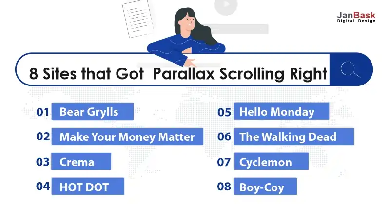
Bear Grylls
Bear Grylls a world-famous adventurous personality who is famous for the show Man Vs Wild which is broadcasted on Discovery Channel – has a fire website. The website holds a parallax design that provides the audience with a unique experience, you can see several different parallax templates when you scroll down the website. The movement of the elements on the site is quick and slow.
When you see and visit the website, you will get a real sense of depth and transmit the feeling that you are out there in the adventurous wild tour.
Make Your Money Matter
Make your money website educate people about all the good things that come with joining a credit union. I know you might find finance and credit union topics a bit boring and uninteresting, but when you visit the website you will find a unique and interactive use of parallax design.
When you scroll down the website to the end, you will find that you are running to the nearest credit union to open the account. This makes the user more interactive and helps you with boosting your website traffic.
Crema
Crema is an IT company which helps their clients to validate concepts and deliver solutions to generate confidence and boost business impact. When you visit the website, you will find out a few parallax backgrounds that change colors when you scroll down the website.
This helps visitors to segment the content and helps the visitor to what new is about to be displayed on the website.
HOT DOT
Hot Dot which has parallax elements that are a bit different from another parallax website. It has a horizontal parallax. When you scroll the website, you will see that the page moves from left to right. When you scroll the website, you will feel a smooth and easing scrolling effect. In the background, you will see the images which are graphically designed.
The website works well on every touch device and is feasible with iOS and android operating systems. The horizontal parallax which is provided on the website is responsive to mobile also, where the visitor can switch the orientation from landscape to portrait mode.
Hello Monday
Hello Monday is a creative studio that makes your digital ideas, products, and experiences. When you visit the website, you will find a unique parallax element. The effects changes on every click of the mouse. From contrasting color change to still images, each image feels like a new one.
Hello Monday uses multiple moving images which make the website more overwhelming and interactive for the audience. The website has a 3D parallax effect on the website which has gained popularity in the upcoming year.
The Walking Dead
If you are a big fan of the Walking dead thriller series The Walking Dead has come up with the website to promote it.
When you visit the website, you will see that as you follow the story as you scroll the website the pages move from left to right (horizontal). The sound effect which is played on time as you scroll the website gives you a relieving mood.
Cyclemon
If you are a bike lover then you must visit this website. Cyclemon has a unique parallax element which you will very interesting and appealing.
The website has a colorful bike presented by parallax scrolling. Unlike basic web design techniques which have static web content, the website allows you to interact with the product and inspire you to purchase the product.
Boy-Coy
Boy-Coy is a professional and creative design studio company that is committed to creating high-quality products for its clients.
When you visit the website, you will find different layers of content, which move at a different speed as you scroll down. This parallax effect provides a nice and easing element on the web page. It will become impossible for you to not scroll down to the end.
Advantages of Using Parallax Scrolling
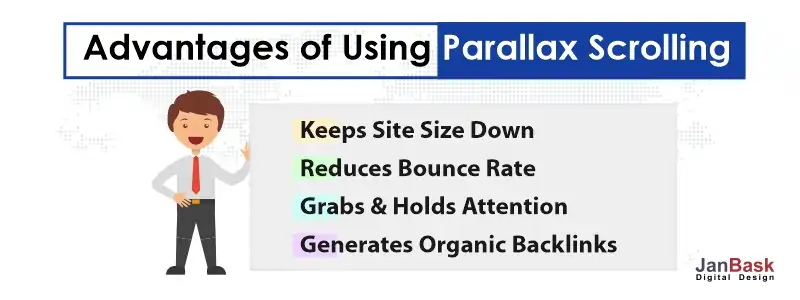
Keeps Site Size Down
A parallax website is the same as a long-scroll website. This means that most of the information provided on the website is going to be on a single page rather than multiple pages that have connecting navigation to it.
As you know, nowadays people are more into mobile devices, which has long-scrolling but it has become outdated and ineffective. So, you can keep all your information on one page which is easy to scroll and it becomes more convenient for the audience to navigate.
Reduces Bounce Rate
If you don’t know what is bounce rate? The bounce rate tells you the number of visitors who visit your website and navigate away from the website after viewing only one page. If your website is having a high bounce rate then it will have a negative impact on your search engine ranking.
So, if your website is having parallax effects and elements it will reduce the bounce rate as all the information is on one-page, scrolling site; which has no other page for the audience to navigate.
Grabs and Holds Attention
When the audience visits your website, you only got a few seconds to grab the attention of the audience otherwise they will leave your website and will visit your competitor website.
If a website has parallax images, animated images or graphics illusion it will create an interactive user experience. Parallax effects are the best way to grab the attention of the audience and work well for those website images intensive rather than sites that have the full text in it.
Generates Organic Backlinks
Generating organic backlinks is not an easy task; either your website should have content which is unique or you are having an interesting product. Having a parallax element helps you to get more organic and natural backlinks because of the visual effects and design. If your website has unique and innovative design your site can alone bring a positive point in generating organic backlinks.
Conclusion
Parallax Scrolling has changed the image of web designing because with the help of Parallax scrolling the designer gets more innovative and creative ideas to tell the details about the product.
But keep in mind that there is no excessive usage of e parallax elements on your website as it may distract and annoy the visitor, so make sure that you use them carefully and review the effects timely before proceeding any further.
Hope you all loved the article and if there are some doubts, you can ask



Leave a Reply