
Nowadays nearly all new clients want a responsive version of their website, as above all its basically important - one responsive web design for the Blackberry, another for the iPhone, then for the iPad, netbook, Kindle, etc. - and for all types of screen resolutions, it should also be compatible.
In the coming years, we might need to design websites for new inventions. And this might never stop!
So, it's no longer sufficient to have a website design that merely looks excellent on a computer screen, as the internet is accessed from mobile devices; when conceptualizing a layout, you must consider devices such as tablets, 2-in-1 laptops, and smartphones of varying screen sizes. Making your website responsive, tablet-friendly, and desktop-friendly is possible with a breeze of responsive website designs.
As a result, the company's conversion rate and overall growth will improve.
Therefore, learn about responsive website designs, from the basics to advanced techniques, including responsive website examples, definitions, a step-by-step walkthrough, and how you can amplify your brand voice using responsive web design and development services and more through this comprehensive guide.
So, without further ado, let's first start with

Looking to Create a Responsive Website Design?
Responsive website designs refer to a modern technique of designing websites that ensures all website pages display appropriately on various devices and a range of screen sizes.
Responsive website designs aim to ensure that visitors to your site have a good experience regardless of the device they use to access it.
Before the advent of responsive website designs, most websites were static, displaying a tiny version of the full site to users on mobile devices. Because the display area is more generous on desktops, you may divide your content into many columns. But users might have difficulty reading and interacting with your information if you divide it into many columns on a mobile device.
Responsive design makes it feasible to send numerous, unique layouts of your content and design to different devices based on screen size.
Earlier, the user experience was terrible because reading the content and tapping the CTAs on a mobile device was next to impossible. Responsive website designs, in contrast to static ones, rearrange their components when the width of your browser window changes, ensuring that text, media, and calls to action (CTAs) always appear at a comfortably readable size.
Without Call To Action buttons, your website visitors will be less likely to be inclined to engage with what they are seen and might leave as they can eventually lose interest. So it's important to know what is CTA and how to use it.
Building a responsive website can completely revamp your company's online identity.
There are five primary principles of responsive website designs:
HTML and CSS, two languages that govern a page's content and layout in any specific web browser, are the basis of responsive design. Almost everything about a website, including its layout, design, and content, is determined by HTML.
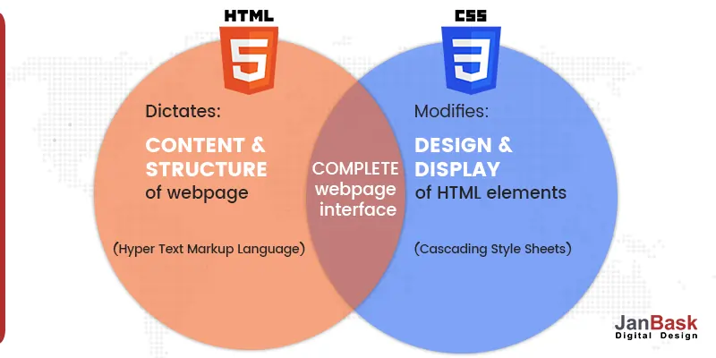
Think of your screen as a container partitioned into multiple content regions that form a grid. If the viewer's device's display changes width, the content zones will shift to fit the new boundaries.
The grid's final form may change, but the data it contains will remain unchanged. The fluidity of the content sections allows for increased flexibility. So plan your web strategy accordingly.
With the use of media queries, your site can automatically adjust its width and height to fit any screen size. These filters adjust the page design so that it works properly on the device being used to render the content.
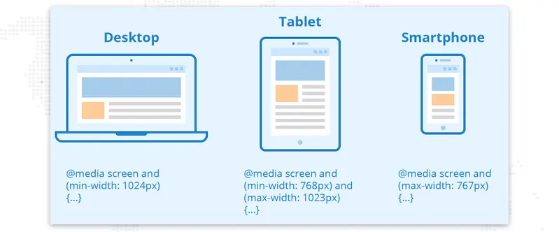
In contrast to the fluid grid example, photographs are typically not fluid. Their fixed aspect ratios can lead to problems with a presentation on displays of varying sizes. It may be necessary to zoom close on your mobile device to read the text; in other situations, the image may take up the entire screen, forcing you to scroll.
By executing a CSS/ HTML command, images obtain the appropriate fluidity and immediately adapt to the relevant screen.
Consider the loading time of your website's pages very carefully when considering a responsive design. You can refer to the guide to website speed optimization because-
If a page takes 5 seconds to open, a whopping 38% of visitors will leave without interacting with it at all. This drops to an average of 9% for pages that load in under 2 seconds.
Your first render time for the page should not be impacted by your responsive strategy, then only your responsive website will succeed.
You may speed up your website in a few different ways. You should think about enhancing your crucial rendering path by optimizing your pictures, introducing caching, and minification, employing a more efficient CSS layout, eliminating render-blocking JS, and so on.
Our website design services are second to none. We create websites that are stylish and easy to navigate while meeting your needs. Our responsive web designers work with you to understand your goals, bring them to life, and make them stand out.
You might be wondering what the big deal is about responsive design if you're just getting started in online design, programming, or blogging.
The answer is simple.
More than 51% of all website traffic now originates from mobile devices, surpassing desktop computers as the previously dominant source of internet access.
Therefore, your site's performance on mobile devices must be on par with that of the desktop version in terms of speed and responsiveness.
In conclusion, mobile has rapidly risen in importance as an advertising medium in recent years. The total amount spent on mobile advertisements increased by 4.8%, reaching $91.52 billion, even after the market had recovered from the pandemic.
The goal of responsive website designs is to provide a better experience for visitors to a website by catering to the viewer's device screen size and orientation, regardless of whatever device they use to access the site. The number of people visiting your website is heavily influenced by how well it was designed. So give importance to user experience design.
Our website design services include web development, responsive website design, search engine optimization, and social media marketing to help companies grow better.
Although there are several methods that can be used, media queries are the most common practice for creating an efficient web design. Browse the stunning responsive web design examples below to get ideas for your own website.
Using these responsive design examples, you can see how responsive grids and pictures can help a website adjust to a user's device and how the desktop and mobile versions of a website differ.

QuickBooks is one of the easy-to-navigate examples of responsive design that looks great on any device because of its large amount of white space, the compelling value proposition in the hero section, and the standout call-to-action button color.
There is more detail about the deals in the hero section and a full navigation bar in the desktop version's header.
In contrast, the mobile version's above-the-fold portion displays only the essential information, including a hamburger menu and direct CTAs. This mobile-friendly layout allows users to enjoy the same high-quality brand experience across all devices.
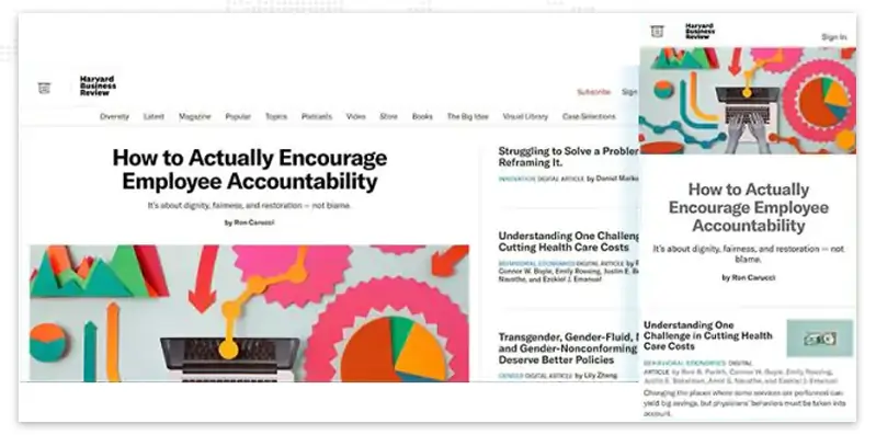
As a media organization, Harvard Business Review features a desktop website with more headlines and stories in the hero section than on its mobile counterpart.
Both designs highlight a single story with a large featured image, while the remaining headlines are text only. The primary article is highlighted for the user across all platforms.
Another key distinction between the desktop and responsive website designs is that the former can display the navigation bar with primary categories by default. At the same time, the latter requires the user to click on the menu icon before the full menu is revealed.
In general, all devices provide the same level of usability, with the most important features being readily accessible and accordingly writing website content.

Converse, like the preceding responsive web design examples, provides a menu of category pages in the desktop site header, as well as links to sign in, create a profile, search the site, and access the user's wish list and shopping cart.
The header of the mobile site consists solely of the hamburger menu, cart, and search bars.
There is no difference between the two versions regarding the hero section, which features an identical slider showcasing multiple products.
On the desktop, an extra image and a distinct CTA button are displayed, whereas, on the mobile version, the same call to action is hidden until the user scrolls down the page.
Converse performs a good job of providing top-notch UX website design ideas across all devices, which is particularly impressive given that not all material from a desktop version would realistically fit into a mobile version.
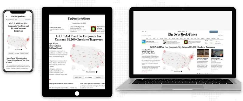
The desktop version of the New York Times is designed to seem like a newspaper, with many images and text in several columns. Each type of news item has its own row or column.
Its responsive design example adheres to the one-column standard and transforms its menu into an accordion for more intuitive navigation.
The desktop version, naturally, has a lot more data, including news categories in the navigation bar, the option to switch between local and worldwide topics, more featured stories, and even the current temperature in New York.
This responsive design example is much pared down, with just the current date, Subscription, and Sign In icons in the header and one news story displayed before the user even has to scroll down. Learn how to design sign-up forms in order to get more conversions.

Because of its clean layout, engaging CTAs, and original, high-quality photography, Shopify is a model of the minimalist responsive design example.
When viewed on a mobile device, the desktop version's drop-down menu design becomes a hamburger menu. The mobile site just has the "Log in" button, but the desktop site's header links to the "Pricing" and "Learn" pages.
The design doesn't strive to cram too much information into each section, instead favoring enough white space to prevent the user from feeling overwhelmed.
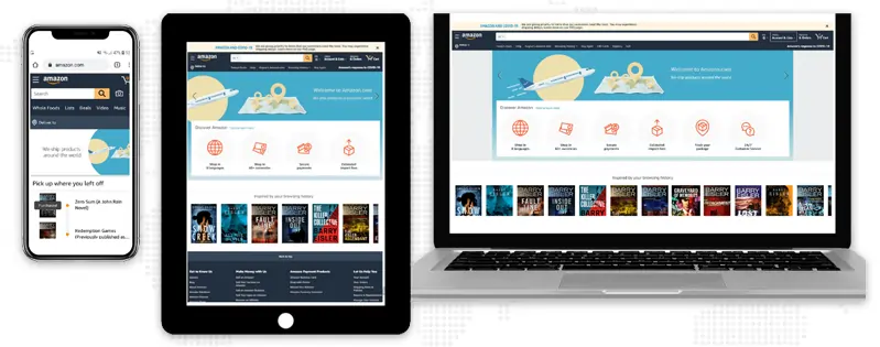
There's a good reason Amazon is the undisputed king of online retail and one of the best examples of responsive web designs: their site looks and functions superbly on every conceivable platform.
In order to cram more information into a smaller tablet layout, they simply eliminated some white space and added a scrollable section of icons.
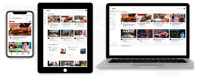
A user-specific video grid lies at the heart of YouTube's SEO design philosophy. You can see only three columns across and down in their responsive design example. On mobile devices, the layout is simplified to a single column.
To accommodate smartphone users' thumbs, the primary menu has been relocated to the bottom of the screen in the mobile edition. This tweak has a huge impact on usability and navigation.
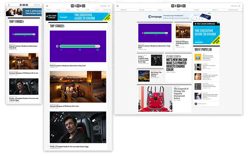
Wired's strategy for responsive website designs centers on adopting a single-column layout on all mobile devices, beginning with tablets.
It's a simple responsive web design example, but it highlights featured articles well and encourages readers to sign up.
When viewed on a mobile device, the menu condenses to just the company logo, a menu icon, and a subscription link. Due to a desire for minimalism, WIRED's mobile site lacks search capabilities and the option to filter the newsfeed by section.
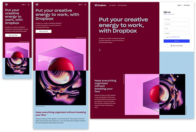
Dropbox's website is an excellent responsive design example of how to make use of a fluid grid and adaptable visuals using color theory to create an engaging user experience. When viewing on a desktop versus a mobile device, the text color changes to match the backdrop color, and the image also flips orientation.
Dropbox provides a curated experience on any gadget by taking context into account. To keep them from leaving, a desktop site may include a little arrow pointing to the bottom of the page to encourage scrolling. However, this arrow is omitted in the responsive design example because it is understood that users will scroll by touching the screen instead.
On mobile, they condense the site into a single column, emphasizing the most important information—like a user's most recent order history—instead of the various section link icons on the regular homepage.
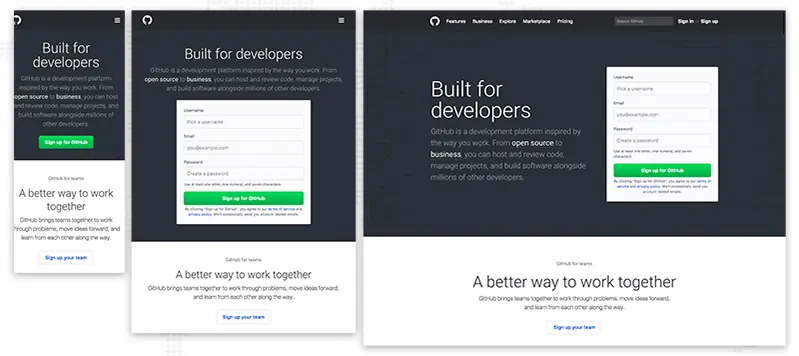
The GitHub site is optimized for use on all screen sizes. But there were a few key distinctions:
When viewing on a tablet, the copy moves from its usual position beside the signup form to above it, transforming the space above the fold from a two-column to a single-column design.
On desktops and tablets, GitHub's signup form takes center stage, but on responsive design examples, all you get is a call to action button. Users must click the call to action to surface the form.
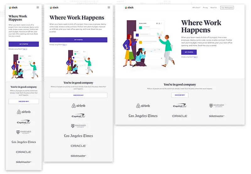
The brand Slack is well-known for being approachable and friendly. It should be no surprise that they use the same standards on their website.
Their flexible grid can fit windows of varying sizes and shapes with ease. When viewed on a desktop or laptop computer, a three-column layout of customer logos is displayed; however, only one column is used in responsive website designs.
Have you noticed how the mobile versions of each display a streamlined, uncluttered, and appealing layout that works well with smaller devices? In contrast, the desktop versions provide more information, larger photos, and multiple calls to action.
That’s the essence of responsive website designs. The goal is not to make a miniature desktop site that can only be viewed on a mobile device. The goal is to maintain the most crucial details and provide a consistent experience across all devices for the user.
Do you need a website but don't know where to start? Don't worry! Our web design agency offers website design, development, and SEO services to get you the perfect website.
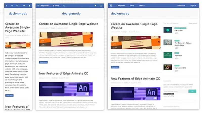
This responsive web design example of the Designmodo website looks very clean and impeccable with a proper user interface. The images and text are perfectly scaled for separate mobile screen resolutions.
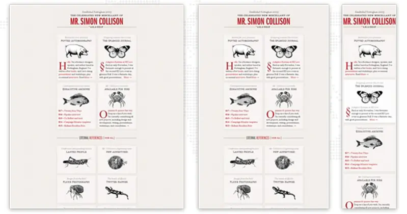
Despite the fact that, nowadays, a greyish grid-like static web design might look monotonous and lifeless. When this website was released, it gave rise to some type of stir with its classy layout.
A major reason behind this was that the web designer solely focused on responsive behavior, which had just started rising in popularity in those days, offering normal developers a benchmark responsive website design example of how a normal grid-style website layout can be gracefully transformed.
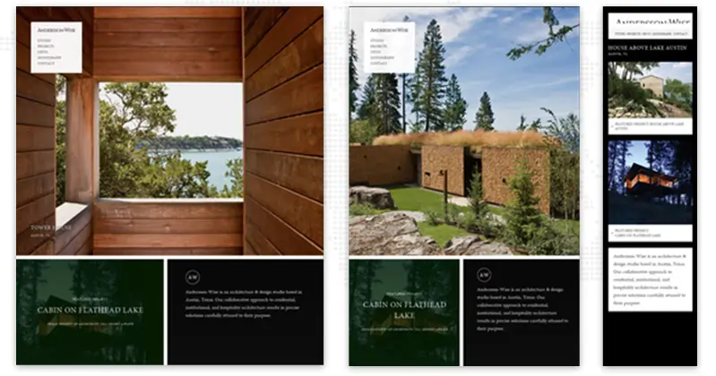
Being devoted to an architecture and design workplace, it's not surprising that the major focus of this website is on photos that brilliantly showcase skills, experience, and the brand.
This responsive design example consists of 3 major sections, each of which is dependent on the image backdrop. The resilient solution supports effectively forming a perfect structure for each standard screen size by developing a delightful content flow for the visitors.

It's one of the top-notch websites regarding responsive web design examples. You might undoubtedly ask what is so unique in this design, what is landing in typography? The solution is simple if you look carefully at the front page, you’ll find that it contains
Through this, the designer entails how a grid-like markup, typography, and blog sections can change as per the respective device screen resolutions.
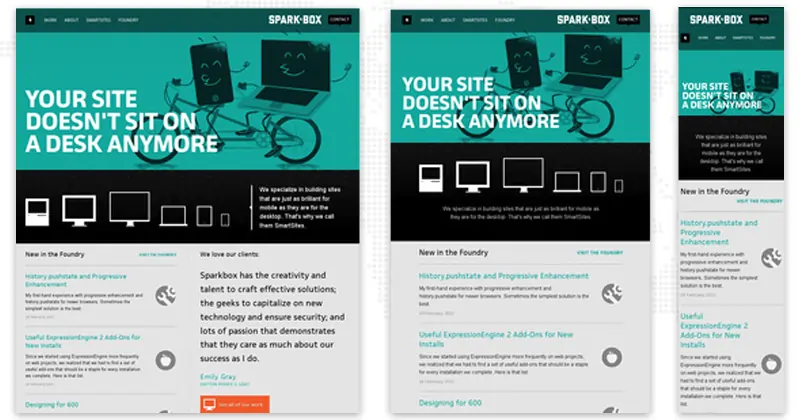
This responsive web design example represents a basic structure of a business website. Still, if you look carefully, the site layout is fairly straightforward, which depends on the standard, regularly-used group of horizontal stripes that indicates data in a low-key way.
This website structure is straightforward to adapt to different screen resolutions.
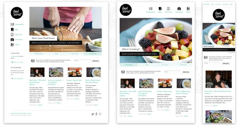
The alteration from a normal left-sided blog-like magazine layout containing a number of yummy images to a basic block-by-block site layout is an example of responsive design showing how this adaptation process looks on this site.
But having said that, there’s nothing paranormal; it's considered the normal solution to a significant number of projects that wish to drive more traffic from mobile, earn new customers, and save the aesthetics from a visual overdose.
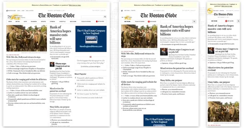
It's a superb example of a well-planned news-related website having a responsive websites designs layout, taking a traditional approach which is helpful for everyone enthusiastic about running their own regularly updated web magazine.
Even so, like a befitting, it might look like it has a complicated, somewhat rumpled outward appearance that is difficult to manage. Still, in reality, the solution is fundamental. The designer has intelligently divided the information into 3 columns, the no. of which decreases as per the screen resolution, bit by bit, passing phases of showcasing data in two columns and lastly in one.

This website uses the same markup, just like other websites, having a single column with a widgetized sidebar on the right side, a header with navigation and font types, a search bar, and a footer that displays information through different blocks.
In spite of that, the team has not carelessly used a responsive design framework as a base, but they have also diligently brought together support from other styling elements. Also, a contrasting color scheme helps to differentiate the content blocks and a few functional components like social media and ads, improving UX for smartphone users. Thus their website design highly impacts engagement.
Thus, a contrasting color palette helps to distinguish content blocks and some functional elements such as social media and ads, enhancing visual perception for mobile users and reinforcing readability.
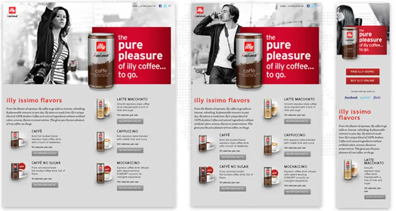
The essential feature of this exceptional promotional website is responsiveness, which exactly understands the rules of attraction. And proper use of a flexible grid so as to
Thus, the advertising campaign is absolutely out in front.
There are a lot of different factors that go into responsive website designs. Without a fundamental understanding of HTML and CSS, it might be easy to make mistakes.
You should be able to create your responsive website without any trouble if you take the time to learn the various building blocks, carefully examine the responsive design examples, and test your work as you go using the sample code.
If that seems too much work, there are always options like getting responsive web design services or ensuring your current theme is responsive.
JanBask Digital Design is a responsive web design company that collaborates with businesses of all sizes and sectors to improve their online visibility, brand recognition, and the number of customers that convert to their website.
To ensure the success of your project, our responsive web design agency services, developers, designers, project managers, QA experts, copywriters, and other members of our team adhere to a systematic methodology based on industry best practices.
Want to create your Responsive Web Design?

1. What are the benefits of responsive websites designs?
Responsive website design provides benefits to your business, and here are some of them; let’s look at them:
2. What platforms do you leverage for responsive web design and development solutions?
Our responsive website design company supports the latest web technologies containing WordPress, Drupal, Joomla, etc. For developing flexible and responsive front-end user interfaces as well as a backend, we leverage PHP, Drupal, React Js, Angular JS, JAVA, AWS, Salesforce cloud, and many more trending business technologies.
3. How long does it take to build a responsive web design from scratch?
A responsive web design and development process is very creative & needs patience. Depending upon the particular requirements, exceptional features, design, usability & functions, it might take anywhere from months to even years to develop.
M
These are some classic examples to take inspiration from.
T
I am in awe of the responsive design of Amazon. It makes things so much simpler to navigate.
T
Can you share some tips and strategies for making a responsive design?
J
Thank you Travis, you can contact at info@janbaskdigitaldesign.com for more information.
R
Interesting article
K
Very crisp blog
P
These are some classic examples to take inspiration from.
N
I am in awe of the responsive design of Amazon. It makes things so much simpler to navigate.
B
Can you share some tips and strategies for making a responsive design?
B
Interesting article
S
Very crisp blog