It is crucial to invest in quality web design services if you want to compete in the increasingly cutthroat market with the best services page design.
It is challenging to find the ideal services web page design for your brand, let's face it.
The most effective services page website design maintains a delicate balance between providing useful information and attempting to close a deal.
Going too far one way will make you feel like a low-class Wikipedia page, while going too far the other way will put you on a level with used car dealers.
So how exactly can you vouch for services page web design that genuinely appeals to your customer?
We've collaborated with dozens of businesses to enhance their B2B or service business websites and are one of the most reliable web design examples. Although there isn't a one-size-fits-all solution for creating an effective web design service page, there are a few services website page design elements that we've discovered to be consistently beneficial.
Before we dive right into it, let’s first understand the basics of the service page.

Looking to Create a Custom Service Page Design?
A service page is an integral part of a business website; as the name indicates, it authorizes a specific brand to present its products or services to prospective customers. It can be a subpage of a business website or an independent web page in a separate domain.
Because of some of the functions of the services page, their usage and location are referred to by different names. You might come across different terms like product page, subpage, sales page, or landing page since this is where most ad campaigns link.
Always remember that your services page should not just comprise the product descriptions but also try to mention the advantages of accepting your offer. A services web page design can include several components that’ll facilitate your potential customers to acclimate with your product and buy the product.
Let’s look at the important elements that your services page should include:
As you know, the service page is helpful for both your company and customers. People visit it to get the information required to buy your product or service and contact the owner.
This is where business owners showcase their products and services and collect data about prospective customers. The service pages assist in improving lead generation, irrespective of their format.
A few elements help generate interest in your offer and motivate them to ask questions.
For the visitors, the elements of a service page web design are all the important things they see and interact with. As a vendor, you must implement the right steps and select the right elements to be put on the service page so as to present your products and services in the best possible way. Also, you may allure your prospective customers to purchase from you.
A service page can include descriptions, ad slogans, headings, bullet points, quotes, etc. and product or service descriptions are the most crucial element because they tell your visitors about your offer, what it is all about, and how your product or service helps them.
The remaining content is utilized to strengthen the message, for example, customer feedback or a blog post section. Other content elements may include buttons to interact with your company or link to the portfolio. Also, remember that the content on your service page web design should be easy to read and contextually correct, and catchy.
The main aim of having a services page on the website is to attract visitors, and it can be achieved by incorporating interesting graphics and photos as the visitors choose whether to read the text or not based on the graphical impressions.
Therefore it is recommended to add product images on the service page. If you provide services or application subscriptions, you can add screenshots from your application that describes how it works or put some charts validating the capabilities of your service or tools.
Another best idea is to add infographics highlighting the ease of using your product or listing its benefits.
With the help of forms, your business can gather data related to your prospective customers, and they can express their desire to communicate with you directly. So, think twice about what information could be valuable to you.
Therefore when designing a form, remember that a too-long form might result in unfavorable effects. So, what should be asked them? If your visitors are business customers, and if you’ve got a no. of business solutions to offer them, then you can ask them which industry or department they present so that you can suggest relevant content and product.
If your visitors are retailers, you could ask them about their interests. You also need to think twice before putting the form on the service page; how it should be represented - in the form of a pop-up window or at the bottom of the service web page or on the side, or move in when the visitor scrolls the page, or be added between two different sections.
It doesn’t primarily be added directly on the service page. Integrating proper call-to-action examples between the content might redirect the visitors to an individual sub-page with the form.
CTA symbolizes a call to action, a button with a short slogan that catches the eye of the visitors and stands out from the rest of the elements with reference to size, shape, or color. You can add it anywhere, in the text or images section, in the header or footer section, etc.. Still, its major purpose is to allure the visitors to perform a particular activity, for example - purchasing a product or subscribing to a newsletter.
You must put it strategically on your service page to improve its effectiveness.
You can make your service page more attractive by using some methods. Interactional elements on your service page help in 2 way communication. I.e., information flows between your company and the customers, for example, contact forms.
When visitors perform a specific action on your page, they see a specific effect.
On the other hand, animations make the page look more “alive” and stimulate movement. For example carousel or a slider in which you can showcase customer reviews or relevant products and services. These are amazing web design trends.
Let’s find out the tools service page admins require without further ado.
When designing a service page, decide how to measure its efficiency. You can use a few tools based on which information you wish to collect about an action of your visitors. You can measure different aspects like the source of traffic, target achieved, etc.
Let's look at the tools available in the market -
This tool provides the no. of visitors who’ve visited your site, the most popular service page, traffic source, etc. Google Analytics also makes it possible to analyze the productivity of advertising campaigns to a certain extent. If you find the bounce rate is high and the avg. session time is short, it could mean that a specific group of visitors visiting your site doesn’t find what they’re searching for or are disinterested in your product or service.
If you find it difficult to use Google Analytics tool, refer to a comprehensive guide on how to set up Google analytics for website.
Marketers use it for setting up events that the business owners wish to evaluate. It’s up to you which events would you like to measure. You need to decide depending on which customer action is essential for you and what you want their journey through your website to look like.
You can consider how your customer’s journey transitions to a thank you page when they click a certain button or scroll to a specific place on your web page.
These are some of the tools you could use. Still, there are some more free as well as paid tools you can use to accomplish your business goals.
Now that you have understood the services page, the elements required to be added to the services page, and the different tools useful for service page admins, let’s look at some of the stunning services page web page design examples to inspire you!
Here are a 11 best service website examples you must consider:
This is one of the best services pages on the website, with so many services to offer, it might be difficult to comprehend how to break them down so that your users can grasp them with the services page on the website.
When iVision put its services together, it knew what to do. They divided them into three groups, each of which contained sub-services. Thanks to this method, users can quickly understand what iVision is capable of using, which also gives them a choice to examine the services on individual pages further.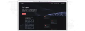
Two quotes, one from the COO and the other appearing to be from a client, frame the services as per website design services. Including social proof and your company's voice on the page adds individuality based on web designing services and shows that you and your clients genuinely believe your services are helpful (boosting conversion rates). Here are 45 winning conversion rate optimization tips.
Professional web design service experts know that the choice to browse a brochure is an additional intriguing feature.
This layout option can be useful if the authors know their market prefers to operate in the "old school" while reviewing services website examples or if they prefer to give CEOs more concrete takeaways.
Even though we must list every product and functionality on the professional web design services page, your target audience might not be interested.
Customers desire proof of value when it comes to the services website page. How will this work and these services website examples convert into a measurable return on investment that shows you were the answer?

Achievers wanted to be sure that the services page design on their website addressed this query. They discuss their evaluation results and support their services page website design with client statistics to demonstrate their effectiveness. Why wouldn't you be satisfied if other customers were?
When you describe customer success on your services page design, it might help users believe that your solutions are the best ones.
Web Design services understand that it's straightforward to get lost in the word "we" while explaining your services. Why, though, wouldn't you? The services page design describes what "we" (your business) can do and how excellently you do it.
Website design services suggest you use the web strategy used by Medallia on their services section website design. The best services website includes the reader (or future customer) within each of their services, even though they explain how their services will become the alternatives for their audience.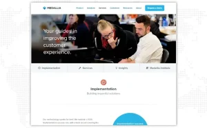
Their writing style makes it clear that service website pages are unbiased. Medallia wants to collaborate with its client as a team (as all client-customer partnerships should be).
The Arcurve service website design is simple. The user can quickly see what services the business provides.
Users can click on a service to reveal more information if it meets their needs by opening a pop-up box when they hover over it. The "X" button allows users to leave the service and return to the original services page design if it is inadequate for their needs their evaluation results required data without any unnecessary frills or fluff because of its straightforward design.
Users can contact Arcurve by clicking the contact icon, a smart initiative per professional web design services.
Software development is difficult and demanding, but Arcurve makes it simple. They make it simple and easy for consumers to locate pertinent information.
Users can click any services page on the website to get additional details. They can easily return to the services page without using the back button or opening a new window using the back button or launching a new window. They can easily return to the best services website. Because of its simplicity, this website is among the best service website examples.
It enables people to quickly and easily find the information they require.
Simple is best. Arcurve's service website page design is a great example of a straightforward and clean web design for service pages, even though yours doesn't have to be as straightforward. You can enhance your service page design by eliminating extraneous content using website redesign services and giving visitors the required data on giving visitors the data they require.
People won't have to search through your full web design service page to find what they need because they will find your data more quickly. Users are more inclined to choose your company when you give them information fast.
Check out Cart2Cart for ideas if you want to learn how to make a service page design. Users are immediately drawn in by Cart2Cart's moving selection function. This functionality cycles through many locations where shopping cart tools can be migrated, which keeps users' attention aesthetically.
Each box has a drop-down menu that, when clicked, brings up a pop-up window with several cart options.
As a result, Cart2Cart immediately engages users with this interactive feature. You can learn more about the benefits of using their services if you scroll down the page. It is divided into many categories, such as migration insurance and data migration, and each section has a corresponding image.
This page is an excellent model for a services page design that is effective for your company and your target market because it is interactive, well-organized, and easy to navigate.
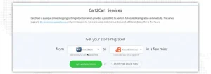
The service website page for Cart2Cart is effective since it is simple yet interactive. Users are drawn in and encouraged to engage with the page by the tool at the beginning of the page.
It increases the likelihood that visitors will stay on their services website page and interact with their material.
Engagement is increased by including interactive features on your web design services page. Interactive components entice users and keep them on your page, whether it's a selection option like Cart2Cart or a video. This is a good illustration to get inspiration from when developing features for your web design service page that will draw users in.
When it comes to organizing, Domo is among the best examples of service page design. When you visit their service website, you can select solutions based on your business jobs, such as sales, IT, or operations. Select solutions based on your business jobs, such as sales, IT, or operations, when you browse their service page on the website.
You can see some data about how their service can benefit someone in a certain function as you pause over a position.
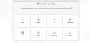
Scroll down and choose your industry if you wish to search by industry. You can also choose your solutions depending on where your data came from, and you can also choose your solutions.
Domo develops a user-friendly and aesthetically pleasing service page design that guides people in selecting the solutions that are appropriate for them.
Users can easily access the appropriate website designing solutions due to the page's organization.
Look at one of the stunning services website examples - a Contractors page from Punchlist- you can see a clear, concise, and crisp opening statement. It shows a statement, “ Do work. Get paid, and It’s never been faster.” the follow through this statement provides 3 clear, strong points that speak about the customer’s pain points.
In the next section, they’ve added a customized user testimonial which does an excellent job of humanizing the services provided by your company and communicating with the strong points just mentioned as you know why are online reviews important.
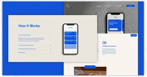
Their “How it works” section also works great in connecting major points with images from the application.
Their FAQs section is also an excellent section to delve into the questions visitors really need to be answered. They’ve seamlessly ended their service page using a soft CTA that asks for visitors’ information.
Another best services website example is Lian Surfaces, which is really a very unique example of a WordPress web design and development sub-page design.
When you land on this page, you’ll instantly get introduced to a few of the best-quality images of their work. Their services page immediately highlights 3 major service areas - Flooring, Design and Construction, Trading & PMP.
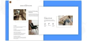
They‘ve subtly used the breadcrumbs on the right-hand side to support visitors in scrolling the page. They could have improved the font chosen for writing the content, which is pretty hard to read. You can use forced uppercase condensed font for headlines or titles.
They have beautifully laid out the page, but they could have 3 of their major services more prominently.
They have a pretty good-looking trucking services page. Here’s what you should find inspiring in their services page on the website:
The opening image clearly shows what they do and can offer. The four-line icons to indicate every truck are well illustrated and to the point. What we like most about their service page is that they aren’t calling out just their technology but also explaining how it boosts sales online and customer service. 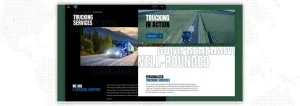
The 2nd video on their page indicates their latest yard is well placed, and this video helps further emphasize their website's professionalism. Their touchpoints speak appropriately with their avg. client size.
Their service page ends with a simple and straightforward CTA to get a quote and finalize the sales loop.
This services page example is simple but very efficient! They’ve excellently used images on their page, which certainly want the visitor to sit in that passenger seat. The clickable video is also great and really adds some life to the service page and shows a few of the tours.
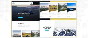
Their locations are quickly called out and provide you with the experience of their custom tour. Like the earlier services page examples, they also end their page with a CTA to book and close the deal.
Their graphic design services page design is an excellent example of how to bring together several design ideas in a systematic and organized way, that appeals to the visitors. Every section on this page has been defined clearly. They’ve very creatively incorporated work examples inside each service section, which adds a nice boost to the quality of work.
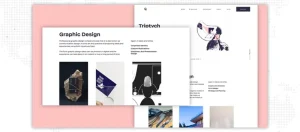
To keep the page interesting, there’s ample interaction provided on the page, but not so much that it creates a distraction.
Your service page is essential for converting leads into customers. You must put work into creating a service page design that keeps your audience interested and offers them useful information.
JanBask Digital Design website design services can assist you with creating a service page if you need guidance. Our talented website designers will work with you to develop one-of-a-kind, brand-oriented service pages that attract your target audience, inform them about your offerings, and encourage them to contact you. Are you prepared to increase website activity on your services page?
Call experts today!
Interested in our Web Design & Development Services?

C
Great ideas.
K
Nice ideas, I will use it.
R
These ideas are really good.
J
Thank you for your feedback, Reid.
K
I am gonna try these ideas.
A
Amazing ideas.
D
Thanks for sharing this information.
M
It was great learning about logo rebranding.
J
Thank you, Martin.
D
Your company has excellent knowledge on logo rebranding.
J
Thanks for your feedback, Damien.
D
Your team is really helpful.
C
How much time and duration does a rebranding journey take?
J
Thanks for your interest our team will definitely help you, please contact at info@janbaskdigitaldesign.com
C
Appreciate your teamwork and cooperation.
J
Thanks for your feedback!
J
Thanks for sharing this information.
E
It was great learning about logo rebranding.
R
Your web designing services have excellent knowledge of logo rebranding.
K
Your website designing services team is really helpful.
A
How much time and duration does a rebranding journey take?
T
Appreciate your website designing services teamwork and cooperation.