
Startups, these days, have a lot on their plates—from writing a business plan and building a team to determining the legal business structure. But you could be losing business if you don’t have an exciting and creative startup web design.
In fact, a great startup web design can help make your online business look aesthetically pleasing and welcome more users. However, not everyone can make a design-oriented, visually pleasing website. But most users know what a good website looks like when they see one. So, it is important as a web designer for startups or as the brand owner of your startup, you take a keen interest in building an attractive website for your business.
Moreover, when it comes to web design for startups, it's crucial to create a user-friendly and visually appealing interface that effectively communicates your brand's message and engages your target audience. To stand out from the competition and make a strong online presence, startups should invest in the best website design that combines sleek aesthetics, intuitive navigation, and seamless functionality.
Read through this article to know what are some of the best practices to create the best startup websites and the importance of web design.

Elevate Your Brand with Startup Web Designs Today?
A good startup web design plays a huge role in deciding the brand’s credibility and gaining users’ trust. Hence, regardless of the industry, website design for startups is an important aspect of an online business platform. It gives the brand a touch of professionalism and trust. Just because the startup is new, don’t assume the users will give it a pass. The look and feel of a website matter a lot as it instantly conveys the professionalism and attitude of the brand even before the user starts reading through the website. Therefore, whether you are a brand owner or a consumer, a good website design benefits both equally.
When it comes to brand owners, an easy-to-navigate website design for startups can assist them in effectively presenting the brand information to the targeted audience, which can persuade the users to use the services. On the other hand, when it comes to the audience, a visually pleasing web design can help retain the user to stay longer on the site, navigating through different services provided by the brand. Hence, web design startups are pivotal in providing innovative and customized solutions, helping emerging businesses establish a captivating online presence that resonates with their target market. Effective website design startups understand the unique needs of startups, offering tailored solutions that align with their brand identity, usability requirements, and growth objectives.
Just as they say, ‘First Impression is the Best Impression’, it is important as a brand owner to ensure that your website design for the startup has the best-looking home page and landing pages that convey your product and services in an impressive manner. If you are someone looking to build an online presence for your startup, you must familiarise yourself with some of the best types of websites.
If you're looking for websites to start a business, platforms like WordPress, Shopify, and Squarespace provide intuitive interfaces, flexible templates, and robust e-commerce capabilities to help you kickstart your entrepreneurial journey, as you can see below.
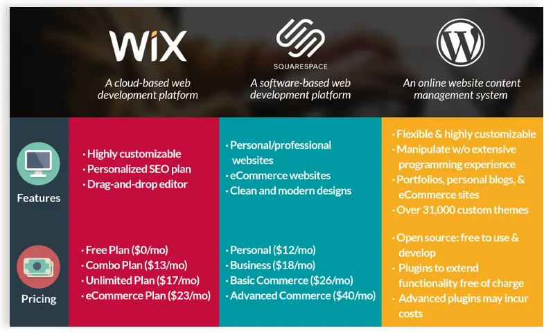
Companies with the best websites prioritize user experience, captivating visuals, and easy navigation, setting the benchmark for startups seeking inspiration and insights to enhance their own digital interfaces.
Start-up business websites serve as powerful tools to showcase products or services, engage customers, and establish credibility, making it essential for startups to invest in professional web design company that reflects their unique value proposition and fuel business growth.
However, when you create a website, it is important you ensure that your website is unique from your competitors. But how do you ensure your website stands out from others? What are some of the unique elements you can bring into your website to keep your users engaged? How do you choose a website design that is apt for your business? In this section, we will be answering all of these questions. Let’s begin by breaking down six different types of website designs.
As the name suggests, a single-page web design contains all the information a user needs on one page. On a single-page web design, a user usually will have to scroll down to get all the information. One of the many advantages of a single-page web design is that it helps promote the brand’s services in an uncluttered manner. This, sometimes even, helps the users to make decisions faster as they don’t have to switch between pages within the website looking for multiple options.
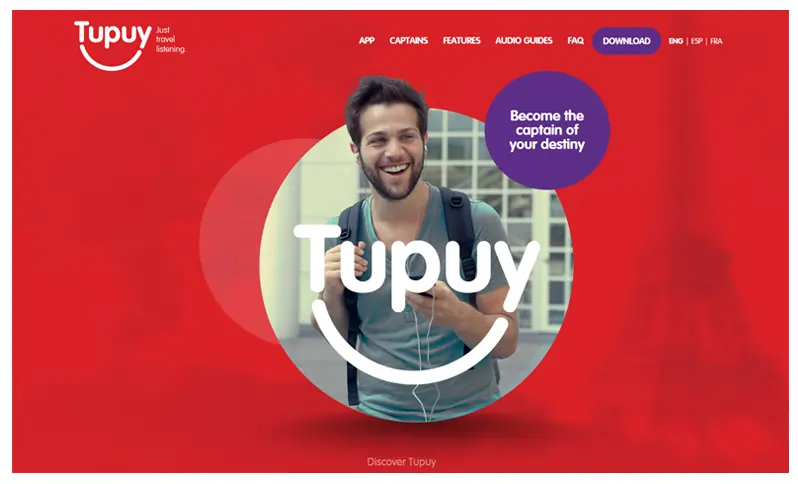
Interestingly, in a single-page website, you can consolidate all the content you would use in multi-pages to create a concise yet engaging experience. A single-page web design can best be used for creating portfolios for artists including photographers and actors. You can also use single-page websites for your products provided you bring them out in a creative manner using interactive elements such as subtle animations and illustrations. But remember too much scrolling down in a single-page design can also drive your users away. So, keep it minimal and engaging.

The word ‘static’ means lacking in movement or stable. A static website, therefore, is made of multiple static pages. These static pages are created by CSS, Javascript, and HTML. One of the easiest forms of website design to create is the static website design as it uses fixed code. Most small business owners prefer using static websites as it is affordable, work well even on slow connections, and are easier for Google to index. Most importantly, on a static website, you don’t have to keep updating the content as all the content is pre-determined.
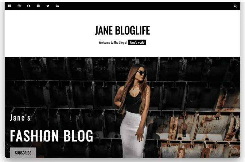
However, a few downsides of this kind of website is that if you have to make any changes on the website, you will have to do it manually. Moreover, static websites cannot tailor the user experience for each customer. For instance, if you are running an eCommerce business, a static website won’t work for you as it cannot customize the experience based on the user’s previous shopping experience on the site. Nevertheless, a static website is best suited for creating online brochures, portfolios, and journals.
When designing a website, it is essential to keep in mind to create a seamless online experience for users who use web browsers and access your services through tablets and mobile phone browsers. This means your website design for the startup will have to accommodate designs that work well on big and small screens. Liquid or fluid websites are your best bet to give this wholesome experience to your users.
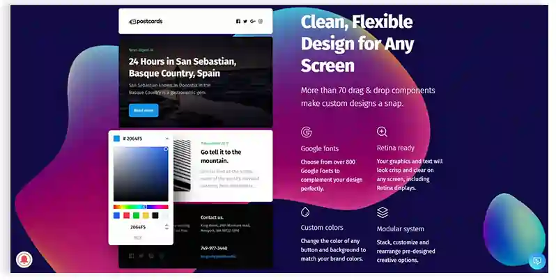
The widths of page elements in liquid web design are proportional to the width of the screen, be it on the laptop or the phone. A liquid website expands or contracts based on the current viewport width. This makes websites more usable across all devices with different screen sizes. Almost all kinds of websites can be made into liquid websites. But the only point to remember while creating a fluid website is to see that the content or image doesn’t stretch out or shrink on different screens.

In a dynamic website, the content keeps changing frequently. This means every time a user visits the website, the content changes according to the user’s previous experience. One of the best examples of a dynamic website is a news portal or a real estate service. This type of website makes it easier to manage content on the site and tailor the user experience according to the needs.
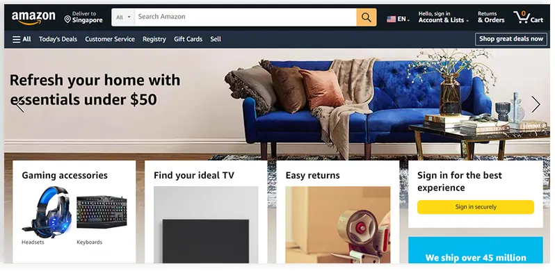
For instance, if a user is looking for a property online, you can capture the user’s location to show properties in and around the area. Some of the advantages of using a dynamic website design for your services are that it offers a better user experience, provides real-time data, has a user-friendly interactive interface, and is very easy to update. However, you would require a skilled and experienced web designer for startups to create a dynamic website design for your startup.
If you want your website to be functional and user-friendly, you would perhaps want to use a responsive design. Responsive website design is similar to fluid design. The only difference here is that the layout changes according to the screen size. In a fluid design, the website layout doesn’t change but tries to fit into the screen size. However, in a responsive website design, the layout of the online interface changes according to the device you are using.
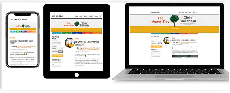
Perhaps, the layout that you see on the web browser on your laptop wouldn’t be the same on the mobile. Hence, this makes an ideal design solution while creating a website for your business, especially for mobile responsive designs. If your business is focusing more on mobile users, a responsive website design would be an ideal choice for your website.
Adaptive website designs are similar to responsive and liquid designs. But the only catch here is that startup web designers create a website for a particular device or size. For instance, if you are creating a user experience for Apple product users, the web designer for startups will create a website that fits perfectly into a Mac book or an iPhone screen.
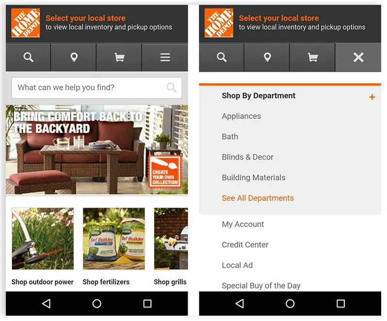
The design specifications are precise and apt. This means the site will recognize the user’s device and load the page accordingly. However, as it is difficult to create designs for different screen sizes, most brand owners who prefer adaptive website designs refer to using analytics to determine the most used screens. Accordingly, the website is customized.
Now that we know different types of website designs, let’s dive a little deeper into understanding what visual hierarchy and contextual computing are in a web design.
Text on image: Tips to customize your website based on user activities
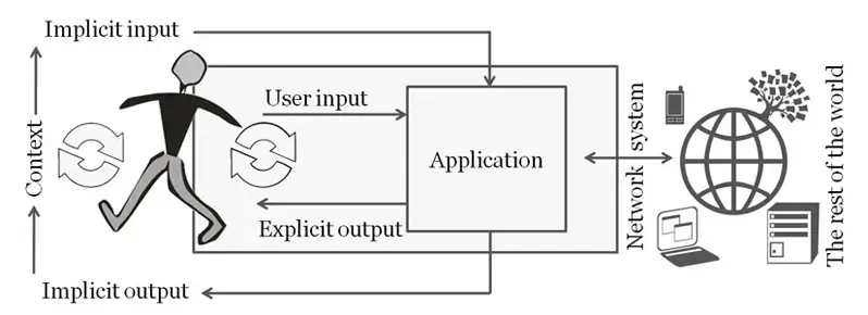
When it comes to computing, contextual computing refers to the use of computer technology to collect and analyse data about one's surroundings. The goal is to create devices that are aware of their surroundings and can analyze data to generate exciting new use cases.
Contextual computing is also referred to as context-aware computing. In contextual computing, we collect data, analyze it, and present it in more effective ways to automatically capture the attention of a targeted audience. Thus, contextual computing is a technological game and is now being used widely throughout all organizations.
Contextual computing is widely regarded as the future of website design, in which everything is done automatically using software and hardware. In fact, contextual computing is spreading its wings in the website development industry, changing the entire web design scenario. Contextual computing captures elements such as the cost of website creation in comparison to profitability and the ability to configure the website on any platform, including Joomla, iOS, and Windows.
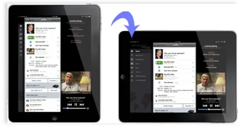
This in turn helps a designer to effectively read the mind of the targeted audience and design the website accordingly. Brands with the best company website designs always fall ahead of their competitors. In order to help you create business startup websites that stand out from your competitors, our experienced startup website designers at JanBask can help with professional web development services. We have in-depth knowledge of contextual computing and can come up with the best company website designs.
Every element of our design should contribute to a better user experience and a clearer message. Visual hierarchy in web design refers to arranging different elements on the web page according to their importance. You can help establish each element on the website in its proper place and help the most important element stand out by using principles such as contrast, scale, and balance, among others.
Visual hierarchy plays an important role in structuring your information throughout the website. It also helps your users to navigate through different products and services easily on the website.
Let’s look into some of the principles used within the visual hierarchy to enhance the visual aspect of a web page.
You may perhaps want to enhance and highlight certain elements on your webpage. To do so, sizing can help. By increasing the scale of an element you can attract the users' attention immediately.
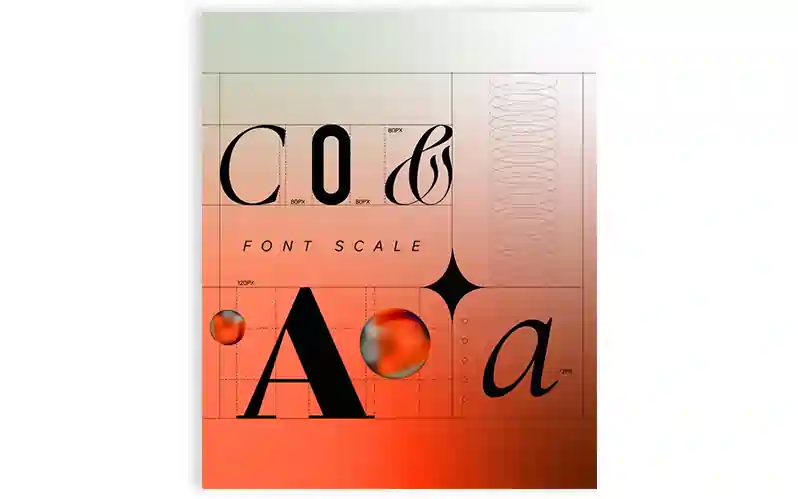
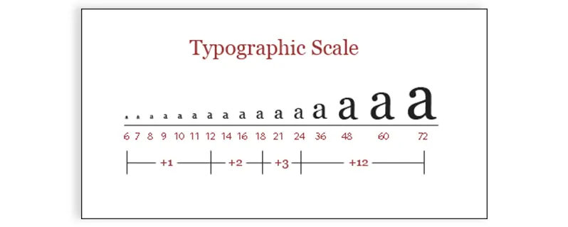
Say, for instance, increase the font size of the title or scale up the image to grab the attention of the user. However, you have to be careful in ensuring that not all the elements on the webpage are to be sized or scaled as this could bring chaos in the design.
Colours plays a huge role while designing your website. The use of one bold color on the webpage can help highlight the element no matter where you place it. For instance, you can use a standard black and white color throughout the webpage but to highlight a call to action button you can give it a bold red color.
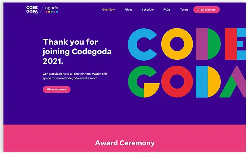
This will bring the attention of the user to the button as well as persuade them to click on it. Always remember that colors with higher contrast appear closer and bolder to the viewer, conveying a sense of importance.
Most startup business websites are designed to be 2-dimensional making them look flatter. However, if you bring in perspective changes within the design element you will be able to catch the attention of the viewer.
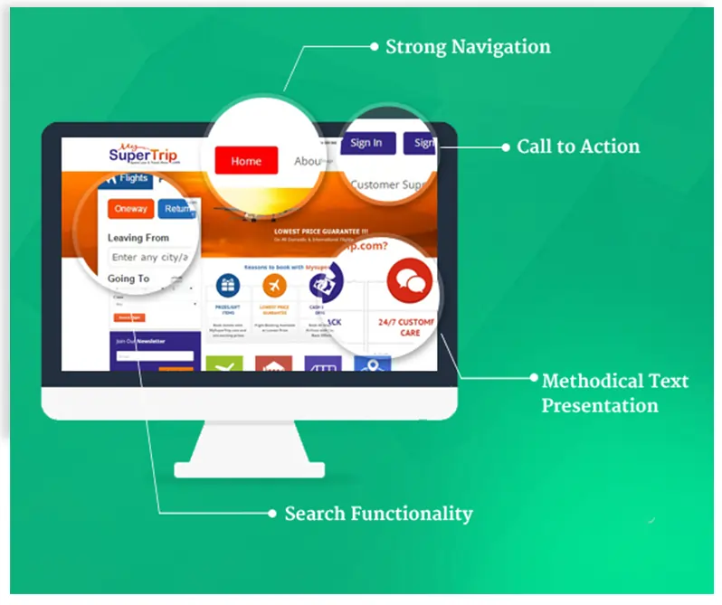
For instance, if you are placing text on top of a brightly colored image, the visibility of the text could be dimmed. However, if you blur out the image in the background, it would bring in more depth to the text making it more focussed. You can also add animations and illustrations to enhance the look and feel of the text and image on a given page or you could even play with the font size or placement of the text.
When you use guides and grids to design your page, it makes the whole layout of the given page look organized and neat. A viewer will be able to easily navigate through the page through simple patterns that don’t disrupt the overall user experience.
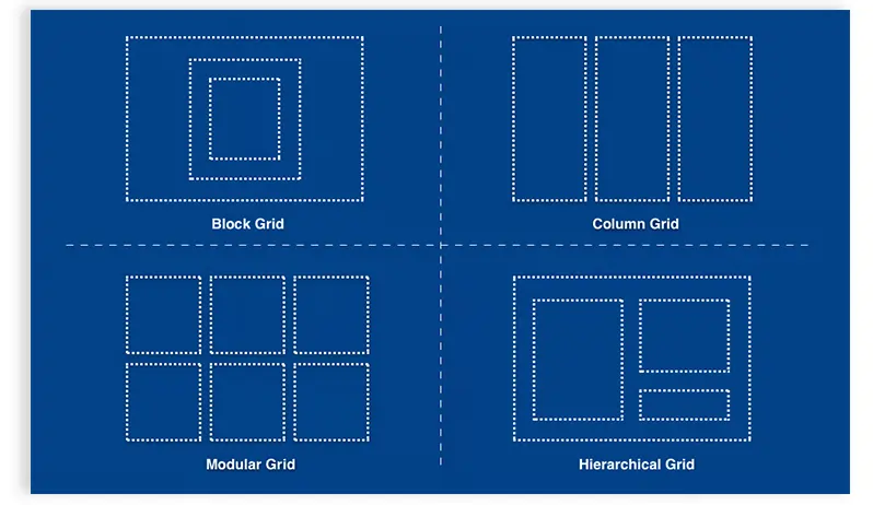
The most used formula by a web designer for startups while creating a page using layouts is the golden ratio. According to the golden ratio, when you divide a line into two parts, the longer part (a) divided by the smaller part (b) equals the sum of (a) + (b) divided by (a), which both equal 1.618. This formula can help you create shapes, logos, layouts, and other elements from a design perspective.
Isn’t it interesting to know that each viewer has a pattern to scan through the content on the website? Well, that’s right! However, this pattern may change from person to person based on the type of content and visuals on the page. The two most popular types of patterns people use are F and Z patterns. Both patterns differ based on the content and design elements on the page. Let’s learn about these patterns in detail.

The F pattern is most commonly used on text-heavy pages on the best startup websites. In this pattern, viewers tend to read from left to right, then move to the next line and continue scanning through the content from left to right. Further, when the viewer scrolls down, the user tends to read the content only on the left side of the page as the most attractive elements of the page are placed on the left-hand side.
The Z pattern travels from top left to top right, then down to the lower left and across to lower right. This pattern best suits content that is not text heavy. This pattern is for minimalist websites and helps viewers to san through the website quickly getting all the information they want. One of the best examples of this type of website is Apple’s webpage.
Visual hierarchy is used to help prioritize certain elements of your design. But the more elements you consider as the most important on your page, the more difficult it will be for you to design your page. If you are looking for web designs for startups, we suggest you begin by concentrating on the single most important factor that will propel your design to success. You can also get in touch with our team of experts at JanBask for website design tips.
Now that you have plenty of options to design your website, one of the major questions you probably would be asking yourself is: How do I choose the right website design? To help you answer this question, here are three factors you can consider while designing your website design startup’s online interface.
Each website design differs based on the type of business. Considering the business while designing a website will definitely help you to narrow down the kind of design you would like for your web design startup’s online presence. For instance, for an eCommerce site, you cannot afford to have a text-heavy design. Rather, a dynamic website design, customized for your specific user can help make the user experience more exciting and create the best startup website.
Determining your target audience can help design your website according to their likings. For instance, if your target audience falls between 18 to 35, you could probably design a website that is more appropriate for a tech-savvy audience, who appreciates colors, designs, and animations. But if your target group falls between 40 and 65, probably you would want to keep a design that is easier to navigate yet keeps them engaged.
Optimizing your website based on the device type is another important factor to be considered while designing a website. For instance, if you are focussing on a group that accesses your website through tablets and mobile phones, you would want to design a site that is more design-friendly on these devices. This in turn will enhance the site viewing experience.
1. How important is the look and feel of the website?
Without a doubt, the look and feel of your website add to the success of your business. Besides the fact that the look and feel of a website help retain users on the site for a longer time, it also helps gain the trust of your users. It also helps improve your customer base as well as improve conversions.
2. What are the different kinds of website designs?
There are different kinds of website designs that can be customized based on your business type. From static and liquid website designs to dynamic, you have a variety of design types to choose from to help enhance the look and feel of your website. Need help choosing the right kind of website design for your startup? Get in touch with our JanBask design team.
3. How do I choose the right design for my website?
The internet is bursting with a lot of website design options. But choosing the right one for your business can be a little tricky. Some of the factors you can consider while creating a website consider your website requirements, budget, and looking for a balanced approach. You can also get in touch with our experienced team of startup website designers at JanBask Digital Design for the best startup website design ideas.
4. What are some of the elements included in a startup website?
Some of the elements included in a startup website are high-quality content, professional design, call-to-action, a device-friendly website, and Search Engine Optimization. But most importantly, you must define your target audience to start designing your website. This will help to cater to your audience more precisely.
5. Do startups need a website?
If you are building a startup, an engaging website is a must to build an online presence. Without a website, you will not be able to create an online presence. Moreover, your competitors can even capture the online market. So, it is important you stay up-to-date on website designs and capture the online presence. We can help do that.
The online marketplace is thriving. People across the world are looking into services and products that are accessible at their fingertips. But to build up your brand and to make it a success it is important for you to build an engaging, captivating, and creative website. In fact, behind every successful website is a highly skilled design team, which is where we come in.
At JanBask, we understand what each website needs to succeed. Our cross-industry experienced design team has a deeper understanding of creativity, adaptability, user experience, and design to create a great website for your startup. Moreover, we deal with a wide range of businesses and budgets.
Our team at JanBask can make your marketing dreams come true. Regardless of your company's size, stage, or aspirations, we can create bespoke website designing solutions from scratch that fits your budget.
Get in touch with us if you have got a project and we will come up with the best design solution to get started with your startup.
Interested in our Web Design & Development Services?

Leave a Reply