Marketers may find Twitter difficult because each tweet has a limit of 280 characters with which to grab attention. However, it is a medium that companies can't afford to overlook. When used properly, Twitter can significantly increase the number of highly targeted visitors to your blog, product page, or website. While it may be difficult to sum up a brand's mission in a few tweets, there is a more effective approach.
If you scroll through your timeline, you can see tweets with rich media embedded underneath the tweet text. Unlike tweeting a photo, which just enlarges the photo, clicking on these images takes you to a different website. The graphics that can be clicked on are known as Twitter Cards, and they typically display a title and brief summary of the connected article as well.
Sounds familiar, right?
You can add cool, eye-catching graphics to your Twitter cards, just like you can on Facebook, to increase the likelihood that viewers will click and open your content.
With Twitter Cards, you can provide your followers with a wealth of information without exceeding the character restriction. This guide will walk you through everything you should know, such as what is a Twitter card, how to create a Twitter card, and how to use a Twitter card to generate leads for your website.
Looking to Work on Your Twitter Cards?

If you are wondering what is Twitter cards, here is your answer.
You've probably already interacted with a Twitter card if you've used your Twitter stream to see a Vine, a YouTube video, or a photo. These media-rich interactions, which extend far beyond Twitter's traditional character limit, are made possible by Twitter's card system.
You can provide visitors with a similar experience with just a few lines of HTML code on your site. If users share a link to your content via Twitter, a card will be attached to the tweet, making your content accessible to the user's followers.
Twitter cards are a great way to share rich media on Twitter. They allow you to attach an image, video, or rich media to your tweet and can be used to promote your brand or product. Here's a guide on how to use Twitter cards to get the most out of your Twitter marketing.
You can categorize Cards as:
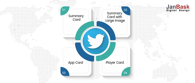
Different Card styles reflect the tweet's organizational structure. For instance, a Summary Card will feature a small image alongside a catchy title and a quick summary of the content it is promoting.
The Summary Card condenses your website's information into a thumbnail, title, and brief description, just as its name implies. The card will also include the website's URL for the user's convenience. The goal is to pique the interest of potential site visitors before they click through to your site. This may be a great choice for you if you're using Twitter to increase your site's visitors rapidly.
Summary Card: How to make a Twitter card?
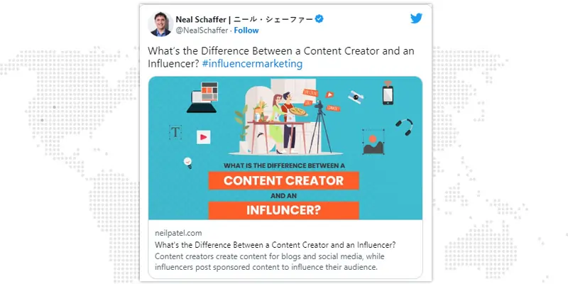
A Summary Card with a Large Image is shown on the same layout as the standard Summary Card but with a larger image.
Every day, users generate hundreds of millions of Tweets. It's easy to grab attention with a large image.
Summary Card with Large Image: How to make Twitter card?
When you really want your material to stand out, a large image on your Summary Card is your best bet. Think about whether or not an image might enhance your post. A regular Summary Card will suffice if you only require a small logo image. Nothing beats a huge image if you want to draw attention to a new product line, an infographic section, or a particularly compelling statistic.
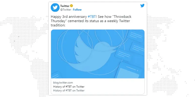
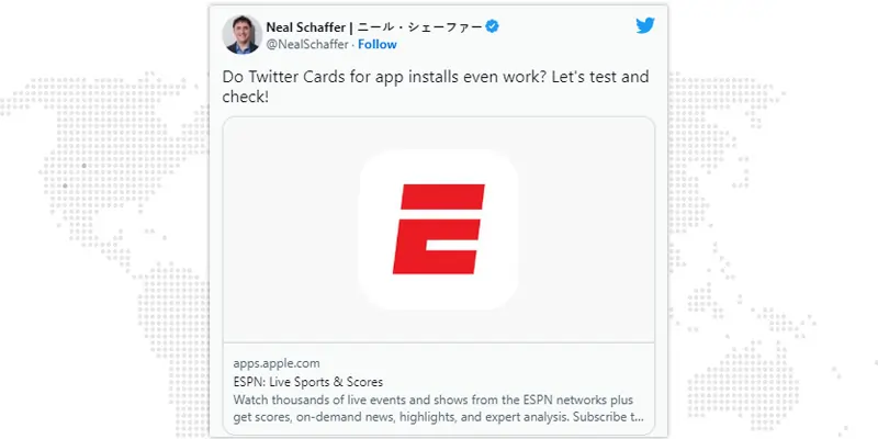
Tweets with embedded App Cards use the app's profile picture and link from the relevant app store. App Cards are Twitter's answer to the problem of monetizing mobile app usage by commercial entities. It only takes a few lines of code to provide your consumers with a seamless mobile experience.
App icons, short descriptions, and star ratings can all be displayed in App Cards. It's a terrific place to showcase your newest apps because Twitter users always look for anything new to try.
App Card: How to make a card for Twitter?
The most self-evident application for your Twitter app cards is advertising your brand-new and awesome app. For Twitter to access the data from your app, it must first be made available to the public via the app store. Make sure your app card looks excellent before you release it to the public, as its title and image will be taken directly from the store.
Your video will start playing, and a link to your website will open in a new tab once you tweet a Player Card. As more and more consumers are interested in watching videos online, now is the perfect time to take advantage of the Player Card. Plenty of fascinating opportunities for engagement with clients may be found on Player Cards.
Video: Up to 640 x 480 pixels at 30 fps
Involving your audience with Player Cards is a great idea. Take advantage of them by:
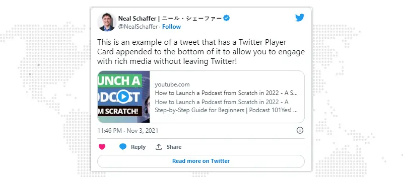
Like Twitter itself, cards have a wide range of uses. They can be used in a wide variety of contexts, all with the goal of improving the quality of the material you're presenting to the user. Cards are your best buddy for promoting your new podcast or product update on Twitter. Rather than just a short explanation and a link, Twitter cards can provide a visual element to your blog posts, making them more engaging for readers.
Alternatively, you can manually create one of these types if the above doesn't provide the flexibility you need in your creatives:
These Twitter cards offer a site's thumbnail and description. The card also has a CTA “Read More.” Experts at our Twitter marketing company recommend this card format when you just want to advertise your website. You can either go to your homepage or a specific landing page you've created for this campaign.
Instead of a thumbnail image, a video advertisement is played. Many advertisements may point customers to an Amazon page or an online storefront to facilitate sales.
These Twitter cards are very much like the app card, except that they also include an image ad. A few formatting constraints exist, but these only help you promote your app more effectively. In addition, tapping the card takes you directly to the relevant app store or market.
The ability to embed a video demonstration of your app within a Twitter card is a real plus. In the same way that the image version does, clicking on them will take you to a page where you can get the app.
Curious about how to set up Twitter cards and how to share rich media on your Twitter profile? Talk to our Twitter advertising agency and get all the answers you want.
Twitter cards can be put into action with little effort. Everything you need to know is outlined below in a few easy steps. Twitter cards can help you increase your online return on investment in as little as a few lines of text.
As there are numerous variations of Twitter cards, it's crucial to pick the one that works best for each page of your business's website. Does the link you provided connect to product information, media, or a form? Choose the Twitter card that works best with the page's content once you've determined the page's primary purpose.
This is the part when a lot of people in the digital marketing industry get nervous about integrating Twitter cards but have no fear! Twitter has released a list of required meta tags for use in website development.
Before allowing you to utilize Twitter cards, Twitter will manually review your website's credibility after you've added the necessary meta tags to your code. Verifying your site using their validator tool and checking out the Twitter card preview will ensure that everything displays properly.
Twitter Cards can be used to increase your Twitter ROI, and Twitter gives Twitter Card Analytics so you can see how. You can evaluate the efficacy of Twitter cards for your business by tracking engagement metrics like clicks, impressions, and total users. You've just finished studying what Twitter cards are and how to use them in your tweets. You now know everything there is to know about using Twitter Cards.
Twitter provides analytics for Twitter Cards so you can see how your cards perform in terms of engagement. Knowledge gained includes:
1. Snapshot: The snapshot provides an immediate assessment of the cards and tweets' impact on the number of shares, clicks, and downloads. Click on its corresponding circle to get additional information about a certain exchange rate.
2. Change Over Time: It is represented as a chart displaying a rolling 25-day image of your Snapshot's impressions, clicks, and tweets.
3. Card Types: A discussion for evaluating the quality of your Twitter cards in relation to industry norms.
4. Links: Track the success of individual pieces of content. Your most popular content will always be displayed first regarding engagement metrics like views and clicks.
5. Influencers: In terms of clicks and impressions, which posts did your influencers find most effective? Your most influential followers will be displayed here.
6. Tweets: Which of your tweets has generated the most clicks through to your site? Tweets that have done well elsewhere can be shown here as well.
7. Sources: This includes where people find and post one of your cards.

Looking to Updating Your Twitter Cards?
Twitter Cards are still a great way for businesses to be noticed on social media and drive traffic and conversions to their website.
Here are a few suggestions to consider as you integrate Twitter Cards to your future initiatives.
Make sure your cards stand out to users whether they're on a mobile device or a desktop computer. One option is putting your most recent card at the top of your timeline. It will be displayed on your profile's header permanently.
Instead, you should concentrate on writing interesting material that makes readers want to click.
Twitter is amazing at resizing your impressive photographs to fit in your post. However, if you leave all the formatting up to Twitter, your photographs may look stretched or pixelated. You can improve your brand's reputation and increase conversions by putting in more effort to polish the look of your profile.
Make your Twitter cards as visually engaging as your Instagram feed in order to attract more followers and site visitors.
Twitter is well-known for popularizing the #hashtag and elevating its importance in online communication. If you want to get the most out of your Twitter cards, it's important to include relevant hashtags. Tag your posts with relevant keywords so that individuals searching for those terms will find your content.
Last but not least, when using Twitter cards, let your visual or audio content do most of the talking for your business. That implies you can get away with using fewer than 280 characters to describe your cards.
The most successful instances of Twitter cards accomplish this by providing a short but engaging introduction to the content that follows, increasing the likelihood that the reader will click through to the full card.
If you've taken the time to learn how to set up Twitter Cards for your campaign, you should double-check that they're functioning properly. Once your tags are live, you can double-check their functionality with the Twitter Card Validator.
To use the validation tool, please navigate here: https://cards-dev.twitter.com/validator.
Simply paste your page's URL into the validator program to check its legitimacy. If everything is in order, you'll see a preview of your card and information about the number of meta tags you've set up. Every time you make a major update to the code or whenever you distribute a particularly significant campaign or post.
Ans. A Twitter card can be obtained in one of two ways:
Ans. Creating a Twitter card typically will cost you nothing. If you're using Twitter ads, you should be able to make them either manually or automatically using your website's plugins. There is no monetary outlay involved.
Ans. Twitter cards should be checked and approved when they are created. You can accomplish this by employing Twitter's own validation tool. A preview of your card can be seen by clicking the "Preview Card" button after you've pasted the URL of your page.
Ans. Summary Cards, Summary Cards with Large Images, App Cards, and Player Cards are all different kinds of Twitter cards. The structure and function of each variety vary greatly. A summary Card, for instance, would have an image, a title, and a brief description of the content. Meanwhile, the Summary Card with a Large Image format is the same, though the image is enlarged. That's why it's important to tailor your type of usage to your specific requirements.
Ans. Here are some examples of why a Twitter card would be useful:
Careful use of Twitter Cards can increase exposure, improve social media results, and strengthen an organization's online standing.
To incorporate these cards into your social media deck, all you want is the appropriate technique to use. You should be open to experimenting with new types of cards, but the most important thing is to keep track of how well you are doing. Increase the quality of your tweets by paying attention to the data provided by Twitter cards.
Social media marketing is one of the most effective ways to connect with customers and promote your brand. But it can take time and effort to know which platforms to focus on and how to create content that resonates with your audience. That's where our Twitter marketing agency comes in.
Talk to our experts and leverage most of your business with our Twitter marketing services.
Looking For Social Media Marketing Agency?

C
Thank you for simplifying Twitter Cards for me.
J
Glad to know that it helped you!
M
Intriguing guide.
H
It was very insightful.
J
Thank you, Holden.
P
Loved reading it.
N
Twitter is a complex platform and cards are definitely going to make this better for businesses wanting to market themselves on Twitter.
J
Thank you for your feedback, Nash!