
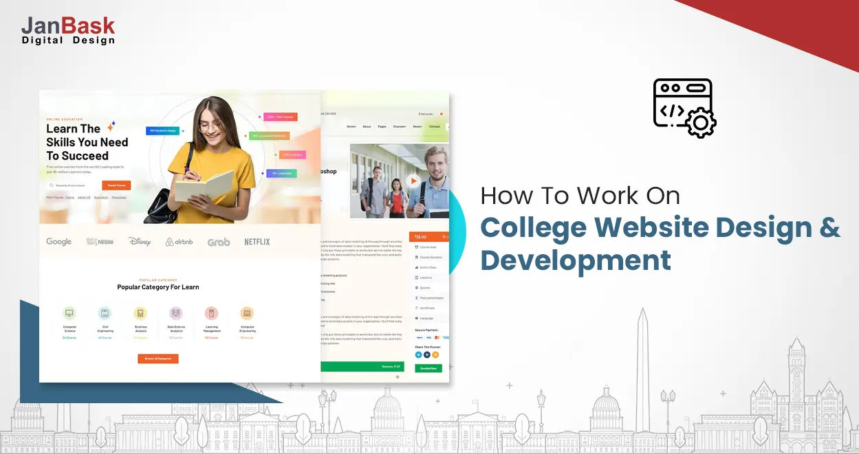
More than ever, potential students are utilizing the internet to study the institutions they want to attend. They are researching the available majors and minors, financial assistance details, local attractions, and—if the institution is a good fit—application procedures. 20.5 million students were enrolled in colleges and institutions in the autumn of 2016.
These students use the school website to access course materials, teacher listings, academic calendars, and grades. However, there are a few regular discrepancies between what students anticipate from a website for a school and what they are given.
These numbers have since altered, and in 2022, nearly 95% of US students will visit college websites to learn more about the programs and admissions criteria. Because of this, university website development is a crucial component of your organization.
In this process, a trustworthy college web design and development company can greatly assist. They have the sector knowledge that enables you to stay clear of common blunders and focus on the successful launch of website development for college.
Additionally, several factors should be given priority as you progress through your web development college, and hiring a trustworthy web development company seems like a good choice.
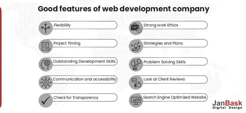
Furthermore, it is essential to gain adequate knowledge of university web development before you commence website development for college.
Here’s what you need to know:

Looking to Create a Custom University Website?
Understanding what your college website ought to be attempting to do is the first step in establishing a solid base for digital marketing for universities. If you want to increase enrolment, your objectives ought to be the following:
Goals are fantastic, but how can you accomplish them with the university website development for your college? This list includes the key website elements that institutions should emphasize to increase enrolment.
Would you like to avoid the instances and get right to the point? Learn how the website consultant helps in college website design & development by utilizing web design best practices.
The main image, and (often) CTAs that people encounter when they first visit a website are referred to as the "what’s the message" in website development for college. Users don't have to navigate to see the fundamentals because it is above the fold.
Why it's important: This is a college's first chance to talk to students about where they are and help them on their path to enrollment, not only to make a nice first impression.
How to do it correctly: What distinguishes the finest college website design & development from the worst ones? simplicity, appeal, and user intent alignment.

The greatest principles for university web development are to include:
Here’s an impactful instance of a web development college:

Here’s another web development college instance.
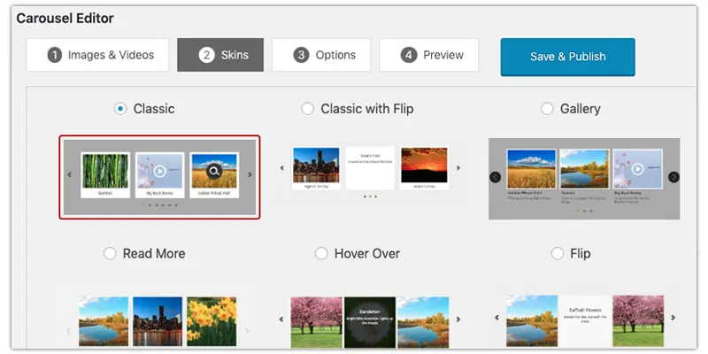
Pomona College, a liberal arts college in Southern California, decided to deploy a carousel image that promotes five different news stories, each of which is only marginally relevant to prospective students. Carousel heroes, in our university web development experience, reduce interaction because most visitors lack the patience to scroll through all the images.
With its heartwarming, engaging movies about campus life, Goucher College's homepage's fundamental image hits all the right notes with effective website development for college.
Their CTAs particularly amaze us since they steer clear of bottom-of-funnel pitfalls like "Apply Now" and instead target students that are more interested in choosing the best degree programs, boosting their professions, and enjoying their college life!
Prospective students are interested in experiencing college life and that’s how university website development helps you. Through the efficient use of movies and photo galleries, colleges and institutions may provide students with what they are searching for without making them leave their homes.
Why it's important: Videos and pictures help you establish compassion and trust with potential students through college web development. Additionally, it has been demonstrated that including videos on websites can:
How to do it correctly: For good reason, aerial shots of university campuses are extremely popular these days. It enables students to see themselves there, which is an excellent first step toward contemplating applying and then enrolling. The same is true with student life photo collections for college website design & development.
Additional urge you to educate your audience by employing video. Consider making movies for each program that describe the courses it offers, as well as a video for admissions that guides potential students through the application process and uploads them during website development for college.
The top video and image collections to include in your university website development are:
Our experts have used the following two examples:
In the end, probably not. Why? It misses the "empathize and connect" boat because it concentrates obsessively on the conceptual and not sufficiently on the actual lived experience of attending Kenyon.
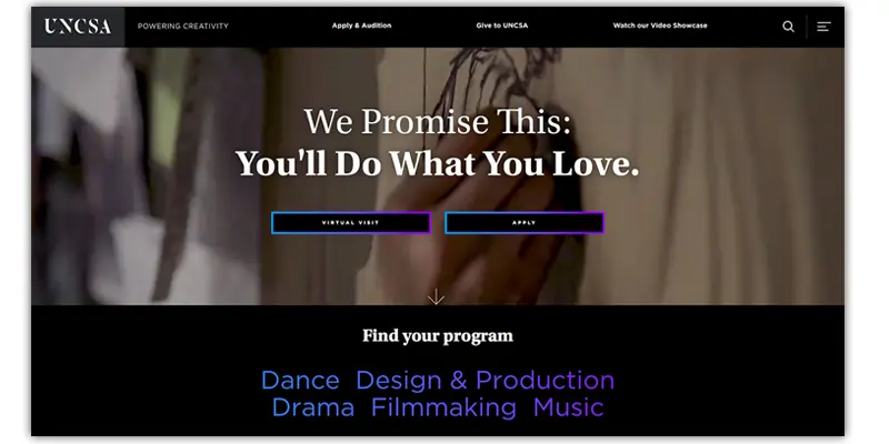
From one of the greatest film schools in the nation, you wouldn't expect anything less, and the San Francisco Film School's video does not disappoint. The film enables viewers to picture themselves "living the life" of an enrolled student, including beautiful images of the Golden Gate and clips of students honing their art through their college website design & development.
Your website's message consists of all the terms you decide to use to explain to its audience the value of your college through university web development.
Why it's important is knowing your audience and creating messages that are pertinent to their passions and intentions is crucial for institutions trying to expand their programs. Students need to understand right away that they are in the correct place.
Your bounce rates will remain low if your headlines and underlying messages speak plainly and specifically to the kinds of students you would like to draw in and your university web development won’t go in vain. This is instant and completely clear.
Users frequently leave Web pages in 10 to 20 seconds, but webpages with a defined value proposition can keep people's attention for much longer, according to a study from the Nielsen Norman Group.
You must effectively express your value proposition in under 10 seconds if you want to capture the user's attention for several minutes. All your university website development is effective as it conveys your unique selling point.
Keep in mind that you are up against over 1400 other colleges. It would help if you describe your unique and superior qualities to your prospective students.
Address your audience directly. Your web development college must primarily speak to potential students (and, if you're pursuing undergraduates, their parents) if increasing student numbers is your goal.
Be authentic! This title serves as the cornerstone for Moore's messaging, which is straightforward, unambiguous, and consistent throughout their website development for college.
The Moore College website is doing an excellent job of explaining who the college is for and why prospective students should pick Moore above other art and design colleges.
UX in college website design & development is all about structuring and presenting content in a way that makes it as simple as possible for users to go to the desired location.
Why it's important: The paradox of user experience is that when it's done well, users won't even notice, but when it's done poorly, you'll leave a very unfavorable impression. If you get it incorrect enough, visitors to your website will become frustrated and leave before you have an opportunity to persuade them to stay.
How to do it correctly: Website development for college should have straightforward, user-friendly navigation, search, and routes so that prospective students may quickly locate what they're looking for.
The primary menu should make it simple for students to find all of the applications that are offered, through web development college as well as any extra information.
a navigation bar for students who are certain of their needs. Even though it doesn't need to be highly noticeable, this should appear on every page.

Tools and secondary action navigation utilities are a must-have in your web development college.
To help readers find blog entries that are relevant to their interests, users can search for and filter them.
Here’s an example:
With logical navigation that directs potential students to first browse programs while making it simple to learn more about all their top-level issues, ASU online has its priorities in line when it comes to the user experience through its effective web development college. The Apply Now icon is present but underemphasized, and when you navigate down the page, the navigational elements are identical to those at the top.
Your skills are what students value and your right university website development efforts will in return provide information on your website, typically through an inline form. Consider eBooks, webinars, comparisons, virtual tours, and more.
Why it's important is when it comes to chances for conversion, gated offers are gold. Today's colleges have numerous possibilities to offer programs in return for information; if they don't, they risk losing out on prospective students at all points of the application process.
How to do it correctly: Be imaginative. The good news is that most institutions' online offers begin and end with a panoramic view, giving you plenty of opportunities to establish yourself as a standout candidate. Utilize your SEO consultant to help reach your potential students so that you can create engaging content around those topics.
Engaging early-stage prospects is what the top university website provides. For the large number of applicants who are still deciding where to attend college, resources like university comparison charts (that, of course, portray your institution in a favorable light), college preparation checklists, and electronic books about the employment prospects for particular degrees are all helpful.
Extension of your "free" material through work Gated offers isn't enough on their own, so you shouldn't assume prospective students will be willing to submit a form to receive one before they've invested some time on your website.
Use free material, such as program webpages and blog posts, to pique consumers' interest. As a value-added service, present pertinent gated offers.
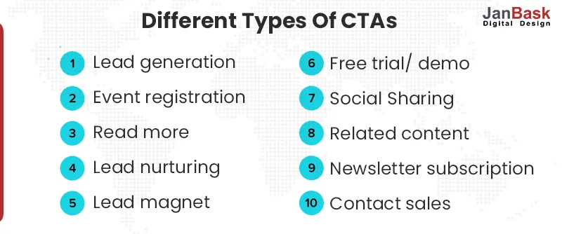
CTAs, or calls to action, do exactly what they sound like they will do: they instruct users on what to click and what they should expect once they do so but only when used wisely during university website development.
The top CTAs on university websites are:
Anyone can enjoy a good quiz, right? It's one of the finest homepage CTAs to "Take the Quiz" if you're unsure of your major. Although purple is often a good CTA color, it might have been preferable for the university to select a color that stood out from the remainder of the website.
Your university web development company can recommend the best places, colors, and content for your CTA.
Nowadays, most colleges and institutions are aware of the importance of having a blog. Do they however know how to use it? Every institution uses blogs to its best capabilities right through university web development.
Start with a targeted, strategic SEO strategy. A smart place to start is creating a keyword list that is pertinent to your specific programs and evaluating related search volume and competition. An expert SEO approach in sync with university website development is rather in-depth. If your postings aren't performing well enough, analyze your competitors to see what you can do to improve.

A lot of things are done properly on the University of Cincinnati Online's blog, which regularly posts dozens of pieces aimed at picking readers' interest from the early stages of contemplation to those who are prepared to apply.
As a result of blog posts being optimized (and ranking) for elevated search terms, a volume of traffic that converts to leads is generated right from the initial stages of web development college.
Users can choose more than one of each of the 15 study categories offered by UC online and explore over two dozen topics.
We'll examine the strategies institutions are doing to boost engagement and encourage conversions and their web development college.
The top chatbots for university websites:
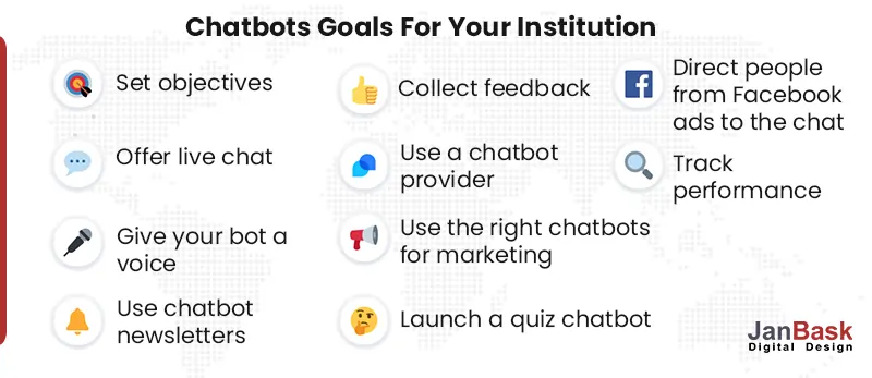
However, this successfully lowers communication barriers, which is a positive thing and ensures an applicant-friendly website development for college.
Over the years, several colleges have tried and tested efforts to create a niche digital presence. However, college website design & development under an expert’s vision has a different outcome.
For instance, experts at JanBask Digital Design have a more strategic approach that does not ignore leads in the initial stages, prioritizes content to lead stuck applicants, and encourages them to complete their process organically.
Connect with our experts to discover innovative ways to reach applicants through impeccable university web development.
Interested in our Web Design & Development Services?

J
Connecting with experts and gaining knowledge from this type of content on website development really helps us a lot. I received this article from one of my friends to learn more about websites. I am really happy to share my thoughts in the comment section.
E
I use all of your tactics to improve my understanding of the present issue. I really appreciate your useful information. I note down all of the crucial details. Thank you so much, JanBask, for giving such excellent website building content.
R
We’ve worked with JanBask on multiple projects and read all of his articles, and we’ve always been satisfied with the results. They are always punctual, inventive, and professional. We are excited to collaborate with them on our next project. Excellent work, team. Keep up the good work!
K
Excellent advice for utilizing tried-and-true providers! Yet creating such great content is not a simple task. And this essay is simply too good for web development advice. Thank you so much for providing these helpful website creation ideas for newbies.
A
I don’t know what to say about JanBask’s service and blog material; they are beyond my comprehension. Their services are excellent, and their blog content is quite beneficial to me. Excellent work and services. Continue to do so.