Think back about shopping scenarios 5 to 10 years ago.
Where did we go to buy clothes? Where did we get fresh groceries from? Where did we get information about certain topics? How did we find businesses for work collaboration? -- all offline and physically right?
Today the onset of smart & innovative websites has transformed the way we shopped, transacted, or gathered knowledge earlier. Today, from ordering food to medicines, we all now have a clear choice to visit stores to get them or simply be home and still get them.
Do you know there are 1.74 billion websites globally - out of which, some are successfully doing businesses, while some are simply not? The reason behind some not leading the crowd might be --- not being able to match up the Website design trends of 2024.
Wait, are you one of them? Don’t worry, in the following blog post, we will help you go through the Website design trends based on the types of popular websites via the help of a few examples. Read them, implement them, and become a bigger brand this year!

Looking to Create a Custom Website?
Because:
Here are the website design services that suggest web design trends based on the 6 biggest website types. So pick yours and start looking for what’s new!
These Healthcare Website Design Trends supercharge your patient's online experience.
Online healthcare businesses are no exception when it comes to web design trends. After all, your patients also love watching some cool visuals right when they are doing online consulting or booking an appointment with your clinic.
Here are the 5 healthcare website trends that your patients are anticipating.
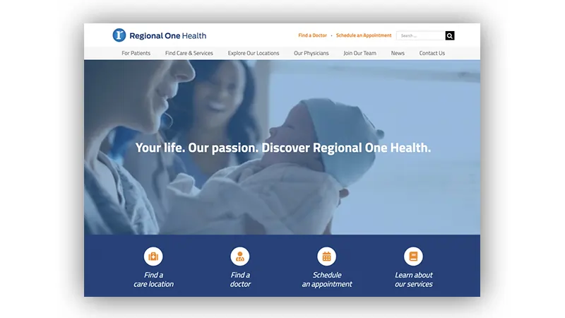
In the healthcare business, patients and caregivers expect less distraction and more human-based elements. That’s why, this year in healthcare websites we will see the visuals and typefaces that are more humane, organic, and earthy. We see this trend of natural vibe going in the following forms:
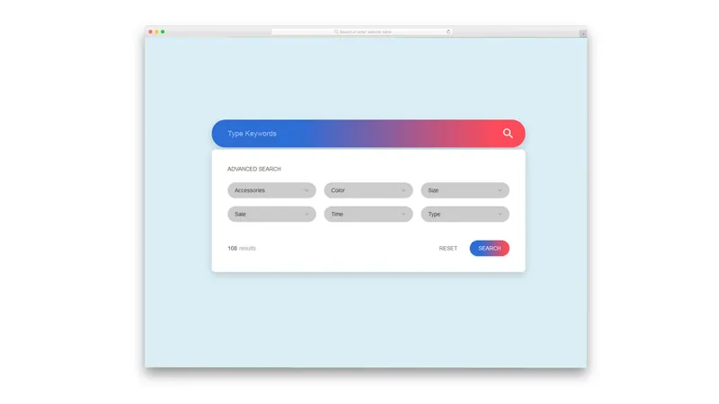
3D modeling is a new trend that is getting great prevalence over the traditional custom visuals and illustrations. This year we will see it more in use over healthcare websites, as it gives:
This trend will make your website appear more real & approachable, your care receivers will form great credibility towards your healthcare business.
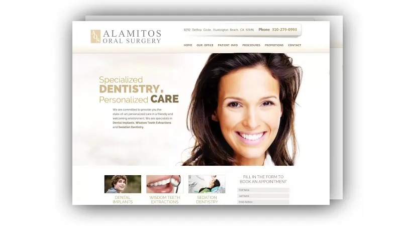
The minimalism in healthcare websites will follow this year as well. Since the aim of healthcare websites is to provide effective caregiving, having minimal illustrations and design elements throughout the website will make it easy for the patients to follow thoroughly.
Having light or minimum colored UI with a simple line-art style, the website will appear to be straightforward, easy, and appealing for the users to navigate through.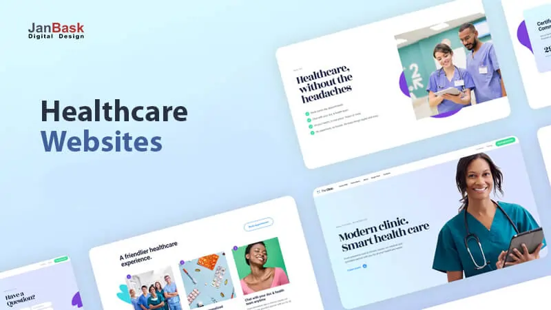
This is the most growing trend we have seen followed by caregiving websites. Where the one side has a large portion is covering a business-related image and the other side has blocks of text or content. 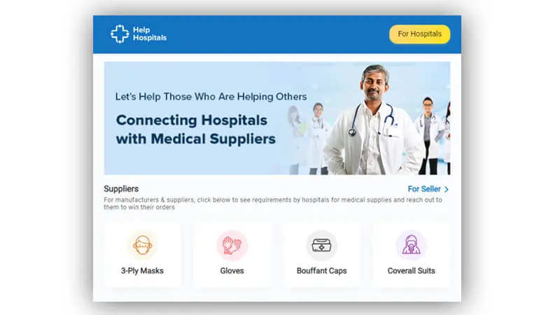
This trend makes the reader focus on the content more since they have a real image around to convince. You can add stock photos or your real staff or clinic environment picture to build a great deal of trust with the audience that visits your website to explore your services.
To stop the users’ experience from breaking at any point, the purposeful micro-interactions over the website will be seen greatly this year.
The micro-interactions like simple animations, swipe actions, animated buttons, and call to actions have a bit of action associated with them which will constantly nudge the users to interact.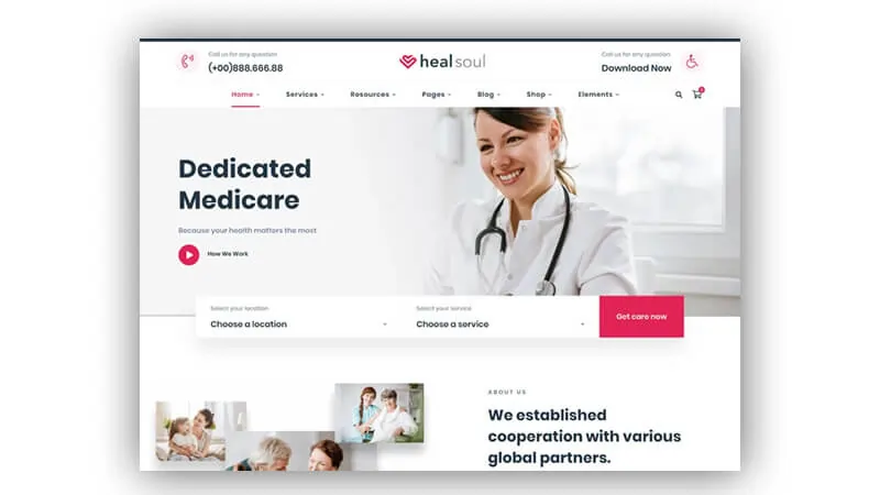
These Fintech Website Design Trends make an impression while they transact.
Financial websites can’t give their audiences a dull look when their transacting audiences are going big in their expectations. Your design needs to sound more compelling & attractive than just safe & purposeful. This year, your financial services seekers’ design expectations are something like this.
3D visuals had always delighted the user’s interests, this year, we will see this trend holding back in fintech websites. The hyper-realistic 3D images taking up the entire screen will create an immersive experience for the website visitors.
This trend will convince the audience to stay for longer by breaking the boundaries between “digital space” and “reality''.
The typography overlapping graphics will be more obvious for the banks to make visuals more appealing and less boring. The trend is best to add more personality to your website design.
And to make the most from this trend, it is best to use graphics and typography matching the brand theme. You can add cartoon squiggles to sound more playful or some geometric or detailed illustrations when you want to sound professional & serious.
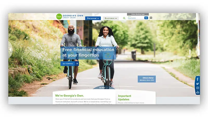
This year we will see a lot of wide white frames or space in the fintech website’s page to steer away from full-bleed images and parallax designs and to give designs more structure and stability & make each element of visual shine.
Neatly structured white frames around the page will make a satisfying sense of order and help to prioritize and separate the different sections of the page.
Minimalistic navigation is soaring in trends as it renders great usability to the users. The trend will allow fintech product users to think less and move around the website speedily, instead of wondering “how to navigate further”.
The giant size imagery or videos covering the page with bare minimum text and button will be seen more to stop the users fall into usability jargon of the website.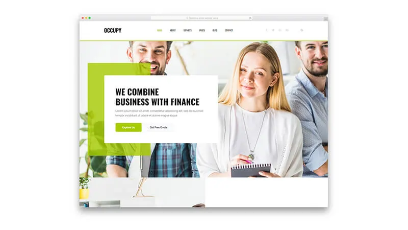
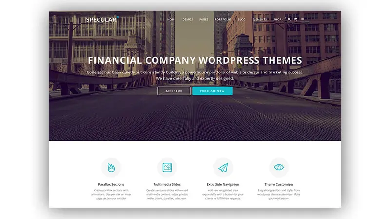
Dark mode web designs are on the rise as they are easy on eyes and make the website images and elements pop-up.
Dark themes are seen better than OLED screens as they save power and expand the screen lifespans. Having a dark background improves the visibility of other accent colors on the website and results in dynamic designs.
If you don't want to go with full dark mode, you can give your users the option to switch to dark mode themes to match their interests whenever they feel the need to.
These eCommerce Website Design Trends uplift your shoppers’ spirit.
eCommerce websites are the core of website types and they can’t take a backseat when they have to drive the needs of the shoppers online. Let’s learn about the types of eCommerce business models before you will see some innovative & trendsetting changes in eCommerce website designs.
Find out which eCommerce model your business belongs to!
In the B2C eCommerce model, businesses sell goods, services to the customers. Anything businesses sell to the online audience for direct consumption is called B2C, which is the most common model.
You selling wardrobe, household supplies, entertainment services to the audience are part of the B2C model.
B2C model is preferred because it has a shorter sales cycle, which benefits both customers and seller:
Examples of B2C eCommerce websites are everywhere, but the ones we know the majorly are Overstock.com, Newegg.com, ModCloth, Wish, Walmart, Target, REI, Gap Inc.
If your business is too into selling goods/services directly to consumers - you are a B2C eCommerce business model.
In the B2B business model, businesses sell products/services to “other businesses”.
The other businesses quoted in the above line can be the ultimate customers or sometimes can be a reseller to a customer.
As compared to B2C models, the B2B eCommerce model has a longer sales cycle - but it is worth it, as here the order value is generally high and the recurring purchases are more.
The offline B2B businesses by replacing the traditional catalogs and order sheets with eCommerce storefronts have been getting improved targets in the niche market.
Do you know, in 2015, Google found out that nearly half of the B2B buyers (doubled amount from 2012) are actually young millennials. Younger generations entering the business decisions are making the B2B selling space more in limelight.
The brands we see around like General Electric, Grainger, McKesson, Quill are the few renowned brands that are affixed into the B2B eCommerce model.

In this model, individuals sell products or services to businesses or companies.
Under this type of model, customers post the product or services they want the businesses to bid for the opportunity. Even affiliate marketing services fall under the C2B model.
You know Elance (now called UpWork) was the early innovator in this C2B model that helped individual talents to pitch to the brands from a common platform.
The competitive edge of this eCommerce model lies in its setting price for the goods or services.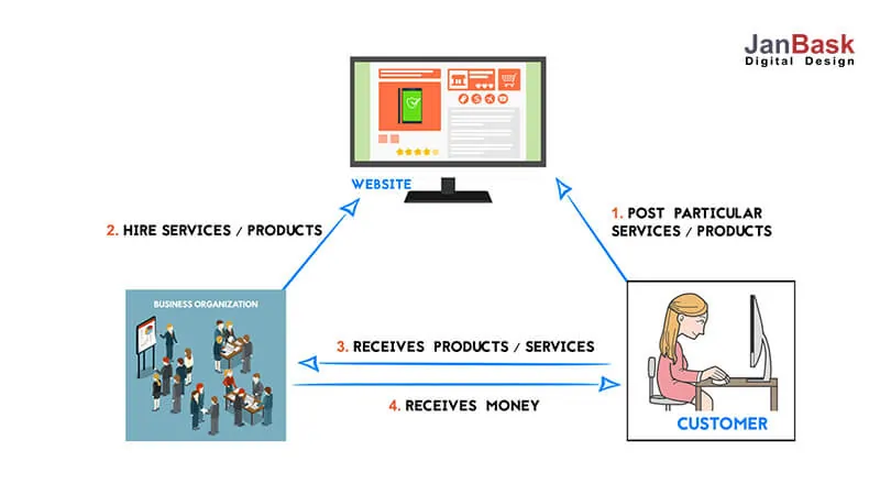
This type of model is perfect for individuals or customers who want to start something of their own and want to become able to directly compete to meet their needs.
You see influencers collaborating with brands/businesses or their product/services or food bloggers with the food chain for their marketing are also forms of the C2B eCommerce model.
In this model, the customers connect with other customers to bring exchange of goods and services.
Pioneers like Craigslist, eBay, and OLX are the few brands that are renowned for this model.
The C2C model is run by self-motivated sellers and buyers who are bought under one roof to exchange goods/services, value, and money all by themselves - without any intervention of middlemen.
Now we know what 4 business models exist in our eCommerce landscape, let’s now discuss the eCommerce design trends that these models are going to witness and should get prepared.
The latest eCommerce website trends focus more on AR,/VR, AI, along with innovative marketing techniques that offer a great buying experience, usability, and personalization to sellers of every business model - over any devices consumers have.
The AI and Machine Learning are on a constant rise in online retailing. With which, retailers will be able to target more personalization and improved customer experience.
Online retail business by welcoming AI technology can help:
Did you know? A fashion brand used AI (Artificial Intelligence) to make decisions for their Digital Ad spending. Doing this resulted in a 76% increase in their social media revenue.
People love connecting with sellers who care about them and show concerns. With AI, the bots can learn forming sentences to convey an emotion. AI can soon help bots become sensitive towards the needs of the buyers’ purchasing needs based on their moods and emotions.
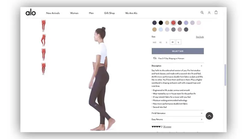
The current eCommerce products are stressing more on advanced visuals, simply put - visuals with a lot of movement or motion. This means we will see fewer static photos and a lot of dynamic ones.
Earlier we have seen the use of motion in product images sparsely, but this year, this feature will take commonplace. We will witness more advanced visuals like videos, cinemagraphs, animation, and micro-interactions.
eCommerce sites are and will continue using motion in images to grab more and more eyeballs. 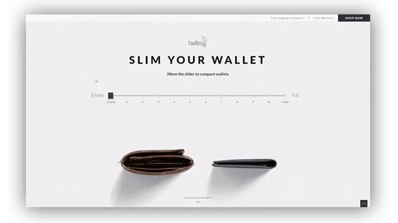
Motion in eCommerce design will lead to quite a lot of advantages:
This year, the trend of bold and bright typography will be the greatest highlight. This will make the websites grab the attention of the buyers to stand out from the crowd and keep their essence glued in the users’ memory long.
Bold and bright typography will help to add more texture, substance, and voice to eCommerce websites.
Layering such bulky typography with a splash of bold colors will make the sellers speak volumes about their propositions to help attract powerful and desirable brand associations.
Bold and beautiful typography will scream out loud that synergy with such a brand is going to be beneficial for buying customers - whether normal individuals or business groups.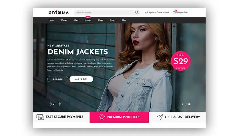
With such bold calligraphy over their website, the sellers can portray a subliminal message that buying or associating with their brand is a power deal.
In a competitive environment, sellers/brands will be required to provide more payment modes to the buyers to create a frictionless checkout experience.
Buyers are expecting more fresh payment options, especially while doing overseas purchases. Completion of the order depends a lot on the “Buying process”. The increasing rate of cart abandonment is one of the reasons that persist because of an unpleasant checkout process.
You know, over 70% of users having clear intent end up not completing the order due to hurdles in the checkout process.
Having a good payment gateway is one thing that can help to capture more sales. This year we will see eCommerce platforms incorporating users’ favorite and preferred payment methods.
The platform will see strides of centralization of payment where buyers will get a unique ID - which will be for a wallet service continuing payment info, buyers’ shipping and billing address, preferences, etc to make it convenient for the users to complete the process. Payment processors like Apple and PayPal have given this a shot in the past - we think this will continue this year and further too.
With that trend in mind, the websites still struggling to deliver responsive website design experiences will require to pull up their socks to deliver experiences over mobile as similar to desktops.
eCommerce businesses will be seen doing their best to bring seamless shopping experiences over users’ palmtop devices with a variety of payment options including fast and secure e-wallet options.
The VP of marketing at Northern Commerce says that “improved quality and mobile payment integrations will lead to the great changes in coming years”.
Along with mobile solutions, another major thing we will see walking parallel to responsive websites is PWA (progressive web apps). That will give users a native app-like experience with the same capability to allow push notifications and do basic work offline.
PWA will help sellers improve their buying journey for customers who are mobile users.
AR (Augmented Reality) has been the game-changer in the eCommerce industry for quite a long time. This year, AR will take commonplace to enhance users’ shopping experiences and cement in the gap of ambiguity.
We will see websites drooling over AR to help buyers see the products in a more broad and realistic light - no matter the product is a furniture item, glasses, or any clothing piece.
AR will help buyers to see how a certain product would look on them or within their premises --- all before they hit that “Add to Cart” button.
These Educational Website Design Trends create stellar platforms for blended learning.
The website of any educational institute be it of high school, college, university or online tutoring website should offer a first impression that convinces a potential parent or learner to stay on the website and explore it for long hours.
If you own an educational website, here are the few latest web design trends you should adopt and apply to your website.

Your website’s users would be tutors, students, parents, administrators among others -- who are strongly expecting to have personalized experiences over your website.
Edutech users are expecting more straightforward & personalized designs this year. A website that’s responsive as well as filled with information looked by target visitors.
You can add quality images, professional stock images, or real images, background videos to create aesthetics that depicts personalization.
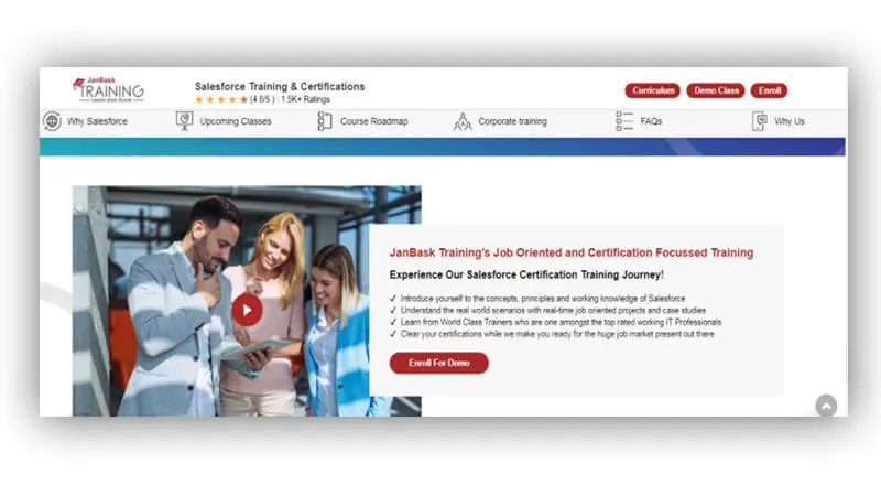 Websites in the past have found successful conversions through three things:
Most educational websites are using the first two broadly but very few are using the third one.
This year, we will see the rise of websites having integration of quality video-based content. You can add videos as:
Pro tip - Embedding video-based content to design is super necessary for businesses those who conduct online classroom programs. To get the most customers/learners - they need to infuse social proof or informational video around their website.
VR (virtual reality) is taking commonplace even in the edutech websites. Learners are expecting more out-of-the-box experiences from the brands and thus, incorporating the VR technology will add an element to your website and help your web page draw and sweep your visitors off their feet and convince them to turn from “potential learners” into “learners”.
No matter if you are a teaching institute offline or online, you can use VR technologies to give students a round of your educational facilities. Like the place where they learn (if you are situated offline) or from where the instructors teach learners, your admin, & other areas (to make them confident in your existence when you are online platform).
You can use VR technologies in any way by donning the VR requirements of your students/learners.
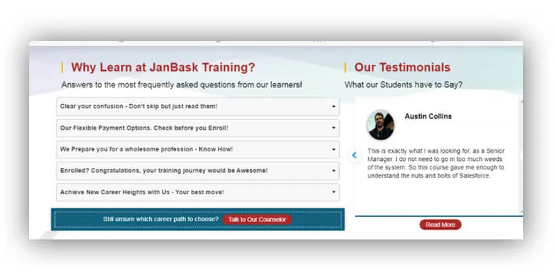 People love watching a huge image than small ones.
When you set up your educational website
These NPO Website Design Trends make your case stronger by creating a compelling online identity.
Since NPOs run for a cause, they have to make their cause reach successfully the target audience via convincing & cause-driven web design. Here we are sharing the latest website design trends of this year for NPOs that will help them:
Since the NGOs’ aim is to make people believe in them, such websites have to up their empathetic voice through a variety of multimedia. They should add compelling & convincing:
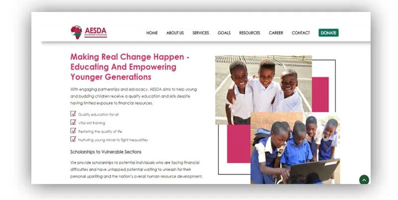
Adding a variety of multimedia throughout the site can convince the would-be volunteer/contributor to stay longer on the website and his/her time spent on the website will convince them to contribute to your noble cause in any smaller to bigger way.
Once the users are moved by your thought, they would want to look for the call to action “donate” button that could help visitors move towards the end of completing the process like ---- volunteering or contributing to fundraisers.
A giant “Donate” or “Join us” or “Schedule a call” button often seems missing on the website.
A big CTA button driving towards the cause with bright colors & clear choice of words can attract maximum clicks & navigate the purpose of both visitors & the non-profit organizations.
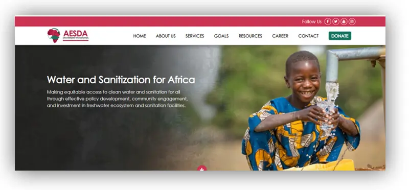
White spaces are also a huge website design trend for NPOs this year, as they add breathing room around the website’s content, design elements & other features.
A website with a minimal look and lots of white spaces to relax the users’ tired eyes will better help in taking their attention toward your noble cause of “helping & growing others”.
Also, studies have shown that website that breathes with a lot of white space gets:
Website traffic from handheld devices has already surpassed the ones that come from desktop browsing. Even NPO websites see huge numbers of website traffic occurring from mobile traffic.
Going responsive to the mobile-first design is a never-aging trend that we will see this year shaping too. NPO websites need to build a design that operates & orients well on the different screen inches, if not done so, they may lose heavily on the people who would be willing to help or contribute to their cause.
Marketing Website Design Trends uplift your website’s design before your market theirs.
Marketing websites cannot be left behind in meeting the website design trends, especially when they have to market other websites. Here are the web design trends especially for marketing websites to always stay up to mark and bag more clients.
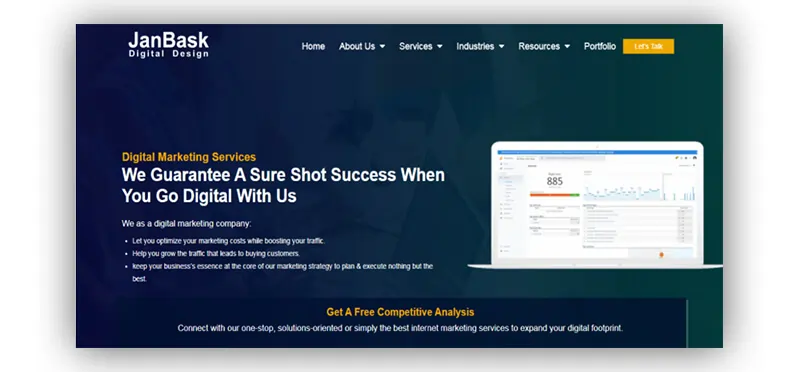
Marketing websites can’t do without a catchy banner. This year, they have to focus on a banner, the theme & media around that can summarize their work, level of efficiency, positives in a quick short area.
White space can never become an outdated trend. Digital marketing websites should also adopt the white spaces to calm down the eyes of the visitors.
Use subtle yet bright colors around the white spaces, to make other design elements stand out. You can create room for white spaces as:
You can choose either of the three. White spaces are important as they help to focus on the core content & design elements more, don’t puzzle the brain on what’s happening, and retain the website theme in the mind for long.
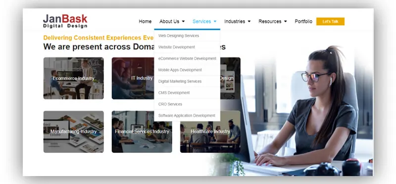
Hovering menus are “in” these days because they are so effortless to glide through the menu options. Since your website’s visitors will be in a hurry to know about what’s more you have for them, simply avoid the menu that take struggles to open.
A simple hovering menu that drops down on a gentle cursor swipe should be used to keep momentum with the users’ experience.
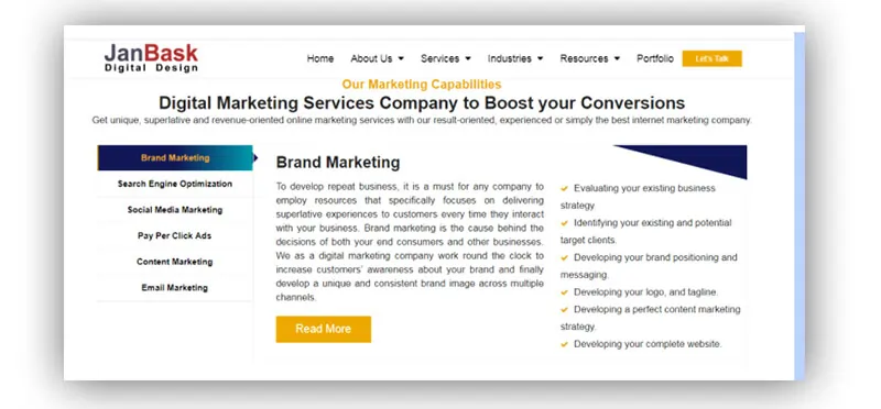
People love exploring websites that don't have a haul of text or content in just paragraph form. Add a variety to how you display your content (after all you are a marketing company). You can experiment and add a variety of layouts for your content.
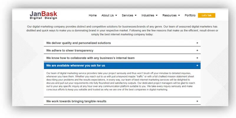
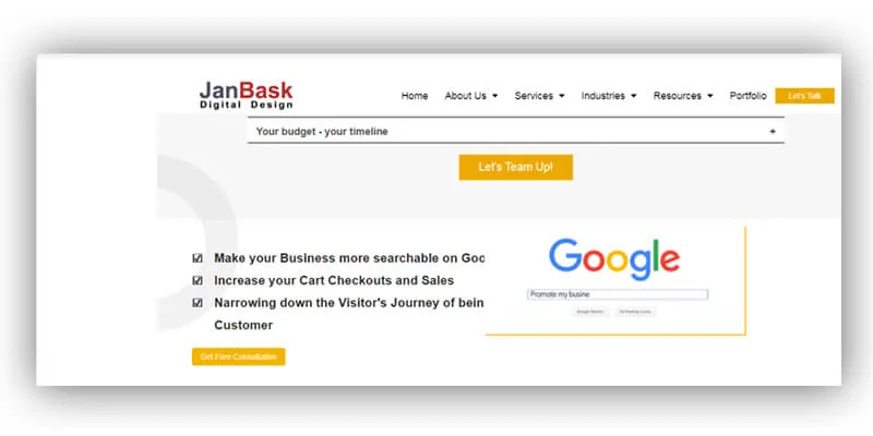
Give your readers a unique and different layout and design around content. Don’t add the long-haul paragraphs as today’s readers or visitors want fast & accessible information & design.
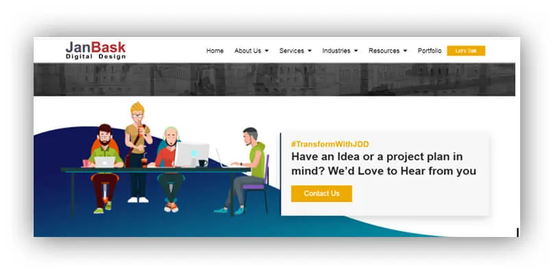 Having actionable CTAs (call-to-action) at prominent places is important this year. Websites often lose conversion because they don’t add CTAs where a user eye would demand. Just having a “Contact us” button on a website is not enough. Users can make their mind while navigating the website or reading your proposition, and that time to avail your services, they won’t climb up to reach out to you.
You should have CTAs at the header and at the bottom of the website, and the rest of them at the end of each section’s end. 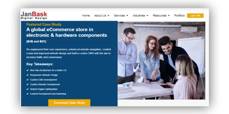
Use simple & catchy phrases inside the CTA button, don’t be wordy, go for direct & trigger words like “Learn more”, “Let’s talk”, “Download case study”, “Subscribe to newsletter”, “Let’s work together”, “see our work”, “Get free quotes”, “Free analysis”, etc.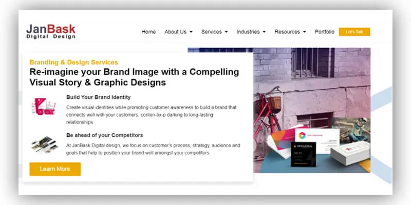
This year’s website design trends will look something like:
Along with following the above trends, create your own innovative trend, and compel other brands to adopt it. You can be an inventor of a trend by hiring a website designing company, just express your imagined web design or features to them, and who knows one day your trend could be in the list of the top website design trends of 2025… maybe!
We just showed you the new website design trends that can be a game-changer for any website in any business niche.
Having a business website is not just enough, you have to constantly upgrade it to satisfy the interests of both your target audience & the search engines. You can’t just do brisk walking in the race, where everyone is simply running. A new and improved website can help you:
Need someone who can help you meet these trends? We can help. How about we start with a website analysis & quotes?
Interested in our Web Design & Development Services?

S
Thank you for this information, I appreciate your effort, please keep us update.