CTA (call to action) is one of the essential elements in making your website worthy. Business websites are designed using numerous graphics to attract customers and inform them about a particular product. However appealing the website is, it is more or less worthless until your viewer doesn't take any action even after frequent visitation.
CTA helps our website to convert these viewers into potential customers. But there are different types of CTA and each has a specific technique to be used. Your call to action banner simply can't pop up on the whole screen just after the viewer is two minutes into it.
So, in this article, we will help you understand CTA (Call to action), its type, beneficial factors, and some additional tips for better usage. Stay tuned!
Interested in Conversion Rate Optimization Services?

A call to action, often known as a "CTA," is a request made to website visitors In the form of any text, banner, button, image, or other feature to perform a certain activity. These frequent actions draw the attention of the customers towards the next step. It also helps the customer to click on the right product at the right time.
The majority of call-to-action pop-up is composed of "Email listing" or "Buy Now." All these forms have to be perfectly placed, written, and designed to move viewers from the evaluation stage to the final selection stage.
Without CTAs, visitors to your website will be less inclined to interact with what they see and will eventually lose interest.
One of the simplest methods to encourage website visitors to take action is by using call-to-action buttons. This will enhance engagement, raise conversion rates, increase revenues, and help your business expand quickly.
You may have encountered the following examples of call-to-action buttons:
Not only should call-to-actions be visible on your homepage, but also on your product pages, pricing pages, and even your "About Us" page. But these different methods of website CTA are just like throwing your marketing strategies in the bucket and seeing what stays or works.
However, you might have seen success in your master Call to action plan but without monitoring your progress and testing different strategies, your success will quickly fade away.
It is impossible to overstate the significance of a call to action in advertising. Because Random strategies get random results.
But what's worth remembering is that simply website CTA’s can lead your viewer to a new journey of your sales.
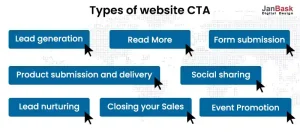
The truth is that when you're initially starting out, your website really just needs eight diverse and attractive call-to-action. You may need to change these as your business expands quickly and steadily and as your website becomes more complicated, but these are excellent starting points for any marketer.

It is used to convert visitors into leads. You don't want to lose the potential viewer just because you couldn't collect the data. So, you have to put them on the spot where there are higher visitors. The most common location for these CTAs is on blogs, where they can be seen in the sidebar, at the end of posts, or even as a floating banner in the corner. Visitors should be able to clearly see what they will receive as soon as they arrive at the landing page that these CTAs direct them to.
You probably don't want to show the entire post on the home page of any area where you display a stream of information, including your blog, customer case study page, or even your press office. Encourage visitors to specific posts by including the opening few paragraphs of your material on your homepage, followed by a call to action to "read more."
After visiting your landing page, your visitors must complete two additional crucial tasks before being registered as a lead. In order to add their information to your contacts database, ask them to complete a form and submit it. You can use more actionable buttons instead of the “submit” button.
When you notice visitors browsing your website in an effort to learn more about your business and its products, you should make it as simple as possible for them to do so. This business information will help create awareness about the product and also increase your sales rate. Just keeping your CTA’s button simple and textual would be fine, as long as the button sticks out against the background well enough.
Imagine a viewer likes something on your website and wants to share it for seeking a friend's approval. Now, Social calls to action help the viewer to share a piece of content with their friends and relatives. An easy way for visitors, leads, and customers to interact with your brands is through social sharing buttons. You must make sure to post each one on your website where it makes sense.
Sometimes viewers love the product but think 100 times before buying a product or opting for a service. For such potential leads, lead nurturing website CTA’s help the most. A lead nurturing CTA offers product demos, free trials, or free quotations. You should highlight these CTAs in locations where you are aware that many leads are present, such as blog posts or the thank-you page for another marketing offer.
The growth of the business solely depends upon the sales rate. Moreover, higher sales also show that your CTA’s are working. Closing sales CTAs emphasize direct sales. You would like to attract potential customers that are immediately interested in purchasing your goods or services. Try to use these CTA on websites’ thank you or closing pages.
If you plan to throw an event, online or offline, you want plenty of customers or leads attending it. Try to use a Call-to-action on a website for event promotion to encourage ticket sales or to help spread the word about the event. Depending on which type of audience segment you are trying to get to attend, there are countless places you can put this type of CTA. Remember, a constant reminder of events attracts more customers.
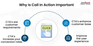
Here are the following reasons to complete your marketing strategies with call to action.

Potential Customers are often confused and leave the website without taking any action. CTAs will serve as a clear road map that shows them where to look next and what to do next, removing any misunderstanding and preventing choice exhaustion. Additionally, it makes links between their requirements and our availability.
The major purpose of CTA is to leverage the motivation and curiosity in your audience which in turn increases click-through rates of your website. These click-through rates increase the Conversion rates. More customers will navigate your website, if you make it simple for them to do so. Giving your visitors the quickest path to the next action and removing the need to solve a problem is what makes them fall for it.
The guided paths with call-to-action buttons like "Follow on Instagram" or the powerful "Buy Now" operate as leverage and increase your client database.
Imagine a customer leaving your website with utter satisfaction. Good right? Adding CTAs in web designing plans will enhance user satisfaction by reducing annoyance and enhancing usability, which will lead to a rise in customer loyalty. CTAs serve as signals to users that your website is trustworthy, user-friendly, and well-designed.
Here are certain things to keep in mind while writing a compelling CTA.
Apart from persuasive writing skills, here are some technical things for you to remember:
Last but not least, you should assess the effectiveness of your last call to action and note areas for development. It may seem that creating your website CTA is a lot of guessing and shooting but it's all about experimenting. Take a peek at your stats to get a general notion of how well your CTA is performing. To determine what proportion of your overall visitors clicked, compare the page traffic to the conversion rate.
If your conversion rate percentage seems low, Don’t worry. There is no particular CTA. However, A split test on your CTA web design is worthwhile if your conversion rate is much lower. Examine which of two distinct calls to action performs better with your target audience by testing with different wording, fonts, and colors.
In conclusion, the purpose of a call to action on a website is to increase the market's response to the advertisement's content. Without it, a visitor will move on and forget about the advertisement. Successful salespeople have long understood ‘why call to action is important for a website?’. Giving customers compelling reasons to make a purchase right away is the secret to a successful call to action.
Don't let the time and work you put into creating your marketing materials go to waste by not including strong CTAs!
Looking for Digital Marketing Services?

Leave a Reply