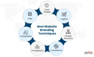
There are over a billion websites in the world, with thousands of new ones coming online every day. If you’re an entrepreneur, there are hundreds or even thousands in the arena where you compete. How can you make your website stand out in all this? An important part of the answer is in website branding.
A branded website is one that creates a connection with visitors and turns them into customers. It has a personality that makes it unique from its competition. It tells the world clearly what it is and what it has to offer. A great website is a key part of any good branding strategy.
People remember a branded website. When they see its elements, such as its logo or color scheme, they immediately think of the business that’s behind them. When website branding works effectively, the company quickly comes to mind when people think of its product or service. It’s one they’re likely to look at when they’re ready to buy.

Here are some reasons website branding is vital:
There isn’t any single factor that produces a good branded website. Rather, it’s a combination of elements that work together to give your website a visual appeal that reinforces your brand. Here are seven techniques that do just that.

Big companies have logos, and small companies should have them, too. It’s the most important and effective branding element you can employ. When you see the Starbucks Siren or Volkswagen’s stylized VW, there’s no question what company is behind the symbol. When the Nike swoosh appears in the upper corner of the page, you don’t have to look twice to know what site you’re visiting.
A logo must be straightforward, distinctive and memorable. It also has to be attractive and recognizable, no matter how large or small it is. You’ll want to use it on your website, emails and social media posts. It needs to look good on laptops and mobile devices. It should appear on printed materials, and you may even use it on coffee cups and t-shirts.
Some companies hire a graphic designer, but you can establish an effective logo without writing a big check. There are many free and low-cost online logo design tools. You enter your company name, something about your business and some design preferences, and they generate samples that you can customize and download.
If you haven’t established brand colors, you should. Colors carry emotion. IBM blue connotes stability and reliability, and Coca-Cola red expresses life, excitement and passion. Consider the color combination on the Burger King website. Notice how the red, pumpkin, and antique white recur as a theme and also complement the pictures of the food.
Your color or colors should resonate with your target customers. They’re going to affect how visitors feel. A company selling sporting goods should choose brighter and livelier colors than one selling accounting software.
The colors should appear in your logo. Use them a lot or a little on your website, depending on how forward they are. Bright orange might be used more sparingly than blue. You’ll also want your colours on signage and printed advertising.
When a tagline becomes widely known in popular culture – “What’s in your wallet?” or “When you care enough to send the very best.” – a company’s name becomes more prominent in the public mind. A good tagline reflects a company’s personality, goals and values. It sticks with people. It tells the world something about who the company is and what it has to offer. In today’s world, it doesn’t hurt to have a tagline with an industry-specific keyword or two for SEO purposes.
You don’t have to be a well-known corporate giant to profit from a website tagline. Consider this example from a small outfit called The SMS Works. “Low cost SMS API for developers” tells you what the company offers and who it’s for. As a bonus, it’s a phrase a potential customer might enter in a search engine.
We’ve all seen “busy” home pages with too many moving images and a confusing array of buttons. Customers come to a website to look for something, not to be dazzled. A branded website should be easy to read with obvious navigation clues. Consider this example from Wealthsimple. The top center menu has clear, intuitive categories and subtopics. The use of white space has a calming effect. That will be welcome for anyone with financial concerns.
As you scroll down, each topic has a button to show you more. There’s a complete navigation guide at the bottom of the page. When you’re visiting a website, you should never wonder how you got to this page, how to keep exploring or how to get back to where you were previously.
Every time they go to a new page, users should feel they’re in familiar territory. There should be one or a few page formats that are repeated throughout the site. Most website builders offer templates that help ensure this consistency.
Moreover, your visitor should have a similar experience whether they’re using a laptop or a mobile device. With the difference in real estate, the pages can’t look exactly the same, but they should feel the same.
Think about the widely used Weather Channel website. Whether you choose Hourly, Daily, Weekend, 10-day or Monthly weather, the pages are similar enough that they’re instantly easy to read. It’s a recognizable Weather Channel look. And it feels the same no matter what device you’re using.
Pictures, whether they’re photographs or illustrations, tell a story and evoke emotions. Never lose track of your branding philosophy when you’re choosing pictures. Use people in your images when you can show them enjoying your product. Make sure they represent your target audience in terms of age, race and other diversity factors. In fact, you might be able to use diverse subjects to expand your customer base.
Pictures can reinforce your brand image. Consider Patagonia and their commitment to environmental protection. Their images include stunning background shots, many featuring people wearing and using their products. The images of the items themselves are quality photos with color that jumps out at you.
Typography consists of words, but the positioning of text on a screen can act much like a picture in setting mood and evoking emotion. Typography includes not only font selection but also the use of white space and the placement of text on a page.
Fonts need to be consistent across web pages and your printed material. You don’t have to have just one font, but you shouldn’t choose more than three or four. Use them to distinguish the relative importance of text blocks.
Fonts should reflect your business’s personality. For example, large block fonts are strong and stable, elaborate fonts denote sophistication and unusual fonts suggest informality and playfulness.
Look at how Grammarly uses simple, non-serif, well-spaced fonts and ample white space. They’re in a business that involves words rather than pictures, and they display those words in a straightforward, serious manner that reinforces their credibility.
Creating a branded website isn’t a magic trick. It’s the coordinated use of specific techniques to stand out in the online world. Small businesses as well as large ones have done it successfully. By paying attention to some principles and learning from the best examples, you also can create an effective branded website.
Through right branding strategy, you can build customer loyalty and trust as well as create a memorable brand that will stand out from the competition. And while it may take some time to develop cohesive branding across all your digital platforms, investing in the right resources and tools will pay dividends in the long run.
Leave a Reply