As much as marketers would like to, they can't focus solely on design or conversions when considering websites. User experience (UX) is the key to bridging the two perspectives and ensuring that your design leads to conversions.
This is where wireframe comes into play. If you are thinking to avoid it, don’t!
A simple wireframe can literally help designers, developers, and clients save time and work more efficiently throughout the entire development process.
Are you new to the concept of wireframe? Let’s start by addressing that for you.
The wireframe of a website is its structural framework, which is depicted using simple lines and forms and few or no colors. The goal is to have a format that is simple to modify in terms of appearance and content placement, as well as navigation and functionality.
The user experience can be treated as an independent (yet related) factor in website redesign and website development if the wireframe is first developed. With a wireframe in web design, you can play around with the page structure and test out user flows to get a feel for how your new website will operate and spot any hiccups that could cause a drop in conversions.
In this article, we'll discuss what is wireframe in web design, what a web design wireframing process looks like, the different kinds of wireframes, and how to make a wireframe for your project.
Looking to Create Wireframe for your Website?

Simply put, wireframes are simple black-and-white layouts that detail the dimensions and placement of your website's pages, features, conversion zones, and navigation. They have no design elements like color or font that could detract from the content and no branding at all.
We often compare them to a house's blueprint, in that you can see at a glance where everything is situated.

Web designers create wireframes to plan out the structure and major components of a site before developing the final version. To get a sense of the site's functionality before delving into the content and color schemes, this is a good place to start.
Need web design services? We design and build websites that are functional, aesthetically pleasing, and responsive for both small and large businesses.
Now that we have understood what is wireframe in a website, let’s see what does wireframe mean in web design.
Designers utilize wireframing to plan and define the structure of their product's or website's information architecture. The design process here takes into account the findings of the user research that has already been conducted and centers on the way the designer or client intends for the user to process the information presented on the site.
The end-user experience is evaluated by sketching out potential layouts and features like menus and buttons. In addition to helping everyone on the team know where they stand in terms of the overall project, a website wireframe can serve as a handy road map as individual members work on their respective parts of the project.
Making a wireframe early in the process will allow you to catch mistakes in your thinking and design while there's still time to fix them. Wireframes are a useful tool for communicating ideas both internally and externally, such as to clients.
Many different methods of wireframing are used by UX designers. While some people prefer traditional methods, others prefer digital resources. However, in the vast majority of cases, the choice of whether to use online tools or to wireframe by hand, as well as the process used to get from wireframe to code, has much less to do with the individual preference of the designer and a great deal more to do with the kind of strategy that the specific circumstance calls for. The degree to which visual design is prioritized and the degree of ambiguity surrounding the project's goals are two major factors in this regard.
From conceptualization to implementation, designers have a variety of options, including the ones listed below

It makes sense to jump straight into coding and development if the task is narrow and the visual design is either set or considered unimportant, but it makes more sense to spend the time and effort necessary to create a high-definition wireframe and put it through a cycle of test results with a fully realized interactive prototype if the time, resources, and business value are all high.
Get the best website designing company in town. We are a team of designers and developers who will work with you to create a website that is perfect for your needs.
We've compiled the most compelling arguments for why you should use wireframes as part of your web development process.
Sitemaps, especially those for enormous websites, can be difficult to conceptualize. The first single concrete visual process for a project begins with the sitemap converted into a wireframe. Unlike a flowchart, which can be difficult to visualize in its abstract form, a wireframe is a visual representation of the underlying structure of a program. By doing this, we can be sure that everyone is on the same page.
A website's UX and copywriting teams can begin to think about visitors' goals in light of wireframes. A wireframe highlights the site's architecture, navigation, primary page, subpage organization, and user flow through conversion funnels.
By creating a wireframe, you can show a client exactly how a feature will look and work on their website, as well as how it will be placed and how beneficial it will be to their project overall.
Even after a feature has been wireframed, you might also decide to cut it. Perhaps it doesn't fit in with the overall purpose of the site. A client's ability to focus on other, equally important elements of the project is enhanced by being able to view the features independently of the creative process. In addition to reducing work, later on, this is a time saver now.
Wireframing places an emphasis on usability by exposing the structural components of page designs.
Everyone involved is compelled to take an objective look at the website's usability, conversion rates, link names, navigational structure, and feature placement. A website's architecture or a feature's potential operation can both be improved with the help of a wireframe. In most cases, spotting problems early on is the best course of action.
How well your site scales as more content is added can be seen at a glance in the wireframe. The capacity for growth and adaptability are crucial. If, for instance, you currently offer 15 products but anticipate offering 150 in the next six months, you'll want to make sure that your website's design, architecture, and usability can scale up accordingly. These promising new avenues for content development can be pinpointed with the aid of wireframes.
Wireframes guarantee that the technical aspects of the site's functionality and layout are addressed separately from the aesthetic and branding considerations. This facilitates early feedback from customers and other team members. Feedback is easier to provide on a wireframe than on a fully developed design.
In spite of what some may say, wireframing can actually be quite efficient:
Everyone on the web team and client team has a shared understanding of the website's goals and objectives, as well as its intended structure and operation.
So is there really any reason to forego a wireframe?
The answer is clearly no! You can't skip over or replace wireframes if you want to build a successful website that converts visitors into customers.
Looking for website design services?
Your new website design is both yours and ours. We want it to be a reflection of your intentions, goals, and ambitions. In other words, we want it to be perfect for you.
We are a team of creative professionals that are passionate about creating engaging and beautiful websites. We also have a team of web development experts that transforms your vision into a functional web application. Yes, we work closely with the development team to make sure everything is perfect before it launches!
Low-fidelity, medium-fidelity, and high-fidelity wireframes are the three most common kinds of wireframes. The level of detail included in each of these wireframes is the main determining factor between them.
We'll take a closer look at these:

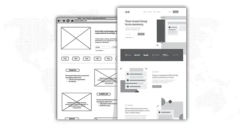
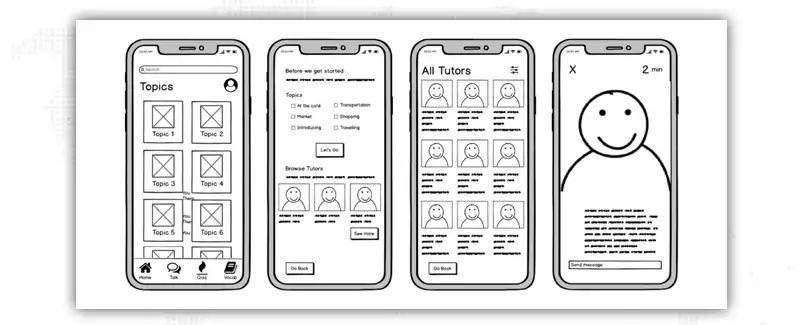
Low-fidelity wireframes are simple images of the website, which are used as a starting point for the design. Consequently, they are often quite rough, having been made without regard to scale, grid, or pixel accuracy.
Simple images, block shapes, and mock content like filler text for labels and headings are all that is present in low-fidelity wireframes.
Initiating discussions, settling on a navigation layout, and mapping the user flow are all made easier with low-fidelity wireframes. In a nutshell, low-fidelity wireframes are great for quickly sketching out ideas with a pen and paper during a meeting while key stakeholders or clients are present. Similarly, they are of great assistance to designers who are torn between competing product ideas and need to make a snap decision.

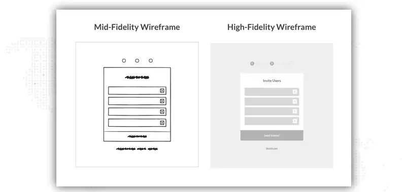
Mid-fidelity wireframes, which are the most widely used type, provide more precise depictions of the layout. They still don't include images or fancy fonts, but there's more attention paid to individual parts, and features are distinguished from one another.
The use of different text weights to denote headings and body text is another option. Even though most designs are black and white, designers can use varying shades of grey to highlight particular elements.

Last but not least, pixel-perfect layouts are a feature of high-fidelity wireframes. High-fidelity wireframes can include real images and text that is relevant to the design, as opposed to low-fidelity ones that use fillers like pseudo-Latin and grey boxes with an 'X' to indicate an image.
High-fidelity wireframes are great for prototyping and documenting intricate ideas like menu systems or interactive maps due to the increased level of detail they provide. The development of high-fidelity wireframes is best left until late in the product's design process.
Your website is the most important tool in your business. With a professional web design service, your company will be able to reach new markets and promote its products and services.
You should know what you want from your website before you put pen to paper to draft a wireframe. While it's understandable to want as many visitors as your server can handle, it's important to plan out exactly what you want them to do once they're there. For example, do you want them to make a purchase or download a newsletter. You need everyone on your team to be pulling in the same direction to ensure a smooth transition from planning to launching your site.
If you want everyone on your team to have a common understanding of how a visitor should navigate your site, wireframes are a must. First, you'll need to map out all the possible ways people could find their way to your homepage. Then, you can pick a handful of the most important entry points and use them to shape the flow of your visitors' experience.
Before you start sketching out a wireframe, it's a good idea to write out a detailed description of the user flow. Why? When compared with a wireframe mockup, rearranging steps in a written outline is much simpler and quicker.
You'll need to scale your wireframes up or down depending on the size of the device you're designing for. Screen sizes on smartphones, tablets, and computers will vary, and on a desktop, the window size can be adjusted. Utilize pixel measurements as opposed to inches or points for the most precise wireframe. You can find the typical dimensions of various display devices below:
You should now create a wireframe of the user experience. Paper with dots or grids can help you stay organized if you must rely on pen and paper. As a result, you'll have an easier time converting your physical wireframe into its digital equivalent.
If you're building from the ground up on a digital system, pick the best wireframing tool that can handle the level of detail in your wireframes.

After you've sketched out your wireframes, you can determine the exact flow the user should take through each stage. Just because you've laid out the user's next steps doesn't mean they'll naturally follow along. At this point, you'll establish which of the page's buttons, links, images, or other elements will prompt the reader to proceed to the next step in the process, and so on, until they reach the desired outcome.
You can think of wireframing as a series of small iterations. Wireframes that are ready for development typically go through multiple iterations of sketching. Some of your website's pages may be duplicative, and merging them would reduce the number of times a user has to navigate through your site.
Even though your website will undergo numerous iterations of testing and revisions before going live, it's still a good idea to solicit early feedback on your wireframes. Get feedback on the flow itself from your design and development teams, as well as from internal staff and customers. It's important to get feedback early so that the core UX doesn't get lost in the shuffle as more features, screens, and page layouts are added.
We are a professional and dedicated web designing company, offering web designing services that have made us the number one provider in our region.
We sincerely hope that it has motivated you to try new things! It is important to remember that iterating the design process multiple times is not something to be afraid of.
In addition to that, you should definitely try your hand at a variety of tools and procedures. When you finally find a program that fits your needs and feels natural to you, you'll realize that the time you spent on it was well worth it.
Web designing is one of the most important aspects of a website and we are here to provide you with the best web design company services.
We specialize in website redesign services, including site architecture, website strategy, UX design, and front-end development. We offer a one-stop service for any business of any size. Our team is comprised of talented and experienced professionals with years of relevant experience.
Thank you for reading, and please don't hesitate to ask any questions you might have in the comments.
Looking for Website Redesign Services?

P
You have the potential to be an amazing writer. I encourage you to keep writing as much as you can, get even better, and show the world what you have to offer. This was a great article with a unique point of wireframe in web design.
N
I love the way you articulated this topic of wireframes in web design. I know it will help a lot of people understand it better and open my mind up to other possibilities. Great job!
B
I recognize how much time you must have put into researching the facts about wireframes in web design. I love so many things about this piece. You possess a great amount of this skill. Thanks for writing this. Lots of love.
B
I appreciate your team’s dedication. Your team’s writing changed my perspective on wireframes in web design. It was truly remarkable and you managed to capture everything about web designing so well! Recently I read your post, and I just fell in love with your writing style.
S
Such a helpful topic of wireframe web design essay this is. I finally understand this topic now. The way your team explains a complex topic in an easy-to-understand way is really impressive. All thanks to writers like you, I just love your tone of writing.